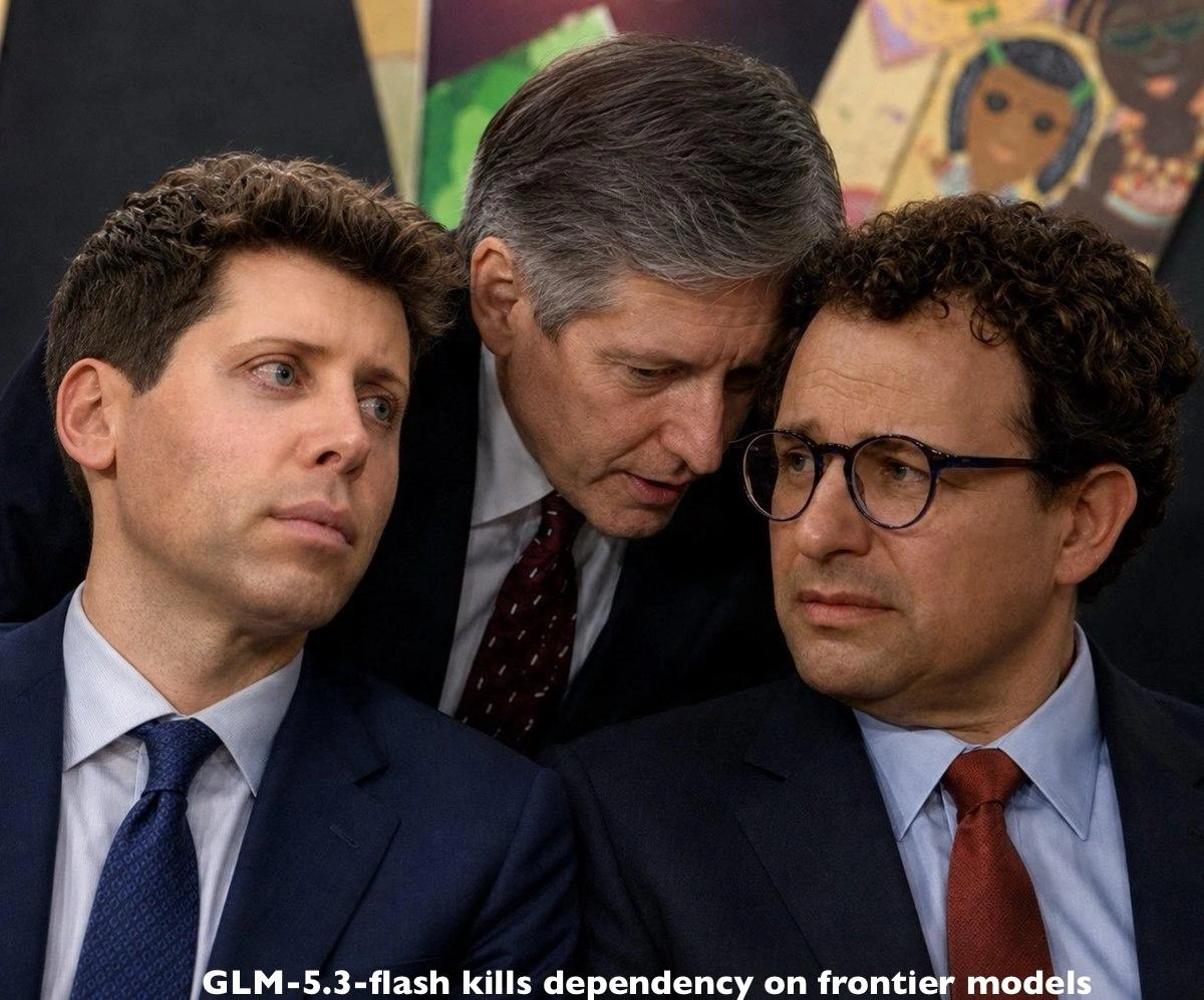
LLM cost-vs-quality spreadsheet every principal engineer now gets pinged with
Why is this AI ML meme funny?
Level 1: Best Toy for Your Money
Imagine you have six different robot buddies you could play with. 🧸🤖 Each robot is good at different things: one is really good at answering trivia questions, another is awesome at doing math homework, another can help you draw pictures, and so on. But here’s the catch – they aren’t free to use. Each robot asks for some of your candy as “payment” for playing or helping. The super smart robot might ask for a LOT of candy every time it talks, while a simpler robot asks for just a little candy. Now, your parents show you a big chart on a whiteboard. This chart lists all the robots side by side. For each robot, it shows two things: How good the robot is at certain tasks (like math, science, making up stories, fixing toy code) – kind of like giving the robot a score in each “school subject” – and how much candy it costs to use that robot for a while. It’s like a report card for each toy, plus a price tag!
You really want the robot that’s super helpful but you also don’t want to lose all your candy. 🪙🍬 So you stare at the chart. Robot A is the best at math and pretty good at everything else, but wow it’s expensive (lots of candy per hour!). Robot B is cheaper (only a few candies), but oh dear, it’s not very good at answering science questions and it can’t draw pictures at all. Robot C can even look at pictures and videos and explain them (cool!), but it’s the priciest of all – your whole candy stash might be gone in one afternoon. Choosing is hard! You start feeling like a little accountant, comparing numbers and making trade-offs: “Hmm, maybe I can use Robot C only for art class help and Robot B for daily homework to save candy…”
It’s a funny situation because, normally, wouldn’t you just pick the toy that looks the most fun and try it out? 😃 Instead, you’re treating playtime like a big business decision, with a spreadsheet and everything. The humor comes from that exaggeration: we have this giant chart as if we’re making a very serious choice, even though all we want is the best helper for the best price. In the grown-up world, engineers are doing exactly this with AI models (their “robot buddies”). They literally create huge tables comparing how smart each AI is and how much it costs, trying to get the most “fun” (useful answers) without breaking the bank. It’s like seeing a kid meticulously calculate which toy gives the most fun per dollar – a bit over-the-top and therefore amusing. So, this meme is basically joking that every time a new super-smart AI comes out, the first thing everyone does is whip out a big spreadsheet like this to decide if it’s the best deal or not. It’s poking fun at how even choosing an AI has turned into homework! 📈🤖🎉
Level 2: Benchmark Breakdown
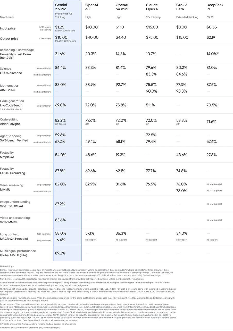
Let's break this meme down in simpler terms. What you see is essentially a comparison chart of AI models, and it’s being joked about because it’s so detailed that every senior engineer is now getting inundated with these sorts of charts. An LLM — which stands for Large Language Model — is a type of AI that can understand and generate text (and sometimes other media like images or code). Think of ChatGPT or Google’s Bard; those are LLMs. In 2025, there are several big players releasing advanced models. The meme’s table shows six such models side by side: Google’s latest Gemini, two from OpenAI (labeled here as g3 and g4-mini, presumably different tiers or versions of their GPT series), Anthropic’s Claude Opus 4, and a couple of others named Grok 3 Beta and DeepSeek R1. Each of these is like a different “genius AI” you could choose to use, and each one has its own strengths, weaknesses, and costs.
Now, the left column lists a bunch of tests or metrics (we call them benchmarks) that measure various abilities of these AIs. The idea is to quantify how good each model is at certain tasks – kind of like giving each AI a report card in multiple subjects. For instance:
- Input price $/1M tokens and Output price $/1M tokens – This is about cost. These AIs aren’t free; companies charge per token of text. A token is just a slice of a word (for rough understanding, 1 token is ~¾ of a word, so 1 million tokens is like 750k words). The table shows how much it costs to use each model: e.g. Gemini charges about $1.25 per 1M input tokens and $10 per 1M output tokens, whereas another model (say OpenAI’s g3) might charge $10 for inputs and $40 for outputs. Lower is cheaper. “No caching” just means that’s the price without any special reuse or discounts. Essentially, Gemini is a lot cheaper per token in this preview compared to some others (OpenAI’s older model looks pricier at $40 output per 1M tokens!). Cost matters because if you integrate these AI models into a product (like a customer support chatbot or coding assistant), the token counts add up fast – and so do the bills. A principal engineer must weigh Cost Optimization: do we go with the cheaper model or is the pricier one worth it for better quality?
- Reasoning & knowledge – Humanity’s Last Exam – This is one benchmark that tests general reasoning and knowledge. The name “Humanity’s Last Exam” sounds grandiose (and a bit ominous!), but you can imagine it’s a very hard quiz covering all sorts of topics. The percentages (like Gemini’s 21.6%) likely indicate what fraction of questions the model got right. Here, all models scored pretty low (around 10–21%), meaning the questions were extremely challenging (no external tools allowed, so just the AI’s own brain). So, 21.6% is actually the highest among them – not great in an absolute sense (failing grade 😅), but relatively the best. It shows that none of these models can ace every tough question, but some are a bit better than others.
- Science – GPQA diamond – This appears to be a science Q&A benchmark (GPQA might stand for something like General Physics Question Answering, but that’s a guess). The “diamond” might indicate a difficulty level. The scores here are much higher (80–90%), so these AIs do pretty well on whatever science questions these are. Gemini scored 86.4%, but interestingly one model (Claude Opus 4) scored about 90.0%, so Claude slightly outperforms Gemini on this science quiz. This shows how the “best” model can differ by domain – Claude might have an edge in science knowledge.
- Mathematics – AIME 2025 – AIME is a well-known math contest (the American Invitational Mathematics Exam), which has very tricky problems usually for high school math wizards. These percentage scores (mid 80s to low 90s) likely represent how many problems the AI solved correctly. These models are surprisingly good at math! For instance, OpenAI’s g4-mini score is 92.7%, and even a model like Grok 3 Beta hit 93.3%. Gemini’s at 88.0%, a bit behind the top. So in pure math problem-solving, one of the other models slightly beats Google’s. This must be humbling for Google’s team – they’ll tout other wins, while maybe downplaying that math gap. 🤓
- Code generation – LiveCodeBench – This measures how well the AI can write code from scratch to solve programming tasks. Think of giving the AI a coding interview problem and seeing if the first answer it writes (pass@1 means first attempt) works. The scores (~69% to 75%) show the success rate. Here, OpenAI’s mini model scored 75.8%, topping the chart, whereas Gemini scored 69.0%. So OpenAI’s model is a bit better at writing code on the fly in this test. Code generation is a big deal (for coding assistants like GitHub Copilot or code suggestions in IDEs), so these differences matter.
- Code editing – Aider Polyglot (diff-fenced) – This one is about editing code. Aider Polyglot sounds like a benchmark where the AI must modify existing code (perhaps producing a diff – the changes – in multiple languages, hence “Polyglot”). A high score means the AI can understand code and apply edits correctly. Gemini scored 82.2%, which is higher than the others (OpenAI g3 had ~79.6%, Claude 72.0%, etc.). In fact, Google explicitly bragged that Gemini is state-of-the-art here. State-of-the-art (often abbreviated SOTA) means it’s the best result achieved so far on that benchmark. Including “(diff-fenced)” hints the test expects the AI to output changes in a specific format. So, this is a win for Gemini – it’s apparently the best code editor AI among the bunch, even beating Anthropic’s Claude (which got 72.0%). That’s one reason the caption says “Google claims it’s SOTA on Aider (with Opus 4 included)” – they included Claude “Opus 4” in the comparison and still came out on top, which adds credibility to the claim.
- Agentic coding – SWE-bench Verified – This is a bit more exotic. “Agentic coding” suggests the AI acting like an agent that writes and possibly executes or verifies code. SWE-bench might be “Software Engineer benchmark.” “Verified” likely means the AI’s solutions were actually run against tests to verify they work (not just theoretically correct). This could involve multiple steps: write code, check if tests pass, maybe debug if not. It’s a complex, more autonomous task for an AI. Here the scores are lower (around 50-72%). Gemini got 59.6%, but interestingly Grok 3 Beta scored 79.4%, the highest by far. That suggests Grok (perhaps a specialized model or a smaller startup’s AI) is particularly good at these autonomous coding tasks. It might be leveraging a tool-use or something (the “Extended thinking” note on Grok implies maybe it can use more reasoning steps). This stands out: a beta model outperforming big names in a niche category – which is a talking point for engineers (“Should we consider this lesser-known model for that specific use-case?”).
- Factuality – SimpleQA and FACTS Grounding – Both of these are about factual accuracy. SimpleQA probably means straightforward Question-Answer: ask a factual question, see if the AI’s answer is correct. FACTS Grounding might test if the AI can provide answers that align with a trusted knowledge source or if it can cite evidence (basically not hallucinating or making facts up). The scores vary a lot here. For SimpleQA, Gemini’s at 54.0% (the best of the bunch), whereas some models (OpenAI g4-mini, DeepSeek) scored much lower (19-27%). That implies smaller or older models might really struggle with factual correctness on random questions, perhaps making up answers. For FACTS Grounding, Gemini again leads at 87.8%, with others like Claude and Grok in the 70s and 60s. So, Gemini is trying to show it’s very good at factual responses (perhaps due to better training or techniques to avoid lies). In plainer terms: if you ask these AIs straightforward questions, some are more trustworthy than others. Google wants to prove theirs tells the truth more often.
- Visual and Image understanding – MMMU & Vibe-Eval (Reka) – These benchmarks involve images (and possibly other media). Not all language models can handle images or videos – that requires a multimodal model (one that processes text + visuals). The table shows Gemini has scores for visual reasoning (82.0%), image understanding (67.2%), and even video understanding (83.6%). Meanwhile, most other models have “—” for those, meaning they don’t support multimodal input or the data isn’t available. (OpenAI’s “g3” shows 82.9% in visual reasoning though, interestingly – maybe an older multimodal GPT-3 variant? Or that might be some anomaly. But by and large, Gemini is positioned as handling images and video, unlike others.) So basically: Gemini can look at a picture or a video and answer questions about it, and it performed quite well on the tests (MMMU might be a Visual reasoning benchmark, and Vibe-Eval likely a test from a company called Reka for image tasks). This is Google flexing its multimodal muscle, similar to how GPT-4 has a vision mode. If you were a company needing image-analysis plus text, that column says “Gemini’s your guy” (assuming those numbers hold up).
- Long context – MCRC v2 (8-needle, 128k) – This one tests how well models handle very long texts. “128k” refers to 128,000 tokens of context – which is huge (on the order of an entire book or many documents). “MCRC” likely stands for something like Massive Context Reading Comprehension. Essentially, the AI is given either one very long document or multiple documents (“8-needle” could mean it has to find 8 relevant pieces of info among a haystack) and then asked questions. Only some advanced models can even accept that much input. The table shows Gemini got 58.0% on one aspect and 16.4% on an even larger “1M pointwise” test (maybe 1 million tokens context!). OpenAI’s g3 managed ~57.1% on the 128k test, which implies maybe GPT-3 had a version with long context or they used retrieval. Others show “no support” or much lower scores (36% for g4-mini, 34% for Grok). So, Gemini is at least as good as the best here and is one of the few that can stretch to extremely long texts. Long context matters if your AI needs to digest, say, an entire legal contract or a big codebase at once. A principal engineer considering use cases like summarizing a 200-page report in one go would pay attention to this row.
- Multilingual performance – Global MMLU (Lite) – Finally, this measures how the model does across many languages and subjects. MMLU is a famous benchmark that includes questions in history, science, etc., possibly in different languages. Gemini scored 89.2% here, and the rest are blank (“—”), implying either those others didn’t have the data ready or they weren’t tested on this specifically. If Gemini is the only one with a number, it suggests it’s particularly strong in multilingual understanding (or at least Google is highlighting it). For an international product, this is a selling point: the AI can handle queries in many languages with high accuracy.
Phew, that’s a lot of metrics! 😅 Even for a junior dev, it’s clear this chart is very comprehensive. Now, why is this funny or meme-worthy? Because it’s highlighting a current trend: everyone in tech is obsessively comparing these AI models on such detailed stats, to the point that it’s like doing a full-on benchmarking study before choosing a vendor. A principal engineer (a very senior engineer who guides big technical decisions) often ends up being the one to analyze these kinds of reports. So the meme jokes that every principal engineer is being spammed with a “cost-vs-quality spreadsheet” for LLMs – it’s become a routine thing. Cost-vs-quality is exactly the trade-off we see: one model might be cheaper to run but maybe lower quality on some tasks, another is high quality but pricey. So the team asks the principal engineer, “Which one gives us the best bang for our buck?”
In the meme’s text, they mention Google just released the updated Gemini model and claimed it’s SOTA on that Aider code-editing benchmark (which we saw it is, at 82.2%). They also note that including Claude Opus 4 (Anthropic’s model) in the comparison gives more credibility – it shows Google isn’t afraid to put their model next to a top competitor on the same chart. They then say Google promises that any regressions from the last version (say, from March 25 to June 05) are resolved. In plain terms, a “regression” means the new version accidentally got worse at something that the old version handled better. It’s like when you update an app and find a feature broke – that’s a regression. So apparently the previous Gemini update had some regressions (maybe it got worse at a couple of tasks), and now Google fixed those issues in this version. This is something that happens in machine learning: you tweak the model to improve one metric, and unexpectedly another metric drops. Fixing regressions is like whack-a-mole. Engineers reading that would nod – you always have to check that improvements didn’t come at the expense of something else. Google publicly assuring “we fixed the dip in performance from last time” is both reassuring and a bit funny, because of course they want to gloss over the fact it happened at all.
Finally, the meme laughs at the naming of the model: Gemini 2.5 Pro Preview 06-05. This does look odd. Most models or software have version numbers or simple names (like “GPT-4” or “Claude 2”). Google making the name include a date (06-05, which presumably stands for June 5th) and calling it a “Preview” makes it sound like a beta release or an A/B test version. Engineers find that a tad silly – it’s like naming a car model “Toyota Camry 2025 06-05 Edition”. There’s even confusion: some parts of the world read 06-05 as 6th of May, others as June 5. 😜 So people are poking fun: “They really decided that naming the next iteration of their top model ‘05.06’ is a good idea, lol.” In other words, the naming might cause more confusion than clarity, and it’s an easy target to joke about (we love to rib on version naming schemes).
To sum up, as a junior dev looking at this meme, understand that it’s showcasing how choosing an AI model has become a big analytical task. There’s an entire model comparison matrix with token pricing and performance metrics on dozens of benchmarks. It highlights real concepts like token pricing (cost per usage), the rush for state-of-the-art results, and even the quirky ways companies version their models. The reason it’s funny is because it’s so very extra: picture an engineer buried in an Excel sheet of AI stats – that’s now a fairly common scene. It’s a mix of AI industry trends (everyone’s chasing the best LLM), a bit of gentle mocking of the AI hype cycle (every new model is “revolutionary” for a week and gets these slides made about it), and relatable developer life (being asked to make sense of all this and optimize both performance and cost). In essence, the meme is both educational and a light-hearted jab at how our engineering work has evolved: today it’s not just about writing code, it’s also about choosing which AI to call – and that decision comes with spreadsheets that look, well, like this. 📊🤓
Level 3: The Great LLM Trade-off
For seasoned engineers, this image hits embarrassingly close to reality. It feels like every week there’s a new LLM comparison spreadsheet floating around on Slack or email, pinging “Hey, have you seen these numbers? Should we switch models?” This meme’s title nails it: every principal engineer now gets pinged with an LLM cost-vs-quality sheet. In other words, if you’re the tech lead or architect, you’ve probably been dragged into the latest episode of AI Model Top Trumps. The slide shown – with its neat columns for Gemini 2.5 Pro, OpenAI g3, OpenAI g4-mini, Claude Opus 4, Grok 3 Beta, and DeepSeek R1 – looks exactly like the kind of decision matrix that would kick off a meeting: six competing models, dozens of benchmarks, and a blue-highlighted column subtly suggesting, “psst, this one’s the frontrunner.” (Of course, it’s Google’s new Gemini getting the VIP highlight – vendors love tinting their product in blue, as if to say “pick me, I’m special!” 🤨)
The humor here comes from recognition. In the era of the AI hype cycle, senior devs are inundated with these comparisons. Today it’s LLMs, but it echoes past tech crazes – remember all those AWS vs Azure vs GCP feature charts, or the database performance bake-offs? Now it’s GPT vs Claude vs Gemini, and the stakes (and numbers) are even higher. The chart is ridiculously thorough: it lists everything from token prices (how much $$ per million tokens each model charges) to obscure-sounding benchmarks like SWE-bench Verified and MCRC v2 (8-needle). It’s the sort of slide a cloud architect would present to justify a choice, and it’s both impressive and borderline comical in its detail. You can practically hear the principal engineer thinking, “Here we go again – time to be the adult in the room and interpret all this.”
Let’s unpack a few specifics that industry veterans will appreciate. Google’s Gemini 2.5 Pro (Preview 06-05) column is essentially them flexing their latest model. They’ve crammed in metrics showing Gemini’s prowess: it’s claiming high scores on coding tasks (LiveCodeBench and a whopping 82.2% on Aider Polyglot code editing, allegedly best-in-class), strong showing in multi-lingual and multimodal tasks (notice Gemini is the only one with numbers for image and video understanding, 67.2% and 83.6%, because presumably others “have no MM support” – a subtle nod that Gemini can handle images and video). By highlighting these, Google is saying, “Look, our model does everything (and maybe does it best)!” They even included Claude Opus 4 in the table – that’s Anthropic’s model, a major rival – specifically to brag that Gemini edges out Claude on certain benchmarks (like Aider’s code diff tasks). It’s a classic vendor move: include the competition, but only where you win. We chuckle because we know how this game is played.
At the same time, a savvy engineer will notice Gemini isn’t sweeping every category. For instance, on the “Agentic coding” row (SWE-bench Verified), some upstart model called Grok 3 Beta scored 79.4%, beating Gemini’s 59.6%. You can imagine the back-and-forth this sparks in meetings: “Gemini looks great for code editing, but Grok might actually be better if we need an autonomous coding agent. Do we dare trust a beta model from who-knows-where?” It’s exactly the kind of nuanced debate a principal engineer mediates: one model is cheaper or stronger in one niche, another excels elsewhere. No clear winner, no easy answers – hence the cost-vs-quality conundrum. The spreadsheet doesn’t magically answer “Which model to pick?”; it just lays out the trade-offs in excruciating detail. And the principal engineer’s job is to interpret that for the business: What do we actually value more for our product — saving money on tokens, or getting a slightly better math reasoning for that new feature?
The meme text also pokes fun at the naming and versioning drama. Google went with the name “Gemini 2.5 Pro Preview 06-05” for this model update. 😅 That sounds more like a date (June 5) than a version. Engineers are chuckling, “Really? You named your top model after today’s date? Bold choice.” It’s reminiscent of those times when software versions were named by year or month (like Windows 10 20H2 or Ubuntu’s date-based versions), which often causes confusion. Is it Gemini 2.5 or is it Gemini 06-05? Do we call it Gemini June? Having a date in the model name might make sense for an internal development snapshot, but as a public moniker it’s a bit lol. It certainly doesn’t roll off the tongue in meetings – principal engineers are probably teasing, “Can’t wait for Gemini 2.5 Pro Preview 07-15 next month.” In short, the naming feels awkward and the meme’s author is lightly roasting Google for that.
And oh, the bit about “regressions from upgrade 25.03->06.05 are resolved”. This is an inside-baseball reference to something every experienced dev knows too well: the last version upgrade introduced some regressions (i.e., things that got worse). Perhaps an earlier Gemini update around March 25, 2025 had unexpected drops in certain scores (maybe it mysteriously got dumber at math or misbehaved in coding). Now Google is assuring us that the June 05 release fixed those hiccups. Any veteran engineer reading that footnote will smirk – how many times have we heard “Don’t worry, we un-broke the thing we broke last time”? It’s a mix of relief and eye-roll. Sure, it’s good news the regression is resolved, but it also highlights how volatile this LLM race is: models can actually lose ability in an update if you’re not careful (maybe a finetune overshot, or some alignment tweak had side effects). It’s both a brag (“issues fixed!”) and an admission (“yeah… our March version had issues”).
All of this context leads to why the meme is amusing for those in the trenches. It exaggerates a reality: architectural decisions now come with a crazy amount of homework. Back in the day, you might compare two database systems with a short list of pros/cons. Now, picking an AI model means reading the fine print of a giant table, balancing dime-level token costs against percentages on obscure benchmarks. Every principal engineer has felt that pressure – the CTO excitedly slacks, “Check out these new Gemini numbers, looks like we could save 3¢ per 1000 queries and get better code answers!” Meanwhile, you’re cautiously replying, “We need to validate those claims on our actual data…” The meme captures that mix of excitement, skepticism, and fatigue. Yes, the AI industry trend is amazing – look at all the progress quantified here! – but also, wow, now it’s part of our job to digest this firehose of metrics on a regular basis. It’s funny because it’s true: this spreadsheet (or something very close to it) likely landed in many of our inboxes this morning, and it’s becoming the new normal in software engineering decision-making.
Level 4: Pareto Frontier of AI
At the most advanced level, this meme highlights the multi-objective optimization dilemma in modern AI systems. In machine learning theory, there's a bit of a No Free Lunch principle at play: you can’t have a single model that’s best at everything without trade-offs. The spreadsheet is essentially mapping out a Pareto frontier for Large Language Models – balancing performance on various tasks against cost (token pricing). Each model (Google’s Gemini, OpenAI’s next-gen models, Anthropic’s Claude, etc.) stakes out a point on that frontier. For example, one model might achieve top-tier math reasoning scores but at a steep price per token, while another is cheaper to run but fumbles on advanced logic puzzles. The table’s dense metrics (from Humanity’s Last Exam to Global MMLU) reflect how AI capability has become multidimensional: language reasoning, coding, factual accuracy, multi-modal vision understanding, and even agentic behavior are all distinct axes of evaluation.
On a theoretical level, this is tied to how these models are built. Larger models with more parameters and training data generally perform better (thanks to scaling laws), but they have diminishing returns and exponential cost. Pushing the context length from 32k to 128k tokens, for instance, demands innovative architecture tweaks (the footnote’s hint about “8-needle” attention suggests a complex strategy to handle ultra-long inputs, perhaps partitioning context windows or using hierarchical attention). Yet even cutting-edge research can’t escape physics and compute limits: longer context or multimodal support means more memory and FLOPs, which means higher latency and cloud bills. Every “Extended thinking” or majority-vote technique mentioned in the methodology tries to squeeze out more accuracy (like having the model reason step-by-step or vote on answers), inching toward better scores on benchmarks like LiveCodeBench (code generation) or MCRC long context. But those improvements often come with extra computation – e.g. running multiple solution attempts and picking the best – again a cost/quality trade-off.
In essence, the meme’s giant comparison chart is a snapshot of the AI research frontier circa mid-2025: an array of specialized evaluations designed by the ML community to probe different capabilities. No single model dominates every row because each category (math vs. code vs. vision vs. QA) taps different aspects of intelligence and knowledge. The state-of-the-art (SOTA) keeps leapfrogging as teams fine-tune models or architect new ones to excel at one metric without tanking another. It’s almost an AI decathlon, and each model finds its own balance of strength – you can improve your “score” in one event, but often only by sacrificing elsewhere or paying more. This fundamental tension between performance optimization and cost optimization is what every principal engineer and researcher grapples with. The humor here, from a deep tech perspective, is that an overwhelming spreadsheet is our modern answer to an age-old engineering problem: systematically exploring the trade-offs, governed by hard limits of algorithms and hardware. It’s both absurd and awe-inspiring that choosing an AI model now involves understanding a dozen academic benchmarks and pricing schemes – a testament to how far AI has evolved into a complex, multi-faceted technology that we attempt to tame with one giant matrix of numbers.
Description
The graphic is a dense, white-background comparison table whose header row names six models: “Gemini 2.5 Pro Preview 06-05 Thinking”, “OpenAI g3 High”, “OpenAI g4-mini High”, “Claude Opus 4 32k thinking”, “Grok 3 Beta Extended thinking”, and “DeepSeek R1 05-28”. Down the left, benchmarks are listed verbatim: “Input price $/1M tokens (no caching)”, “Output price $/1M tokens”, “Reasoning & knowledge Humanity’s Last Exam (no tools)”, “Science GPQA diamond”, “Mathematics AIME 2025”, “Code generation LiveCodeBench (single attempts 1/12/2023 - 2/18/2025)”, “Code editing Aider Polyglot diff-fenced”, “Agentic coding SWE-bench Verified”, “Factuality SimpleQA”, “Factuality FACTS Grounding”, “Visual reasoning MMMU”, “Image understanding Vibe-Eval (Reka)”, “Video understanding VideoMMMU”, “Long context MCRC v2 (8-needle 128k, 1M pointwise)”, and “Multilingual performance Global MMLU (Lite)”. The corresponding cells hold every reported number, e.g. input prices “$1.25 / $10.00 / $1.10 / $15.00 / $3.00 / $0.55”, output prices “$10.00 ($15.00→200k) / $40.00 / $4.40 / $75.00 / $15.00 / $2.19”, and percentage scores such as reasoning “21.6 / 20.3 / 14.3 / 10.7 / - / 14.0*”, science “86.4 / 83.3 / 81.4 / 90.0 / 80.2 / 81.0”, math “88.0 / 88.9 / 92.7 / 75.5 / 93.3 / 87.5”, code-gen “69.0 / 72.0 / 75.8 / 51.1 / - / 70.5”, code-edit “82.2 / 79.6 / 72.0 / 72.0 / 53.3 / 71.6”, agentic “59.6 / 49.4 / 68.1 / 72.5 / 79.4 / 57.6”, factuality-SimpleQA “54.0 / 48.6 / 19.3 / - / 43.6 / 27.8”, factuality-FACTS “87.8 / 69.6 / 62.1 / 77.7 / 74.8 / - ”, visual “82.0 / 82.9 / 81.6 / 76.5 / 76.0 / 78.0”, image “67.2 / - / - / - / - / - ”, video “83.6 / - / - / - / - / - ”, long-context “58.0 (16.4) / 57.1 / 36.3 / - / 34.0 / - ”, and multilingual “89.2 / - / - / - / - / - ”. A grey footnote block labelled “Methodology” explains Gemini’s pass@1, majority-vote, and rerank settings, notes that non-Gemini data is provider-reported, and warns “All scores and methodology details are preview-only and subject to change after June 5th.” Light grey row dividers, a blue highlight behind the Gemini column, and sans-serif typography make the whole sheet feel like the slide every architecture review now starts with

Comments
10Comment deleted
Great, now procurement wants us to pick the model that tops AIME while bottoming out the AWS bill - so naturally the decision meeting has been scheduled for 128 k context and 1 M opinions
The real benchmark here is how many senior engineers it takes to justify spending $75 per million output tokens to management when Gemini does 87.8% on FACTS grounding for 1/7th the price - but hey, at least Claude has that sweet 32k context window for all those JIRA tickets nobody will ever read
When your AI model costs $110 per million input tokens but still can't figure out that 'no MM support' means it's time to pivot to DeepSeek at $0.55 - because nothing says 'enterprise-ready' like a benchmark table that needs footnotes longer than your sprint retrospective to explain why the numbers don't mean what you think they mean
LLM selection in 2025: we argue for weeks over a 2% GPQA delta, then on-call proves the only metric that matters is $/useful-token after RAG, retries, and 429s
This reads like the TPC‑C era reborn - every vendor wins the row they defined, while the metric we actually budget for (cost per correct PR at p95 latency with 128k context) is still a very confident em dash
Vulkan Latency row: Vulkan scores 37% in its own column - validation layers strike again
Fox es were never dom esticated properly. Comment deleted
Now look at this wild beast Comment deleted
Foxes are cat software running on dog hardware. Comment deleted
According to the video just above your message, foxes are as human-friendly as dogs, while cats usually behave as supreme beings no human deserves. Comment deleted