Kubernetes Observability or Occult Ritual?
Why is this Observability Monitoring meme funny?
Level 1: Tangled Star of Connections
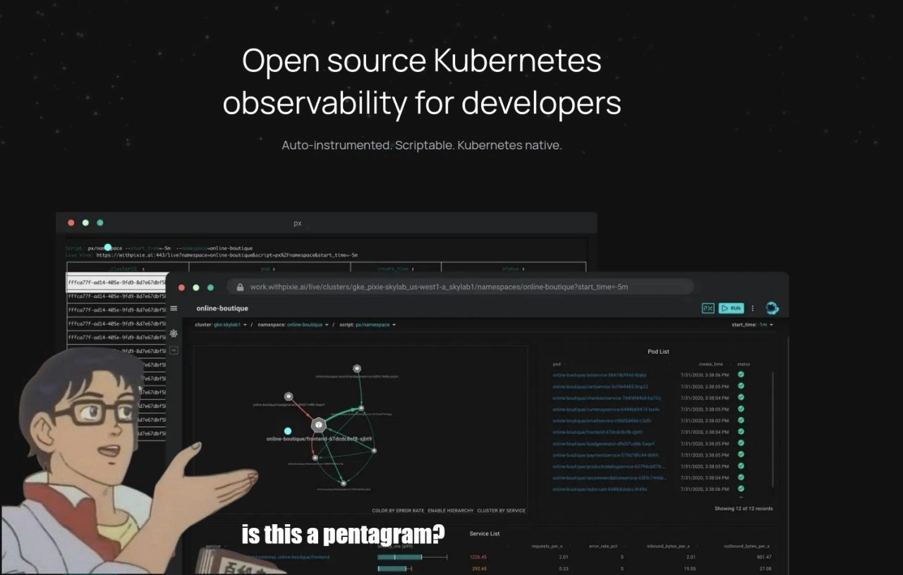
Imagine you have a bunch of friends all passing secret notes to each other in class. If you tried to draw a line for every note going from one friend to another, you’d end up with a scribbly web on your paper. Now, if a lot of friends are exchanging notes in a messy way, those lines might accidentally make a shape that looks like a big star. You’d look at that doodle and go, “Whoa, are we drawing a magic star here or what?” This meme is like that, but for computer programs. We have a lot of little programs (think of them as busy friends) all talking to each other, and when we draw a picture of who’s talking to whom, it becomes a tangled star shape. It’s so confusing that a character (the guy in the picture) is jokingly asking, “Is this a pentagram?” (A pentagram is a fancy word for a five-pointed star, often shown in stories as a magic or spooky symbol). He’s basically saying, “Wow, this diagram of our system looks like some magical star – are we doing computer stuff or casting spells?” The funny part is how dramatic and silly that comparison is. It makes us laugh because dealing with a super complex system can feel as puzzling as magic. Even grown-up engineers sometimes joke that working with these complicated systems is like doing wizardry. So the meme is a playful way to say: “Our system is so complicated, even our high-tech monitoring tool drew a crazy star shape! It’s almost like we accidentally made a magic symbol.” You don’t need to know the technical details to get the joke – it’s basically comparing a very messy network drawing to something from a fantasy story. The feeling it gives is a mix of amusement and disbelief: it’s funny that the situation is so chaotic that you might as well call it magic.
Level 2: Microservice Spaghetti Map
Let’s break down what’s happening in this meme in simpler, junior-friendly terms. First, some basics: Kubernetes is a platform (often called a container orchestration system) that helps run and manage many small applications (called containers) across a cluster of machines. Think of Kubernetes (a.k.a K8s) as a traffic controller and caretaker: it decides which server your app pieces run on, restarts them if they crash, and helps them talk to each other. Modern apps are often split into microservices – these are the “many small applications” part. Instead of one big program doing everything (a monolith), you have lots of little programs, each in charge of one thing (like an inventory service, a payment service, a frontend website, etc.). The idea is to make development and scaling easier: teams can work on different pieces independently, and you can scale pieces up and down as needed. The trade-off is all those pieces need to communicate over the network. What used to be internal function calls in one program become external calls between services, usually via APIs or messaging. It’s as if we took a restaurant’s kitchen and split each task into separate kitchens in separate buildings – now the chef (frontend) has to run around connecting to the butcher shop service, the bakery service, the produce supplier service, and so on. Observability is how we keep track of all that activity to ensure things are working. It covers tools and practices for collecting logs (text records of events), metrics (numerical data like request counts, error counts, CPU usage), and traces (records of a request’s path through multiple services). An Observability tool like Pixie helps developers and operators see what all those microservices are doing, especially when something goes wrong.
Now, Pixie in particular (mentioned on the slide) is an open source observability platform for Kubernetes. “Auto-instrumented” means you don’t have to manually add a bunch of monitoring code into each microservice – Pixie can automatically start collecting data (like who’s calling who, how long calls take, errors happening, etc.) as soon as you install it on your cluster. It likely does this by using clever techniques (like eBPF, a kernel-level superpower) to watch network traffic and function calls without you changing your app code. “Scriptable” means you can write scripts or queries to customize what data you want to see – for example, “show me all requests to the checkout service in the last 5 minutes that resulted in an error”. “Kubernetes native” means the tool was built to run inside Kubernetes itself and understand K8s concepts (like pods, namespaces, services) out of the box. The screenshot in the meme shows a Pixie dashboard. It’s in dark mode (black background UI – developers love dark mode, it’s easier on the eyes and just looks cool 😎). The central panel is a graph labeled “online-boutique”. Online Boutique is actually a known demo microservices application (originally by Google Cloud) – it’s an example online shop made up of many microservices (cart service, product catalog service, frontend, etc.). In the graph, each bubble (node) likely represents one of these services or perhaps a specific pod (an instance of a service). The lines connecting them represent traffic or calls between services: for example, the frontend service asking the product service for item details, or calling the cart service. The green lines indicate active, healthy communication links. If one service calls five others, you’d see a star-like pattern of lines emanating from it – that’s exactly what we see, a sort of star shape drawn by many interconnections.
The text overlay in classic meme style (“is this a pentagram?”) is using the format of the “Is this a pigeon?” meme. In that meme format, a character from an old anime mistakenly identifies something – in the original, he points at a butterfly and asks if it’s a pigeon. It’s often used to poke fun at someone misidentifying or misunderstanding something. Here, the developer (represented by that anime guy image) is pointing at the complex service graph and asking if it’s a pentagram, which is a famous five-pointed star symbol often associated with magic or the occult (think of something you’d see in a book of spells or a ritual). Why would he say that? Because the pattern of lines between services unintentionally looks like a pentagram! When microservices call each other in a complex way, the diagram can turn into a mess of lines – sometimes even forming recognizable shapes like stars. The meme jokingly suggests that the dev is so stunned by the complexity that it might as well be an occult symbol to him. It’s humor by exaggeration: “This system diagram is so complicated and spooky-looking, maybe we’re accidentally doing dark magic here.”
The controls like “COLOR BY ERROR RATE | ENABLE HIERARCHY | CLUSTER BY SERVICE” at the bottom of the graph are part of the Pixie UI to help make sense of the graph. Here’s what those mean:
- COLOR BY ERROR RATE: This likely means you can color the lines or nodes based on how many errors are happening on that service or connection. For instance, if calls from the frontend to the payment service are failing often, that connecting line might turn red. It’s a quick way to highlight trouble spots.
- ENABLE HIERARCHY: This might group services by tiers or namespaces. In a complex graph, hierarchy can visually cluster related components so it’s less of a hairball. For example, all services that belong to a particular feature or all pods that are instances of the same service might cluster together.
- CLUSTER BY SERVICE: Similar idea – if there are multiple pods (instances) of the same service (for scaling or redundancy), this option could cluster them into a single node to simplify the view. Instead of seeing 3 separate frontend pods all connected to 3 separate backend pods (which would be 9 lines), you cluster by service and just see one “frontend service” node connected to one “backend service” node (a single line).
In the screenshot, the left panel shows some kind of script or query (
pxscript with namespace and time window) which is how the Pixie user requested this data. The right panels list things like “Pod List” and metrics (requests per second, error rate, etc.). So essentially, this dashboard is giving a holistic view: the center graph shows who is talking to whom, the sides show details like what pods are in the cluster and some numbers per service.
For a junior developer or someone new to DevOps/SRE: the meme is highlighting the challenge of understanding a very complex system. When you have dozens of microservices, visualizing their relationships can result in something visually overwhelming – a bit like looking at a bowl of spaghetti and trying to find patterns. The term “spaghetti code” has long been used to describe tangled, unstructured program logic; now we have “spaghetti architecture” where the connections between components are tangled. The joke here is that the spaghetti has accidentally formed a pentagram shape, making the developer humorously wonder if it’s an evil omen! It underscores a common situation in modern Observability and Monitoring: even though we have fancy tools to map out our systems, the maps can become so complex that they’re hard to interpret. It’s poking fun at the reality that sophisticated tools like Pixie can produce very convoluted diagrams if the underlying system is convoluted. In summary, at this level: the meme jokes that a complicated Kubernetes microservices dashboard looks like a creepy magic symbol, reflecting how complicated and intimidating distributed systems can appear, especially to those trying to make sense of them.
Level 3: Summoning Circle in Production
For those with a few years of DevOps or SRE experience, this meme hits home as a commentary on microservice sprawl and the challenges of monitoring such complex systems. Imagine you’re a senior DevOps engineer who has spent countless nights trying to trace a production issue through dozens of interconnected services. You open your fancy new observability dashboard (in this case, Pixie’s) hoping for clarity, and you’re greeted with a dark-mode UI and a tangled web of green lines connecting service nodes labeled things like “online-boutique/frontend-54c7e0cbd-slzph.” Instead of the clean, insightful architecture diagram you hoped for, you see something that looks like a mystic pentagram glowing on your screen. It’s both hilarious and painfully relatable: we adopt Kubernetes and break our applications into microservices to be more agile, but end up with a “distributed” ball of yarn that we then need special tools to untangle. The meme captures that cognitive dissonance by overlaying the classic “Is this a pigeon?” anime character – here representing a bewildered developer – who looks at the Pixie service graph and earnestly asks, “Is this a pentagram?”
Why is that so funny to a seasoned engineer? Because it’s absurdly close to the truth. We often joke that running a microservices architecture requires summoning dark arts to debug. When an incident hits production, you dive into these dashboards or run kubectl incantations to gather logs and metrics from various pods. The process can feel like a ritual: you adjust filters, toggle “COLOR BY ERROR RATE”, maybe “CLUSTER BY SERVICE” to group related components, all trying to coax a coherent story out of the chaos. Those UI controls in the meme (“enable hierarchy”, “cluster by service”) are meant to tame the complexity by rearranging or coloring the graph, but it’s a bit like rearranging candles on an altar – the underlying topology is still ominous if your system is overly complicated. The option “COLOR BY ERROR RATE” is particularly telling: in a real incident, certain lines would turn red to indicate high error traffic between services. Picture that pentagram of green lines suddenly bleeding red on some edges – it would look like a literal “circle of summoning” for production fires. Every senior dev knows the sinking feeling of seeing red all over your dashboard: it’s practically a distress sigil indicating something is very, very wrong. So here, the meme exaggerates only slightly; the “pentagram” of connections might as well be summoning the on-call engineer’s nightmares.
This also satirizes the tech industry’s penchant for complex solutions to complex problems. Kubernetes and microservices were sold as the cure for monolithic applications’ ills – scalability, flexibility, independent deployments! – and they do provide those benefits. But what did we trade for it? We traded a single big application (easy to reason about but hard to change) for dozens of tiny apps that are “Kubernetes native” and independently deployable, yet talk to each other constantly. In practice, that often means an explosion of inter-service communication: a simple user request might cascade through a dozen services. To understand a single user transaction, you now have to follow a trail through this labyrinthine graph. Senior engineers have lived this pain: chasing a performance bug or an error through multiple logs and correlation IDs, drawing their own mental map of which service calls which. Tools like Pixie, Jaeger, or Zipkin generate these service maps automatically, giving us a fighting chance to visualize the madness. But as the meme jokes, sometimes the visualization itself is so convoluted it looks like occult geometry. It’s the “I can’t tell if this diagram is explaining our system or summoning Cthulhu” problem. Every seasoned DevOps person has at least once squinted at a confusing network graph or a giant dependency tree and thought, “Surely, this wasn’t the intended design!” Often those graphs reveal unintended tight coupling or spaghetti communication paths that architects swear shouldn’t exist – yet there they are, spelling out chaos in green and red lines.
Another layer of humor here is aimed at tech marketing versus reality. The slide proudly proclaims: “Open source Kubernetes observability for developers.” The subheading: “Auto-instrumented. Scriptable. Kubernetes native.” As an experienced engineer, you’ve seen grand promises like this before. Sure, it’s great that it’s open source and that it can automatically instrument my cluster, but the pretty marketing slide doesn’t show the overwhelming wall of data and the steep learning curve that come with it. The anime figure (from an old meme format where a character mistakes a butterfly for a pigeon) is like the clueless upper management or newcomer seeing the fancy graph and getting entirely the wrong idea. The DevOps engineer in you wants to answer his question: “No, buddy, it’s not a satanic symbol – it’s just our microservices dashboard from hell.” The meme underscores a shared truth among veterans: modern Observability Tools are powerful, but can be bewildering. Yes, they turn on the lights in our dark container labyrinth, but sometimes those lights reveal a scene straight out of a horror movie – lines everywhere, mysterious node names, error counters ticking up like a demonic ritual’s progress bar. We can’t help but chuckle, because if we didn’t, we might cry. It’s funny because it’s true: at enterprise scale, Observability and Monitoring often feel like practicing occult arts, complete with inscrutable symbols and a dash of Pixie dust. And every DevOps elder remembers that one outage at 3 AM where they stared at a diagram much like this, muttering “what on Earth am I looking at?” – a summoning circle, apparently.
Level 4: Esoteric eBPF Incantations
At the deepest technical level, this meme touches on the arcane truths of observability in modern distributed systems. Observability, in the formal sense, comes from control theory: it’s the ability to infer the internal state of a system from its external outputs. In a Kubernetes cluster running dozens of microservices, those outputs are telemetry data like logs, metrics, and traces. Capturing and correlating all that data without incurring massive overhead is a non-trivial engineering problem – one that sometimes feels like black magic. Tools like Pixie address this by using eBPF (extended Berkeley Packet Filter) under the hood, essentially injecting sandboxed programs deep into the Linux kernel to automatically trace what's happening in each container. If that sounds like casting a spell on the OS, well, it kind of is – eBPF lets you hook into network calls and system events with minimal performance impact, producing real-time telemetry. Pixie’s tagline “Auto-instrumented. Scriptable. Kubernetes native.” hints at this sorcery: instead of manually instrumenting each microservice with logging or tracing code (which is painstaking), you deploy Pixie’s agents and poof! – they weave themselves into the cluster, extracting data from pods as if by invisible threads. The “scriptable” part means you can write custom scripts (Pixie uses a language called PxL) to query or manipulate this telemetry data on the fly. This is reminiscent of DTrace on Solaris or modern BPF trace tools, where engineers craft small programs to probe kernel events. Those in the know might chuckle here: we’re literally writing tiny programs to observe other programs, like layering one magic spell on top of another to reveal hidden truths.
From a graph theory perspective, the star-shaped network graph in the Pixie dashboard isn’t just visual flair – it’s a reflection of complex service relationships. Each circle (node) likely represents a service or pod in the “online-boutique” application, and each line (edge) represents calls or data flow between them. If you have N microservices, the worst-case scenario is a complete graph (everyone talks to everyone), which has N·(N-1)/2 connections. For N=5, that’s 10 connections – and if you draw a complete graph of 5 nodes, you get the classic pentagram shape with crossing lines. In fact, the five-pointed star (a pentagram) can emerge naturally when drawing K₅, the complete graph on 5 nodes, non-planar on a 2D plane. It’s a beautiful bit of mathematical irony: the chaos of an all-to-all microservice architecture literally produces a pentagram in the diagram. In real systems, we usually don’t have a perfect K₅, but microservice topologies often approach that kind of dense connectivity as they grow unruly. Each added service potentially introduces exponential new interactions, and visualizing those can spawn unintelligible spaghetti — or inadvertently summon geometric demons. The meme’s joke zeros in on this: our ultra-modern cloud-native observability tools, powered by kernel-level instrumentation and distributed tracing, sometimes output images that look less like neat architecture diagrams and more like occult symbols etched by an impish cluster gremlin. When an on-call DevOps engineer at 3 AM stares at such a graph with bloodshot eyes, it’s easy to feel like they’re trying to decipher ancient runes or perform a digital seance to contact the spirit of a crashed service.
The humor lands because there’s a grain of truth known to every experienced Site Reliability Engineer (SRE): at extreme complexity, keeping a system observable is as challenging as designing the system itself. We joke that debugging distributed systems requires sacrificial offerings (☕ coffee to the logging gods, or maybe 🐐 goats if coffee fails), because when dashboards start to resemble summoning circles, the line between software engineering and sorcery blurs. The meme wryly asks “is this a pentagram?” as if some DevOps practitioner has accidentally stumbled upon cult symbolism, when in reality it’s just their observability tool doing its best to chart out microservice mayhem. The occult analogy playfully acknowledges the esoteric incantations (config files, YAMLs, pxl scripts, and kubectl spells) we perform to illuminate what our complex, containerized applications are doing. In short, this level of the joke riffs on the deep technical underpinning: Kubernetes observability can feel like witchcraft, with eBPF as the magic dust (or Pixie dust, aptly named) that reveals a mystical service graph, complete with a pentagram formed by inter-service call lines. It’s a clever nod to the idea that modern software systems have become so intricate that understanding them sometimes requires conjuring knowledge out of thin air with the most advanced tools available.
Description
This meme uses the 'Is this a pigeon?' anime format to comment on the complexity of modern developer tools. In the foreground, an anime character gestures towards a screenshot of a dark-mode dashboard with the subtitled question, 'is this a pentagram?'. The background is a promotional image for an 'Open source Kubernetes observability for developers' tool, which is described as 'Auto-instrumented. Scriptable. Kubernetes native.' The dashboard itself displays a complex service graph for an 'online-boutique' application, showing numerous interconnected nodes and pathways, which the character humorously misidentifies. The technical joke is that the service dependency graphs in microservice architectures running on Kubernetes can be so intricate and visually chaotic that they resemble mystical or occult symbols like a pentagram. It's a relatable jab at the high cognitive load required to interpret the output of advanced observability and monitoring tools, even for experienced engineers
Comments
8Comment deleted
Debugging a microservices issue with a service graph at 3 AM feels less like engineering and more like trying to summon the right demon by tracing a pentagram with request IDs
The moment Pixie renders your microservices as a perfect pentagram, you realise observability isn’t about dashboards anymore - it’s about tracking down the sorcerer who approved 173 sidecars in code review
After 15 years of explaining distributed tracing to executives, I've learned that any service mesh visualization more complex than three nodes gets classified as either 'blockchain', 'AI', or apparently now, 'dark magic summoning ritual'
Every microservice topology graph eventually converges to a summoning circle - which tracks, since prod incidents do feel demon-invoked
When your service mesh topology looks less like a directed acyclic graph and more like a summoning circle, you know you've achieved true microservices enlightenment. The real dark magic isn't the pentagram - it's explaining to stakeholders why you need 47 services to render a shopping cart
When your Kubernetes observability graph looks like a pentagram, it’s not occult - it’s a cyclic microservice dependency plus a headless Service causing a DNS stampede; the demon being summoned is your p99
Kubernetes service graphs: where your meticulously orchestrated cluster reveals itself as a pentagram during that 3AM outage postmortem
Auto-instrumented eBPF is great until the service graph draws a pentagram - that’s Kubernetes achieving quorum to summon PagerDuty; consider exorcising a few microservices