
Skip to content
DevMeme
7175 of 7435
Know the Difference: Real Skeuomorphic iOS vs Fake 'Frutiger Aero' Nostalgia
UX UI Post #7869, on Mar 27, 2026 in TG

Know the Difference: Real Skeuomorphic iOS vs Fake 'Frutiger Aero' Nostalgia

Why is this UX UI meme funny?

Level 1: The Costume Version of the Past

This is like the difference between your grandmother's actual kitchen from the 1970s — matching avocado-green appliances, everything carefully chosen to go together — and a theme restaurant called "The Groovy 70s Diner" that nails lava lamps to every surface and plays disco at full volume. The post is someone pointing at the calm, pretty phone screen on the left saying "this is what it really looked like," and at the fish-covered chaos on the right saying "and this is the costume version made by people who weren't there." The laugh comes from how confidently the costume version gets the past wrong — louder, messier, and decorated with five hundred fish.

Level 2: Skeuomorphism, Flat Design, and the Aero In Between

The vocabulary you need to decode this argument:

  • Skeuomorphism: designing digital things to mimic physical ones — leather textures, glass gloss, page-turn animations. Dominant on iPhones from 2007 until iOS 7 (2013). The left screenshot is its high-water mark.
  • Flat design: the backlash — solid colors, no shadows or gloss, typography-first. iOS 7 and Windows 8 made it the default, which is why glossy icons now read as "vintage."
  • Frutiger Aero: a retroactively named aesthetic from roughly 2004–2013 — think glossy bubbles, water, fish, bright skies, translucent plastic. It was the look of Vista, early Wiis, and stock photography of the era. Today it's a popular nostalgia genre on social media.
  • "Know the difference" meme format: a side-by-side template used to gatekeep — here, separating the authentic artifact from its modern imitation.

If you've ever themed a Linux desktop or built your first UI by stacking every gradient and drop-shadow CSS offers, you've personally walked the path from the right image to the left one. Restraint is the skill that separates them, and it's the one thing you can't download.

Level 3: Nostalgia Without Primary Sources

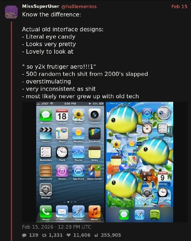
What @halliementos has captured here is a genuinely interesting failure mode of cultural memory in tech: aesthetic revival by people working from secondhand artifacts. The post's left exhibit is a real iOS 6-era home screen — AT&T carrier label, the glossy linen dock, Passbook, Newsstand, Game Center, the leather-stitched Reminders icon — every one of those icons the product of Apple's decade-long skeuomorphism program under Scott Forstall, where the Notes app had to look like an actual legal pad and the Calendar had hand-tooled leather trim. Whatever you think of that philosophy (and Jony Ive thought enough of it to bulldoze it in iOS 7), it was systematic: one lighting model, one gloss curve, consistent corner radii, icons designed as a family.

The right exhibit is the post's strawman-made-flesh: a home screen drowning under giant tropical fish emoji, icons scattered like a desktop after a bad week — the author's parody of what the internet now tags as:

"so y2k frutiger aero!!!1"

And here's the historically delicious part: the post itself commits a version of the sin it's diagnosing. Frutiger Aero (the fan-coined name for the mid-2000s glossy-translucent-nature aesthetic: Windows Vista's Aura, bubbles, water droplets, grass-and-sky wallpapers, the Frutiger typeface) and Apple skeuomorphism are different design movements — yet both get flattened into one nostalgic blob labeled "old tech." That's exactly how revivalism works: Gen Z curators who, as the post says, "most likely never grew up with old tech," reconstruct an era from Pinterest moodboards rather than from shipped products, and the reconstruction is louder, denser, and "very inconsistent as shit" compared to the original — because moodboards optimize for vibe density, while real design systems optimized for daily usability. The same dynamic plays out in engineering: developers who romanticize "simple old PHP sites" without remembering register_globals, or who cargo-cult brutalist terminal UIs without the constraints that produced them. Nostalgia is lossy compression; the artifacts survive, the discipline doesn't.

Description

A screenshot of a post by MissSuperUser (@halliementos) dated Feb 15, 2026 (139 replies, 1,331 reposts, 11,606 likes, 255,905 views) reading: 'Know the difference: Actual old interface designs: - Literal eye candy - Looks very pretty - Lovely to look at' versus '"so y2k frutiger aero!!!1" - 500 random tech shit from 2000's slapped - overstimulating - very inconsistent as shit - most likely never grew up with old tech'. Below are two iPhone home screens: on the left, a genuine skeuomorphic iOS 6 layout with glossy icons (Messages, Calendar, Photos, Camera, Maps, Weather, Passbook, Newsstand, iTunes, App Store, Game Center, Settings) over a blue ripple wallpaper; on the right, a chaotic mock-aesthetic collage covered in giant tropical fish emoji over scattered icons. The post argues real 2000s-era UI design was coherent craftsmanship, while the modern 'frutiger aero' nostalgia trend is an overstimulating pastiche by people who never used the originals

Comments

12
Anonymous ★ Top Pick Skeuomorphism took a decade of designers to perfect, flat design one keynote to kill, and now it's being revived by people whose primary source is a Pinterest board
  1. Anonymous ★ Top Pick

    Skeuomorphism took a decade of designers to perfect, flat design one keynote to kill, and now it's being revived by people whose primary source is a Pinterest board

  2. @RiedleroD 3mo

    personally I find that iPhone screenshot ugly as shit

    1. @RiedleroD 3mo

      signed, someone who grew up with windows xp and android 6. windows was pretty, mobile was very much not

      1. @RiedleroD 3mo

        oh and even that has a huge asterisk. windows was VERY pretty … for 5 minutes. as soon as you open any sufficiently advanced window it's back to windows 9x styling or worse. it's not that I find W9x ugly, but the mismatch between even just the native xp window frame and the inherited W9x contents is fucking terrible

        1. @dzek69 3mo

          I dont recall this being as huge problem as it was in the win10 era, when 10 got styling from: - late 10 - early 10 - win 8 - win 7 - and pre-7 era sometimes Its quite a new thing for every app to reinvent the controls from scratch, making everything inconsistent

          1. @RiedleroD 3mo

            yea it got a lot worse with time

        2. @sylfn 3mo

          and that was one of the reasons why i used "classic" theme on winxp, and not the default luna one it feeled better that way

          1. @RiedleroD 3mo

            I kind of used both in different times

          2. @purplesyringa 3mo

            it's beautiful though 😭

  3. @einbetungzahl 3mo

    KDE was the shit

    1. @purplesyringa 3mo

      s/the //

  4. @tema3210 3mo

    I wonder, how you all notice

Use J and K for navigation
