Skip to content
DevMeme
5738 of 7435
Kubernetes Architecture: Presentation vs. Reality
DevOps SRE Post #6291, on Oct 2, 2024 in TG

Kubernetes Architecture: Presentation vs. Reality

Why is this DevOps SRE meme funny?

Level 1: Hiding the Mess

Imagine you have to clean your room and show it to your parents. You make your bed, put a few toys on the shelf nicely, and maybe even spray air freshener – from the doorway, it looks perfect. But what did you actually do with all the other junk? You shoved it under the bed and into the closet! There are piles of dirty clothes and toys just out of sight. So when Mom or Dad walks by, they say “Good job, your room is so tidy!” – they’re seeing the nice presentation you prepared.

Now, secretly, you’re giggling because you know the truth: if they opened that closet door, oh boy, everything would tumble out and they’d see the chaos. This meme is exactly like that. The top part is the tidy room we show to the “parents” (in this case, our bosses or others in charge) – it’s all neat and labeled, very impressive. The bottom part is what our room really looks like when no one else is checking – messy, with stuff everywhere and us scrambling to keep things working.

It’s funny because we’ve all hidden a mess at some point to avoid getting in trouble or just to make a good impression. In the end, the meme is a big nod and wink: Lots of people do this! – whether it’s with their room or, for grown-up tech folks, with their complicated computer systems. It makes us laugh because we recognize ourselves doing the same silly thing: presenting a perfect front, while behind the scenes it’s a bit of a disaster.

Level 2: Beneath the Buzzwords

Let’s break down what’s happening in this meme in simpler terms and explain the buzzwords and images:

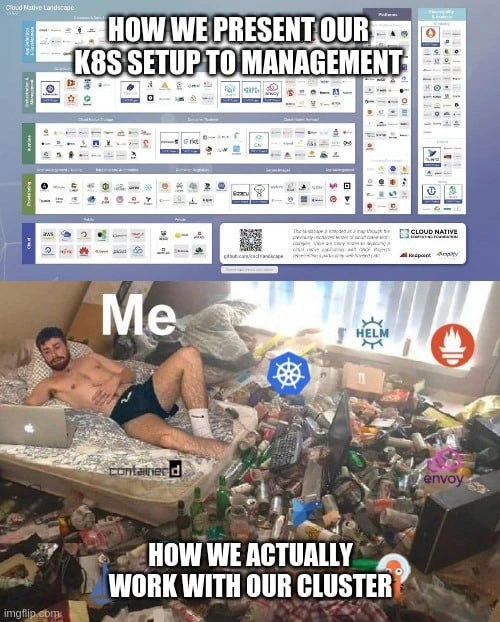
  • Kubernetes (K8s): Often abbreviated as K8s (because there are 8 letters between “K” and “s”), Kubernetes is a system that helps manage containers (lightweight, self-contained software packages). Think of Kubernetes as a sophisticated traffic controller and caretaker for many little app containers running across several computers (or cloud servers). In the meme, Kubernetes is represented by its ship’s wheel logo (blue with spokes) floating in the chaotic room. In the top image, we told management that Kubernetes makes our lives easier by handling tasks like restarting crashed apps, balancing load, etc. That’s why it’s front-and-center on the fancy landscape diagram: it’s the star of modern cloud deployments. However, in practice, a junior engineer quickly learns that Kubernetes has a learning curve and lots of moving parts. In the bottom image, that K8s logo hovering over the mess symbolizes how K8s is indeed present in our work — but it’s swirling amidst chaos. Running Kubernetes can sometimes feel like wrestling a giant squid: many tentacles (features), and if you’re not careful, you’ll get tangled.

  • Helm: Helm is basically a package manager for Kubernetes, often likened to “apt/yum for K8s” or a way to deploy applications in a standardized fashion using “charts” (templates of Kubernetes configs). Its logo (a little Helm wheel/helm icon in teal) is shown floating in the messy room, indicating we do use Helm. On a slide to management, we’d say “We use Helm charts to deploy our services consistently and reliably.” For a newcomer: think of Helm as a tool that bundles all the configuration files you need to run, say, a web service (including database config, network config, etc.) so you can install it with one command. Sounds great, right? In reality, as the meme jokes, using Helm can get tricky. You might run into a scenario where the default settings don’t work for your environment, so you have to dig into those config files (YAML files) and tweak them. The meme’s bottom suggests that instead of a one-command easy life, the engineer is editing configs at 2 AM, possibly pants-less and definitely overwhelmed. Helm is still very useful – it’s just not magic; you need to know what you’re doing.

  • Prometheus: Represented by the orange flame logo, Prometheus is a monitoring tool. It collects metrics (numerical data about what’s happening, like CPU usage, memory, number of requests, etc.) from all your services and stores them so you can make fancy graphs or set up alerts (like “send an alert if server CPU > 90% for 5 minutes”). In the polished view, we brag “We have Prometheus monitoring everything for reliability!” This sounds like we’ll always know what’s wrong in our system. For someone new: monitoring is like having a thermometer and smoke detectors in every room of a house – you get temperature readings and smoke alerts so you know if something’s on fire. Prometheus is one of the most popular “thermometers and smoke detectors” in cloud apps. Now, the reality hinted by the meme: it’s as if the smoke detector is ultra-sensitive and goes off all the time, even when you’re just cooking. The poor engineer in the bottom image is drowning in information and alerts from Prometheus. When all those soda cans in the room are labeled with Prometheus logos (in spirit), it implies we have so much monitoring data and so many beeps from alerts that it’s a mess. So while Prometheus is powerful, it requires tuning (otherwise you get false alarms or too much data, which actually makes life harder).

  • Envoy: That pink/orchid logo at the bottom right belongs to Envoy, which is a high-performance proxy / service mesh component. Simply put, Envoy helps route network traffic between services in a smart way and can provide features like load balancing, traffic routing rules, retries, etc. If you’re new: imagine you have many little services that need to talk to each other (like microservices). Envoy is like a clever doorman at each service’s door, making sure messages go to the right place and collecting some telemetry (metrics) about the traffic. It’s often used in advanced setups like a service mesh, where every service talks to every other through sidekick Envoy proxies. In the slide to management, having Envoy means we’ve got modern, resilient networking (“look, we even implemented a service mesh, very cutting-edge!”). In practice, adding Envoy means another thing that can go wrong unless configured perfectly. For a junior dev, the key is: Envoy is great, but if it breaks or is mis-set, services might not communicate properly and debugging that can be painful. The bottom meme having Envoy’s logo in the trash pile hints that dealing with network issues (like debugging why service A can’t talk to service B at 1 AM) can get as messy as that room.

  • containerd: On the bed or floor there’s the logo of containerd (a round black icon with a “container” glyph). containerd is a container runtime, basically the low-level engine that actually launches and manages containers. Docker, which you might have heard of, initially came with its own runtime, but nowadays Docker uses containerd under the hood, and Kubernetes talks to containerd to run containers. It’s a bit like the engine in a car – not flashy, but absolutely essential. In the slide to management, this might not even be mentioned (it’s too low-level for a high-level overview). But in reality, if containerd has an issue, your containers won’t start. The meme including it in the chaos suggests: even the plumbing (container runtime) occasionally causes headaches (for example, a hung container or an image that won’t pull, etc.). For a newcomer: just know containerd is what actually runs the app containers behind the scenes. If it hiccups, Kubernetes can’t do its job, and guess who has to figure out why? Our friend in the messy room.

  • Cloud Native Landscape diagram: The top picture itself is noteworthy. It’s a famously crowded diagram maintained by CNCF (Cloud Native Computing Foundation) that shows logos of hundreds of cloud-native tools categorized by function (security, monitoring, orchestration, databases, etc.). It looks like a gigantic tech menu. Companies sometimes use a portion of that to illustrate “We have all these areas covered.” When showing management, flashing that landscape (especially zoomed into the sections relevant to your company) can impress folks: it’s like showing you have every tool in the toolbox. However, for someone not deeply familiar: seeing that diagram can be overwhelming – so many logos! And indeed, that’s part of the inside joke: the landscape is so complex that one wonders if anyone truly knows how to integrate all of it cleanly. The newbie reality is, no one uses all those projects at once; each company picks a handful. But the meme’s top half implies we present our selection as if it’s clean and under control, often glossing over how complicated those tools are to operate day-to-day.

  • DevOps/SRE on-call duty: The phrase “ops duty” in the title and the whole bottom scene point to the idea of being on operations duty, meaning you’re the person responsible for handling any issues with the system (especially off-hours). On-call engineers carry a pager or phone to respond if something breaks, no matter the hour. When the meme shows that wreck of a room and an engineer surrounded by chaos, it encapsulates that on-call lifestyle at its worst. For someone newer to the field: imagine you have to keep a store open 24/7, and if something goes wrong at 3 AM (like an alarm or a pipe burst), you have to wake up and fix it. That’s on-call, but for software systems. The top half’s pristine presentation is what we might show in a report: “Our systems had 99.9% uptime last quarter, everything’s fine.” The bottom is how that sausage actually gets made: with a lot of sleepless nights and frantic fixes that nobody outside the team ever sees.

  • Empty energy drink cans & pizza boxes: Not a tech term, but culturally significant 😅. These items in the image are universal symbols in IT humor for late-night hacking sessions. If you pull an all-nighter trying to fix a production issue or meet a release deadline, you probably end up surrounded by Monster/Red Bull cans and fast-food or pizza boxes. It’s practically the diet of heroic deadlines (not a healthy one, mind you, but common in war stories). A junior dev might not have experienced this yet (hopefully they won’t often!), but many of us recall that one week where it looked like a tornado hit our office or bedroom. The meme exaggerates it (that floor is literally covered in cans) to drive the point home: running these fancy systems can be exhausting. And it’s funny in a cartoonish way – like seeing a character in a movie with 50 coffee cups on their desk to show they haven’t slept.

In simpler words, the meme is contrasting expectation vs reality in the context of running a Kubernetes-based system:

  • Expectation (top image): Everything is organized, professional, and automated. We have all the best tools and everything looks under control – this is what we tell others (especially non-technical managers or clients).
  • Reality (bottom image): It’s messy, complicated, and held together with personal effort and maybe some kludges. This is what we actually experience when working with the system daily.

For a junior developer or someone just starting: don’t be discouraged by this meme’s messy portrayal, but do recognize its truth in moderation. All those tools (Kubernetes, Helm, Prometheus, etc.) are powerful and industry-standard – learning them is worthwhile. The meme is saying that even though these tools promise to make infrastructure easy, using them at scale will still be challenging. It’s a bit like getting a high-end sports car – yes, it’s fast and powerful (tools are advanced), but you better know how to drive stick and maintain the engine, otherwise you’re going to crash or stall (things get messy). The humor comes from the over-the-top way it shows the “crash”. In real life, hopefully your on-call nights won’t always look like a landfill explosion. But if they sometimes do, well… welcome to DevOps, have a slice of cold pizza 😅.

Level 3: PowerPoint vs Production

This meme hits home for anyone who’s had to present a pristine architecture to leadership one minute, then fight fires in a messy cluster the next. The top image – “HOW WE PRESENT OUR K8s SETUP TO MANAGEMENT” – is a classic PowerPoint engineering marvel. It shows the entire deployment in tidy boxes and logos (specifically, the famed CNCF landscape poster with dozens of neatly grouped tool logos). This is the version we sell to VPs and CTOs: every piece is enterprise-grade, cloud-native, and under control. We boast about our Kubernetes cluster handling containers effortlessly, Helm automating deployments, Prometheus providing 24/7 monitoring, maybe an Envoy service mesh smartly routing traffic – all those buzzwords nicely aligned. It’s polished, impressive, and (in theory) accurate. After all, these technologies are indeed what we use. The humor, of course, comes from the stark contrast with the bottom image – “HOW WE ACTUALLY WORK WITH OUR CLUSTER” – which shows the grim reality behind that polished narrative.

In the real world of DevOps and SRE, maintaining a Kubernetes cluster often feels like living in that disheveled room: you’re ankle-deep in empty energy drink cans and pizza boxes at 3 AM, laptop balanced on your knees, desperately trying to keep the system running. The engineer labeled “Me” – shirtless, exhausted – is an avatar of the on-call SRE (Site Reliability Engineer) or DevOps specialist who hasn’t seen a normal sleep schedule in days. The floating tool logos around him (K8s, Helm, Prometheus, containerd, *Envoy) are the very same technologies from the slide deck, now personified as ghosts or gremlins haunting his every waking hour. This juxtaposition is hilariously relatable because so many of us have been that person in the trenches, surrounded by the “mess” of a complex system’s reality, even while higher-ups believe everything is running like a well-oiled machine.

Why is this gap so wide? One reason is tech idealism vs practical trade-offs. We want to implement best practices and have a clean infrastructure. Indeed, we might even have all the right tools in place (as listed on the slide). But the day-to-day execution is messy because:

  • The integrations between those myriad tools aren’t as seamless as logos on a chart. Perhaps Helm charts are half-customized; you found a great open-source chart for, say, a Redis cluster, but had to hack it to work in your environment. Now upgrades are a nightmare, so there are a few “temporary” patches sitting in your Helm values that nobody documented.
  • Prometheus monitoring is running, sure, but it’s generating hundreds of alerts. The meme’s empty can avalanche might as well be the avalanche of alert emails or PagerDuty notifications. Over time, on-call engineers become desensitized (so-called alert fatigue), meaning the monitoring is partly tuned out. The slide to management says “We have proactive monitoring with Prometheus,” but it fails to mention that at 2 AM you’re filtering through a trash heap of meaningless alerts trying to find the one that actually matters.
  • The use of Envoy (likely as part of a service mesh or ingress gateway) is another selling point in slides – “We have resilient service-to-service communication!” In practice, it means yet another layer that can misbehave. Perhaps you rolled out an Envoy sidecar mesh (like Istio or Linkerd), but never fully completed the migration. Half your services use Envoy, half don’t, some configs are outdated. When something breaks, you’re digging through JSON configs of Envoy or deciphering obscure 502 errors in logs. It’s chaos, but none of that nuance is on the pretty diagram.
  • And of course Kubernetes itself: to management, “we run on Kubernetes” implies modern, scalable, easier deployments. While true, it glosses over the nitty-gritty: frequent kubectl commands to manually reschedule stuck pods, quirky networking issues with CNI plugins, CrashLoopBackOff incidents that require manual tinkering (like deleting a bad pod to force retry). Those tasks accumulate like the pizza boxes on that bed – technical debt and ad-hoc fixes piling up out of sight.

All these points reflect a common pattern: the difference between “design intent” and “operational reality.” The top image is all design intent – clean lines, defined components, everything accounted for. The bottom is the operational reality – clutter, half-finished tasks, and general entropy. It’s funny because it’s true: anyone who’s worked in DevOps or as an SRE for a production system knows the truth of that bedroom scene. We’ve all had stretches where the home office or server room ended up strewn with coffee cups or Red Bull cans after back-to-back Sev-1 incidents. And yet, come the quarterly review meeting, we put on a collared shirt (unlike our friend in the meme!) and reassure management that our system is robust and our architecture is “following industry best practices” accompanied by that slick diagram.

The meme also pokes fun at the DevOps culture’s own ideals. DevOps preaches things like Infrastructure as Code, GitOps, and automated everything. The reality is often a hybrid of automation and duct-tape solutions. For instance, maybe there’s a cron job script (living on someone’s laptop or a forgotten container) that periodically restarts a flapping service – a quick fix you implemented at 3 AM which never made it into the formal docs. It’s the digital equivalent of sweeping dirt under the rug. Sure, we have CI/CD pipelines and Helm charts, but we also have an /usr/local/bin/fix-cluster.sh script we’re not proud of. The polished slide isn’t going to mention that script named yolo-restart-pods.sh 🤫.

The observability and monitoring aspect brings its own paradox. We sell the idea that with tools like Prometheus (metrics), Grafana (dashboards), and maybe Jaeger (tracing), we can see everything clearly. Yet anyone who’s tried to troubleshoot a live incident knows it can feel like searching for a needle in a haystack of data. The bottom image’s overwhelming clutter is a perfect analog for sifting through logs and metrics at midnight. Yes, the data is there, but finding the root cause amid the noise is as messy as that floor covered in junk.

There’s also commentary about work-life (im)balance and burnout. The engineer in the bottom half looks burned-out and living in chaos – a far cry from the calm, confident narrative management hears. This reflects how SREs often operate: you might be a hero behind the scenes averting disaster, but since everything technically stays up, leadership assumes things are smooth. They don’t see the human cost. It’s darkly humorous – the idea that to keep that immaculate slide deck true, someone might be losing sleep and sanity behind the scenes.

Finally, consider the empty cans and pizza boxes themselves. They are universal symbols of tech grind culture: long nights fueled by caffeine (energy drinks galore) and quick junk food, with no time to tidy up. It’s a parody of the “work hard, play hard” startup trope – except here it’s “work hard, then work harder (because production is down)”. The bottom scene screams “on-call life,” where at 4 AM you are the entire incident response team, working from your bed in whatever state you’re in. The top scene, by contrast, is the ideal “all according to plan” vision. DevOpsPainPoints indeed – the meme zeroes in on that pain with comedic exaggeration.

To sum up the senior-perspective humor: we’ve built an entire vocabulary and PowerPoint-friendly image of how our systems are structured (microservices! containers! cloud-native!). But using those technologies day-to-day is anything but neat. The cluster ops reality is a tangled mess of YAML files, bash scripts, intermittent failures, and late-night panic. Yet, come presentation time, we miraculously package it into a crisp story of success. The laugh comes with a side of PTSD for many of us – remembering times we’ve alt-tabbed from a terminal full of live errors to a pretty slide moments before a meeting. It’s the expectation vs reality of modern infrastructure, and boy, does it hit the mark.

To illustrate the contrast, here’s what the slide deck claims versus what the engineer experiences in reality:

Slide Deck Says... Meanwhile, in Production...
“Kubernetes will auto-heal everything.”
Our cluster is self-managing.
One crashed pod has been restarting in a loop all night until I manually intervene. So much for self-healing – I’m basically the healer.
“Helm makes deployments push-button.”
One-click install with charts.
Spent half the night tweaking values.yaml and rerunning helm upgrade because the app wouldn’t load. “One-click” turned into 100 clicks and a shell full of broken releases.
“We monitor all the things with Prometheus.”
Proactive alerts = no surprises.
Woken up by dozens of alerts that turned out to be false alarms. The one time a real issue hit, the alert was lost in the noise. Now I’m tuning alert thresholds at 3 AM by trial-and-error.
“Envoy ensures reliable service mesh routing.”
Smart traffic control.
Debugging a mysterious 502 Bad Gateway error between services. Traced it to Envoy sidecars, then spent hours in config files basically performing network surgery in the dark. Reliable, huh?
“Our architecture is Cloud Native & clean.”
Every component in its right place.
The system is held together by shell scripts, hope, and a Slack channel of doom. Half the components are misconfigured or running on fumes. Clean? Tell that to the pizza boxes on my floor.

Each line above reflects the meme’s essence: the story we tell vs the reality we live. It’s equal parts funny and painfully familiar. In software, especially in container orchestration and modern DevOps, the diagram rarely survives its first contact with real usage. This meme resonates because it says, “You’re not the only one whose behind-the-scenes is a hot mess.” And if you can’t laugh about that, you’d probably cry.

Level 4: Entropy Always Wins

At the deep architecture level, this meme highlights the inevitable gap between theoretical design and real-world system entropy. The top image is a snapshot of the CNCF Cloud Native Landscape diagram – essentially a meticulously curated map of the cloud-native ecosystem. In theory, every component in that diagram (from Kubernetes orchestration to Envoy sidecar proxies) fits into a clean category, promising an ordered, self-healing microservices architecture. This polished slide represents a low-entropy state: everything neatly classified, predictable, and controlled. It’s like an information theory ideal – maximum signal, minimal noise.

But any seasoned system designer knows that complex distributed systems have a mind of their own. Kubernetes itself operates on control loops and desired state – a concept borrowed from control theory – yet the very need for constant reconciliation hints at the chaos under the hood. The control plane (API server, controllers, etcd storage using the Raft consensus algorithm) works feverishly to maintain cluster consistency. However, the second law of thermodynamics applies in spirit: without continuous intervention (automated or human), disorder increases. Pods crash unexpectedly, nodes go down (Murphy’s Law in action), network latencies fluctuate, and suddenly the “self-healing” cluster feels more like a self-harming one.

This is the entropy of cloud-native operations: every new microservice, every Helm chart, every custom controller adds degrees of freedom – and with them, unpredictability. In fact, scheduling a bunch of containers across nodes is an NP-hard optimization problem at scale (resembling the bin-packing problem). Kubernetes’ scheduler uses heuristics and priorities to place pods, but there’s no guaranteed optimal solution, especially under dynamic loads. Eventually-consistent data stores (like etcd, which backs Kubernetes) uphold theoretical guarantees (CAP theorem reminds us we trade consistency vs availability under network partitions), but in practice, that can mean brief periods where different parts of the system have divergent views. The slide deck shown to management blissfully ignores these subtleties – it’s a static snapshot implying determinism, while the running cluster is a non-deterministic, event-driven choreography.

Even observability, one of the foundations of reliability, has its theoretical limits. Prometheus (the orange flame logo floating in the chaos) operates on a pull-based monitoring model, scraping metrics at intervals. By the time it scrapes and you query, you’re observing the recent past, not the present – a bit like a Heisenberg uncertainty for systems, where measurement lags reality. Moreover, a fully instrumented distributed system can generate a massive volume of data (metrics, logs, traces), approaching an information-theoretic limit where distinguishing the signal (real issue) from the noise becomes as hard as decoding a noisy channel. Ironically, the more you instrument to reduce uncertainty, the more complexity (and overhead) you introduce – sometimes even destabilizing the system you wanted to monitor (monitoring-induced load or alert storms).

In summary, this meme’s core is rooted in a fundamental engineering truth: the map is not the territory. A perfectly drawn architecture diagram can’t capture runtime chaos, just as an equation of motion can’t predict exact weather in a chaotic system. No matter how cloud-native and well-architected your setup is on paper, real systems drift towards chaos without constant energy/input – whether that energy is automated scripts, on-call engineers, or both. The top half is the ordered state (high information, low entropy), and the bottom half is the natural state of a complex system left to its own devices (disorder exploding, entropy maxed out). It’s a tongue-in-cheek nod to distributed systems theory: complexity and chaos are two sides of the same coin, and managing a Kubernetes cluster is essentially an endless fight against the latter.

Description

A two-panel meme contrasting idealized system architecture with operational reality. The top panel is captioned, 'HOW WE PRESENT OUR K8S SETUP TO MANAGEMENT,' and displays the notoriously complex and sprawling Cloud Native Landscape diagram, implying a well-organized, comprehensive system. The bottom panel, captioned, 'HOW WE ACTUALLY WORK WITH OUR CLUSTER,' shows a starkly different scene: a shirtless man ('Me') lying on a mattress with a laptop in a room completely buried in trash, empty cans, and discarded items. Logos of key cloud-native technologies - Kubernetes (k8s), Helm, Prometheus, containerd, and Envoy - are photoshopped into the mess. The humor stems from the relatable disconnect between the clean, abstract architectural diagrams shown to stakeholders and the messy, chaotic, and often ad-hoc reality of building and maintaining such complex systems. For experienced engineers, it's a perfect visual metaphor for the technical debt and operational complexity that hides behind polished presentations
Comments

7
Anonymous ★ Top Pick The architecture diagram is the test environment; the messy room is the production cluster at 3 AM during a Sev-1 incident
  1. Anonymous ★ Top Pick

    The architecture diagram is the test environment; the messy room is the production cluster at 3 AM during a Sev-1 incident

  2. Anonymous

    If your PowerPoint architecture slide has more uptime than the cluster it describes, you might be doing SRE theatre

  3. Anonymous

    We show executives the CNCF landscape like it's a well-organized garden, but our actual K8s cluster is more like trying to conduct an orchestra while the musicians are all containers that randomly restart, the sheet music is written in YAML, and someone keeps force-pushing to the Helm charts repo at 3 AM

  4. Anonymous

    The CNCF landscape has more tools than a Harbor Freight, but somehow we're still debugging why our pod is stuck in CrashLoopBackOff at 2 AM with nothing but kubectl logs, Stack Overflow from 2019, and the faint memory of that one Slack thread where someone said 'just increase the memory limits.'

  5. Anonymous

    Management sees a Kubernetes utopia in Grafana; we live the etcd reconciliation loops and zombie pod purges in sweatpants

  6. Anonymous

    To execs: “CNCF‑aligned platform with service mesh and SLOs”; to reality: kubectl apply -f values.yaml, port‑forward Prometheus, and hope that CrashLoopBackOff is a bad readinessProbe - not my performance review

  7. Anonymous

    Our deck shows a full service mesh; in prod it’s a single kubeadm control plane on a noisy t3.large, three Helm releases glued by a 500-line values.yaml, Prometheus alerts permanently “temporarily silenced,” and Envoy only there because the chart wouldn’t install - SLA powered by hope

Use J and K for navigation