Skip to content
DevMeme
4846 of 7435
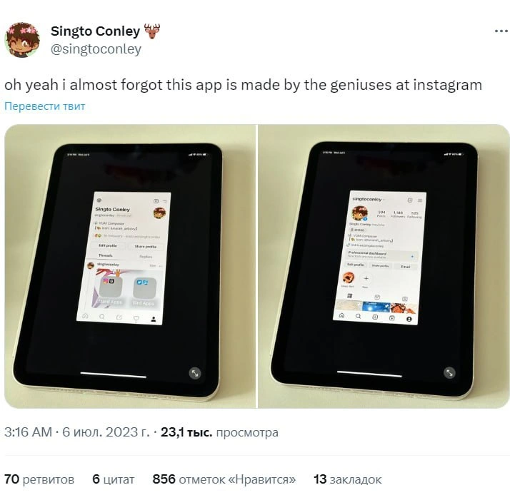
Instagram's groundbreaking approach to iPad app design
MobileDev Post #5306, on Jul 20, 2023 in TG

Instagram's groundbreaking approach to iPad app design

Why is this MobileDev meme funny?

Level 1: Big Screen, Tiny App

Imagine you have a big tablet (like a large iPad, basically a big iPhone) and you open your favorite picture app, but the app only uses a tiny rectangle in the middle of the screen and all the rest is just empty black. It’s as if you had a huge dinner plate but only a little cupcake sitting at the center – the rest of the plate is totally empty. Kinda silly, right? In the photos from the meme, that’s exactly what happened: the Instagram app looks super small on the iPad’s big screen. It’s funny in a frustrating way, because you’d expect such a popular app to fill the whole screen and make use of all that space, but instead it’s like they just copied the phone version onto the tablet without changing it. People joke that the developers at Instagram must be “geniuses” for doing this – but they’re saying it sarcastically. In simple terms, they actually mean it’s a not-so-bright move. The humor comes from the obvious mismatch: big device, tiny app. It makes everyone go “Huh? Why would they do that!” and chuckle, because it’s a goof that even non-techy folks can see looks wrong. It’s like watching someone serve a tiny candy on a huge tray – it just looks ridiculous, and you can’t help but laugh at how oddly lazy it is.

Level 2: Big Device, Same Tiny UI

For a less experienced developer or tech enthusiast, let’s break down why this image and tweet are making fun of Instagram. The crux is a UI design issue: Instagram’s app was built for an iPhone’s small screen and hasn’t been adjusted for the iPad’s much larger display. The iPad is Apple’s tablet – basically a big touchscreen device – and it can run most iPhone apps. However, if an app isn’t optimized for the tablet (meaning the developers didn’t create layouts or behaviors for the larger screen), the iPad will run it in a sort of “phone mode.” In those attached photos, you can see the Instagram interface looks tiny on the iPad, surrounded by a thick black border. This effect is called letterboxing – similar to when a small movie is shown on a big TV with black bars around it. Essentially, the app is using only a phone-sized area, and the rest of the iPad screen is just empty unused space. It’s a phone UI on a tablet and definitely not a flattering look for a popular app.

This is considered a responsive_design_fail because good responsive design (whether in web or mobile apps) means the interface should respond or adapt to different screen sizes. In web development, for example, a site might rearrange or scale up content for a bigger monitor compared to a phone. In iOS native development, Apple provides tools to make Universal apps that work on both iPhone and iPad. Typically, a well-made app will have a slightly different layout for iPad: maybe more content shown at once, bigger buttons, or using the additional space to avoid that “giant blank margins” effect. Here, Instagram simply didn’t provide any different layout – it’s as if the developers said, “Eh, just show the iPhone version, the iPad can deal with it.” The result? A comically small Instagram feed floating in the middle of the screen. Users immediately recognize this as a sign that Instagram’s dev team hasn’t put effort into the iPad experience.

Let’s touch on some terms you might have seen: MobileFirstDesign is an approach where designers and developers start by designing for small mobile screens (like phones) and then expand the design for larger screens (tablets, desktops). The idea is that it’s easier to scale up a simple, small-screen design than to try to cram a big, complex layout into a tiny phone later. Instagram clearly embraced the first half – they built a great phone app – but never really followed through on the second half for tablets. In the context of the meme, this is why it’s funny: they did “mobile-first” and then seemingly forgot about tablets entirely. iPad users are left with what we see in the pictures: a pint-sized UI.

From a UX (user experience) perspective, this is a fail because it makes using the app on an iPad less enjoyable. Imagine you’re holding this big iPad, but all the action is happening in a little rectangle as if you were on a phone – you have to zoom your eyes in, tap on tiny icons, and you get no extra features or information on the bigger screen. It’s wasting the potential of the device. A good UX would mean taking advantage of the iPad’s size – for example, maybe showing multiple photos side by side, or a list of messages next to the photo feed. None of that happens here. The meme’s author calling the Instagram developers “geniuses” is sarcasm – they actually mean the opposite. It’s a playful way of saying “I can’t believe such a smart company made this silly mistake in design.” In the development community, especially among iOSDevelopment folks, this is a well-known issue: Instagram has still not delivered an iPad-optimized app, and people often joke about it. The tweet is one such joke, lovingly poking at Instagram and getting lots of likes/retweets because many developers and users share that frustration.

Finally, it’s worth noting that Apple’s AppleEcosystem philosophy usually encourages developers to support all device types for a seamless experience. Most popular iOS apps do have iPad versions or at least adaptive layouts. That’s why seeing Instagram – a top-tier social app – with this clunky one-size-fits-all (or rather one-size-fits-phone) approach is both surprising and amusing. It’s like seeing a big brand shoe that only comes in kid’s size; technically you can wear it (maybe on your big toe), but it’s far from ideal. This contrast between what Instagram should do (in an ideal developer world) vs. what they actually did is exactly what makes the meme resonate with the tech crowd.

Level 3: Mobile-First, iPad Last

At the highest technical level, this meme highlights a notorious responsive design fail in the Apple ecosystem. Instagram – a flagship MobileDevelopment product – has long been iPhone-only in practice, effectively ignoring iPad optimization. In the attached tweet screenshot, a developer mocks how Instagram on an iPad appears as a tiny phone-sized UI letterboxed by huge black margins. This isn’t a bug; it’s a deliberate (or neglectful) design choice. The tweet’s caption "made by the geniuses at Instagram" drips with sarcasm because any seasoned iOS developer knows that supporting an iPad’s larger screen is a basic expectation, not rocket science. Yet here we are: a $1000 tablet running a postage-stamp-sized app UI.

From a UX/UI standpoint, this is almost comical. Apple provides robust tools for adaptive layouts – think of Auto Layout constraints in UIKit or modern SwiftUI’s responsive view modifiers – which let developers create interfaces that stretch or reflow elegantly on bigger screens. A well-designed Universal iOS app can seamlessly adjust from an iPhone’s compact screen to an iPad’s expansive display by using dynamic UIDesign principles. Typically, you might introduce split-view controllers or expanded columns on iPad, showing more content at once. Instagram, however, has historically been mobile-first design taken to an absurd extreme: mobile-first, and tablet-never. The app is essentially an iPhone app running in compatibility mode on iPad, which by default centers the phone UI and surrounds it with empty space (a letterboxed_ui effect). It’s as if the developers flipped a switch in Xcode marking the app “iPhone only,” so iPad just emulates an iPhone screen.

Why would a tech giant do this? One possibility is technical debt or prioritization: Instagram’s codebase and product focus have always revolved around smartphone use cases (snapping photos on the go, vertical scrolling feeds). Historically, they hard-coded assumptions about screen size and orientation – for example, the app has been portrait-only on phones, reflecting its origins. Adapting that experience to a larger, often landscape-oriented tablet might require redesigning the layout or adding new workflows (imagine viewing a profile, feed, and messages side-by-side on iPad – none of which exists in the current app). Rather than investing in a full responsive redesign, the company has for years allocated its engineering efforts elsewhere (launching new features, copying competitors cough Stories/Reels cough, even making entirely new apps). As a battle-scarred developer might quip, “We’ve got time to reinvent the feed again, but supporting iPad? Nah, who needs it.”

This situation is a textbook example of UXFailures in the wild. The humor here resonates strongly with senior devs and designers: we’ve all seen big companies inexplicably neglect obvious platform conventions. Apple’s Human Interface Guidelines practically beg apps to utilize the iPad’s screen, yet Instagram gives iPad users the proverbial shrug. It’s a shared pain: every iPad owner who’s opened Instagram has felt a mix of disappointment and eye-strain, squinting at a blown-up phone UI or a tiny scaled mode. The meme’s popularity stems from that collective “ugh, seriously?!” Among developers, it’s almost lore how Instagram (and by extension the AppleEcosystem giant Meta) refuses to release a true iPad app. We chuckle because it’s so bad it’s funny: a multi-billion dollar tech company leaving a responsive_design_fail visible for over a decade. It underscores an unwritten rule of MobileDev: even “genius” companies make baffling design trade-offs, often due to business priorities over engineering common sense.

To put it in code-ish terms, Instagram’s approach might as well be:

if device == .iPad {
    // No tablet-specific UI provided by these geniuses 🙃
    runIphoneAppInCompatibilityMode() 
} else {
    runStandardPhoneUI() 
}

The runIphoneAppInCompatibilityMode() essentially just centers the 414px-wide iPhone interface on the iPad’s 768+ px screen, resulting in those glorious thick borders. MobileFirstDesign doesn’t mean phone_ui_on_tablet like this – normally, once you have the phone experience, you’re supposed to enhance it for larger contexts. But Instagram’s devs (or product managers) apparently decided the effort wasn’t worth it, despite the obvious hit to user experience. This kind of responsive design slap-in-the-face is exactly what the tweeting developer is lampooning. Seasoned folks laugh (or groan) because it exemplifies corporate design dysfunction: it’s like shipping a car with bicycle training wheels because the company couldn’t be bothered to make proper tires for the deluxe model.

Description

This image is a screenshot of a tweet from user Singto Conley, which sarcastically comments on the quality of apps made by Instagram. The tweet's text reads, 'oh yeah i almost forgot this app is made by the geniuses at instagram'. Below the text is a photo showing two iPads side-by-side. Both devices are displaying social media apps - the new Threads app on the left and Instagram on the right - in a small, phone-sized window centered on the large tablet screen. The rest of the screen is filled with black, unused space. The meme is a sharp critique of Meta's (Instagram's parent company) failure to create native, optimized applications for the iPad. Instead of utilizing the larger screen real estate, the apps simply run the phone version in a letterboxed mode, a practice widely seen as lazy development and a poor user experience. For developers, it highlights the disconnect between a trillion-dollar company's resources and its seemingly low effort in supporting major platforms beyond the smartphone

Comments

39
Anonymous ★ Top Pick That's not a poorly designed app, it's just aggressively containerized
  1. Anonymous ★ Top Pick

    That's not a poorly designed app, it's just aggressively containerized

  2. Anonymous

    Instagram’s iPad app proves you can pour billions into ML ranking, yet still ship a single storyboard hard-coded to 375×812

  3. Anonymous

    Ah yes, the classic 'eventual consistency' where 'eventual' means somewhere between now and the heat death of the universe, and 'consistency' is more of a suggestion than a requirement - perfect for a social network where your follower count exists in a quantum superposition until observed

  4. Anonymous

    Ah yes, the classic 'view-in-a-view-in-a-view' bug - when your component tree becomes a fractal and your render cycle achieves enlightenment through infinite recursion. Nothing says 'we thoroughly tested on tablets' quite like accidentally implementing the Droste effect in your mobile UI. At least they're consistent: Instagram's algorithm shows you the same content repeatedly, so why shouldn't the UI follow suit?

  5. Anonymous

    Threads: Instagram's proof that engineering orgs exhibit distributed system entropy - eventual consistency in UI mediocrity

  6. Anonymous

    Instagram’s iPad support is basically fixedWidth(375pt) + alignCenter - a scalability pattern where the bezel handles horizontal sharding

  7. Anonymous

    Apparently the iPad build is a 375pt root view centered on black - size classes replaced with a single OKR

  8. @M4lenov 2y

    Explain pls

    1. @M4lenov 2y

      Threads app doesn't adapt to screen size?

      1. @saidov 2y

        Same as Instagram, yes

      2. @anivaros 2y

        Only iPhone version, not iPad

  9. @Box_of_the_Fox 2y

    How do you even do that? Entire mobile programming resolves around apps adapting to different screens

    1. @mvolfik 2y

      not on iOS, apparently

    2. @zaspirin 2y

      Android yes. Apple iirc requires you to support those specific screens (resolutions) that they put in their devices individually

      1. @Box_of_the_Fox 2y

        What if you use things like react-native or flutter? Do you still need to support individual resolutions?

        1. @zaspirin 2y

          No idea, sorry

    3. @danogentili 2y

      someone has (fortunately) never used an iPad

      1. @Box_of_the_Fox 2y

        Everyone and their dog were telling me that iPad is better then android tablets

        1. @CcxCZ 2y

          They all have their own special set of unfortunate design decisions. At least Moore's law mostly compensated for the shittiness of Java.

          1. @Box_of_the_Fox 2y

            I wouldn't say Moore's Law. At least on Android there was a lot of work put into making apps use as many threads as possible. You have coroutines that create 3 pools of threads: 1. (1 thread) for UI 2. (4 threads) background computation 3. (64 threads) API calls Then it was combined with CPU hybrid architectures where you have big cores, medium cores and small cores. Best phones seem to have about 1 big core, about 3 medium cores and about 4 small cores. So together it makes for a fairly well designed system. Recently Google has created Compose for UI, which can draw stuff in parallel, allowing for even higher efficiency.

            1. @CcxCZ 2y

              I was talking mainly about memory. About the design: all that to make it about as responsive as SHR (plain Linux + X11 + Enlightenment touch mode) was on my elderly G1/htcdream. Good job developers. 💪

              1. @Box_of_the_Fox 2y

                I think that developing apps on modern android is far easier than whatever you had on that G1 😅

                1. @CcxCZ 2y

                  Debatable, I did say plain old Linux with X11. Though EFL definitiely does not win any awards for ease of use. It was at time when QtQuick was basically a tech demo without widget support. The actual pain point was drivers, or lack thereof for running regular Linux systems. Otherwise I'd stick with it. (Maemo and Sailfish are nice too)

  10. @Box_of_the_Fox 2y

    You can have apps that adapt poorly but this is something on a completely different level

  11. @CcxCZ 2y

    This website is best viewed at 800x600 resolution.

  12. Kademlia 2y

    Looks as great as the youtube app on Android tablets

  13. @heito_r 2y

    What device is that? iPad? What is the arrows icon at the bottom?

    1. dev_meme 2y

      It's like 2x scale button, so entire UI of the app is blurred.

    2. dev_meme 2y

      It's funny coz it's still like I remember things on iPads back in 2013.

  14. @Odbjorn 2y

    Facebook does not support tablets screen size on purpose

  15. @farkasma 2y

    What is the purpose of that?

  16. dev_meme 2y

    And the whole tablet thing is seems sad to me, as a Win8/WP8/UWP developer (kinda), this idea of universal platform and unified UI was so good. But it went to shut down. And now no windows phones, no UWP. Back in times there were lack of apps in Windows Store because the platform was unpopular because there were lack of apps. But crappy useless things like the iPad is selling year by year, grown it's popularity.

  17. @Box_of_the_Fox 2y

    I went with an Android tablet and with android 12L I started wondering what more would you want

  18. @Box_of_the_Fox 2y

    On Apple they might have been betting on Moore's Law as they seem to have really strong single core, while not necessarily so strong multicore

  19. @SamsonovAnton 2y

    It's like viewing a 4:3 content letterboxed to 16:9 stream broadcast via PAL/SECAM and then letterboxed again on a classic 4:3 CRT TV, thus filling only a small portion of screen area while being a perfect match w.r.t. aspect ratio. 🤦‍♂

  20. @rglrd 2y

    What a nostalgic ratio.

  21. @ShiningFlames 2y

    When you prioritise DSA over common sense

  22. @rostopiradv 2y

    iOS dev here to explain This behavior of the app is just a check box "supports iPad" in the XCode. Developers may disable it for one of two reasons. Apple requires landscape mode support on iPhone, if you support iPad (genius). Developing landscape on iPhone is a fucking hell (status bar, top bar, bottom bar, good luck fitting anything else). If you disable iPad support - you can lock app in portrait. Another, very common reason of some clients, iPad support requires you to upload two another set of screenshots to AppStore, and client doesn't want to pay designer for it.

    1. @dsmagikswsa 2y

      Thanks for the information sir

Use J and K for navigation