Skip to content
DevMeme
6042 of 7435
Hydrating flat logos back to their skeuomorphic glory
UX UI Post #6615, on Apr 2, 2025 in TG

Hydrating flat logos back to their skeuomorphic glory

Why is this UX UI meme funny?

Level 1: Watering a Wilted Flower

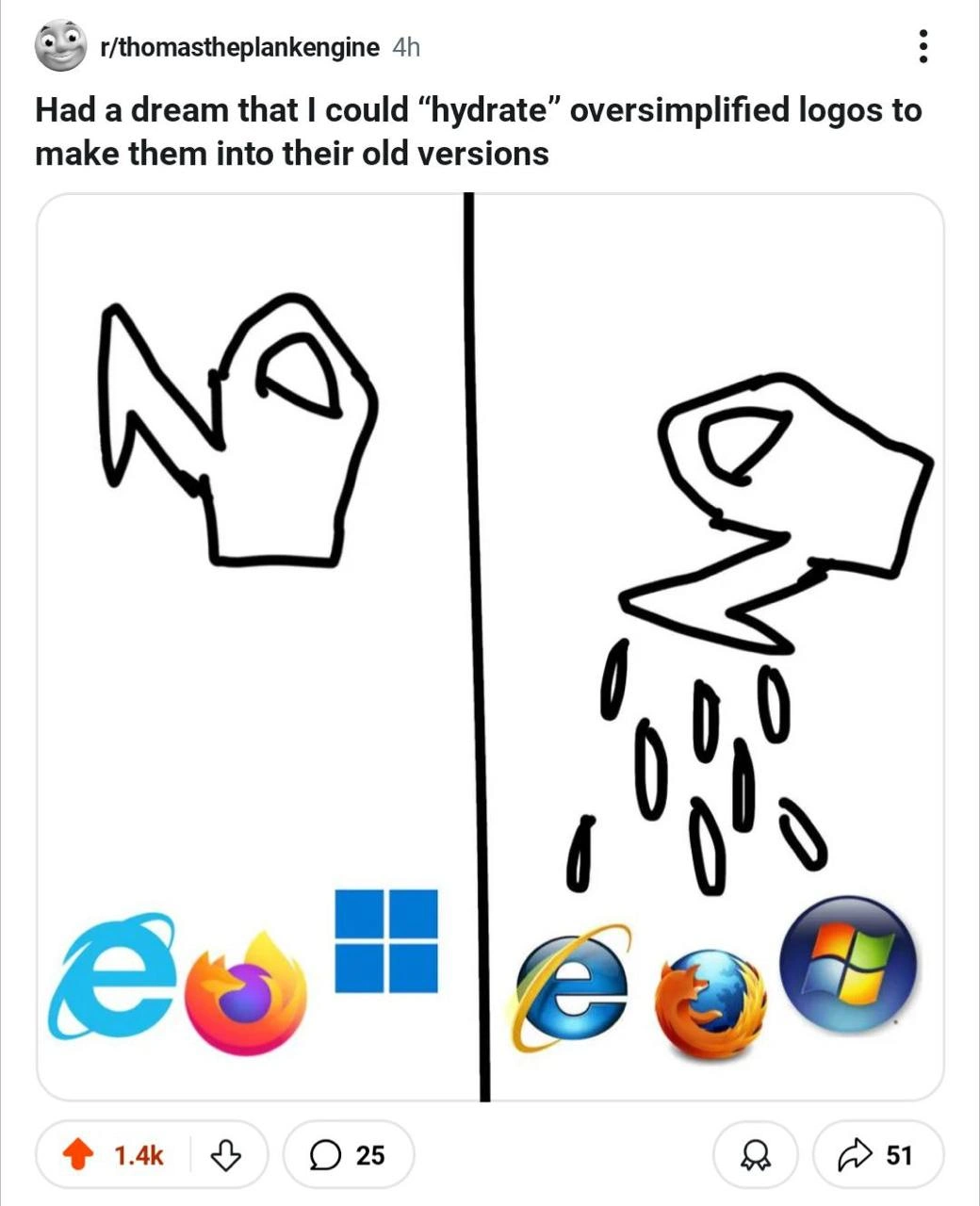
Imagine you have a flower that’s all droopy and colorless, and when you water it, it perks up and becomes bright and lively again. This meme is using the same idea, but with computer logos. On the left side, it shows some modern tech logos that look very simple and plain (kind of like a wilted plant or a dried sponge). On the right side, after a cartoon watering can pours some water drops, those logos magically turn back into their older, shinier, more detailed versions – almost like blooming into colorful flowers. It’s a funny pretend scenario because in real life you can’t just add water to a logo to change it! But the picture makes it feel like these new simple logos just needed a drink to bring back their old style. The joke is basically saying: “Wouldn’t it be cool if we could bring back the cool old designs as easily as watering a plant?” It’s humorous and sweet, especially for people who remember what the old logos looked like. Even if you don’t know the logos, it’s like seeing a boring drawing suddenly turn into a bright, shiny picture with a little water – a little bit of magic for a good laugh.

Level 2: Flat vs Shiny Logos

In the design world, especially in UXDesign, people often talk about flat design versus skeuomorphic design. Flat design is a style where everything is simplified: solid colors, basic shapes, no fancy shading or textures. It’s the style you see in a lot of modern apps and logos — they look two-dimensional and clean, but also a bit plain. Skeuomorphic design is the older style (popular in the 2000s) where icons and interfaces tried to look like real objects or at least had depth and texture. Skeuomorphic icons often have gradients (color fades), shadows, and reflections to appear 3D or glossy. For example, a skeuomorphic button might look like a real button that you could press, and an icon might look like it’s made of glass or metal.

Over the past decade, many tech companies have oversimplified their logos, moving from skeuomorphic (shiny, detailed) versions to flat (minimalist) versions. The meme is playing with that idea. The person says they dreamed of “hydrating” oversimplified logos to make them into their old versions. Normally, to hydrate means to add water. In everyday terms you hydrate a dried sponge or a plant to bring it back to life. In coding terms (especially web development), hydration means taking a webpage that’s already drawn (say, some HTML sent from a server) and then adding the interactive parts with JavaScript. It’s like the page was a dried sponge and the JavaScript is water that expands it to full functionality. So the joke here is mixing those meanings: what if adding water to a simplified logo could restore all its lost detail, kind of like how adding code to a basic page makes it fully interactive? It’s a fun, geeky metaphor – basically logo_hydration as a make-believe process.

Let’s break down what’s shown in the image:

  • On the left side, we have three modern flat design logos:

    1. The light-blue Microsoft Edge “e” – this is the current Edge browser icon. It’s very simple and flat (just a stylized lowercase e, no 3D effects).
    2. The new Firefox logo – a simplified, swooshing flame shape. In recent years Firefox’s icon became more abstract (you might notice it’s basically a curved shape with orange/purple gradient, and it doesn’t clearly show a fox’s face anymore).
    3. The Windows 11 logo – just four flat blue squares arranged like a window. No colors for each pane, no shading, nothing fancy.
  • On the right side, after “hydration” from the little watering can, we see the old versions of those logos:

    1. The Edge logo reverts to the classic Internet Explorer icon. Internet Explorer (IE) was the old browser before Edge. Its icon was a blue e with a golden ring orbiting around it, and it often had a bit of shadow or depth. That icon was extremely well-known in the 90s and 2000s – it meant “Internet” for a lot of people.
    2. The Firefox logo goes back to the older Mozilla Firefox design, where a cute orange fox with details in its fur is wrapped around a blue globe. The globe even had slight shine and the fox had more definition. This was Firefox’s look for many years and is instantly recognizable to anyone who used Firefox a decade ago.
    3. The Windows 11 logo transforms into the Windows Vista/Windows 7 era logo. Back then, the Windows logo wasn’t flat at all – it was a glossy 3D-looking sphere (or an orb) with the four colored quadrants (red, green, blue, yellow) under a glass-like shine. It looked almost like a marble or a button you could click, reflecting light.

So, the meme literally shows a watering can pouring drops on the new flat icons, and those drops "bring back" the old skeuomorphic icons. The phrase “hydrate oversimplified logos” is humorous because we never talk about hydrating graphics in real life – that’s a programming term – but here it’s as if the logos were dehydrated (dried out and made simple) and water is restoring them. It’s a visual metaphor turning a technical idea into a goofy dream.

Why is this funny or interesting to developers and designers? For one, it hits on TechNostalgia. Many of us remember those old logos fondly, since we grew up or started our careers seeing them every day. There’s an emotional pull when you see the Internet Explorer “e” with the gold ring or the old Firefox globe – kind of like seeing a childhood toy. Also, in recent years there’s been a trend of redesigning logos to be flatter and more abstract (you might have noticed lots of apps changing their icons to simpler versions). Some people think this MinimalismInDesign has gone too far, and they jokingly complain that all logos are starting to look the same – just geometric shapes and flat colors. So the meme taps into that feeling: “Wouldn’t it be magical if we could just undo those redesigns with a splash of water?” It exaggerates the idea to make us laugh.

Additionally, for front-end developers, the word hydrate stands out. If you’ve used frameworks like React, Svelte, or others, you know hydration is part of how modern web apps load. Seeing that term used in the context of logos is unexpected and goofy. It’s like mixing up two completely different worlds – watering plants and writing code – into one image. That surprise contributes to the humor. And it’s relatable because every developer has seen things in tech get “simplified” or “optimized” (like logos, UIs, or code) and maybe half-seriously wished they could revert to the more elaborate version just to reminisce or because it had a certain charm. This meme basically says, “I found the secret: just add water!” Obviously it’s just a dream (as the caption says), but it’s a fun thought experiment for anyone who’s seen design trends change over time.

In summary, the meme uses the idea of logo_hydration as a playful joke. It contrasts oversimplified_vs_skeuomorphic design by literally showing flat vs. detailed logos. It also subtly nods to how in coding we hydrate apps to make them come alive – except here we’re hydrating visuals to bring back their old soul. It’s a lighthearted commentary on brandingInTech and how designs evolve, packaged in a format that both designers and developers can chuckle at.

Level 3: The Great Unflattening

In the world of UX/UI and front-end, the term hydrate has a very specific meaning: it's what happens when a static webpage (often rendered on the server) is "brought to life" on the client side by attaching all the interactive JavaScript. Think of ReactDOM.hydrate() binding event handlers to a server-generated page. This meme takes that developer jargon and runs wild with it. It imagines literally watering down today’s flat, oversimplified tech logos to rehydrate them back into their richly detailed, early-2000s incarnations. It’s a cheeky crossover between coding terminology and design nostalgia. The left panel shows modern, minimalist logos looking bone-dry in their simplicity, and on the right, after a few cartoon droplets from a watering can, those logos spring back into their glossy past forms. For seasoned developers and designers, this elicits a knowing grin: we've witnessed the flat_design_trend wash over the industry, and here someone dreams of reversing it with a splash of water.

From a TechHistory perspective, the meme deftly contrasts two eras of design. The 2000s were the era of skeuomorphic glory – icons and interfaces dripping with depth, reflections, and lifelike texture. The Windows Vista logo, for instance, was a gleaming glass orb with the Windows colors, and Internet Explorer’s famous blue e had a golden orbital ring swooshing around it. These designs screamed 3D and shiny, showcasing the then-new graphics capabilities of PCs. Fast-forward to the 2010s and beyond: design went on a crash diet. The MinimalismInDesign movement (ushered in by things like Microsoft’s Metro UI for Windows 8, Apple’s iOS 7, and Google’s Material Design) flattened everything into clean two-dimensional shapes with solid colors. ModernVsLegacy branding became a game of simplifying logos to their core elements. Thus, Microsoft Edge got a sleek flat blue swoosh (a subtle nod to the old "e" but without any 3D ring). Mozilla Firefox gradually shed details — the once-recognizable fox and globe became a stylized fiery swoop. Even the Windows logo lost its multicolor panes and gloss, reduced to a plain flat window. This Great Flattening of design was seen as modern, elegant, and versatile... but it also made all logos start to look a bit alike in their stark simplicity.

Now enter the meme culture twist: "Had a dream that I could 'hydrate' oversimplified logos to make them into their old versions." It’s a perfect storm of TechNostalgia and developer humor. The author dreams of performing a brand_guideline backport – essentially applying the old school style guide to today’s branding. The visual gag with the watering can is a VisualMetaphor for this impossible task. For front-end devs, the word hydrate immediately recalls how a React app loads: a static shell turns dynamic after hydration. The meme says: what if we could do the same for design? What if today’s flat logos are just “dehydrated” versions of their former selves, waiting for someone to sprinkle water (or code) to restore all those gradients and shadows? It’s hilariously relatable because anyone who’s been through a few design refresh cycles has secretly wished they could revert a controversial redesign with the ease of an undo shortcut. If only corporate rebrandings were as simple as watering a houseplant!

Technically speaking, the joke riffs on front-end terminology in a design context. Hydration in a web app is all about state and interactivity, not visuals. But here the meme repurposes it: the state being restored is the visual detail that was stripped away by modern minimalism. It's like the logos had their design_system_churn (constant redesign) and ended up simplified, but all that detail wasn’t destroyed – it was just lying dormant, waiting to be activated by some magical hydration script (or in this case, a magic watering can). Seasoned devs also recall that “hydration” implies something was pre-rendered or dehydrated to begin with. In a way, the new flat logos are the dehydrated versions – easier to ship, more lightweight – and the old logos are the fully hydrated, feature-rich output. There's an ironic truth here: adding all those bevels, shadows, and highlights (the 2000s look) is akin to adding a bunch of frontend resources and complexity. No wonder companies dehydrate their branding for performance and simplicity! But the meme gives us the guilty pleasure of seeing that complexity come back.

The browser_logo_evolution showcased is a trip down memory lane. The Microsoft browser goes from the minimalist Edge icon back to the classic Internet Explorer emblem that dominated the Web 1.0 era – a symbol that for many old-school users literally meant "the Internet". The Mozilla icon reverts from the current simplified Firefox flame back to the beloved fox circling a globe – a logo practically synonymous with open-source browser pride in the mid-2000s. And the Windows logo, which in its Windows 10/11 form is a flat blue window, re-inflates into the glossy Windows Vista/Windows 7 style flag, instantly recognizable to anyone who remembers the pride Microsoft took in its Aero Glass aesthetic. Each of these “revivals” hits a sweet spot of recognition. Older developers see their past desktop icons resurrected. It’s TechNostalgia in full bloom.

Beyond the chuckle, there’s a layer of industry commentary: design trends are cyclical and often polarizing. One generation’s cutting-edge look (say, skeuomorphic 3D icons in 2005) becomes the next generation’s outdated excess. Then the pendulum swings – flat becomes the new norm. Yet here we are in the 2020s, and already there are stirrings of adding back a bit of depth and personality (have you noticed the subtle gradients and shadows creeping into “flat” design lately?). The meme captures this cycle in a whimsical way: maybe the shiny 2000s style isn’t dead, just sleeping, waiting for hydration. For the RelatableDeveloperExperience aspect, just consider how often developers have had to swap out assets or tweak CSS because a company changed their logo. It’s practically a rite of passage to groan, “They changed it again?!” This comic scenario says what many won’t: wouldn’t it be nice if we could just water it and get the old one back? Of course, try suggesting that in a real BrandingInTech meeting and you’ll get some funny looks. 😂

In essence, this meme strikes a chord on multiple levels. It’s a history lesson in browser_logo_evolution and windows_logo_history, a pun on a Frontend development process, and a jab at the relentless march of design minimalism. All wrapped up in a silly dream about a watering can. It invites us, especially those who have been in tech a while, to laugh at how far things have swung in design – and maybe to admit that, yes, a tiny part of us wouldn’t mind seeing a bit more gloss and fox fur in our icons again, even if just for fun. After all, sometimes the only way to cope with ever-changing tech trends is to meme about them. Hydrate those logos, bring on the shiny!

Description

A two-panel comic from a Reddit post titled 'Had a dream that I could “hydrate” oversimplified logos to make them into their old versions'. The left panel shows a crudely drawn watering can next to modern, flat, minimalist logos of Internet Explorer, Firefox, and Windows. The right panel depicts the watering can pouring water onto them, transforming them into their older, more detailed, skeuomorphic versions from the 2000s era - the glossy Internet Explorer 'e' with a golden ring, the detailed Firefox fox wrapping a globe, and the Windows Vista/7 aero glass logo. The humor comes from the term 'hydrate,' a technical term from frontend development (e.g., React) for making a static page interactive. Here, it's cleverly repurposed to mean restoring the 'life,' depth, and detail that have been stripped away in the modern trend of corporate logo oversimplification, a sentiment many senior developers who grew up with the older designs can relate to

Comments

24
Anonymous ★ Top Pick Modern logos are like serverless functions: stripped of all state and character for maximum scalability. I miss the days when a UI had enough glossy, stateful buttons to crash a machine with the majesty it deserved
  1. Anonymous ★ Top Pick

    Modern logos are like serverless functions: stripped of all state and character for maximum scalability. I miss the days when a UI had enough glossy, stateful buttons to crash a machine with the majesty it deserved

  2. Anonymous

    If React could hydrate brand guidelines this effectively, marketing’s asset repo would lose 30 GB and design would finally stop filing “make it flatter” tickets

  3. Anonymous

    Just like how we 'hydrate' dehydrated DTOs back into full domain objects, except this time we're restoring the bloated gradients and drop shadows that our CPUs spent half their cycles rendering back in 2007 - when a browser icon had more polygons than our entire WebGL budget today

  4. Anonymous

    Ah yes, the 'hydration' process - because nothing says 'progress' like spending millions on rebrands to remove the gradients and shadows that cost millions to add in the first place. It's the circle of life, except it's a flat circle now with 2px borders and we call it 'modern.' Meanwhile, senior devs remember when buttons looked like buttons and you didn't need a PhD in minimalism to find the clickable area. The real technical debt isn't in the codebase - it's in our collective muscle memory trying to find the 'Save' icon that's now just three ambiguous lines

  5. Anonymous

    If hydration can bring back the glossy IE/Firefox/Win7 logos, the next PR will re‑hydrate ActiveX and Aero - congrats, you’ve shipped Skeuomorphism‑as‑a‑Service with a mandatory Silverlight dependency

  6. Anonymous

    If only React’s hydrate() worked on branding - flip a feature flag, mount gradients and bevels, then listen to perf scream about the extra bytes

  7. Anonymous

    Hydration turning minimalist MVPs into gloriously bloated legacy systems - one gradient at a time

  8. @Sp1cyP3pp3r 1y

    frtgr ar

  9. @mpolovnev 1y

    Personally, I like the modern ones more. Logo doesn't have to be beautiful, it has to be recognizable at first sight

    1. @ilia_esmaili 1y

      But the beautiful ones are recognizable at first sight too

      1. @TERASKULL 1y

        skeuomorphism is ugly most of the time and I'm happy we're finally over it

    2. @pyrothefuck 1y

      The new firefox logo is absolutely beautiful, definitely more tasteful and professional looking. Idk why people obsess about the old ones so much, design practices evolve for a reason, people seem to prefer cleaner, more abstract and less skeuomorphic designs, what's wrong with that?

      1. @Agent1378 1y

        And this even better

        1. @apBUS_amp_K 1y

          what is going on with her spine?

          1. @Agent1378 1y

            She's flexible, probably😁

      2. @heyimszylu 1y

        people? or corporations? ;)

        1. @pyrothefuck 1y

          Corporations don't really have personal preference. There would be no reason for them to force a new design language upon the public. They just cater to what people prefer

          1. @Valithor 1y

            Discord's new GUI makes me think those same corpos are wearing those goggles to simulate being drunk

            1. @pyrothefuck 1y

              discord's gui is bad not because of modern design language, it's just badly designed

          2. @Dark_Embrace 1y

            https://i.kym-cdn.com/entries/icons/facebook/000/036/211/cover6.jpg

      3. @azizhakberdiev 1y

        maybe just nostalgia as the grass was greener before etc. It actually is possible to weaponize it, rolling back to old design

  10. @ashit_axar 1y

    So that's why Linux distros still looks like old days

  11. @blade_prime 1y

    Ai generated logos

  12. @azizhakberdiev 1y

    the problem with modern logos is that they look so generic, it starts to seem like many of them are just different permutations of one logo

Use J and K for navigation