The Web Developer's Eye Chart Test
Why is this WebDev meme funny?
Level 1: Code Goggles
Imagine you love building with LEGO bricks so much that when you look at a real building, you immediately think about what LEGO pieces you’d need to recreate it. This meme is playing with a similar idea. It says that a web developer loves coding so much that they see code tags everywhere they look. In an eye test, most people just see big or blurry letters. But the joke is that a web developer sees the computer code that would make those big and small letters on a webpage. It’s like they’re wearing special glasses that turn everything they look at into code! That’s pretty silly, of course – developers are regular people and don’t actually see the world as code. But the funny feeling it describes is real: when you learn a new skill or language, sometimes you start seeing the patterns of it in everyday life. This meme makes us laugh because it shows a goofy example of that: the developer’s world is so full of HTML code that even an eye chart at the doctor’s office magically looks like a bunch of <h1>, <h2>, <h3>… tags. In simple terms, it’s saying “developers see things differently (through a coding lens)” – and that idea is both amusing and kind of sweet. It reminds us how passionate devs can be, seeing their craft in everything around them.
Level 2: Heading Hierarchy 101
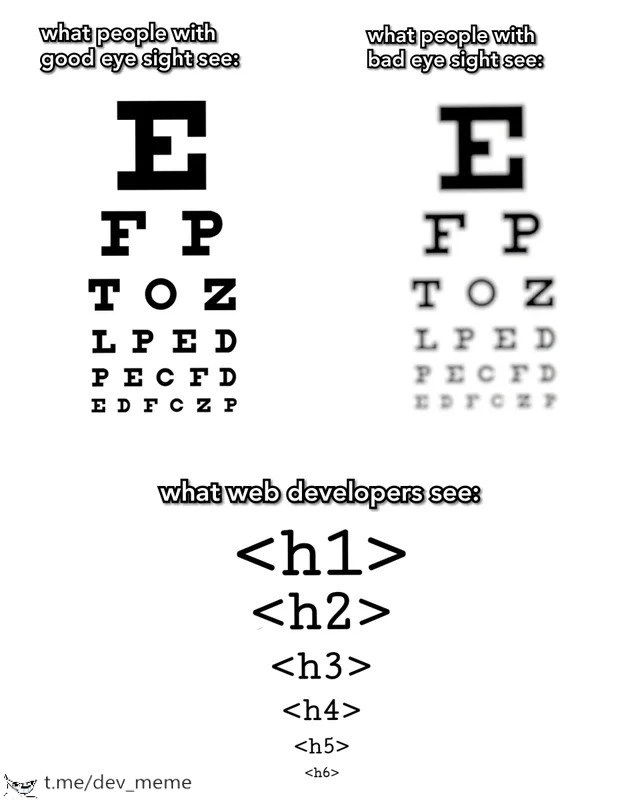
Let’s break down the components of this meme in simpler terms. On the top left, there’s a Snellen eye chart – you know, the chart with a big letter E at the top that you read at the optometrist’s office. It’s used to test eyesight. The letters start off large (E on the first line), and then each line below has smaller letters. Most people with good eyesight can read quite far down the chart clearly. The meme shows this normal chart under “what people with good eyesight see:” – crisp, clear letters in descending size. On the top right, it shows “what people with bad eyesight see:” – the same chart but blurry. That’s straightforward: if your vision isn’t great, those letters become fuzzy and hard to distinguish without glasses. So far, it’s a familiar scenario unrelated to coding – just vision clarity.
Now, the funny part is the bottom panel: “what web developers see:”. Instead of letters, a web developer supposedly sees a list of HTML heading tags: <h1>, <h2>, <h3>, <h4>, <h5>, <h6>. These are actual pieces of HTML code that represent headings in a webpage, from level 1 through level 6. In HTML (which stands for HyperText Markup Language, the code that makes up web pages), you use <h1> for the most important heading (usually the title of the page), <h2> for the next section headings, and so on, down to <h6> for the smallest, least important subheadings. By default, browsers typically make <h1> text very large and bold, <h2> a bit smaller, and each subsequent <h#> a little smaller than the previous, all the way to <h6>, which is fairly small. This creates a visual hierarchy on the page, so readers can see what’s main and what’s secondary at a glance. It also creates a semantic hierarchy – meaning the code itself knows the structure of the content (like an outline or family tree of ideas).
So, why would a web developer see <h1>…<h6> on an eye chart? It’s a bit of DeveloperHumor about how our brains get wired once we start making websites. We’ve spent so much time dealing with HTML tags for headings that whenever we see text in different sizes, we can’t help but think of those tags. The eye chart literally has a big item at the top (the giant E), then slightly smaller items, then smaller… That’s exactly how we use headings in HTML to structure content! A web developer might jokingly say, “Ha, that eye chart goes E, F, P, T... but all I see is an <h1> and then an <h2>, etc.” In other words, the dev isn’t reading the letters at all – they’re mentally labeling each line with the HTML tag that would produce text of that size.
This joke is relatable for many people in FrontendDevelopment, especially those into WebDev and UXDesign, because it highlights how we sometimes think in code even when away from the keyboard. It’s like a reflex. Also, it touches on accessibility_in_design concepts in a lighthearted way. In web accessibility (making websites usable for people with disabilities), using proper heading levels is important. For example, screen readers (tools blind or low-vision users use to browse the web) rely on headings to navigate a page. If a sighted user sees big and small text to know section titles vs content, a blind user relies on the developer having coded <h1> and <h2> correctly so their device can say “heading level 1… heading level 2…” and give the same sense of structure. So, a developer tends to always be conscious of headings and their order. This meme exaggerates that mindset: even at the eye doctor’s office, the dev’s brain is whispering “this is an H1, then H2, then H3…” instead of just reading letters!
Let’s clarify each HTML tag shown:
<h1>: This defines a top-level heading. There’s usually one main<h1>on a page (like the title of an article). Browsers show it big and bold by default.<h2>: A second-level heading. These are sub-headings under the main title. Visually a bit smaller than<h1>.<h3>,<h4>,<h5>,<h6>: Third level through sixth level subheadings, each one normally rendered smaller than the level above. By<h6>, the text is quite small by default.
In the meme’s bottom image, these tags are listed in descending order and actually displayed in decreasing font size (just like the letters on an eye chart get smaller). It’s implying that a developer’s vision automatically translates those letter sizes into the corresponding HTML tags. This is a humorous take on the “if all you have is a hammer, everything looks like a nail” idea. Here the “hammer” is HTML knowledge, and the “nail” is any text with varying sizes. Of course, in reality, developers still see letters like everyone else, but the joke is we impose our coding perspective on it. It’s like a little thought bubble above a dev’s head that adds angle brackets around everything they read. RelatableHumor indeed – many of us have caught ourselves saying silly things like “That sign is all caps, it must be a <h1> in the HTML!” or noticing poorly structured headings on a website and cringing. This meme captures that quirk in a simple, visual way that combines everyday life (eye tests) with FrontendHumor.
In summary, for a junior developer or someone learning HTML, the meme is a fun reminder of how HTML headings work and why they matter. It indirectly emphasizes the concept of visual hierarchy (important in design) and semantic hierarchy (important in code). As you grow in experience, you start to “see” both at once — even when you’re not intentionally checking. And if you’re deep in learning mode, you might actually find yourself parsing the world in code for a second, just like this meme suggests!
Level 3: Hierarchy in Focus
At first glance, this meme cleverly juxtaposes visual hierarchy with HTML semantic hierarchy. An experienced front-end developer immediately recognizes the joke: the Snellen eye chart’s big E at the top is akin to a huge
heading, followed by progressively smaller letters corresponding to , , and so on, down to . This is funny because a seasoned web developer can’t help but see the structure behind content. In day-to-day WebDevelopment, we’re trained to think in terms of headings and document outline. When normal people see an eye chart, they either see crisp letters or a fuzzy blur depending on their vision. But a developer’s brain? It overlays HTML tags onto those lines of text like augmented reality! It’s as if we have code-colored glasses that highlight semantic structure everywhere we look.
, and so on, down to . This is funny because a seasoned web developer can’t help but see the structure behind content. In day-to-day WebDevelopment, we’re trained to think in terms of headings and document outline. When normal people see an eye chart, they either see crisp letters or a fuzzy blur depending on their vision. But a developer’s brain? It overlays HTML tags onto those lines of text like augmented reality! It’s as if we have code-colored glasses that highlight semantic structure everywhere we look.
This meme gets a knowing chuckle from any FrontendDevelopment veteran who’s spent time worrying about proper heading order and AccessibilityStandards. It’s poking fun at how obsessive developers can be about markup. We know that <h1> through <h6> aren’t just big bold text styles – they convey importance and nesting of content. In a well-structured webpage (and in good UXDesign for accessibility), you should only have one <h1> (the main title), then <h2> for section titles, <h3> for subsections, and so forth, much like an outline or table of contents. Seeing the eye chart, a dev instinctively maps that largest letter E to a top-level heading and the smaller letters to sub-headings. It’s a reflex honed by countless hours of coding: the world gets mentally translated into HTML.
Why does this sight gag resonate so strongly? Because it’s RelatableHumor about how developers perceive the world. The meme hints that developers see with another dimension – where others see just content, devs see the underlying markup. It also subtly references accessibility and structure: in web design, visual size should match semantic importance. A non-developer might just see “big letter, smaller letters” and think only about physical eyesight. But a dev is conditioned to think “Is my heading hierarchy logical?” and “Would a screen reader user understand the page structure from these headings?” We literally can’t turn off that part of our brains! This is humor born from shared experience: after worrying so much about proper <h1> usage for SEO and screen readers, even an eye exam chart turns into an HTML document in our eyes.
There’s a deeper industry in-joke here about how we sometimes prioritize semantic markup as much as design. Old-timers recall the era of using <font> tags and styling text based on appearance alone – a big no-no now. Modern best practices preach separating content structure from presentation: use semantic HTML for structure (like proper headings) and CSS for visual styling. So a dev looking at an eye chart isn’t just seeing random letters; they’re identifying a perfectly descending typographic scale, exactly how browser default styles render <h1> through <h6> in decreasing font size. This alignment of visual size with HTML tag order is so spot-on that it tickles a web developer’s brain. It’s like the eye doctor unknowingly designed their chart with correct HTML semantics!
Furthermore, the meme nods to the idea that frontend folks often see the Matrix code behind everyday things. We might joke about pressing F12 on a street poster to “inspect element,” or wonder if a magazine headline is an <h1> or just a styled <span>. The humor here comes from that moment of recognition: only a web developer would look at an eye test chart and think of heading tags. It’s a gentle roast of our profession’s tendency to see FrontendHumor in places where non-coders wouldn’t. And it’s a bit self-deprecating too – implying we might be hopelessly code-obsessed. But hey, viewing the world through an HTML lens also means we care about accessibility_in_design and structured information, which is a good thing in moderation! In summary, the meme lands because it transforms a mundane sight (literally about vision) into a joke about web developer perspective – something only insiders truly appreciate. It’s humorous, a tad nerdy, and surprisingly insightful about the importance of semantic structure.
Description
A three-part meme comparing different perspectives of a standard eye chart. The first section, titled 'what people with good eye sight see:', displays a crisp, clear Snellen eye chart with descending lines of capital letters. The second section, 'what people with bad eye sight see:', shows the same chart but progressively blurred, simulating poor vision. The final section, 'what web developers see:', replaces the letters entirely. Instead, it shows a hierarchy of HTML heading tags, starting with a large '<h1>' at the top, followed by '<h2>', '<h3>', '<h4>', '<h5>', and a tiny '<h6>' at the bottom, perfectly mimicking the decreasing font size of the eye chart. The humor stems from how a web developer's brain is conditioned to see any visual hierarchy of text in terms of the semantic HTML structure they use daily. It's a clever in-joke about how professional specialization shapes one's perception of even the most mundane things
Comments
7Comment deleted
I showed this to a designer and they saw six different font sizes. I showed it to a marketing person and they saw seven H1 tags
Forget 20/20 - my vision’s fine; it’s my blood pressure that spikes when marketing jumps from <h1> straight to <h4>. That’s the semantic equivalent of ripping the middle rows off the eye chart
After 15 years of arguing about semantic HTML, I still can't unsee the fact that most sites use h1 through h6 purely for font sizing while their actual document outline looks like someone threw spaghetti at a DOM tree
After years of semantic HTML debates, senior developers don't see visual design anymore - just a perfectly nested heading hierarchy. They'll argue for 20 minutes about whether that hero section deserves an h1 or if it's semantically an h2, while the designer quietly weeps into their Figma mockups. Bonus points if you've ever refactored an entire codebase because someone used h3 before h2, breaking the sacred document outline. The real eye test? Spotting a rogue h4 nested under an h2 during code review
An eye chart is the only UI where skipping H2 gets you dinged by both Lighthouse and the optometrist
If your design spec says “make it H1 for size,” that’s not typography - that’s a P0 for a11y and your document outline
Optometrists fix vision; web devs just nest another heading level for clarity