Google's AI solves the icon readability problem it created
Why is this UX UI meme funny?
Level 1: Colorful Confusion
Imagine you have a pantry full of canned food, and each can usually has its own label – one has a big tomato for soup, another has a bean picture for beans, another maybe a peach for peaches. That way, you can tell at a glance what’s what. Now suppose someone decides all the cans should look the same, with the same colorful label, just maybe with tiny text. Suddenly, your soup, beans, and peaches all have identical cans. You’re not sure which is which without reading each one carefully. To solve this, instead of bringing back the unique labels, you invent a fancy machine that can scan the cans and tell you which is soup and which is beans. Pretty over-the-top, right? It works – the machine can do it – but it’s a lot of effort to fix a problem that didn’t need to happen. That’s what’s going on in the meme: Google made all their app icons look alike (lots of pretty colors but kind of confusing), and then they bragged about a special AI tool that can identify those icons for you. It’s funny because they wouldn’t need that high-tech solution at all if the icons were easy to tell apart to begin with, like giving each can in the pantry a different label again.
Level 2: Icon Detection 101
Let’s break this down in plainer terms. Google came out with something called IconNet as part of their Voice Access app on Android. Now, Voice Access is an accessibility feature – it helps people control their phone using just their voice. For example, if someone can’t use the touch screen easily (due to a physical disability or even if your hands are busy), they can say commands like “Open Chrome” or “Scroll down” and the phone will do it. It’s pretty neat and important for hands-free use and accessibility.
Before IconNet, Voice Access would often overlay tiny numbers on every clickable thing on the screen, and you’d have to say “tap 7” or “tap 3” according to those numbers. That worked, but it’s a bit clunky. What Google is doing now is making this more natural: you should be able to just say the name of an app icon, like “Open Gmail,” and the system will understand and click the Gmail icon for you. But to do that, the software needs to recognize where that Gmail icon is on the screen. Your phone’s not a person – it doesn’t “see” icons by default; it only knows pixels. So how can it find, say, the Gmail icon among all the other icons?
This is where AI comes in. Specifically, a type of AI called computer vision – teaching computers to interpret images. Object detection is a computer vision technique that not only figures out what something is in an image, but also where it is. For example, an object detection model can look at a photo and tell you “there’s a cat at these coordinates, and a dog over here.” In our case, the “objects” are app icons. IconNet is basically a model that was trained to look at a smartphone screen and find familiar app icons. It’s like giving your phone a pair of eyes and a bit of brain to say, “Aha, that little multicolored shape in the top-right is the Gmail icon.”
How does it know? Likely, Google showed the model tons of images of these icons in different scenarios (different screen setups, wallpapers, light/dark mode, etc.) so it learned to recognize the unique patterns of each app’s icon. Most modern image recognition models use something called a neural network – think of it as a virtual brain with layers of neurons that activate for certain patterns. A convolutional neural network (CNN), in particular, is great at analyzing pictures by scanning over them for features (like edges, shapes, color patterns). IconNet probably uses a CNN under the hood. When running, it takes a screenshot of your phone’s display as input, and outputs coordinates and labels – e.g. “Icon at (x,y) = Gmail, icon at (x2,y2) = Maps,” etc.
So with IconNet, if you say “Open Maps,” Voice Access can consult this AI “vision” model, find the Maps icon on the screen (because IconNet recognized it), and then simulate a tap there. All without you touching the device. That’s a win for accessibility – it makes it easier for people to navigate apps by voice commands referencing actual on-screen icons.
Now, here’s why this became a joke. A few months before this AI was announced, Google changed the design of all those app icons. Google’s icon redesign made a lot of their app icons look very similar. They decided to use the same four colors (blue, red, yellow, green) in each icon and a similar flat style. This was a branding decision: it makes the icons look consistent, like a family. But the downside was, at a quick glance, many of these icons started to blend together. They each lost some distinctive features. For example, the old Gmail icon was a big red envelope – super easy to spot. The new Gmail icon is an abstract letter “M” with all the Google colors. Google Drive’s icon was already a three-color triangle, but it became flatter; Google Maps’ icon became a multicolor pin; Google Calendar’s icon became a white square with tiny colored tabs. Individually, you can tell them apart if you look closely (shape differences, small letters or symbols). But on a busy screen, especially for people who may not have perfect eyesight, they can all kind of look like colorful squares or blobs. Even folks with great vision found it annoying – it wasn’t as quick to pick out the app you wanted.
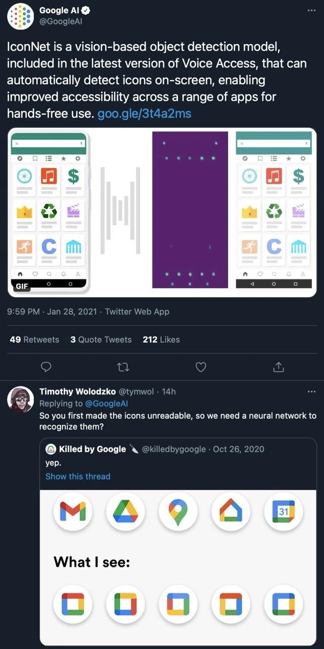
So along comes Google’s AI division with this IconNet technology. They tweeted a proud announcement: “Hey, our new model can automatically detect icons on screen, making Voice Access even better!” On paper, this is positive news. But many in the tech community immediately connected the dots (pun intended) — Google had created the icon legibility problem and was now solving it with AI. That’s what Timothy Wolodzko’s reply highlighted: essentially “you made them unreadable, and now you need a neural network to recognize them.” It’s poking fun at the absurdity of the situation. Another account, @killedbygoogle, known for cataloging Google’s missteps and discontinued projects, chimed in with a simple “yep.” and an image that jokes about how the new icons all look identical. In that image, the official icons are on one row, and the row below is labeled “What I see:” showing eight look-alike multi-color icons. It exaggerates, but it drives the point home – to some of us, those icons might as well be the same sticker in different positions.
From a junior developer perspective, there are a few lessons and terms here. First, UX/UI design matters. UX stands for user experience, which is about how easy and pleasant it is for someone to use a product. UI means user interface, the visuals and layout of an app. A core idea in UX is to avoid unnecessary confusion; things that are important should be easily identifiable. Iconography (the design of icons) is a big part of that. If you make all your icons look alike, you’re adding cognitive load (i.e., the user has to stop and read labels or think harder). It’s generally seen as a design mistake or regression when something that used to be easy (finding Gmail) becomes harder after an update. That’s why this is tagged as a UXFailure.
Second, it shows how accessibility isn’t just about adding new tech, but also about good design. Accessibility standards often recommend using clear shapes, good contrast, and not relying solely on color to differentiate things (because, for example, color-blind users might not distinguish red vs green well, and low-vision users need clear cues). In Google’s defense, they didn’t remove all cues — each icon still has its unique silhouette or letter — but they definitely moved closer to uniformity. And indeed, Google’s solution was to apply AI as a kind of safety net.
Third, this is a peek into how machine learning gets applied in products. IconNet is essentially an ML feature shipping in a consumer product. It shows that even something as GUI-based as identifying buttons on a screen can be automated with AI. As a junior dev, you might find it cool that they can do image recognition on a phone in real time! This tech could have other uses too, beyond this context (like identifying icons for visually impaired users and reading them out, etc.). But the reason folks are laughing is because here ML is used to fix something arguably needless. It’s like using high-tech wizardry to fix a problem that didn’t exist until someone introduced it.
Finally, this highlights a bit of the AI hype vs reality. In press releases, companies often hype AI as something magical (“Our AI will see and understand everything on your screen!”). The reality can be that it’s solving fairly narrow or even self-inflicted issues. AI limitations are also at play: note that IconNet presumably had to be trained specifically for known icons. If a user changes their icon pack or uses a non-Google app with a random icon, the model might not recognize it. It’s not a human-level vision that knows any picture; it’s trained for a purpose. And models can make mistakes – imagine it confusing one app for another if they look too alike (maybe an edge case, but who knows). That could be awkward for a user: “Open Gmail” and it opens something else because it misidentified. It reminds us that AI isn’t infallible, especially if we force it to solve problems born from design choices.
In summary, Google’s IconNet + Voice Access combo is a smart technical feature aimed at helping with accessibility and hands-free use. But it became meme-worthy because the need for it was unintentionally amplified by Google’s own icon redesign. It’s a bit of self-owning humor from the developer community: we can appreciate the tech, but we also shake our heads at why the tech was needed. A good takeaway for a newer developer is: simpler solutions (like clear design) should come before complex ones (like neural networks), whenever possible. And if you do end up in a situation where a complex fix is necessary, at least make sure it genuinely helps users (in this case it does help, so it’s not all for nothing, just a funny case of causation).
Level 3: The ML Band-Aid
Only in big tech do you create a UX problem and then proudly announce an AI/ML solution to fix it. This meme spotlights Google’s ironic loop of cause-and-effect: they redesigned all their app icons to look uniformly Google-y (lots of blue-red-green-yellow), creating an inadvertent UX failure – and then rolled out IconNet (a vision model) to undo the confusion. The tweet exchange tells the tale:
Timothy Wolodzko (@tymwol): “So you first made the icons unreadable, so we need a neural network to recognize them?”
That one line is dripping with sarcasm that every senior dev can appreciate. It’s a classic case of AI humor and corporate irony. Google’s design team chased brand consistency so hard that all their app icons became siblings in the same outfit. Gmail, Drive, Maps, Calendar – glance at your phone and it’s a kaleidoscope of similar shapes and colors. Distinctiveness? Thrown out the window sacrificed for branding. Now enter the engineers with a fancy vision-based object detection model to compensate for that decision. This is the quintessential AI hype vs reality scenario: a convolutional neural network deployed to solve a problem that good UI design would have avoided in the first place.
Let’s break down how this saga unfolded step by step:
- One Style to Rule Them All: In late 2020, Google’s design team rolled out a unified google_icon_redesign. All the major app icons (Gmail, Google Drive, Maps, Calendar, etc.) got the same four-color palette and minimalist style. The once-distinct red Gmail envelope, the green double-loop of Google Maps – all morphed into variations of the Google logo colors. The result? A bunch of duplicate color icons that look eerily similar at a glance.
- User Confusion Ensues: Suddenly, many users (and devs with cluttered home screens) found themselves squinting: “Wait, which one is Gmail and which one is Drive?” What used to be instant recognition now took actual effort. UX/UI 101 says icons should be easy to tell apart – here that principle got steamrolled by branding. This uniformity even raised AccessibilityStandards concerns, since not everyone has perfect vision or color perception. It’s a real-life UXFailure: when your audience jokes that all they see is a row of identical multicolored blobs, you know something’s off.
- Bring in the Neural Network: Meanwhile, Google’s Voice Access team is working to improve hands-free control on Android. Voice Access lets users control their phone by voice (critical for accessibility). To make it smarter, Google AI introduces IconNet – an object detection model that can automatically detect icons on-screen. In theory, this is awesome: you say “Open Gmail,” and IconNet scans the screen, finds the Gmail icon (by visually recognizing it), and the system clicks it for you. No more saying “Tap 5” or whatever; the AI can see the icon like a pair of digital eyes. Under the hood, this likely uses a convolutional neural network (CNN) trained on thousands of icon images. It’s akin to face detection in photos, but here it’s icon detection in the UI. The model outputs bounding boxes around each app icon and classifies them (Gmail vs Maps, etc.), enabling truly hands-free app navigation. Technically cool, right?
- Problem Solved… And Self-Owned: Google announces IconNet as an “improved accessibility” feature (which it genuinely is for many users). They get to flaunt some cutting-edge AI/ML tech in a blog post and a tweet. But the timing is hilarious: essentially, the fix for making icons harder to recognize is an AI to recognize icons. It’s like setting your house on fire and then inventing a new sprinkler system. Sure, the sprinkler is great and helps people – but you also lit the match. Google got a pat on the back for innovation, while the dev community collectively raised an eyebrow.
The response on Twitter was immediate and brutal. The @GoogleAI tweet proudly demoed IconNet’s capabilities, but Timothy’s reply nailed the elephant in the room. Even the infamous Killed by Google account jumped in with a one-word reply: “yep.” accompanied by an image meme. That image showed the official new icons on top, and below them “What I see:” — eight nearly identical multicolor squares. It’s a mic-drop visual commentary on AI limitations: even humans now struggle to tell these apart, so we’re using a machine to do it. In developer circles, this situation is painfully relatable. We’ve all seen over-engineering in action: a high-tech band-aid slapped over a self-inflicted wound.
From a senior dev perspective, there’s a bittersweet humor here. On one hand, IconNet is a neat piece of tech – a tailored CNN model integrated into an accessibility service, running on-device, possibly optimizing performance to identify small icons quickly (maybe using something lightweight like MobileNet under the hood). It’s no small feat to get real-time object detection working smoothly on a smartphone. On the other hand, it’s hard not to facepalm at why it was needed. It highlights a classic disconnect: one team’s decision (branding/UX) inadvertently creates technical debt for another team (AI/engineering) to fix. Instead of, say, rethinking the icon designs or adding simpler visual cues, they doubled down with ML. It’s the kind of irony that senior engineers nod at knowingly: we build overly complex solutions when simpler, more user-friendly options are politically off the table.
In essence, this meme is calling out Google with a sarcastic “Look what you made us do.” It falls squarely under DeveloperHumor and TechHumor because it captures a truth in our industry: sometimes we end up using advanced technology to paper over avoidable mistakes. It’s funny, a bit frustrating, but also educational. As the cynical vets might say after a deploy at 3 AM, “Sure, let’s just throw a neural net at it – that’ll fix everything.” And in this case, Google literally did.
Description
This image is a screenshot of a Twitter thread, starting with a post from the official Google AI account. The Google AI tweet announces IconNet, a vision-based model for detecting on-screen icons to improve accessibility. Below this, a user named Timothy Wolodzko replies, 'So you first made the icons unreadable, so we need a neural network to recognize them?'. This is followed by a reply from the 'Killed by Google' account showing a previous tweet that compares Google's old, distinct app icons (like Gmail, Drive, Maps) with their newer, redesigned icons that are all visually similar, multi-colored outlines. The joke is a sharp critique of Google's design philosophy, where they homogenized their icons to the point of being hard to distinguish, and then celebrated a complex AI solution to fix the very accessibility problem they introduced. For senior engineers, this is a classic example of a large corporation creating a problem through a design decision and then over-engineering a technical solution, rather than addressing the flawed design itself

Comments
7Comment deleted
Some call it 'creating a solution.' We call it 'billable hours to fix the design team's branding exercise.'
IconNet: because branding collapsed every app into the same four-color hash collision, so engineering spun up a TPU fleet to run a CNN as a glorified Ctrl-F for the home screen
Google's engineering excellence: spending millions on neural networks to distinguish between icons that a $50K/year designer made indistinguishable. It's like implementing quantum computing to solve a problem you created by removing all the labels from your server room
The pinnacle of modern engineering: training a neural network to solve the icon recognition problem your design team created by making all icons look identical. It's like Google built a complex ML pipeline to reverse-engineer their own design system's accessibility regression - a perfect O(n²) solution to an O(1) problem. Next up: an LLM to interpret their own documentation after they rewrote it to be 'more concise.'
Brand unification made every app a four-color G; IconNet exists so Voice Access can tell them apart - my favorite pattern: converting UX debt into GPU spend
Compress icon entropy with a brand refresh, then decode it with a CNN - lossy UI, lossless MLOps
Google icons: So abstract they bypassed human vision straight to fine-tuned object detection - entropy optimized for TPUs