Skip to content
DevMeme
6514 of 7435
Google Trends Shows Help With Mortgage Searches Hitting 2008 Crisis Levels
DataVisualization Post #7139, on Sep 17, 2025 in TG

Google Trends Shows Help With Mortgage Searches Hitting 2008 Crisis Levels

Why is this DataVisualization meme funny?

Level 1: When Everyone Panics

Imagine a big school where one year, a really hard test made everyone freak out and ask for help at the same time. The teachers’ help line got super busy because almost every student was yelling, “I need help with this homework!” That’s like the first big spike on the chart – it happened back in 2008 when lots of grown-ups were suddenly worried about paying for their houses (so they all searched for help with their mortgages). Things eventually calmed down (the test was over, everyone graduated, and for a long time homework was normal). But now, many years later, it’s as if the school gave an even harder test, and once again all the students are panicking together and asking for help all at once. That’s the second spike happening “Today.” The blue line in the picture is basically showing how many people were asking for help at those two different times: it goes way up when everyone panics together, then goes down when life goes back to normal. The funny (and a bit sad) part is that it’s happening again – like seeing the same big problem come back and everybody reacting just like before. We laugh a little because the picture makes it look so clear and simple, but it’s also saying, “Uh oh, here we go again!”

Level 2: A Tale of Two Spikes

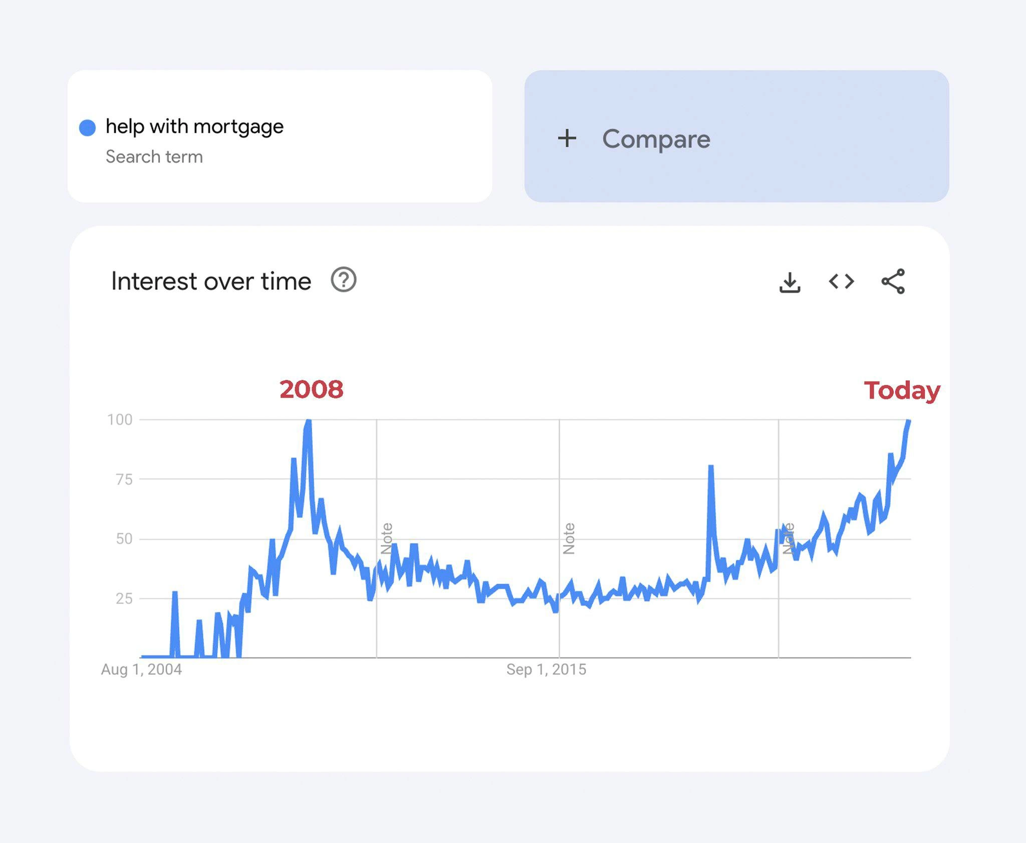
What we see here is a snapshot of the Google Trends interface focusing on the search term “help with mortgage”. Google Trends is a public tool that shows how frequently a particular phrase is searched over time, on a relative scale from 0 to 100. In the image, there’s a blue dot next to the query name (indicating the term’s color in the chart), and a light-blue "+ Compare" button (which normally lets you compare multiple search terms on the same graph, though only one term is shown here). The main part is the white chart card titled Interest over time. This is essentially a line chart of search interest (popularity) for “help with mortgage” from August 1, 2004 up to now. The blue line starts near zero in 2004, jumps dramatically to a high point around 2008, then settles down (with minor ups and downs) for years. On the far right, the line shoots up sharply again “Today,” reaching a peak that surpasses even the 2008 level. The meme creator has labeled the 2008 spike with “2008” in red text and the latest surge as “Today” in red, to make it clear these are the two big moments of interest. Those red annotations aren’t part of Google’s actual UI – they were added to highlight the timeline’s two key events (much like annotating important incidents on a graph).

Now, why are 2008 and today significant for this search term? In 2008, the world experienced a major mortgage_crisis_2008: the housing market collapsed due to a lot of risky loans (subprime mortgages) and financial shenanigans. Many people suddenly couldn’t afford their home loans, or were worried they wouldn’t be able to pay their mortgage (a mortgage is a loan people take to buy a house, and they must pay it back with interest). During that crisis, tons of folks desperately searched online for things like “mortgage help” or “what to do if I can’t pay mortgage” – hence the huge spike in the graph. Essentially, “help with mortgage” became a very popular plea on Google. The chart quantifies that public panic: the interest level hit 100 (the maximum on Google’s relative scale) in 2008 because that was the peak moment of people Googling this problem. After 2008, the line goes down – meaning fewer people were searching this phrase as the crisis passed and things stabilized. It stays relatively low (though not completely zero; some people always search for mortgage help in normal times too) for over a decade.

“Today,” however, we see a new surge reaching even higher. This suggests that currently (circa 2025), there’s another wave of people feeling anxious about mortgages. The likely reason is a mix of rate_hike_anxiety and possibly economic downturn: interest rates on home loans have risen very fast recently (making monthly payments much more expensive), and maybe house prices or other economic factors are straining people’s finances. So once again, many are turning to Google with the same plea: “help with mortgage.” The meme’s title calls this “Google Trends mortgage panic peaks again,” implying we’re witnessing a similar level of panic as 2008, all over again, on a macro scale. It’s like the data is telling a story of IndustryTrends repeating: first the 2008 hype-and-crash, now another hype/panic cycle. This falls under FinTech and economics because it’s about mortgage finance and public reaction, but it’s presented through a tech lens (Google’s big data chart).

The funny twist comes from the second part of the title: “—macro-scale incident repeats production outage.” In developer terms, an “incident” usually means something has gone wrong in a system (like a server outage or a major bug in production). Production refers to the live environment where real users are affected (as opposed to development or testing environments). So a production outage is when a live app or service goes down unexpectedly – a very serious event that triggers all hands on deck. We often treat such outages as incidents to investigate and fix. The meme calls the 2008 crisis a macro-scale incident – “macro” hinting at macroeconomics (big economy-wide) – basically saying the entire economy had a giant failure in 2008 (which it did, in a sense!). And now that same kind of incident has repeated: the graph spikes again today as if the same problem came back. It’s a tongue-in-cheek way to say “Uh oh, we didn’t learn our lesson from 2008 and now we’re seeing the same meltdown signs again.” Developers use the term “déjà vu” for recurring bugs or outages that look just like a previous one – here we have a very visual déjà vu in the data.

In practice, engineers and data folks often do exactly what this meme does: look at a time-series chart to diagnose problems. In a metrics dashboard (like those in Grafana, Datadog, or CloudWatch), if we saw a graph with a huge spike, calm period, then another huge spike, we’d immediately suspect a recurring issue. We might annotate the first spike as “Outage due to X cause” and when it happens again, we’d shake our heads thinking “not this again!” The meme riffs on that by treating Google’s search data as if it’s monitoring data for society. The phrase “accidental time-series postmortem” from the description captures it perfectly: the Google Trends graph wasn’t made for an incident retrospective, but it unintentionally serves as one by pinpointing when massive public distress events occurred. Even the layout with share/export icons in the corner makes it feel like a fancy report from a dev’s analysis tool. It’s bridging BigDataAnalytics and real life: Google is crunching billions of searches (that’s big data!) and outputting an easy-to-read graph that, in this case, doubles as a graph of a financial system failure. And yes, people in FinTech and data science do monitor Google Trends for PublicPerception signals – it’s not just a joke; it’s something like an early alarm for economic or social trends.

So for a junior developer or someone new to these terms: this meme is comparing a financial crisis to a server outage. The “mortgage panic” is visualized by how many people searched for help. The joke is that it looks just like how a critical bug would appear on a monitoring chart – with big spikes at the times of failure – implying the economy “failed” in 2008 and is kind of “failing” again now. It’s a mix of dark humor and clever insight: if you treat global events like software, 2008 was a crash that everyone hoped was fixed, and seeing that graph spike again is like seeing the crash repeat. And just like an engineer might groan “we’ve seen this error before,” everyone today is groaning “not another 2008!” but phrased in meme-speak.


Level 3: Time-Series Déjà Vu

At first glance, this Google Trends graph for help with mortgage looks eerily similar to a production monitoring chart highlighting two huge outages. In true DataVisualization fashion, the blue line represents search interest over time – essentially a search_query_metrics timeline. We see a massive spike around 2008, then relative calm, and now another steep climb hitting a new peak at Today. For seasoned engineers, this pattern screams “incident recurrence”. It’s as if the entire economy is a software system that crashed in 2008, got hotfixed, ran in a stable state for a while, and is now crashing again. The meme’s title even frames it like a postmortem: “macro-scale incident repeats production outage.” In other words, a macroeconomic crisis (the housing market meltdown) is being described in terms of a repeated production outage – the kind of P0 incident that pages everyone at 3 AM. The humor here comes from treating a financial crisis like a server crash: an absurd collision of FinTech reality with DevOps terminology. It’s a classic case of déjà vu on a time-series graph, and anyone who’s battled recurring outages or seen metrics doing the same crazy thing twice will chuckle (perhaps nervously) at this parallel.

This chart is essentially an economic_indicator_dashboard for public panic. The Google Trends interface (with its familiar Interest over time graph) is repurposed as an incident graph for society. In 2008, the world experienced a mortgage_crisis_2008 – triggered by bad loans and a housing bubble – and the search interest for “help with mortgage” skyrocketed. That was like a catastrophic failure event: imagine an error metric shooting up to 100%. Engineers remember 2008 not just as a financial fiasco but also as a time many tech companies tightened belts; it’s seared into industry memory. Fast-forward to Today, and we see another soaring spike. It likely corresponds to modern rate_hike_anxiety – interest rates have climbed rapidly, mortgages have become painfully expensive, and once again people are frantically Googling for help. To a developer’s eye, this looks like the same bug occurring in production after 17 years. The system (our economy) probably had a patch after 2008 – new regulations, better risk controls – but apparently a latent bug remained. Now under new stress conditions (rapid rate hikes, inflation, whatever triggered 2025’s panic), the old issue resurfaces, causing a second outage-level event. In DevOps terms, we’d call this a regression or an incident recurrence; in plain terms, history is repeating itself.

What really nails the joke is the way the meme labels the peaks in red text – “2008” and “Today” – just like annotating incidents on a graph during a postmortem analysis. In software postmortems, we annotate timelines with key events: “Deploy v2.3 → Traffic Spike → Error Rate 100% → Outage”. Here, the key events are major financial crises highlighted on a public BigDataAnalytics chart. It’s an accidental yet perfect “postmortem” of public sentiment. The Interest over time label (a standard part of Google Trends UI) even carries a cheeky double meaning: it refers to search interest, but in this context it hints at interest rates over time – exactly what’s squeezing mortgage holders and driving the panic. It’s a subtle pun likely unintended by Google’s designers but deliciously apt in this meme. Data engineers love this kind of thing: using huge datasets of Google searches as a mirror of PublicPerception. In fact, it’s common for analysts to treat Google search volume as an early warning system for real-world issues (kind of like how we use monitoring to catch system issues). If thousands of users suddenly search “login error 500,” you know your app might be down. Similarly, a spike in “help with mortgage” searches means lots of people are feeling financial pain at once. This public panic telemetry shows up as a giant spike, the same way a critical bug causes an error graph to go vertical.

To highlight the parallel, let’s compare a tech outage to this financial crisis as if they’re two incidents on different dashboards:

Tech Production Outage 🖥️ Financial Crisis 💸
Root cause: Bug or overload in system code. Root cause: Bad loans, housing bubble, or rapid rate hikes.
Alert: PagerDuty calls an engineer at 2 AM. Alert: Google search spikes (‘help with mortgage’ trends on everyone’s screen).
Immediate fix: Restart servers, rollback deployment, apply hotfix. Immediate fix: Central bank cuts interest rates, government bailouts or relief programs.
Postmortem: Engineers write an RCA doc, add monitoring, promise “won’t happen again.” Postmortem: Regulators write reports, pass laws (e.g. new finance rules), promise “never again.”
Recurrence?: Happens again if underlying bug wasn’t truly fixed (we all dread the repeat page). Recurrence?: Happening now because underlying economic issues weren’t fully resolved (we’re all getting deja vu 😓).

Reading the graph with this mindset, 2008 was “Incident 1” for the economy, and today is “Incident 2.” The seasoned developer in us can’t help but smirk at how the production_incident_deja_vu is unfolding at a global scale. It’s both darkly funny and unsettling – like laughing at a server crash because the error message is ironically humorous, even though you’re frantically fixing it. In the end, the meme clicks because it bridges tech culture and real-world events: we use our nerdy habit of analyzing graphs to make sense of human crises. And as cynical as it is, the meme suggests an uncomfortable truth familiar to any veteran engineer or Tech Historian: those who don’t address root causes are doomed to repeat them, whether it’s in code or in credit markets. Here we go again…


Description

A Google Trends chart showing the search term 'help with mortgage' over time from August 1, 2004 to present. The 'Interest over time' graph shows a massive spike around 2008 (labeled in red as '2008') corresponding to the financial crisis, followed by years of relatively low search volume. The chart then shows current search interest surging to match or exceed the 2008 peak (labeled in red as 'Today'). The Compare button and download/embed/share icons are visible. This data visualization implies that mortgage distress is reaching 2008 financial crisis levels, a deeply concerning economic indicator

Comments

17
Anonymous ★ Top Pick When your Google Trends chart starts looking like your production error rate graph, it's time to update both your resume and your mortgage broker's contact info
  1. Anonymous ★ Top Pick

    When your Google Trends chart starts looking like your production error rate graph, it's time to update both your resume and your mortgage broker's contact info

  2. Anonymous

    That's the original hockey-stick growth chart every founder wants to show investors, but for public anxiety

  3. Anonymous

    Looks like the "help with mortgage" metric just breached its 2008 ceiling - turns out exponential backoff is great for retries, not for interest rates

  4. Anonymous

    The only thing more predictable than a memory leak in production is developers googling 'help with mortgage' every time their startup's burn rate meets reality - though at least in 2008 we could blame subprime lending instead of subprime architecture decisions

  5. Anonymous

    When your production monitoring dashboard and Google Trends for 'help with mortgage' show the same alarming spike pattern, you know it's time to update your resume AND refinance. The 2008 peak was the original 'this is fine' meme for homeowners, and here we are again watching that line go vertical like an unoptimized database query hitting production. At least with technical debt you can refactor - with actual debt, you just get to watch the graph climb while your equity disappears faster than a startup's runway after their Series A falls through

  6. Anonymous

    Just like a legacy service dormant for 16 years, then spiking to 100% CPU right when you're on-call

  7. Anonymous

    When the 'help with mortgage' panel hits 100, you realize Google re-baselines but salary bands don’t - the only SEV-1 your observability stack can’t auto-remediate

  8. Anonymous

    When your personal finance dashboard breaches the 2008 p99, you open a SEV‑1, page the Fed as on‑call, and pray the rollback isn’t ‘variable-rate.’

  9. @abel1502 9mo

    It's particularly funny to measure interest over time for a loan. And see it hit 100)

  10. @async_andrew 9mo

    And one more piece: https://www.currentmarketvaluation.com/models/price-earnings.php

  11. @Johnny_bit 9mo

    "uh oh"

  12. @SamsonovAnton 9mo

    What country is it — Zimbabwe?

  13. @GarySKS 9mo

    I could be wrong, but it could also be because of far more people searching on google for such queries now than in 2008, thanks to smartphones being more widespread.

    1. @hur7m3 9mo

      That's literally what Google Trends tracks.

      1. @GarySKS 9mo

        Oh, I should have elaborated: probably because of more widespread internet usage at any given moment (especially due to smartphones).

        1. @hur7m3 9mo

          Smartphones have been widespread since early 10s. By mid 10s everyone and their dog were permanently connected to the internet. The graph reflects the shit economy we're in, not the internet usage.

  14. @GarySKS 9mo

    Edited it to reflect that

Use J and K for navigation