GIMP Mascot as Algorithmic Confetti
Why is this Graphics meme funny?
Level 1: Broken Sticker Magic
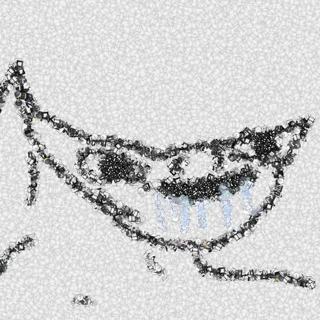
Imagine taking a sticker of a cartoon character, cutting it into hundreds of tiny pieces, shaking them in a box, and somehow arranging them so the character is still barely recognizable. That is why this is funny: it looks ruined and carefully made at the same time, like a computer tried very hard to draw a mascot and proudly handed back a pile of confetti shaped like one.
Level 2: Pixels With Intent
GIMP is an open-source image editor, often used as a free alternative to commercial graphics tools. Its mascot is Wilber, the cartoon creature whose outline is still visible here even though it is built from many tiny pieces instead of smooth shapes.
The image connects to several graphics concepts:
- Dithering is a technique where patterns of small dots or marks create the impression of shading or detail.
- Thresholding turns an image into strong light/dark regions, often making it look harsh or posterized.
- Compression artifacts are unwanted visual glitches that appear when image data is simplified too aggressively.
- Icon design depends on recognizability at a glance, which is why this distorted mascot still works as a joke.
For a junior developer, the funny part is similar to running code that technically produces the expected output but in the strangest possible way. The program says, "I made the mascot," and it did. But it made the mascot out of scattered bits, noise, and suspicious little shapes. Anyone who has written a first image filter, CSS effect, shader, or data visualization has seen this kind of half-success: the result is wrong enough to be alarming, but right enough to be impressive.
The absence of visible text also matters. Since nothing in the image explains the reference, recognition becomes the punchline. If you know GIMP, the shape snaps into place; if you do not, it just looks like an abstract swarm arranged into a creature.
Level 3: Wilber, Deconstructed
The joke lands because the image is doing a very developer-specific kind of disrespect to an icon: it turns the recognizable GIMP mascot, Wilber, into a field of tiny repeated fragments. There is no visible caption to explain it. The whole gag depends on whether the viewer can still reconstruct the mascot from the noisy black-and-white swarm: the long brush-like shape on the left, the pointed head outline, the eye area, and the grin-like dark cluster across the middle.
That makes it feel like a visual pun about image processing algorithms and open-source tooling. GIMP is the kind of program people use to manipulate pixels deliberately; here, the mascot looks as if it has been fed through a destructive pipeline that still accidentally preserves semantic structure. It is part dithering, part compression artifact, part "I wrote a filter and now the logo has entered witness protection."
The experienced-developer read is that the image resembles what happens when a toolchain technically succeeds while aesthetically committing several crimes. The silhouette survives, but the implementation details leak everywhere. You can almost imagine a pipeline like:
source mascot -> edge detection -> particle fill -> thresholding -> "ship it"
The humor is not just "GIMP logo but weird." It is that the result looks like a debugging artifact from a graphics experiment: a mascot rendered as debris, surrounded by a pale background full of repeated low-contrast shapes. That background matters because it makes the central figure feel algorithmically generated rather than hand-drawn. The viewer gets the uneasy pleasure of recognizing the image while also seeing the machinery that destroyed it.
There is also a very open-source cultural flavor here. Wilber is not a generic mascot; it belongs to a tool with a long history of being powerful, odd, beloved, and occasionally mocked for its interface choices. So fragmenting the mascot into technical confetti feels less like vandalism and more like community in-joke archaeology: the kind of thing someone makes because they know exactly which audience will recognize the outline before they recognize why they are laughing.
Description
The image is a square, captionless graphic with a white-gray background made from many tiny repeated pale shapes. Across the center, dense black and white fragments form the recognizable outline of the GIMP mascot Wilber, including the long brush-like shape extending left, the eye region, and the pointed head silhouette. There is no legible in-image text; the technical joke is mostly visual, suggesting an image editor or graphics algorithm has decomposed an open-source mascot into noisy particles while keeping just enough structure to identify it.
Comments
14Comment deleted
It looks like someone ran Wilber through a lossy compression codec optimized for open-source existential dread.
What is it meant to be? Comment deleted
whats in that message, im 2 lazy 2 upate tg Comment deleted
ty Comment deleted
guys don't bother if you don't have tg nitro Comment deleted
And that’s how it looks like with updated TG after click on the “Boost” button Comment deleted
is the amount required depending on subscriber count? Comment deleted
subs / 250 Comment deleted
Time to criiinge 🎉 (which is yet to be made) Comment deleted
let me know when to be the cringe finisher Comment deleted
Why do people so want to turn telegram into another trash heap of stories?😋😋😋 Comment deleted
they ran out of stack Comment deleted
You can actually hide all those stories posted by your contacts/channels Comment deleted
Or unsubscribe. Comment deleted