Gender As A Color-Space Coordinate
Why is this DataVisualization meme funny?
Level 1: The Fancy Chart
This is funny because someone took a personal question and made it look like a game board or color chart. It is like asking "what kind of sandwich do you want?" and handing someone a map with letters, numbers, colors, and symbols instead of just letting them say "cheese." The chart looks official, but nobody is completely sure how to use it.
Level 2: Dropdowns Were Simpler
The technical terms here come mostly from data visualization and interface design. A grid is a way to organize values across two dimensions, like rows and columns in a spreadsheet. A heatmap uses color to show intensity or category across a grid. A coordinate picker lets someone choose a point, like picking a color from a palette or selecting a value on an X/Y chart.
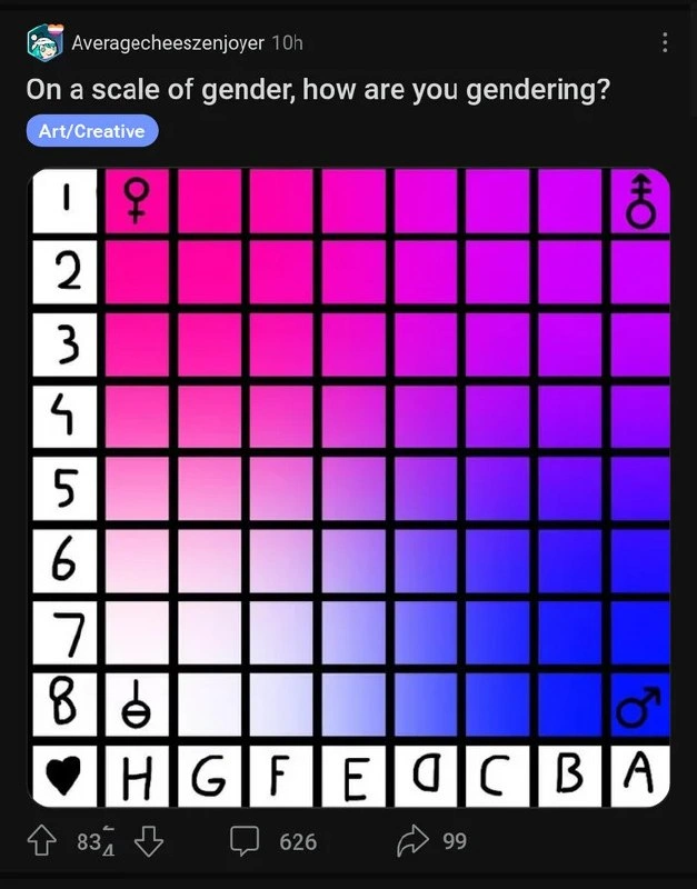
In the image, the row labels 1 through 8 and column labels H through A make the chart feel addressable. You could point to a square and call it D4 or B7, the same way spreadsheet cells are named. The gradient gives the impression that moving across or down changes some property. The gender symbols placed near the edges act like labels for the chart's extremes, even though the image never defines exactly what each direction means.
That ambiguity is where the developer humor appears. A junior developer often learns that forms are harder than they look. At first, a field seems simple:
type Profile = {
gender: string;
};
Then real users appear, and the model starts breaking. You add custom values, privacy controls, localization, legacy imports, analytics requirements, compliance rules, and profile-display rules. The original "simple dropdown" becomes a tiny product inside the product.
This meme exaggerates that lesson by turning the selector into a full visual control. Instead of choosing from a normal list, the user is apparently supposed to find their gender by navigating a color matrix. It is funny because it resembles a serious UI pattern while applying that pattern to something where the axes are unclear and the output would be hard to use anywhere else in a system.
Level 3: Identity as Coordinates
The screenshot asks, > On a scale of gender, how are you gendering? and then presents a numbered-and-lettered grid like gender has been refactored into a coordinate plane. The visual joke is not just "gender is complicated." It is that an extremely human, contextual, self-described concept has been rendered as if it were a UI widget, a heatmap, or a lookup table with row and column values.
The grid is doing several developer-adjacent things at once. Rows are labeled 1 through 8, columns are labeled H through A, and the cells shift through a pink, purple, and blue gradient. Gender symbols sit around the edges like anchor points in a color space. The blue Art/Creative label above the image makes the whole thing feel like a community post, but the actual artifact looks suspiciously like an internal design-system component that escaped review.
For people who build software, the humor is in the mismatch between representation and reality. Software loves to turn messy domains into clean structures:
- an enum called
Gender - a dropdown with three options
- a boolean column named
isMale - a database migration that seemed harmless in 2016 and is now load-bearing
This image goes in the opposite direction. Instead of oversimplifying to one field, it overspecifies the interface into a two-axis gradient selector. Somehow the result is both more expressive and less usable. A person could answer "B5" and still require a README.
That is the classic UX trap: when the domain is nuanced, adding more controls does not automatically create clarity. A color picker works because color has a technical model behind it: hue, saturation, brightness, RGB values, hex codes. Identity does not become easier to understand just because someone drew a grid and put symbols at the corners. The chart looks precise, but precision is not the same as meaning. Every product team eventually learns this after making a "flexible" settings page that needs a staff training session.
The best part is that the grid implies a hidden schema without explaining it. Does A8 mean more masculine because the male symbol is near that corner? Is H1 a different polarity because the female symbol is nearby? What does the heart icon in the lower-left corner mean? Is the diagonal a transition, a spectrum, a mood, a palette, or a cursed onboarding form? The meme works because it offers just enough visual structure to make engineers start reverse-engineering rules that probably do not exist.
Description
A dark social-media screenshot from "Averagecheeszenjoyer" marked "10h" asks, "On a scale of gender, how are you gendering?" with a blue "Art/Creative" label underneath. The main image is a black-outlined grid filled with a pink-to-purple-to-blue gradient, numbered 1 through 8 on the left, labeled H through A along the bottom beside a heart icon, and marked with gender-symbol icons in the corners and edges. The layout reads like an alignment chart, heatmap, or coordinate picker, turning identity into a two-axis color-coded interface. Its technical relevance is mostly visual-system humor: an abstract human concept is rendered as if it were a strongly typed matrix or UI control.
Comments
33Comment deleted
Finally, gender modeled as a two-dimensional enum with a custom color map and no obvious default value.
Seems logical Comment deleted
No, the scales should be reversed, so that "classic" male and female correspond to the highest values. The logic is simple: * a male is H1 — "the Hard One", 🍌 * a female is A8 — "A ∞". 🍈🍈 Comment deleted
What's a1 and h8? Comment deleted
a1 androgyne h8 agender Comment deleted
I sent the chart Comment deleted
I SELECTed the names FROM your chart :з Comment deleted
Ah yes the age old choice between identifying as nurglite or mayonnaise Comment deleted
I am attack helicopter Comment deleted
new chess board just dropped Comment deleted
Sea Battle Comment deleted
Может сразу Rgb введем шеснадцатиричной записью? Comment deleted
English please @ohirro Comment deleted
I'm unown f if anyone asks Comment deleted
IDC c5 check with potential mate? Comment deleted
"On a scale of normal to mentally ill, what gender are you today?" Comment deleted
There's still a limited number of genders in this picker. Comment deleted
fuck it, 2d double coordinate in range from 1.0 to 0.0 Comment deleted
Yeah only 64 instead of 72 Comment deleted
Why is it only 2-dimensional? Comment deleted
Nobody knows it should be 6D Comment deleted
can i play chess here? Comment deleted
What happens when you win?🤔 Comment deleted
You always win, that’s the point Comment deleted
I am more of a rescue helicopter myself Comment deleted
Seriously this but for attraction. Comment deleted
Probably C6 or something Comment deleted
I h8 the last one (joke(or not)) Comment deleted
I am last row h4 Comment deleted
I'm binary(.exe) Comment deleted
Exe is PE format not binary Comment deleted
I'm binary() Comment deleted
Binary would be (*) or (.bin) Comment deleted