GANs: Expectation vs. Terrifying Reality
Why is this AI ML meme funny?
Level 1: Menu vs Meal
Imagine you see a glossy picture of a hamburger on a restaurant menu or in a TV commercial. It looks perfect – tall bun, everything stacked neatly, mouth-watering. Now think about the burger you actually get served. It’s still a burger, but the bun might be a bit squished, the lettuce is off-center, maybe it’s a little sloppy. Tasty or not, it definitely doesn’t look as picture-perfect as the ad. That difference is just like what’s happening in this meme. The left side is the promise (the beautiful result we were shown), and the right side is the reality (the funny, imperfect thing we got instead). It’s the classic “expectation vs reality” scenario. You can’t help but laugh when you compare them, because the gap is so wide. We’ve all been there – like when a toy’s box shows an amazing toy, but when you open it, the toy is kind of clunky. Here, the “amazing toy” is the AI’s perfect output that was showcased, and the “clunky toy” is the actual output the AI gives you when you try it yourself. In simple terms: sometimes people show off something as if it’s completely perfect, but when you try it, it comes out looking pretty silly. That contrast is exactly what makes this funny – it’s a cartoon way of saying “Well, that didn’t live up to the hype, did it?”
Level 2: GANs in the Wild
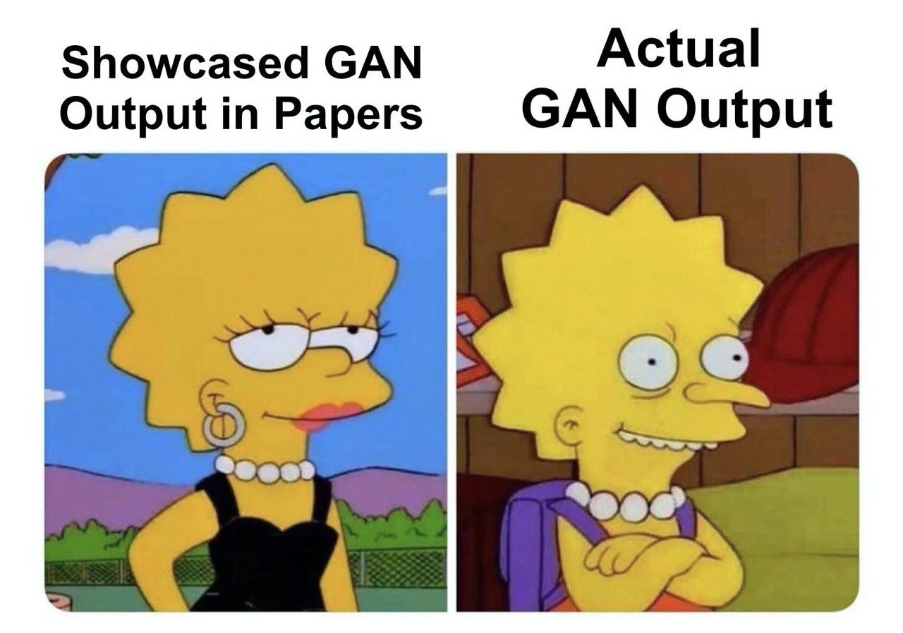
Let’s break down the meme and the tech in simpler terms. The two panels are comparing how things are supposed to look versus how they actually turn out, using Lisa Simpson as an example. On the left side, the text says “Showcased GAN Output in Papers.” We see Lisa dressed up perfectly – black dress, pearls, looking confident and flawless. On the right side, it says “Actual GAN Output,” and here Lisa looks… well, a bit off: she’s cross-eyed, with a goofy smile, her body posture is awkward, and she’s in a plain setting (you can see her backpack straps in a classroom). So what’s the joke? Essentially, the meme is saying: In research papers, the examples of GAN-generated images look amazingly perfect (like left-panel Lisa), but when you actually use the same AI model yourself, the results can come out hilariously weird (like right-panel Lisa). It’s a classic AIHypeVsReality scenario, illustrated with a Simpsons twist.
Now, what exactly is a GAN? It stands for Generative Adversarial Network. Think of it as two AIs playing a game with each other. One AI is the generator – its job is to create new images from scratch. You can imagine it as a robot artist trying to draw a picture of Lisa Simpson from memory. The other AI is the discriminator – its job is to look at an image and judge whether it’s “real” (a genuine image from the actual Simpsons show) or “fake” (an image produced by the generator). The generator keeps trying to fool the discriminator with better and better fake images, and the discriminator keeps getting better at spotting fakes. They’re adversaries, but this rivalry actually makes both improve over time. If training goes well, the generator learns to make images so realistic that the discriminator is consistently fooled – meaning the generator has learned the patterns of real images (like how Lisa is supposed to look) really well. That’s the ideal outcome.
However, in practice, training a GAN is tricky and things can go wrong. Sometimes the generator doesn’t learn evenly – it might get some features right (say, Lisa’s general shape and the fact she has spiky hair) but mess up details (like her eyes or smile). One common problem is called overfitting – that’s when the model “memorizes” the training data too closely and doesn’t generalize well to new examples. For instance, the generator might have essentially memorized one particular picture of Lisa (so it can reproduce that one nearly perfectly – giving us a left-panel-worthy image), but when it tries to draw Lisa in a different pose or scene that it hasn’t seen before, it struggles and produces a goofy version (like the right panel image). Another problem is something called mode collapse. Think of this as the generator getting stuck in a rut, producing only a few types of outcomes over and over. It’s as if our robot artist learned to draw Lisa only in that fancy black dress pose and didn’t learn anything else; if asked for something different, it just can’t do it well, resulting in a distorted image. The right panel could be what a failed attempt looks like when the model hasn’t learned the full variety of how Lisa can appear.
The meme also hints at how researchers present their results versus what users experience. In a research paper or demo, the team behind a GAN will likely show off only the best examples that their model generated. It’s like if you had 100 AI-generated images, you’d pick the prettiest and sharpest ones to put in your article to impress everyone. (Who wouldn’t, right?) That’s the left panel vibe: only the polished, pretty output is showcased. They won’t put the funky, messed-up Lisas in the paper if they can avoid it. So those less-than-great results (the ones like the right panel) stay behind the scenes. But when other developers or anyone outside the lab actually uses the model, they will generate all sorts of images – and inevitably, some of those will be the awkward, goofy ones that never made it to the paper. It’s like the paper gave you the highlight reel, but using the model yourself is like watching the blooper reel as well.
So, “GANs in the wild” means how GAN models perform outside of the controlled lab environment. In the wild, you see everything: the good outputs, but also the failures. The phrase AIHypeVsReality captures this exact point: the hype is the shiny promise (perfect images, as advertised), and reality is what you actually get (mixed results, sometimes comically bad). This meme is funny to people who know this field because it exaggerates a truth we’ve all experienced: those AI-generated images that looked perfect in the research paper might actually turn out strange or low-quality when you try it yourself. Seeing Lisa Simpson go from a glamorous pose to a derpy expression makes that lesson easy to understand and laugh about. It’s basically saying, “What you see in the paper isn’t always what you get at home,” in a way anyone can chuckle at.
Level 3: Cherry-Picked Perfection
The humor hits home for any developer who’s chased the latest AI research hype. It’s all about research_vs_production reality. In academic papers, GAN results are often presented with almost smug confidence – just like Lisa Simpson on the left, flawlessly styled in a black dress and pearls, looking like she’s aced the task. Why is she so confident? Because she represents a cherry-picked example: the kind of picture-perfect result that authors love to flaunt in academic_papers to show off their model’s potential. These are the results that make it to the paper’s glossy figures or the project’s website demo, often selected from dozens (or hundreds) of generated samples.
Meanwhile, the right panel (goofy, cross-eyed Lisa with her backpack straps showing) is the truth of Actual GAN Output when you run the model on a random day in the real world. It's the unvarnished reality: many outputs are awkward or low-quality. Developers recognize this scenario all too well. You excitedly download the latest GenerativeModels code from GitHub, feed in some inputs, and suddenly you’re looking at something that resembles Lisa’s wonky grin on the right. Not exactly the polished, state-of-the-art result you were promised! The meme exaggerates it with humor: Lisa’s eyes are literally misaligned – a classic sign of a GAN that hasn’t fully learned consistency (we’ve all seen those generated faces where one eye is off in its own world – spooky yet hilarious).
Why does this happen? Insiders know that authors often cherry-pick outputs for publication. It’s like generating 100 images and only showing the top 5 that look the most realistic. The code equivalent might be:
samples = [generator.generate() for _ in range(100)] # get 100 candidate images from the GAN
best_sample = pick_prettiest(samples) # cherry-pick the most perfect result
publish(best_sample) # showcase it in the paper's figure
# (...quietly ignore the cross-eyed Lisas in the other 99 samples)
The left Lisa is that one-in-a-hundred ideal output. The right Lisa is one of those many rejects that didn’t make it into the glossy PDF. When you deploy the model or test it without curation, you inevitably encounter those rejects. This contrast is essentially AIHypeVsReality in action: the hype shows the best case, reality gives you the average case. Seasoned engineers have learned to be skeptical of impressive AIGeneratedContent demos. They’ve been burned by prototypes that worked amazingly on a conference stage, but then produced laughably bad results when integrated into a real product.
It’s also a jab at the IndustryTrends_Hype cycle in AI/ML. Every few months a paper claims “Our GAN can do X flawlessly!” and the showcased image (like our poised Lisa) looks amazing. Managers, clients, and the internet get excited. But when you try to reproduce those results, you often discover the model is finicky — maybe it only works on the specific dataset used, or it needs carefully tuned settings, or it just got lucky for the demo. Hence, developers share memes like this to commiserate. It’s a tongue-in-cheek way of saying “Sure, it looks great in the lab, but wait till you see what it does in production.” The Simpsons imagery nails the point: one moment Lisa can look like a million bucks on stage, and the next moment she’s back in class looking like a total goof. The gulf between model_expectations and actual performance is both frustrating and comedy gold for those of us in the field.
In short, this level speaks to the inside joke: GAN output often isn’t as magical as advertised. That polished Lisa Simpson is the exception that the research paper wants you to focus on, whereas the cross-eyed Lisa is the rule you discover when you actually use the model. It’s a humorous reminder to take flashy results with a grain of salt (and to be prepared for some “d’oh!” moments when reality kicks in).
Level 4: The Minimax Mirage
In cutting-edge ML research, a Generative Adversarial Network (GAN) is defined by a two-player minimax game. The generator network $G$ learns to map random noise (a latent vector) to synthetic samples (like images), while the discriminator $D$ tries to distinguish those fakes from real data. Ideally, when this adversarial training converges to a Nash equilibrium, the generator’s distribution matches the true data distribution. In other words, $D$ can no longer tell real images from generated ones, and every output from $G$ would be as impeccable as that glamorous Lisa Simpson on the left panel.
However, achieving this theoretical perfection is more of a mirage than a guarantee. GAN training is notoriously finicky due to issues like unstable gradients and mode collapse. Mode collapse occurs when $G$ gets lazy and learns only a narrow slice of the target distribution — for example, it might master drawing Lisa Simpson facing left in a black dress very well (the paper-worthy sample), but fail to produce Lisa at other angles or with consistent facial features. The result? Many generated images turn out cursed or distorted, just like the cross-eyed Lisa in the right panel. These quirky outputs are hints that the generator hasn’t globally solved the distribution’s intricacies. They lurk as low-probability samples in the model’s output space, analogous to weird outliers the discriminator never properly schooled the generator on.
Academically, researchers often optimize not just for visual fidelity but also for quantitative metrics like the Fréchet Inception Distance (FID) to boast how close $G$’s outputs are to real data. But even a model with a great overall FID can produce individual failures. The math is clear: training minimizes expected divergence between distributions, not a guarantee that every sample is perfect. So probability-wise, there’s always a tail of the distribution yielding oddball results. The left Lisa is a lucky sample from a well-modeled region of that distribution (so good it was fit for a figure in a paper). The right Lisa springs from a poorly covered region of the generator’s learned manifold — essentially a manifestation of overfitting or incomplete learning on parts of the data.
In essence, the meme humorously underscores a fundamental ML truth: the beautiful theoretical equilibrium GAN papers imply (where all outputs look real) is elusive in practice. There’s a gap between the idealized GAN output that mathematical models aspire to and the messier reality of actual inference. It’s a reminder that behind every polished result in a conference paper, there’s a complex high-dimensional minimax tango going on, where convergence is delicate and sometimes what should be an elegant waltz ends up producing a few awkward dance moves.
Description
A two-panel meme using characters from 'The Simpsons' to contrast idealized and actual results. The left panel is labeled 'Showcased GAN Output in Papers' and shows a well-drawn, poised, and confident Lisa Simpson in a formal black dress. The right panel, labeled 'Actual GAN Output,' displays a crudely drawn, disheveled Lisa Simpson with wide, misaligned eyes and a goofy, unsettling grin. This meme format serves as a classic 'expectation vs. reality' joke. It humorously criticizes the tendency in academic research and tech showcases to present only the most perfect, cherry-picked results from Generative Adversarial Networks (GANs). For anyone who has actually worked with GANs, the 'actual' output is a relatable depiction of the many failed, distorted, or nonsensical images these models often produce during the training and iteration process, highlighting the gap between polished theory and messy practice
Comments
7Comment deleted
The model isn't producing garbage; it's just exploring a rich, high-dimensional latent space of nightmare fuel. We only publish the results from the one dimension that doesn't scream
GAN in the paper: “FID 2.3 on eight A100s.” Same weights after we 4-bit quantize and ship to the lone T4 in prod: Lisa’s face says the discriminator rage-quit
The paper's loss function converged beautifully after 500 epochs, but nobody mentioned it only worked on that one specific seed value they found after three months of grid search
This perfectly captures the GAN training experience: your paper shows epoch 47 where everything converged beautifully, but production is stuck at epoch 3 where the discriminator is winning so hard your generator is just outputting nightmare fuel. Bonus points if you've spent three weeks hyperparameter tuning only to discover the 'state-of-the-art' results in the paper used a dataset they conveniently forgot to mention was manually curated to remove 80% of the failures
Funny how SOTA evaporates the moment you disable the truncation trick, stop cherry-picking, and render an uncurated grid - suddenly mode collapse becomes your brand identity
GANs in papers: best‑of‑10k samples with a smug FID; GANs in prod: mode collapse and distribution shift, because we didn’t ship the author’s seed or their 400‑GPU hyperparam sweep
Papers flaunt FID sub-5 masterpieces; your Colab spews 10k eldritch horrors before one usable frame