Skip to content
DevMeme
1992 of 7435
Flattening The Curve, Literally
DataVisualization Post #2220, on Nov 3, 2020 in TG

Flattening The Curve, Literally

Why is this DataVisualization meme funny?

Level 1: Riding The Wrong Hill

Imagine someone sees a hill on a map and says, "This looks easy to ride down," but the hill suddenly turns into a cliff. The joke is that computers can look at old numbers and guess what comes next, but real life can change direction fast. The skateboarders are treating a scary chart like a playground, which is funny because the chart is actually about a serious problem.

Level 2: Curves Are Not Guarantees

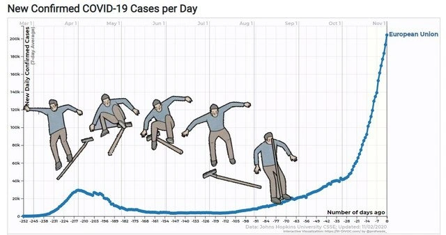
The image is a data visualization: a line chart showing new confirmed COVID-19 cases per day. The y-axis measures daily cases, and the x-axis is labeled:

Number of days ago

The skateboarders are pasted onto the line as if the data were a ramp. This makes the phrase "flatten the curve" literal. In public health, flattening the curve means reducing the speed of spread so hospitals are not overwhelmed. In the picture, "flat" simply looks easier to skate on.

The post's machine-learning angle comes from how models can misread real-world data. Machine learning finds patterns in historical examples. If the world keeps behaving the same way, that can work well. If the world changes, the model may make confident-looking predictions that are wrong. For a junior developer or data scientist, this is the lesson hiding in the joke: a model is not magic. It is a set of assumptions wrapped in code, and bad assumptions can look professional when plotted with a nice blue line.

The meme also points at model evaluation. A useful forecast needs to be tested against data it has not seen, and it needs humility about uncertainty. A single smooth chart can hide reporting noise, measurement issues, and policy changes. The skateboarders make that hidden complexity visible by being comically unprepared for the sudden climb.

Level 3: Nonstationary Skate Park

The chart is a joke about what happens when a serious data visualization gets treated as a literal physical object. The visible title says:

New Confirmed COVID-19 Cases per Day

and the blue line labeled:

European Union

becomes a skate ramp for a sequence of illustrated skateboarders. That alone is a clean visual pun on "flattening the curve," but the post message sharpens it into a machine learning joke: predicting infection rates is not the same as drawing a pleasing line and hoping reality agrees.

For experienced data people, the pain is in the shape of the curve. It is not a stable process with one clean seasonal pattern and tidy independent observations. Infection-rate data is affected by testing policy, reporting delays, public behavior, restrictions, holidays, variant dynamics, healthcare capacity, and plain old human noncompliance. A model trained on the early gentle dip can be humiliated by the later steep rise. The skateboarders are funny because they act like the line is just terrain, while a forecaster is supposed to understand that each slope is the visible trace of messy social systems.

The chart also satirizes a common analytics failure: confusing visual pattern recognition with explanation. A line going down does not mean the underlying system is solved. A line going up does not mean the previous model was useless. It means the model assumptions need to match the world being measured. Time-series forecasting for epidemics is especially rude about this. Yesterday's trend can become tomorrow's liability when interventions change, reporting backfills arrive, or the population changes behavior because of the chart itself.

That is where the meme's absurdity lands. The skateboarders look calm on the flat and gently sloped parts, then the curve rockets upward on the right edge like the data has turned into a wall. Any naive model that learned "cases are low now, so cases stay low" has just discovered the difference between interpolation and prediction. The graph is not a skate park; it is a warning label with axis ticks.

Description

The image shows a line chart titled "New Confirmed COVID-19 Cases per Day," with the y-axis labeled "New Daily Confirmed Cases" and the x-axis labeled "Number of days ago." A blue time-series line labeled "European Union" dips, rises, and then climbs steeply toward the right edge, with small text at the bottom indicating Johns Hopkins University CSSE data updated on 11/02/2020. Several illustrated skateboarders are pasted onto different slopes of the curve, treating the epidemiological trend line as a skate park. The meme turns pandemic data visualization and prediction into a literal "flatten the curve" joke, while the caption frames it as what happens when machine learning is applied naively to infection-rate forecasting.

Comments

7
Anonymous ★ Top Pick The model did not flatten the curve; it just discovered Tony Hawk as a feature engineer.
  1. Anonymous ★ Top Pick

    The model did not flatten the curve; it just discovered Tony Hawk as a feature engineer.

  2. @ArchieWindragon 5y

    At least we had a bit of time to beef up healthcare capacity.. Right?

    1. @Roman_Millen 5y

      Yeah, sure. Spend the COVID budget to fix some roads and give more money to police. (Greetings from Ukraine)

  3. @p4vook 5y

    not funny at all

    1. @nenten 5y

      true

  4. @NiKryukov 5y

    According to prediction, we're all gonna die

    1. @ANeufeld 5y

      Well, just remember that over the same period of time, more people will die because the flue than because of covid-19.

Use J and K for navigation