When you solve a convex problem in a non-convex world
Why is this AI ML meme funny?
Level 1: Losing and Still Bragging
Imagine you and two friends run a race. One friend finishes first, another finishes second, and you finish third (last among them). Now, who would you expect to be celebrating the most? Probably the first-place winner, right? But picture this: the kid who came in third place suddenly jumps up and starts acting like they won the whole race. They grab their little bronze medal and bite it like they’re a champion, they hug and kiss the award presenter, and then they shake up a bottle of juice and spray it everywhere in excitement. Meanwhile, the actual winner (first place) is standing on the top podium, just watching in confusion, and the second-place kid is also standing quietly, wondering what's going on.
It’s a funny scene because the third-place kid is bragging and celebrating without actually winning. Everyone can see they only got third, but that kid is acting as if they got the gold medal. It feels completely out of place and silly.
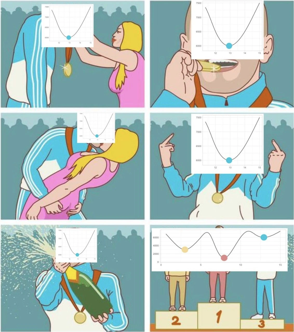
Now, in the meme, instead of a kid or a person, it's showing a computer model (like a computer program that learned to do something) as that third-place character. We know it's a model because its "face" is drawn as a line chart (a kind of graph) that represents how well it was doing. That graph-face has a little point on it that was its best result. So basically, the model had one really good moment (at that point on the graph) and it’s overly proud about it. But overall, when you compare everything, it was still only the third best model in the contest.
Think of it this way: it’s like you took a test and got the third highest score in the class. But there was one question on the test that you got absolutely right when even the top scorers got it wrong. Now you start parading around saying, “I’m the best in the class!” because of that one question you aced, even though two people actually beat you in total score. That would seem pretty ridiculous, right? Your classmates who got first and second would be like, “Um, you do know you didn’t win, right?”
So the meme is funny because that’s exactly what’s happening: the model that lost overall is acting like a huge winner just because of one little highlight. It’s a goofy reminder that you shouldn’t claim you’re the champion just because of one lucky success when you actually came in behind others. Everyone can see the truth, which is what makes it comedic. The third-place model spraying champagne and gloating is humorously exaggerating how silly it looks to brag when you haven’t truly won.
Level 2: Third Place Flex
Let's break this meme down in simpler terms. We have a cartoon of an awards podium (like at the Olympics) with spots for 1st, 2nd, and 3rd place. Normally, the person on the 1st place podium is the winner and would be the one celebrating the most. But in this comic, it's the 3rd place guy who is going absolutely wild with celebration. This format is actually based on a popular internet meme where a bronze medalist (third place) jubilantly celebrates and does ridiculous things, even though they didn't win. It’s a way to joke about someone who is over-celebrating a not-quite-victory.
In the meme panels, the twist is that each person's face is replaced by a graph. Specifically, the over-the-top third-place guy has a small line chart for a face. It looks like something you’d plot with Matplotlib (a Python graphing library). On that chart, there's a curved line in a U-shape and a blue dot marking the lowest point of the curve. The axes are labeled (x-axis from 11 to 15, y-axis from 6000 to 7500), which suggests this graph is showing something like the model's performance (loss) over training epochs or over a range of hyperparameter values. The key part is that the curve goes down and then up, and the lowest point (bottom of the U) is highlighted by that blue dot.
What does that U-shaped validation loss curve mean? In training a machine learning model, you often measure how well it's doing on a validation set (a set of data not used for training, to check performance). Early on, as the model trains or as you increase model complexity, the validation error typically goes down – the model is learning and improving. But if you train too long or make the model too complex, it can start to get worse on validation data (because it begins to overfit, meaning it's memorizing training data quirks that don't generalize). That makes the validation error curve go back up again. So a U-shaped validation loss curve often indicates that the best performance was in the middle somewhere. In the meme’s blue chart, the best performance is at that blue dot (the bottom of the U). Let’s say at epoch 13 the model had its lowest error (around 6000 on the y-axis). Before that (epochs 11-12), error was higher (around 7000), and after that (epochs 14-15), error climbed back up toward 7500. So the single best result this model achieved on validation was at epoch 13.
Now, in the final panel of the meme, we see the podium positions labeled 1, 2, 3. The blue-dot curve character is on position 3 (meaning overall it is the third-best model), yet it's the one acting like a champ. The other two characters on positions 1 and 2 are also line charts (with presumably red and yellow dots showing their best points, as described). They’re the ones who actually beat the blue model in overall performance. They might have achieved lower validation loss or better accuracy consistently or on the final run. But they are just standing there normally, with gold and silver medals, not making a fuss. Meanwhile, the blue curve on bronze is biting his medal, kissing a woman who presented the medal, giving two middle fingers, and spraying champagne everywhere. It’s complete over-excitement from the least winning model.
So why is the blue model so excited? Because it’s focusing on that one blue dot – its one moment of glory – and ignoring the fact that it lost overall. This is a classic case of cherry-picking a metric. In more human terms: imagine you took a test with three sections and you scored worse than two other people overall, but you got the highest score among them in one of the sections. If you then ran around saying, "I'm the best in the class!" because of that one section score, people would find it odd. That’s exactly what this model is doing: it’s bragging about one aspect (one epoch’s loss was really low) as if that makes it the champion, when actually the other models did better when you consider the whole exam (the entire evaluation).
For a junior dev or someone new to AI_ML, here are some key concepts to know:
- Model: in machine learning, this usually means a program or mathematical thing that has been trained to make predictions or decisions from data.
- Training vs Validation vs Test: Typically, you train a model on training data, tune it using validation data, and finally evaluate it on test data. The validation set helps you see how well the model might do on new data so you don't fool yourself by only looking at training performance. You shouldn't adjust the model specifically to the validation data too much, or else you'll start to tailor it to that data (and it might not perform well on truly new data).
- Loss: a measure of error (how far off the model's predictions are from the true values). In many ML tasks, lower loss = better performance. That graph is a loss curve, so down is good, up is bad.
- Overfitting: when a model performs well on the data it was trained on, but poorly on new data. It often happens if the model is too complex or trained too long. A sign of overfitting in a graph is when the validation loss starts increasing after a point, even as training loss might keep decreasing.
- Cherry-picking: selecting only the evidence that supports your claim and ignoring the rest. In data science, cherry-picking might be choosing only the best experiment or the most favorable metric out of many, to make your results look good.
In light of those, the joke becomes clear: The blue-dot model is overvaluing one favorable outcome (that low loss at epoch 13). Maybe it got lucky or found a very specific pattern at that point. The other models might not have such a neat U-curve, maybe their curves look messy or have multiple dips (as hinted by "multi-peak curves"), but ultimately they achieved lower error or more stable results, which is why they are first and second. The blue model, despite being objectively worse overall, is acting as if that doesn’t matter because “hey, at epoch 13 I was awesome!”
This is poking fun at a scenario that's all too real: Sometimes people will present their machine learning results in the best possible light, even if that means glossing over the fact that others did better. For example, if someone’s model is actually third best, they might still try to find some metric or some subset of data where their model is #1 and highlight that in their report. It's a bit deceptive or at least self-delusional. The meme exaggerates it to make it obviously silly – I mean, a guy on the third-place podium making out with the presenter and spraying champagne is ridiculously out of place – so we laugh and also get the point.
In an early-career context, you might recall a time you were super happy about a piece of code or a result that turned out not to be as great as you thought. Maybe your program passed one tricky test case and you celebrated, but later you found it failed others. This meme is saying: don’t be that person who over-hypes a single success when the overall outcome is behind the pack. It also highlights the importance of proper ModelEvaluation: You want to look at the whole picture (all epochs, all metrics, multiple runs) before declaring you have a winning model.
So, "Third Place Flex" is exactly what it sounds like: the third-best model flexing (slang for showing off) as if it were the best. It’s both a funny image and a gentle lesson. In data science (and any science), cherry-picking data is a bad practice – you might momentarily convince someone you're on top, but the truth usually comes out when a thorough evaluation is done. The meme uses humor to remind us: focus on genuine performance, not just the shiny moment that flatters your ego.
Level 3: Cherry-Picked Champion
This meme is hilariously spot-on for anyone who's seen dubious ModelTraining results touted as breakthroughs. It uses the well-known olympic_podium_meme format to parody AI bragging rights. We see a podium with ranks 1, 2, 3, and the competitor on the third-place platform is celebrating like they took home gold. Thanks to a clever graph_face_swap, that overzealous athlete has a Matplotlib-style line chart for a head, specifically a U-shaped validation_loss_curve with a blue marker at its lowest point. This blue-dot curve character earned the bronze medal in actual performance (meaning two other models did better on the main metric), yet he's acting as if he's the world champion. In each panel of the comic, our bronze hero goes more over-the-top: receiving the medal and immediately biting it (classic pose), then dramatically kissing the presenter, then even flipping off the other podium finishers with both hands, and finally spraying champagne everywhere. Meanwhile, the actual 1st and 2nd place models (their faces are other charts – described as multi-peak curves with red and yellow dots indicating their best results) stand calmly on the higher podium spots. They look a mix of puzzled and disapproving as the third-place guy makes a fool of himself.
This absurd victory lap is a satire of machine learning evaluation antics we've all encountered. The blue curve’s team is engaging in metric_cherrypicking – grabbing a single favorable datapoint and hoisting it like a trophy. Essentially, they found one moment (one epoch, or one hyperparameter value) where their model’s validation loss was super low (that blue dot at the bottom of the U) and they’re trumpeting that as if it defines the entire competition. It’s like saying, “Sure, overall we came in third, but look at this one spot where our loss was lowest – woohoo, we’re the best!” It’s both funny and cringe-worthy because outsiders can clearly see the context: two other models have better overall performance (maybe lower average loss, or better final metrics), but the third-place team is selectively focusing on their one tiny best-case scenario.
In practice, this is a known anti-pattern in ModelEvaluation. Perhaps the team ran a ton of experiments and one random run yielded an unusually low validation error. Or maybe among many metrics, they cherry-picked the one metric where they slightly outperform others. For instance, say Model C (our bronze) has worse overall accuracy but a marginally higher precision on a specific class – if they then go and boast “Our model has state-of-the-art precision!” in marketing materials, they’re not outright lying, but they’re surely not telling the full story. We see this in competitive machine learning all the time. A Kaggle team might overfit to the public leaderboard by trying hundreds of tweaks (a classic hyperparameter_tuning_antics scenario) and celebrate a fleeting jump in rank, only to be overtaken on the private test set. In academia, a research paper might include a chart where their method dips below the baseline’s error at one point, and they highlight that in the abstract, even though the baseline wins on final accuracy. It’s intellectual cherry-picking, and the meme calls it out with this flamboyant third_place_champion portrayal.
To illustrate how cherry-picking happens in a more concrete way, consider this snippet of pseudo-code where we track validation loss and select the best epoch:
val_loss = [0.72, 0.65, 0.59, 0.60, 0.62] # validation loss over 5 epochs
best_epoch = min(range(len(val_loss)), key=lambda i: val_loss[i])
print(f"Best epoch: {best_epoch}, validation loss: {val_loss[best_epoch]:.2f}")
# Output: Best epoch: 2, validation loss: 0.59
# They stop at epoch 2 and declare victory based on this lowest point.
In this example, epoch 2 (the third epoch, since we started counting at 0) had the lowest loss, 0.59. A cherry-picking team might say, "Look, our model achieved a sub-0.6 loss! That's amazing!" and then metaphorically break out the champagne at epoch 2. But notice what happened after epoch 2: by epoch 4, the loss crept up to 0.62 again. Perhaps the model started to overfit, or maybe that dip at epoch 2 was just a lucky fluctuation. Also, what if another model, say Model A, started higher but by epoch 5 got down to 0.50 and stayed low? That model would clearly be superior overall, but if someone stopped the timeline early to freeze on their own highlight, they could claim a win that isn’t truly deserved. The code above is a tiny glimpse of how easy it is to grab a single best result and ignore the trend.
Seasoned developers and data scientists chuckle (and groan) at this because it hits home. Many of us have learned the hard way that one great result doesn’t mean final victory. Maybe in your early days, you trained a model and got a fantastic validation score once – you thought you were done, only to find out later it was a fluke. Or you saw a colleague selectively present only the rosy metrics from their project in a meeting. It’s a mix of AIHumor and cautionary tale. The meme exaggerates it to ridiculous levels (the double middle-fingers and champagne shower from bronze place – talk about overkill!) which makes it clear how foolish the behavior is. Yet, it’s not a straw man; this really happens in more subtle ways. Organizations under deadline might unintentionally encourage this: “Show us something that looks good.” So a team might say, “Well, metric X looks good, so let’s lead with that,” glossing over metrics Y and Z where they fell short. It’s a form of wishful thinking with visuals, and the DataVisualization aspect can be very persuasive if you’re not careful. A smooth U-shaped curve with a bold low point looks like a win – human eyes love a clear valley implying improvement. It takes a critical mind to ask, “Wait, what about the other models' curves? Where do they bottom out?”
The meme nails these dynamics without any words. The blue-dot model is essentially giving a big middle-finger to proper model comparison protocol, celebrating in a vacuum. The first and second place charts standing there represent the silent reality: actual better performance doesn’t need to shout. They have their gold and silver medals because, presumably, on the true evaluation metric (say the final test set loss or overall accuracy), they beat the blue model. They don’t need to ham it up – the numbers speak for themselves. The blue model’s team either doesn’t understand this or is willfully ignoring it, which is why we (the audience) facepalm and laugh.
We should also appreciate the meme's brilliant blend of DataVisualization and humor: the fact that the “faces” are literally plots. This is a nod to how data scientists often think of models as their results/graphs. We personify models by their performance graphs all the time (“this model’s curve looks healthier”). So swapping the athlete’s face with a validation curve is hysterical to anyone who’s spent nights plotting training vs validation loss. It’s visual data_science_sarcasm – the graph itself is acting like the competitor. The blue dot on the curve is like a big goofy grin on that face, saying “I did it!” while the actual winners’ graphs look more reserved. Even the podium labels (1, 2, 3) are present in the final panel, hammering home the ranking: the blue curve is literally standing on the 3 spot but behaving as if he’s number 1.
From a senior engineering or research perspective, the meme is a reminder of the difference between performance theatrics and performance truth. It jabs at the tendency to prefer style over substance. We’ve all seen fancy PowerPoint slides where a team dresses up a minor improvement as a big win. This comic says, “Yes, we see through that.” The enthusiastic bronze model is essentially a paper tiger — or maybe a “paper bronze” in this case — flashy but not fundamentally sound.
In sum, Cherry-Picked Champion perfectly describes the scenario: someone who isn’t the real champion but picks a cherry (a sweet little result) and parades it as proof of victory. It resonates in the developer community because it’s a shared joke about integrity in reporting results. It’s both a laugh at how ridiculous it looks and a knowing nod, “let’s not be that guy (or that model).” After the chuckle, you can bet many a data scientist has double-checked their own results to ensure they’re not unintentionally that blue-dot curve on the podium. The meme sticks the landing by combining a universal comedy format (over-celebrating third place) with niche tech content (ML validation plots) — and for those of us in the field, it’s pure gold… or should I say bronze? 😉
Level 4: Overfitting Victory Lap
At the cutting edge of model evaluation theory, this meme spotlights a subtle MachineLearning misstep: celebrating a local optimum as if it's a global win. The overexcited bronze-medalist plot is essentially a model overfitting the validation set and then doing a victory lap. In theoretical terms, it's illustrating the multiple comparisons problem in hyperparameter tuning. The model likely tried numerous configurations or training epochs; naturally, one run had the lowest validation loss at some point (the blue dot at epoch ~13 on that U-shaped curve). By highlighting that one lucky dip, it declares itself the champion. However, from a rigorous standpoint, when you search through enough variations, you're almost guaranteed to find one that accidentally looks great on validation. It’s analogous to p-hacking in statistics – if you test 20 hypotheses at 5% significance, on average one might appear significant by chance. For example, if each model run had only a 5% chance of achieving an outstanding validation result purely by luck, trying 20 runs makes it about $1 - 0.95^{20} \approx 64%$ likely that one will seem like a star just by coincidence. Our blue-dot model is that lucky outlier, gleefully biting its medal and spraying champagne, oblivious to the fact that its victory is statistically suspect.
From a learning theory perspective, cherry-picking the best validation outcome without corrections undermines the integrity of ModelEvaluation. It’s basically picking a local minimum on the error curve and mistaking it for a guaranteed global optimum on unseen data. The difference between validation performance and true test performance is known as the generalization gap. Over-tuning to the validation set (by incessantly tweaking until you hit that blue dot) effectively leaks information from validation into training – shrinking the generalization gap in a deceptive way. In a proper evaluation pipeline, one would use a separate test set (or better, a nested cross-validation) for final model selection. Only if a model outperforms others on fresh, untouched data can it legitimately claim first place. In other words, you shouldn’t throw a party for a model just because it found a sweet spot in one validation curve; you need to confirm it’s truly better overall. The bronze-model behavior in the meme flouts this principle, merrily acting victorious with no test-set verification. It’s doing a victory lap around proper scientific rigor.
The humor is sharpened by how fundamentally the blue-dot model ignores these constraints. It’s akin to a Pyrrhic victory in academic terms: the champion status is empty because it was “won” by compromising the evaluation. We see echoes of this in real ML research and competitions – for instance, when teams fine-tune models on a public leaderboard (effectively using the leaderboard as validation) and then are shocked by a poorer private test ranking. The meme distills that scenario: a model might hit an impressively low error on one known dataset slice, but that doesn’t guarantee supremacy. In fact, it could be an artifact of noise or an overly flexible model fitting quirks in that slice. In formal terms, the model has high variance and is exploiting a niche in the validation data. The first and second place models presumably have more robust performance across the board (lower true error), but the third place found a niche moment to shine. By satirically exaggerating the celebration of that moment, the meme highlights a core truth: in machine learning (and data science in general), context matters. One point on a curve or one metric doesn’t tell the whole story. The blue curve’s antics are mathematically absurd – essentially flipping the bird at the law of large numbers and reliable statistics. And that’s why this resonates with experienced folks: it’s a caricature of what happens when someone ignores foundational evaluation principles and prematurely declares victory. The bronze model is proudly showcasing a delta of validation loss as if it were definitive, when in reality it’s just one sample from a distribution of possible outcomes. In summary, this deep-dive view of the meme reveals a tongue-in-cheek reminder of theoretical ML wisdom: don’t confuse a lucky local minimum for a total triumph.
Description
A six-panel comic using the 'Third Place Celebration' meme format. The first five panels depict an athlete in a blue tracksuit celebrating a victory - receiving a medal, biting it, kissing a woman, and popping champagne. In each frame, his head is replaced by a simple parabolic graph with a single, clear minimum point, representing a convex optimization problem. The final panel shows a winners' podium. The same athlete is in third place, celebrating wildly. The first and second place winners stand stoically, their heads replaced by a complex, multi-peaked graph with several local minima, representing a non-convex optimization problem. This meme humorously contrasts the simplicity of solving a convex optimization problem, which has one global minimum, with the immense difficulty of non-convex optimization, which is common in machine learning and has many local minima that can trap algorithms. The joke lies in the irony that the person who solved the 'easy' problem is celebrating ecstatically, while those who tackled the genuinely hard problem are subdued, aware of the complexity and uncertainty they faced

Comments
17Comment deleted
Training a linear regression is the guy in third place. Training a GAN is the guy in first, who knows he hasn't actually reached the global minimum but has just found the least-worst local minimum that doesn't cause total mode collapse
Modern ML demo: burn 500 GPU-hours, screenshot the one epoch where validation loss twitches downward, paste “SOTA” on the slide, then crack the champagne like the CFO isn’t watching the runway graph
After 15 years of explaining to executives why our model needs more compute for better optimization, I finally realized they're also stuck in a local minimum - the one where 'good enough' beats 'globally optimal' every quarterly earnings call
Every ML engineer's journey: spending weeks tuning hyperparameters only to realize you've been stuck in a local minimum the entire time, while your colleague who randomly initialized with a different seed stumbled into the global optimum on their first run. The real optimization problem isn't the loss function - it's optimizing the time spent optimizing versus just trying random restarts with a good learning rate schedule and praying to the gradient descent gods
Never underestimate a PM with Grafana edit rights: with enough x‑range cropping, every local minimum becomes “global convergence” - and third place tastes like champagne
Random seed 42 gives a screenshotable U‑shape at x≈13 and everyone opens champagne, while cross‑validation quietly puts it in third - another quarter won by metrics theater, not generalization
Gold for flat minima: where gradients ghost you, but generalization shows up on time
Кто-то знает что это за график или просто так? Comment deleted
Local and global minimum of an error in AI. That's the fucking funniest meme ever in this channel Comment deleted
Forgot about the English only rule for a sec sorry. I was asking if anyone knows what this graph is about? Comment deleted
bitcoin price Comment deleted
It doesn't really look like financial graph Comment deleted
it was a joke Comment deleted
Person above asked about 'what is this' fuck you all with your stupid language rules Comment deleted
++ Comment deleted
Fucking best meme ever Comment deleted
+ Comment deleted