Catwalks to regression lines: how 'modelling' shifts from childhood to adulthood
Why is this DataScience meme funny?
Level 1: Not That Kind of Modeling
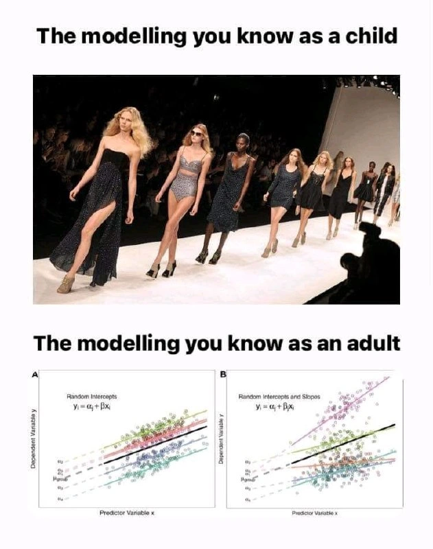
Imagine you hear the word “modeling.” As a kid, you probably think of someone walking down a stage in fancy clothes – like a fashion show where people model outfits. It’s shiny, it’s glamorous, and there are bright lights. Now fast forward to adulthood, and suppose you become a scientist or work with computers. When you say you’re “doing modeling” then, you mean something totally different: you’re talking about making a model in the math or computer sense – kind of like drawing a line through a bunch of points on a graph to predict or explain something. The meme is funny because it shows these two very different meanings of the same word side by side. The top picture shows the kind of modeling a child imagines (fashion models on a runway), and the bottom picture shows the kind of modeling an adult data geek does (a graph with lines and numbers). It’s a surprise comparison – like expecting a big bowl of ice cream but getting a bowl of vegetables instead (or vice versa). The humor comes from that mismatch: we all find it a bit silly and amusing that “modeling” can mean walking in designer dresses or crunching numbers on a computer. The meme basically says, “When I was little, I thought modeling was all about catwalks, but now I’m grown up and for me modeling is about charts and formulas.” It’s pointing out that growing up can change the meaning of things, and that contrast is what makes us laugh.
Level 2: Sequins to Scatterplots
When you’re a kid, “modeling” usually means one thing: fashion modeling. You picture people on a stage (a runway or catwalk) wearing designer clothes, with bright lights flashing. It’s all about glamour, shiny dresses, and striking poses. For example, the top half of the meme shows exactly that – a line of fashion models walking down the catwalk in stylish outfits. That’s the world of modeling a child is familiar with: essentially, being a model means showing off clothes in magazines or fashion shows. It’s an exciting, very visual idea.
As you get older and especially if you step into science or tech, you discover that modeling can also mean something completely different. In Data Science or Machine Learning, “modeling” refers to building a mathematical model – basically an equation or algorithm that tries to represent how things relate to each other in data. The bottom half of the meme is illustrating this kind of modeling. Instead of people on a runway, we see two scatter plots (those are graphs with dots representing data points). Each dot might be a measured observation (say, each dot could be a person’s height vs weight, or some input x vs output y in an experiment). The lines drawn through those dots are regression lines – think of them as best-fit lines that capture the trend of the data. In data terms, to “model” something means to create such a line (or curve or more complex algorithm) that captures the pattern in the data, so you can predict or understand the Dependent Variable (y) from the Predictor Variable (x). In the charts shown, the x-axis is labeled “Predictor Variable x” and the y-axis “Dependent Variable y,” which is standard for this kind of data visualization: x is an input and y is the outcome we care about.
Now, the captions under those graphs, “Random intercepts” and “Random intercepts and slopes,” sound a bit jargony, so let’s break them down. Imagine you have data that is grouped into categories. For example, suppose you collected test scores (y) from students across several different classrooms, and x is the hours of study. Different classrooms might have overall different performance levels (maybe one class had a stricter teacher so everyone scored a bit higher on average). A random intercepts model means we allow each group (each classroom in this example) to have its own starting point or baseline – that’s the intercept (the value of y when x=0). “Random” here implies that these intercepts are like random deviations for each group (we’re not fixing them by hand; we’re letting the data tell us each class’s average). In the graph Panel A, each colored cluster of points could be a different group, and each colored line has a different intercept $\alpha_j$ (denoted by those Greek alphas). All the lines are parallel in Panel A. That’s because the slope $\beta$ (how much y increases when x increases) is the same for every group – the lines rise at the same angle, they just start at higher or lower points on the y-axis. So “Random intercepts” = different vertical position for each group’s line, but same tilt.
Now look at Panel B, “Random intercepts and slopes.” Here, each group not only has its own intercept $\alpha_j$ but also its own slope $\beta_j$. That means each colored line can tilt differently. In a classroom example, maybe in one class, studying an extra hour boosts scores a lot (steep slope), but in another class, it boosts scores only a little (flatter slope). On the graph, you see the lines are no longer parallel – they fan out or criss-cross because each has a unique slope $\beta_j$ in addition to its own intercept. This is a more flexible model, letting each group follow its own trend line more independently. These concepts come from mixed_effects_models in statistics: “mixed effects” just means our model includes some effects that are constant for everyone (fixed effects, like the overall idea that study hours help scores) and some that vary by group (random effects, like each class’s individual baseline and maybe its own study-hour effect). A model with random intercepts and slopes is a specific type of hierarchical model where each group has its own mini-line within the big model. It’s hierarchical because there are two levels of variation: overall variation (how y depends on x generally) and group-level variation (how this relationship shifts for each group).
So, the bottom half is essentially showing a data visualization of a statistical model’s result: lots of colorful data points and fitted lines for each category. To someone in DataScience, that image is recognizable as the output of a regression analysis on grouped data. Those formulas $y_i = α_j + β x_i$ etc. are just a compact way of writing “for an individual i in group j, the predicted y is (some baseline specific to group j) + (some slope * x for that individual).” It might look intimidating if you’re new to it, but it’s basically the equation of a line (y = mx + b form) with a twist that b (the intercept) and m (the slope) can differ depending on the group.
Now, why is this funny again? Because of the huge disconnect between the two meanings of “modeling.” The meme’s top says “the modeling you know as a child” and shows the familiar glamorous scenario. The bottom says “the modeling you know as an adult” and shows what, to a non-data person, would seem like a dull graph with some math. If you’re a young software developer or data analyst, you might relate to this: you learned that the term model isn’t always about runways. Sometimes it’s about algorithms, charts, and StatisticalAnalysis. The meme is basically a light-hearted nod to how our perspective changes. The child version of you thought of fashion models; the adult version of you deals with statistical models. We even spell modelling the same way, but mean such different things! That surprise is exactly the joke.
Think of it this way: The word “model” is like a dress that can fit two very different occasions. In one case, it’s literal fashion and beauty. In the other, it’s all about numbers and data beauty (finding patterns). Both involve creativity in a sense – one with clothing designs, the other with mathematical designs – but you wouldn’t know that as a kid. So the meme contrasts “sequins” with “scatterplots,” if you will. Those scatterplots in Panel A and B are basically the adult’s version of a “fashion show”: not as sparkly, but for data geeks, each colored line is exciting because it reveals something about the data. The humor clicks especially for folks who do MachineLearning or data analysis, because the phrase “I’m working on a model” is daily lingo – and it no longer has anything to do with posing for photos.
In summary, the top half = fashion modeling (the art of walking in high heels and designer clothes), and the bottom half = statistical modeling (the science of fitting lines to data). The meme brings these together to highlight the play on words. Even if you’re relatively new to tech, you likely know by now that “model” in tech doesn’t mean a person on a runway – it can mean a machine learning model or a data model. This meme just dramatizes that difference in a fun, visual way. By showing actual regression charts labeled with terms like random_intercepts, it doubles down on the nerdy side of “modelling.” You can almost hear the collective giggle of data scientists who see this and think, “Yep, that’s my life – explaining to my family that no, I’m not into fashion, I just really like DataVisualization and regression lines!”
Level 3: Chic vs Greek Letters
This meme plays a classic trick of tech humor: it exploits a single word with dual meanings – “modeling.” The top half says “The modelling you know as a child,” and shows glamorous fashion models on a runway, the epitome of chic. The bottom half says “The modelling you know as an adult,” and flips the script with scatter plots full of data points and regression lines (complete with α’s and β’s – those Greek letters we use for equations). It’s a perfect wordplay_on_modeling. As kids, many of us heard “modeling” and thought of supermodels, fashion shows, and magazines. But fast forward to adult life in tech or data science, and “modeling” likely means building a predictive model or doing statistical modeling. The meme humorously captures that shift in worldview: from catwalks to regression lines in one phrase.
The contrast is as stark (and comical) as it looks. The top image is all about fashion – people dressed to impress, bright lights, a runway (the literal “catwalk”). The bottom image is the realm of statistics – tiny dots on a graph, lines, and formulas. Visually and conceptually, these two couldn’t be more different, and that absurdity is exactly why it’s funny. It’s poking fun at how our adult careers and hobbies redefine common words. In the world of Data Science Humor, this resonates because many data analysts have had that conversation:
Friend: “So I hear you do modeling?”
Data Scientist (grinning): “Yes, but not the kind with cameras. I mean computer models – you know, equations and data.”
The meme basically says “not that kind of modeling” without using those words. It’s the gotcha moment: the reader sees “modelling” and a glamorous runway, then scrolls and – surprise! – it’s about charts and formulas instead. If you’ve ever tried explaining your day job to family or friends, you might’ve run into this. Tell your uncle you “build models at work” and watch him do a double-take – are you a fashion designer? a model maker? No, you’re tweaking a machine learning algorithm or a regression equation. Fashion_vs_statistics confusion at its finest.
For the seasoned developer or data scientist, the specifics in the bottom panel are a cherry on top. Those two scatter plots aren’t random; they illustrate a nuanced concept (random intercepts and slopes) that we encounter in StatisticalAnalysis. Dropping Greek letters $\alpha$ and $\beta$ into the meme is a tongue-in-cheek way of saying “yep, this is hardcore DataScience now.” It’s the Greek to the runway’s chic. The subtitle I’ve given this level – “Chic vs Greek Letters” – captures that exact juxtaposition: the chic world of fashion versus the Greek-letter-laden world of statistical models. We’ve traded sequins for scatter plots and Vogue for variance components.
This kind of joke hits home for data folks because it’s both self-deprecating and celebratory. On one hand, it’s saying: remember when “modelling” sounded cool and glamorous? Now our reality is debugging code and analyzing graphs at 2 AM, wheee! There’s definitely an element of “growing up to be less cool than we thought” humor. On the other hand, it’s also a proud nerd moment – we find beauty in those regression lines! 😃 The fact that we get excited about an $R^2$ value or a well-fitted mixed model is endearing in its own way. Instead of judging models by their poses, we judge our models by their fit (how well they explain the data). Your younger self might have cared about a model’s outfit; your grown-up self cares about a model’s output (like predictive accuracy). As one might joke: “Sure, she’s a supermodel, but have you seen the predictive power of my multi-level regression? That’s stunning!”
Another layer to the humor is how data visualization replaces glitz. The runway has spotlights and flair; our scatterplot has color-coded points and regression lines. For a data scientist, those colored clusters tell a story just as intriguing as a fashion line’s new collection – each cluster (perhaps each color) is a category or group, each line a summary of a trend. We secretly find that exciting. The meme acknowledges this nerdy excitement. It says: the things that thrill us as adults are so different, yet we still call it “modeling.” It’s a bit like an inside joke among analysts, gently teasing how arcane and detailed our work is compared to the sparkly concept a kid imagines.
Historically, this also reflects how language evolves in different fields. “Model” has always meant a representation of something – a fashion model represents style ideals, a statistical model represents data patterns. So it’s natural the word spans domains. But the meme banks on the emotional whiplash of that realization. It’s the same kind of chuckle you get when you see memes about “I thought I’d be doing cool hacking like in movies, but actually I’m googling error messages all day.” Here, it’s “I thought I’d hear ‘modeling’ and see haute couture, but actually I see Python notebooks with scatter plots.” For many of us, that’s our daily life in DataScience — maybe not as photogenic as a runway, but intellectually rewarding (and, apparently, a source of great puns!).
In short, the meme succeeds because it connects two completely different worlds with one word, letting us laugh at the contrast. It’s DataScienceHumor 101: take a term or scenario, flip its meaning between tech and non-tech contexts, and enjoy the nerdy giggles. The next time someone says they “love modeling,” you can smirk and think, “me too – linear regression modeling, that is.” This meme had us at the bold caption – we know the punchline is coming, and when those scatter plots appear, we still crack a smile because yep, that’s the modelling we know and love as adults. Who needs a catwalk when you have a well-calibrated model, right? 🎉📊
Level 4: Hierarchical Haute Couture
On the bottom half of this meme we plunge into advanced statistical modeling territory – specifically the realm of mixed-effects models, also known as hierarchical linear models. Those cryptic equations (like $y_i = \alpha_j + \beta x_i$ and $y_i = \alpha_j + \beta_j x_i$) are not runway measurements, but formulas describing how random effects work in regression. In Panel A (“Random Intercepts”), each group $j$ has its own intercept $\alpha_j$ while sharing a common slope $\beta$ for predictor $x$. In other words, the regression lines for different groups are all parallel – they rise at the same rate (same $\beta$) but start at different heights ($\alpha_j$ shifts each line up or down). Mathematically, we’re modeling something like:
$$ y_{ij} = \alpha_j + \beta , x_{ij} + \epsilon_{ij}, $$
where $i$ indexes individual data points and $j$ indexes the group (for example, $j$ could be a particular school, patient, or category). Here $\alpha_j$ is a random intercept – we assume each group’s baseline $\alpha_j$ is a random variable (often modeled as $N(\mu_{\alpha}, \sigma_{\alpha}^2)$) that can differ by group, capturing variability between groups. The slope $\beta$ is a fixed effect (one value shared by all, representing the overall trend of $y$ vs $x$).
In Panel B (“Random Intercepts and Slopes”), the model gets more fabulous (statistically speaking): now each group $j$ has its own slope $\beta_j$ in addition to its own intercept $\alpha_j$. The formula expands to:
$$ y_{ij} = \alpha_j + \beta_j , x_{ij} + \epsilon_{ij}, $$
meaning regression lines can differ in their tilt as well as their height. Visually, the lines in Panel B have various slopes – some steeper, some flatter – not just vertical shifts. Each group’s trend line struts at its own angle. We treat ${\alpha_j, \beta_j}$ as random variables for each group, usually assuming they come from some multivariate normal distribution around a global trend. This random slopes model acknowledges that different categories or clusters might not only start at different points but also respond to $x$ differently. It’s a powerful concept in Statistical Analysis and Data Science for modeling hierarchical or grouped data: it accounts for both within-group and between-group variability.
This approach is central to hierarchical_linear_models theory – we’re effectively adding another level of hierarchy. For example, if we were analyzing student test scores (y) against study hours (x) across multiple classrooms (groups), a random-intercept model lets each classroom have its own baseline performance, and a random-slope model further lets each classroom have its own learning rate per study hour. The fancy term “mixed-effects” comes from mixing fixed effects (overall population-level effects) with random effects (group-specific deviations). Statisticians love this because it provides partial pooling: each group’s line is influenced by that group’s data and the overall trend, often yielding more robust estimates especially when some groups have sparse data. Under the hood, fitting such models involves heavier machinery (e.g. iterative REML algorithms or Bayesian MCMC sampling) than an ordinary regression – we’re estimating distributions of parameters, not just single values.
To a data scientist, the bottom images scream familiar technical details. We might even write code to fit these models, using something like R’s lme4 or Python’s PyMC. For instance, in R one could specify:
# Using R's lme4 package to demonstrate:
lmer(y ~ x + (1 | group), data = data) # random intercept model (α_j for each group)
lmer(y ~ x + (x | group), data = data) # random intercept & slope model (α_j and β_j for each group)
In the first model, (1 | group) tells R to give each group its own intercept; in the second, (x | group) grants each group both its own intercept and slope. The result matches what the meme’s Panel A and B depict: parallel lines for each group in the first case, and differently tilted lines in the second.
It’s pretty elegant math – DataVisualization of these models (like the scatter plots shown) helps us literally see how group-specific lines behave. Instead of haute couture gowns, we have regression lines walking down the “runway” of the plot. And note those Greek letters in the formulas: $\alpha$ (alpha) and $\beta$ (beta) are standard statistical notation for model coefficients, quite the “Greek letters” of the adult modeling world. We’ve traded the glitz and glamour of fashion for the Gaussian distributions and goodness-of-fit of statistics. In a way, each colored line in those charts is strutting its stuff across the graph, just as each fashion model struts down the catwalk – only here it’s fashion_vs_statistics at a deeply technical level. The meme is cheekily juxtaposing these two worlds: what “modeling” means in a DataScience context (complex math and careful StatisticalAnalysis) versus the very different meaning it has in everyday life. It’s a clever nod that as we grow up (and for some of us, dive into data), the word “model” transforms from supermodels under spotlights to super models under scrutiny of our algorithms.
Description
Meme split into two horizontal halves. Top caption in bold black text reads, "The modelling you know as a child." Below it is a runway photo with fashion models in dark dresses and swimsuits walking toward the camera under bright lights; faces are blurred for anonymity. Bottom caption says, "The modelling you know as an adult." Under that are two side-by-side scatter-plot panels labeled "A" and "B." Panel A heading: "Random Intercepts yᵢ = αⱼ + βxᵢ" shows multi-colored points grouped by category with parallel regression lines of differing intercepts. Panel B heading: "Random Intercepts and Slopes yᵢ = αⱼ + βⱼxᵢ" shows points with regression lines of varying slopes and intercepts. Meme humor arises from the wordplay on “modelling,” contrasting childhood exposure to fashion modeling with adult life in data science, mixed-effects regression, and statistical analysis
Comments
6Comment deleted
I used to worry about a model tripping on the catwalk; now I worry about my random-slope mixed-effects model tripping on a singular covariance matrix - either way, someone face-plants in production
The only runway that matters now is the one where your model gracefully overfits on training data before catastrophically failing in production
Ah yes, the classic career pivot: from worrying about whether your model can walk in heels to worrying about whether your model can handle heteroscedasticity. Both require careful fitting, though only one involves regularization techniques - and ironically, it's not the fashion industry. At least with statistical models, you can actually explain the variance in your results to stakeholders without resorting to 'it's just the aesthetic.'
Fashion models turn heads; data models turn correlated covariates into headaches
Kid: modelling is a runway; adult: modelling is a mixed-effects chart proving each microservice has its own random intercept (baseline latency) and random slope (how fast it degrades under load) - aka the org chart rendered as math
Amazing how “modelling” evolved from runways to arguing about random slopes while Stan throws divergences and the PM wants it explainable by EOD