Fail Fast Before The Bridge
Why is this UX UI meme funny?
Level 1: The Practice Bump
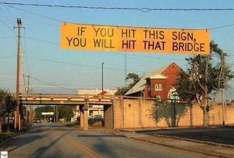
Imagine putting a soft practice bar before a doorway. If your tall backpack hits the practice bar, you know it will hit the doorway too. That is why the sign is funny: it is basically saying, "If you mess up here, trust me, the next mistake will be worse."
Level 2: Smoke Tests With Asphalt
An input validator checks whether something is acceptable before the system uses it. A fail-fast design reports a problem as early as possible instead of letting the user continue toward a bigger failure. A smoke test is a quick check that catches obvious breakage before deeper testing or real use.
The road sign does all three. The bridge is the real danger, but the sign is placed earlier. If a vehicle hits the sign, that is evidence the vehicle is too tall for the bridge ahead. The driver gets a clear warning before the worse crash happens.
For junior developers, this maps directly to everyday coding. Check that a password meets requirements before submitting the form. Check that a config file exists before starting the service. Check that tests pass before deploying. A small early failure can save hours of cleanup later.
Level 3: Cheap Failure First
The sign is a perfect physical implementation of a software principle:
IF YOU HIT THIS SIGN, YOU WILL HIT THAT BRIDGE
It is funny because the warning is not abstract, polite, or buried in documentation. It is a fail-fast validator hanging before the expensive failure. If a truck is too tall, the driver learns that by hitting a relatively cheap sign before hitting the bridge. In software terms, this is input validation before persistence, a smoke test before deployment, a schema check before ingestion, or a dry run before production writes. The system catches the bad condition at the boundary, where the blast radius is smaller.
The post message calls it "Smoke tests in the wild", which is exactly right. A smoke test does not prove that every edge case works; it proves that the obvious catastrophic path is not already on fire. This sign does not compute every clearance scenario, model driver behavior, or offer a rich onboarding flow. It answers one brutal question: if this object cannot pass the early marker, it cannot pass the downstream constraint either.
Good engineers appreciate this because late validation is how systems become expensive to debug. Let invalid data enter the database, let incompatible versions deploy, let malformed events reach consumers, or let a bad migration run halfway, and the failure becomes distributed archaeology. The bridge sign says what every API gateway, type checker, CI job, and preflight check aspires to say: stop here, because continuing will make the same problem worse and more expensive.
The UX is also excellent in its rude simplicity. There is no ambiguous color legend, no paragraph of liability language, and no "please consider your vehicle height as appropriate." It tells the user the consequence in the user's immediate context. That is the difference between an error message that says Invalid input and one that says File is over 10 MB; upload a smaller image or choose compression. One is technically true. The other prevents damage.
Description
A road photo shows a large yellow overhead sign stretched across the street before a low bridge. The sign reads, in all caps, "IF YOU HIT THIS SIGN, YOU WILL HIT THAT BRIDGE," with the bridge visible farther down the road. The visual joke is that the sign is a physical preflight check: a cheap, early failure before the expensive, structural one. In software terms, it is input validation, fail-fast design, and user-facing error prevention implemented with brutal clarity.
Comments
1Comment deleted
The best validator is the one that fails before the customer turns the production database into a clearance test.