The Irony of Poorly Planned Design Docs
Why is this Documentation meme funny?
Level 1: When Plans Go Wrong
Imagine you’re drawing a huge poster for school that’s supposed to say “Happy Birthday” in big letters. You start writing the words really large, but uh-oh, by the time you get to the end of “Birthday,” you’ve run out of space on your poster. 😬 What do you do? You squish the last few letters down the side of the poster in a vertical line. It looks pretty silly, right? Anyone who sees it can tell you didn’t plan out the spacing well. You meant to have a perfect, neat sign, but the result is awkward and kind of funny-looking.
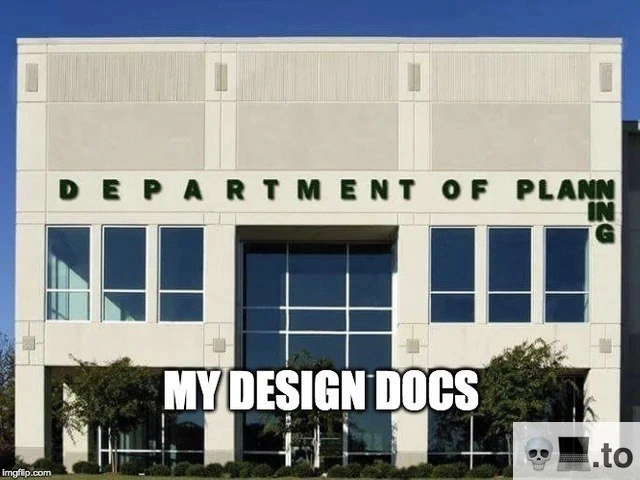
This meme is just like that, but for grown-up work projects. The picture shows a building for the Department of Planning (basically an office of people who plan things). The name “Department of Planning” on the building is written in big letters, but they didn’t fit on the wall correctly. Most of the word “Planning” is on one line, and the last part “ING” got stuck going downwards at the end because someone didn’t measure or plan it right. It’s a goofy mistake: the very people who are supposed to be good at planning made a sign that looks unplanned! The text at the bottom of the meme says “MY DESIGN DOCS,” meaning the person who made the meme is joking that the plans they write for their software projects (their design documents) end up looking as clumsy as that mis-spaced sign.
Why is that funny? It’s the irony that even plans can be poorly planned. It feels like when you try really hard to organize something, but it still comes out a bit messy. Even adults working on important projects sometimes have their plans turn out awkwardly, just like a kid running out of room on a poster. The meme makes us laugh because we all know the feeling: you had one job – to make a clear plan – and somehow it went wrong in a way everyone can see. But instead of getting upset, the person is laughing at themselves and saying, “Yep, that’s my work sometimes!” It’s a friendly reminder that nobody’s perfect and even the experts can make mistakes that are obvious and amusing. Just like a funny crooked sign, a mixed-up plan can make people smile and say, “Wow, that didn’t go as expected, did it?”
Level 2: Plan vs. Reality
In the world of software development, design docs (design documents) are like the blueprints for your code. During the planning phase of a project – an essential part of the SDLC, or Software Development Life Cycle – engineers write down how they intend to build a system. This includes outlining the system’s architecture (the big picture of how components interact), drawing diagrams of data flow or class relationships (think of these like maps of the code), and sometimes mentioning design patterns. Design patterns are common solutions to recurring problems – for example, a “Singleton” pattern ensures only one instance of a class exists, and an “Observer” pattern defines a neat way for parts of a system to receive updates. A good design doc might say, “We’ll use the Observer pattern for the notification module,” to communicate a clear plan. In theory, all of this planning should be very organized and consistent – the documentation should read logically from start to finish, just like a well-made sign’s text runs in one straight line.
Now, the meme shows a building sign that says “DEPARTMENT OF PLANNING,” but the word is split awkwardly. Most of the letters are in one row, and the last three letters “ING” are shoved vertically at the end because they literally didn’t fit in the row. Imagine walking up to a government building and seeing that – you’d probably chuckle or scratch your head. It’s obviously a mistake or a result of poor planning for the sign’s design. The sign was supposed to proudly display Department of Planning in one line, but whoever made or installed it realized too late that they ran out of space. Instead of rethinking it, they just stacked the remainder at the side. This visual goof is instantly recognizable even to a junior developer or a newcomer: something didn’t go according to plan in the planning department’s own plan!
The caption on the meme, “MY DESIGN DOCS,” tells us that the person sharing it feels their design documents look just as clumsy and misaligned as that sign. For a new software engineer or student, here’s why that’s funny: design documents are supposed to be the picture of carefully laid-out thinking. When done right, anyone reading the doc should easily understand the plan for the software. But in reality, especially when we’re in a rush or still learning, our documentation can end up messy:
- Sections might be incomplete or out of order because we forgot something and added it later.
- The formatting could be inconsistent – maybe headings and bullet points don’t line up (just like the letters on the sign).
- Sometimes different team members write different parts, and it shows – the tone and details jump around.
- Worst of all, the design doc might not match the final code at all if things changed mid-way (nobody updated the “blueprint”).
This contrast between expectation and reality is exactly the joke. We expect the Department of Planning to have a perfectly planned sign (of all things!), just like we expect design docs to be perfectly thought out. When those expectations are violated in such an obvious way, it creates humor. It’s a bit of DocumentationWoes that many developers face: you plan and plan, yet somehow your plan document still ends up looking like it was planned on a napkin. New developers quickly learn that maintaining good documentation is hard – it’s an ongoing effort, and if you’re not careful, you’ll produce something confusing or laughable in hindsight. This meme is a light-hearted warning and admission: even the pros end up with wonky design docs sometimes! It says, “Hey, you’re not alone – look, even my docs turn into a bit of a joke.” And by comparing it to that ridiculous building sign, the meme makes the lesson memorable: don’t let your documentation look like a bad sign. Or if it does, at least we can all share a laugh about it in true DeveloperHumor fashion.
Level 3: Misaligned Master Plan
Software design documentation is supposed to be the neatly architected blueprint of a system, much like a building’s official signage should be perfectly aligned. This meme hilariously exposes the gap between that ideal and reality. The image shows the Department of Planning building with its own name grotesquely misaligned: “DEPARTMENT OF PLANN” on one line and the last “ING” awkwardly stacked at the edge. The caption “MY DESIGN DOCS” suggests that the meme creator’s software design documents are just as embarrassingly disjointed. It’s a prime example of Developer Self-Deprecation and DocumentationHumor rolled into one visual gag. Seasoned engineers immediately recognize the irony: a place dedicated to planning failed to plan its sign layout, just as our carefully titled Design Docs often fail to deliver a coherent design.
From an experienced perspective, this humor cuts deep. In a well-run SDLC (Software Development Life Cycle), the design phase should produce comprehensive docs describing system architecture, interfaces, and even references to Design Patterns (proven solutions like Singleton or Observer that provide structure). Those docs are meant to be consistent and meticulously organized. However, in practice, schedules slip, requirements change, and design docs turn into a patchwork of last-minute edits. The result? DocumentationWoes – diagrams that don’t line up with text, sections that contradict each other, and pages that read as if two engineers wrote them in isolation at 2 AM (because they probably did). The meme’s broken sign is a Physical World analog of these issues: the letters of “PLANNING” didn’t fit as intended, so someone simply tacked the overflow vertically. Likewise, we’ve all seen design docs where new features or changes are awkwardly shoehorned into an appendix or tacked onto the end in a different font.
Why is this so relatable? Because it lampoons a common anti-pattern in system design and documentation: the illusion of planning. Often in corporate projects, teams create a “Department of Planning” on paper – elaborate architecture reviews, glossy design templates – yet the end product (or its documentation) is a misaligned jumble. This sign fail perfectly symbolizes that phenomenon. The Architecture might be described with big UML diagrams in the doc, but when you inspect closely, you find half of the important details were forgotten until later and then dumped in as an afterthought (the vertical “ING” of the doc). Every senior developer chuckles (or winces) because they’ve endured projects where the design documentation itself needed design help. It’s a bit of cathartic DeveloperHumor: acknowledging how far reality falls from theory. After all, nothing screams “We know what we’re doing!” like having to duct-tape stack letters on a building – or on a design spec – because the plan didn’t actually plan for change.
In short, the meme cleverly compresses a thousand war stories into one image. Documentation that doesn’t line up, design guidelines that weren’t followed, best practices thrown off the balcony – it’s all there. The bold white caption “MY DESIGN DOCS” is the engineer owning up to their flawed artifacts with a sarcastic grin. The humor works on multiple levels of irony: the Department of Planning couldn’t plan its sign, and we software folks who preach good design often produce documents as mangled as that signage. It’s a gentle roast of our industry’s habit of treating documentation as an afterthought. As veterans like to say with a smirk, “Perfect planning, meet perfect execution… or not.” Here, the not-so-perfect execution is plain as day (or as letters on concrete), and we can’t help but laugh (and maybe cry a little) at how accurately that reflects our own DesignPattern-laden docs gone awry.
Description
The meme displays a photograph of a modern, multi-story office building. The sign on the building reads 'DEPARTMENT OF PLANN...ING', with the last three letters 'ING' awkwardly misaligned and crammed vertically to the side, indicating a significant failure in planning and execution. Overlaid at the bottom of the image is the text 'MY DESIGN DOCS'. The humor stems from the irony of a 'Department of Planning' having such a poorly planned sign, which is then directly compared to the quality of one's own design documents. For experienced developers, this is a highly relatable self-deprecating joke about the frequent reality of creating design docs: they are often rushed, poorly thought out, or quickly become obsolete, much like this comically flawed sign

Comments
11Comment deleted
My design doc is a perfect example of eventual consistency; the implementation will eventually be consistent with something, just not what's in the doc
My design docs aren’t incomplete - they’re just horizontally partitioned across Confluence and six stale Google Docs, pending eventual consistency
Just like our design docs, it looks complete from a distance until someone actually needs to use it and discovers critical pieces were never implemented
The Department of Planning building ran out of space for its own sign - a perfect metaphor for every design document that starts with comprehensive architecture diagrams and ends three sprints later with a hastily updated README that just says 'see Slack thread from Q2 2019.' At least the building's technical debt is literally carved in stone, unlike our Confluence pages that link to deprecated wikis that reference deleted Jira tickets
When 'planning' doesn’t fit on one line in the doc, neither will your NFRs in production
Like my design docs: PLAN on page 1, NING in another Confluence space, and the I is in a deleted Slack thread
Design docs so grand, they qualify for historic preservation - untouchable and eternally maintained
Lol Comment deleted
They planned the building to be wider Comment deleted
Or letters to be smaller Comment deleted
Planner must be a css programmer Comment deleted