Data Scientists Choose The Data
Why is this DataScience meme funny?
Level 1: Looking At Footprints
This is like ignoring a person standing in front of you and staring only at their footprints because footprints are easier to measure. The footprints can tell you something, but they are not the whole person. The joke is funny because the data scientists care so much about the clues that they forget the users who made them.
Level 2: Users Become Rows
Data science uses statistics, programming, and domain knowledge to learn from data. In product work, that data often comes from user behavior: button clicks, page views, purchases, searches, errors, support tickets, and survey answers.
User research tries to understand people more directly through interviews, observation, usability tests, and feedback. The two approaches should support each other. Data can show that many users abandon a checkout flow; research can reveal that the shipping estimate appears too late or the form rejects valid addresses.
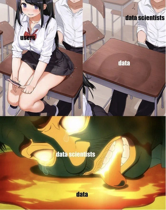
The meme is funny because it shows data scientists ignoring the person labeled users and focusing intensely on the thing labeled data. That is the mistake: treating collected data as if it contains the whole truth. Data is powerful, but it is shaped by what you chose to track, how the product works, who used it, who avoided it, and what context is missing.
For newer developers and analysts, the practical lesson is to ask what the metric represents. If active users go up, did the product become better, or did notifications become noisier? If time on page increases, are people engaged, or are they lost? Data answers questions, but only the questions you frame carefully.
Level 3: Optimizing The Proxy
The image labels the seated person as users, the desk mark as data, and the intense face in the bottom panel as data scientists staring into data. The joke is not subtle: the people who produce the signal are right there, but the professional obsession has shifted to the residue they leave behind. It is a brutal little diagram of how data science can drift from understanding humans to worshipping measurable exhaust.
At a senior level, this is about proxy metrics. Data scientists rarely observe “user happiness,” “trust,” “confusion,” or “this workflow makes me want to close the laptop and become unavailable.” They observe clicks, sessions, retention curves, conversion rates, event logs, survey responses, and model features. Those can be useful, but they are not the user. The meme’s empty desk stain labeled data is funny because it shows the abstraction receiving more attention than the source.
The systemic issue is incentive alignment. Teams are rewarded for dashboards, models, experiments, and statistically defensible claims. Talking to users is messier: people contradict themselves, context changes the answer, qualitative notes do not fit neatly into a feature matrix, and inconvenient feedback can disrupt a roadmap. So the organization gradually learns to prefer the dataset because the dataset is easier to query and less likely to ask why the product is hostile.
This is how respectable analysis becomes nonsense with confidence intervals. A model can segment users beautifully while missing why they are frustrated. A funnel chart can show where people drop off without explaining whether the interface is confusing, the pricing is scary, or the onboarding copy sounds like it was translated through a procurement spreadsheet. The meme exaggerates data scientists as hypnotized by data, but the critique is broader: metric-driven cultures can forget that measurement is a map, not the territory.
The post caption, “I'm sorry,” fits because the image is intentionally uncomfortable. It is apologizing for making the hidden preference visible. Many teams say “user-centric,” but their daily rituals ask, “What does the dashboard say?” more often than “What did a user actually experience?” Naturally, the roadmap then ships a beautifully optimized solution to a problem no one has in that shape.
Description
The meme is a three-panel anime collage: the left panel shows a classroom scene with a seated student labeled "users," while the right panel focuses on an empty desk stain labeled "data" and a person labeled "data scientists." The large bottom panel shows a distorted, intense cartoon face pressed toward a glowing puddle labeled "data," with the face labeled "data scientists." The joke is that data scientists can become more fascinated by extracted behavioral data than by the actual users who produced it, satirizing metric-driven work that forgets the human system behind the dataset.
Comments
6Comment deleted
The model has a perfect AUC on missing the point.
sorry for what? Comment deleted
For "datasatanist"))) Comment deleted
Fuck off Comment deleted
Your deed is unforgivable SHAME!! Comment deleted
I want the name of this meme TwT Comment deleted