Skip to content
DevMeme
1093 of 7435
When Form Over Function Hides Financial Ruin
UX UI Post #1230, on Apr 2, 2020 in TG

When Form Over Function Hides Financial Ruin

Why is this UX UI meme funny?

Level 1: Fancy but Flawed

Imagine you have a really fancy picture book with shiny, curvy decorations all around the edges of each page. It looks amazing and expensive, and you’re excited to read your story. But when you get to the most important part of the story – the big surprise or the scary twist – you realize something awful: the decorative border is covering up the last line of text and part of the picture! You can’t see how the story’s big moment actually looks because the curved, fancy frame on the page is in the way. That’s exactly what this meme is joking about, but with a phone instead of a book.

In the meme’s case, the fancy phone has a screen that curves at the edges (kind of like a page with a fancy curved frame). On that screen there’s a chart showing how a stock (like a piece of a company you can buy) is going up and then suddenly falls down – that fall is the really important “uh-oh!” moment, just like the big twist in a story. But because the phone’s screen is curved and stylish, it literally hides the falling part of the chart off the side. It’s like the phone is so stylish that it won’t let you see the bad news. The emotional punchline is that the person paid a lot of money for this super nice phone, and yet that phone’s design is stopping them from seeing something really important (the fact that their stock’s value is crashing). It’s a funny and kind of silly situation, right? It’s poking fun at how sometimes something can be really pretty and high-end, but not very practical. In simple terms: your cool, expensive gadget might be just too fancy for its own good!

Level 2: Form vs Function

Let’s break down what’s happening in this meme in simpler terms. We have a smartphone with curved edges on its screen, and it’s showing a candlestick chart in a stock trading app. A candlestick chart is a type of financial graph used in FinTech (financial technology) apps to show how a stock’s price moves over time. Each “candlestick” (the little red or green bar with lines sticking out) shows one period’s price data – for example, one day’s high, low, opening, and closing prices. In the image, those candlesticks form a mountain-like line. The important part is the big drop on the right end of the chart – that represents a stock market crash (a sudden, steep fall in prices).

Now, the funny (and frustrating) part: the phone’s curved_smartphone_screen design is actually hiding that crucial drop. Many high-end smartphones nowadays have screens that curve along the sides instead of being flat. It’s an eye-catching UXDesign choice meant to make the display look “infinite” or futuristic, with no visible border. However, this design can cause UX failures when apps aren’t prepared for it. “UX” stands for User Experience, basically how well a product’s design works for the person using it. A UX failure means the design is failing the user in some way. In this case, the edge display is causing a data_occlusion issue – “occlusion” means something is blocked or hidden. Part of the chart (the data) is literally going off the visible part of the screen due to the curve.

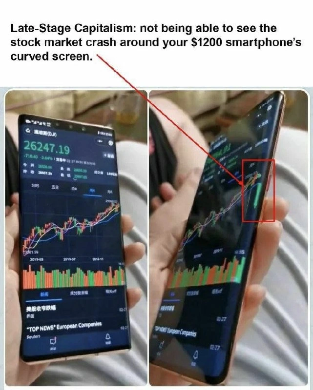
Think of the phone screen like a small TV. If the TV is flat, you see the full image. If the TV was bent around the edges of a wall, you might miss what’s shown at the far sides unless you move your head. That’s what’s happening here: the far right side of the stock chart is bent away on the phone’s curved screen, so the viewer can’t see the last data point (which happens to be super important: the big crash!). The meme highlights this by showing two photos of the phone: one more straight-on (left) where you can see the chart climbing, and one at an angle (right) where the screen’s curve makes the end of the chart disappear. They even drew a red arrow and rectangle to emphasize the missing candlestick on the curved side.

Why did this happen? Probably because the app’s MobileDevelopment didn’t account for the unusual screen shape. Developers usually design app layouts for standard flat rectangles. But modern phones can have notches, rounded corners, and curved edges. Good mobile app design includes using “safe areas” or margins so that important content isn’t placed where the screen might cut it off or distort it. For example, on an iPhone with a notch or on Android phones with camera cut-outs, you typically add some padding or use system guidelines so text and buttons don’t end up behind the notch. With curved edges, manufacturers often provide recommendations too, because the last few pixels on a curve might be hard to see or register touch. If the team behind this stock app didn’t thoroughly test on a device with a curved screen, they might not have realized the chart’s edge is not fully visible. It’s an easy oversight: on phones without curved edges, that chart would look fine, filling the screen nicely. But on this fancy phone, the same layout results in the chart’s rightmost part literally curving away.

The meme calls this situation “Late-stage capitalism” as a tongue-in-cheek joke. Late-stage capitalism is a phrase people use humorously (and a bit sarcastically) to describe absurd or ironic problems that appear in a very developed, consumer-driven economy. In other words, it pokes fun at how companies make super expensive, high-tech products (like a $1200 phone) that have these ridiculous flaws. Here the flaw is that the phone’s luxury design (curved display) interferes with seeing real-world bad news (a stock crash). It’s a form of TechSatire – using tech humor to make a point. We’re essentially laughing at the irony that someone could be holding an ultra-premium device, yet that device’s design is making them blind (even if momentarily) to something critical like losing money on the stock market.

For a junior developer or anyone new to UX/UI and MobileDevelopment, this meme is also a small lesson: DesignTradeoffs are real. “Form vs Function” is the classic way to put it – sometimes designers prioritize form (how pretty or sleek something looks) over function (how well it works). A curved screen is all about form: it’s aesthetically cool and grabs attention. But the function can suffer, as we see with content getting cut off. As a developer, you have to be mindful of these hardware quirks. If you were coding a trading app’s interface, you’d need to test it on various devices and maybe add a rule like “don’t draw chart data all the way to the extreme right edge if the screen is curved.” Many platforms provide tools for this. For instance, iOS has the UIView.safeAreaLayoutGuide to help you avoid placing views under notches or curved corners. Android has DisplayCutout APIs and lets you query screen shape and insets. In plain terms: you can ask the system “is there any part of the screen I should avoid for important stuff?” and adjust layouts accordingly. In this case, the app likely needed a right padding or to allow scrolling past the end a bit, so the last candlestick isn’t stuck on the curve.

The categories UX_UI, MobileDev, and Hardware tagged for this meme indicate exactly the mix of issues here. It’s a user interface design problem (UX/UI) arising from a hardware feature (curved screen), which a mobile developer would have to solve. And the common tags like UXFailures, DesignTradeoffs, HardwareHumor, FinTech tell us the humor is coming from a failed user experience in a financial app due to a hardware design choice. The context tags like edge_display_ui_bug and data_occlusion put specific names to it: it’s a UI bug caused by an edge display, where data is occluded (hidden). Meanwhile, stock_market_crash_visualization and candlestick_chart describe what’s being shown on screen – a visualization of a stock market crash with candlesticks – and curved_smartphone_screen plus mobile_ui_irony describe why it’s funny – the curved screen causing an ironic UI fail.

In summary, to a newcomer: this meme is showing the funny (and cringe-worthy) result of a mobile app UI not playing nicely with a fancy phone screen. It’s saying, “Look, you bought this super expensive phone with a cool screen, but now your app’s chart that shows your stocks crashing is literally cut off by that cool screen!” It’s both a tech lesson (always consider different device layouts) and a bit of social commentary (expensive doesn’t always mean better in a practical sense). And of course, it’s meant to make you chuckle and think, “Wow, what a fail – and thank goodness it’s just a meme and not my phone... right?”

Level 3: Edge-case Capitalism

The meme hilariously spotlights a design trade-off where cutting-edge hardware literally cuts off critical information. In the side-by-side images, a fancy smartphone with a curved screen is running a stock trading app. On a flat display, you'd see the entire candlestick chart, including a huge drop in prices – presumably the start of a stock market crash. But on this ultra-modern edge-to-edge OLED phone, that crucial red candlestick is wrapped around the curved edge, effectively invisible from a normal viewing angle. The top overlay text sums it up with dark humor:

Late-Stage Capitalism: not being able to see the stock market crash around your $1200 smartphone’s curved screen.

This caption nails the irony. Late-stage capitalism is referenced to mock how technological luxury (a $1200 phone!) ends up undermining practical needs. Here, hardware aesthetics (the curved edge display) conflict with UX design – literally obscuring data about a financial catastrophe. The meme blends HardwareHumor and UXFailures into tech satire: in an ultra-capitalist twist, your expensive gadget’s flashy design prevents you from seeing capitalism itself go down in flames (the stock chart plunging). It's a perfect storm of MobileDevelopment meets FinTech folly.

From a seasoned developer’s perspective, this scenario is an edge case both figuratively and literally. Modern mobile UX/UI has to account for all sorts of weird screen shapes: notches, hole-punch cameras, rounded corners, and yes, extreme curved_smartphone_screen designs. This particular phone’s display curves so much at the sides (often called a “waterfall display”) that content near the edges becomes data occlusion – visually hidden or distorted by the phone’s own geometry. It’s likely the app wasn’t fully tested or optimized for such an extreme screen. The developer probably laid out the candlestick_chart to fill the screen width, which normally is fine. But on a curved device, those last few pixels are bent away from view. Oops! This kind of bug is a classic UXFailure: the information is technically there, but the user can’t see it when it counts. As we often joke in development, “Works on my (flat) machine!” – the dev might have tested on a flat-screen device or emulator where everything looked dandy, never realizing a curved display UI bug would eat the most important candle.

Seasoned engineers have seen this pattern before: form over function biting back. Hardware designers chase futuristic looks (zero bezels! curved glass!) that marketers love, but then software folks must scramble to patch around the new feature. In this case, the edge_display_ui_bug is the unintended consequence of a trend. Remember when phones started having notches and initially some apps’ text or status icons were unintentionally hidden behind the notch? Similar principle here. Mobile OSes now provide safe area insets and APIs (DisplayCutout on Android, safeAreaLayoutGuide on iOS) so apps can avoid UI elements in those regions. But an edge curvature isn’t a simple cut-out – it’s part of the screen, just not easily visible. Ensuring that graphs or content don’t hug the extreme edges is now an implicit responsibility of the app’s layout design. A MobileDevelopment veteran might shake their head and add a padding or margin on the chart’s right side for curved-screen devices, ensuring that last candlestick stays on the flat part of the display. It’s a bit of a cat-and-mouse game: hardware keeps inventing new edge cases (pun intended), and developers adapt after learning the hard way.

The humor also works because it’s too real for anyone who follows finance or tech gadgets. In early 2020 (around this post’s date), a major stock_market_crash_visualization like the one shown would have been the sudden COVID-19 market plunge – a multi-year chart would show a giant red candle for March 2020. Many investors were obsessively checking their portfolio apps as markets tanked. Now picture a trader with a premium phone not seeing the cliff on the chart because of their phone’s curved edges. It’s a sardonic metaphor: being literally blind to an oncoming disaster because you’re using an ultra-high-end tool that ironically fails you when it matters. If you can't see the crash, maybe it isn't happening? 😅 That’s cold comfort and dark comedy rolled into one. The TechSatire here points out how absurd it is that a $1200 device – presumably bought for a superior experience – ends up delivering worse usability in a critical moment. Late-stage capitalism indeed: you paid for innovation that ironically leaves you ignorant of your tanking investments.

A grizzled engineer might also note how DesignTradeoffs like this have bitten us elsewhere in technology: sleek edge-to-edge screens often also cause accidental touches (palms triggering UI by mistake) and are more fragile when dropped (those curved glass sides love to crack). It’s a HardwareHumor trope: every cool gadget feature has a hidden cost. We removed headphone jacks for thinner phones – then had to deal with dongles. We made apps fullscreen on notched displays – then had to hack around missing pixels. Here, we got immersive curved screens – now we lose part of our charts. Each time, the ostensible progress (bigger screen, stylish design) introduces an ironic problem. As a result, experienced devs approach new flashy trends with a dose of cynicism. In design meetings, one might quip, “sure, let’s put critical info over the bend of the screen – what could go wrong?” The meme nails this sentiment. It’s simultaneously a laugh at the expense of impractical design and a knowing groan from anyone who’s had to debug visual quirks on fancy devices at 3 AM.

In short, the humor lands on multiple layers: mobile UI irony (the UI literally fails on a fancy phone), FinTech fragility (not noticing a crash doesn’t stop you from losing money), and biting commentary on tech consumerism. It’s a cautionary tale woven into a joke: be careful chasing shiny tech – you might just miss the forest for the (curved) glass. Or in this case, miss the market crashing because it fell right off your stylish screen.

Description

This two-panel image critiques a smartphone design trend. The top of the image has a caption: 'Late-Stage Capitalism: not being able to see the stock market crash around your $1200 smartphone's curved screen.' Below, two photos show a person holding a smartphone with a prominent 'waterfall' or curved-edge screen. The phone displays a stock market application with a line graph trending upwards. In the right-hand photo, a red arrow and a red box highlight the edge of the screen, where the end of the stock chart is distorted and obscured by the curve, making it impossible to see the latest data, which is implied to be a crash. The app's interface appears to be in Chinese, with some English text like 'TOP NEWS' and 'European Companies'. The meme is a sharp commentary on how prioritizing aesthetic design (the curved screen) over practical usability can lead to critical information being hidden from the user, a classic example of a UX/UI failure

Comments

7
Anonymous ★ Top Pick Product Manager: 'Our new waterfall display offers an immersive, bezel-less experience!' Engineer: 'Great, so it's immersive right up until the point the stock chart falls off the waterfall.'
  1. Anonymous ★ Top Pick

    Product Manager: 'Our new waterfall display offers an immersive, bezel-less experience!' Engineer: 'Great, so it's immersive right up until the point the stock chart falls off the waterfall.'

  2. Anonymous

    Curved displays: the hardware equivalent of a blanket try/catch - swallow the crash, ship to production, and let marketing call it ‘edge innovation.’

  3. Anonymous

    When your PM insists the curved edge display is "premium UX" but now your critical monitoring dashboards look like they've been through the same optimization pipeline as your production database queries

  4. Anonymous

    When your phone's edge-to-edge display literally implements 'graceful degradation' by hiding your portfolio's degradation - turns out the curved screen wasn't a feature, it was a coping mechanism. The hardware equivalent of wrapping production errors in a try-catch that swallows exceptions: sure, it looks sleek, but you're flying blind when things go south. At least when your React app crashes, you get an error boundary; when the market crashes, you get... geometric occlusion as a service

  5. Anonymous

    Enterprise risk management, mobile edition: render the chart edge‑to‑edge so the crash falls into WindowInsets - tail risk handled as a literal edge case

  6. Anonymous

    Curved screens: hardware's way of implementing 'works on my machine' for market meltdowns

  7. Anonymous

    PM: “Make sure we handle edge cases.” Mobile team: curves the screen so the crash renders off the bezel - overflow: hidden as a business model

Use J and K for navigation