Skip to content
DevMeme
1390 of 7435
Pennywise Meets a Modern Frontend Developer
Frontend Post #1563, on May 11, 2020 in TG

Pennywise Meets a Modern Frontend Developer

Why is this Frontend meme funny?

Level 1: Above Water

It’s like a scary clown is trying to trick you into using an old, leaky floaty to swim in a storm, but you have a strong new boat that keeps you safe and dry. The clown’s offer sounds dangerous and spooky, so you simply say, “No thanks, I’m using the good boat!” In other words, someone is pushing a sketchy old solution, but you stick with the safer, better one – and that’s why this scene is funny and satisfying.

Level 2: Floating vs Flexing

CSS Float: In web design, a float is an old positioning technique. When you apply float: left; or float: right; to an element (like an image or a sidebar), it floats to that side of its container, and other content (like text) wraps around it. This was originally meant for simple layouts, like wrapping text around pictures – for example, floating an image left so paragraphs flow on its right side. Developers in the early 2000s started using floats to create multi-column webpage layouts. For instance, you might have two <div> columns both set to float: left; so they sit side by side. It works, but it’s tricky: once everything is floating, the parent container can literally shrink to zero height (because in CSS, floated elements are taken out of the normal document flow). To avoid the parent element collapsing like an empty wrapper, developers had to clear the float afterwards or use a clearfix hack. The "clearfix" was a little CSS trick to force the parent to recognize the height of floated children – essentially an unspoken ritual every web developer had to memorize. Using floats for layout was like using a bandaid: it could patch things up, but wasn’t a sturdy solution for complex designs. It often led to layout bugs that were hard to debug, earning floats a reputation as a frontend horror for newbies and veterans alike.

CSS Flexbox: Enter Flexbox, the Flexible Box Layout module. This is a modern CSS layout system explicitly designed to make it easy to build responsive, flexible UI designs. To use it, you declare a container as display: flex;. That container then magically handles its child elements (flex items) in either a row or column, arranging them and distributing space according to rules you set (like justify-content for horizontal alignment and align-items for vertical alignment). With flexbox, if you want two columns, you don’t have to float anything or clear anything – you just say .container { display: flex; } and maybe .container > div { flex: 1; } to make two child <div>s evenly share the space. The parent automatically expands to fit its children (no collapse), and you get powerful options to center, stretch, or space-out items cleanly. For example, instead of wrestling with weird margins to center something, you can simply do align-items: center; on a flex container to vertically center all its items. Flexbox was a huge quality-of-life improvement for web developers when it became widely supported around 2015. It’s now a best practice for many layout needs (with CSS Grid handling even more complex two-dimensional layouts).

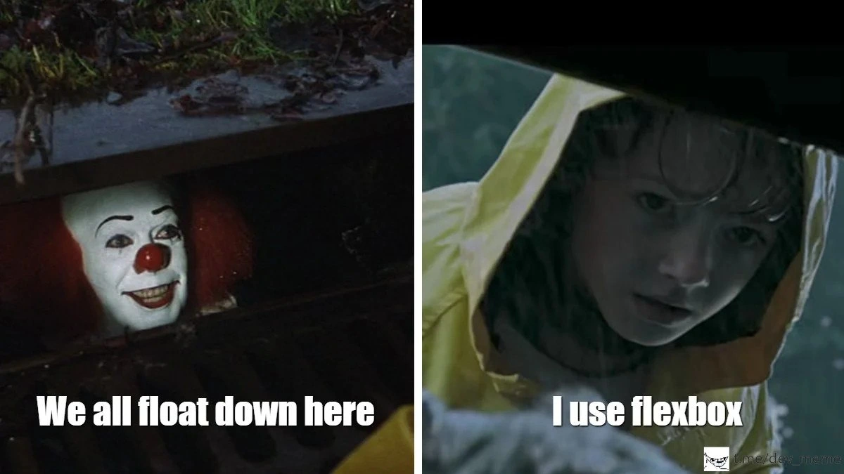
Let’s connect this to the meme panels. On the left, we have the clown in the sewer drain. That clown is Pennywise from Stephen King’s horror movie It. His famous line is “We all float down here.” In the movie it’s spooky – he’s talking about literal floating (in water, and a sinister implication about dead bodies). But in this meme, “float” is a tongue-in-cheek reference to CSS floats. The idea is that the clown represents outdated or “evil” CSS practices lurking in a dark place. He’s saying “Come here, we all use floats in these parts!” like an creepy invitation to do things the old way.

On the right, we have the little boy in the raincoat (Georgie from the movie scene) bending down towards the drain. In the meme caption, Georgie replies, “I use flexbox.” This is hilarious because in the actual horror scene, Georgie is a frightened child being tempted by the clown. But here, Georgie is like a confident developer who isn’t scared at all – he matter-of-factly declares he’s using a modern CSS technique instead. It’s as if a newbie developer or a time-traveling older dev in that yellow raincoat is saying: “No thanks, I’m not gonna use floats, I’ve got a better tool.” The rainstorm setting even adds to the joke: it’s pouring rain (chaos, challenges), the clown is offering the wrong solution from down in the gutter, but our hero in the raincoat stays dry and above the muck with flexbox.

In summary, this meme plays on a web development inside-joke. Floats were the old way to do page layouts and caused a lot of frustration – they’re the dark, scary past (hiding in the sewer). Flexbox is the newer, robust way that saves us – the bright, safe choice (staying out in the open). Frontend developers find it funny because they personify these tools as characters in a horror movie scene. It’s like the meme is saying: Don’t let legacy CSS horror lure you in; use flexbox and stay out of trouble. Anyone who’s struggled with a float-based layout and then switched to flexbox will smile at this one, because it captures that feeling of finally escaping the madness by using a better approach.

Level 3: The Float Trap

Picture a seasoned web developer peering into a dark codebase, only to find legacy CSS floats grinning back like a clown in a sewer. In the meme’s left panel, the clown (Pennywise from It) promises with a menacing smile: “We all float down here.” This line hits home for developers because it’s both a horror movie quote and a pun about the notorious float property. Back in the day, using float for layout was a common trick – you’d float elements left and right to create columns – but it often turned into a nightmare. The meme hilariously casts CSS floats as that clownish lure: an old layout method beckoning unsuspecting coders into a trap. We’ve all been tempted by a quick float fix, only to have our layout (and sanity) dragged down into debugging hell. Float-heavy pages could break in terrifying ways: sidebars slipping under footers, text wrapping in odd places, entire containers collapsing because their child elements floated out of them. Floats ironically sank countless hours of developer time as we hacked around their quirks.

On the right, we see the child in the yellow raincoat (Georgie from the same film scene) calmly saying, “I use flexbox.” This kid represents the savvy developer who isn’t falling for those old floats anymore. It’s the perfect punchline: instead of screaming in horror, the developer deploys modern CSS Flexbox as a weapon. Flexbox is the newer layout system that effortlessly organizes elements in a row or column. When the clown offers the cursed gift of floats, a seasoned dev responds, “No thanks, I’ve got Flexbox,” like holding up a cross to a vampire. The humor shines in the absurd calmness of the response – imagine a horror movie scene where the kid sassily one-ups the monster with superior tech knowledge! It’s a cheeky reversal: the clown’s promise “we all float” was supposed to entice prey, but here the dev has a better way to stay above water.

This meme nails a very real frontend pain point. For years, floats were a necessary evil for layouts, but they came with baggage: clearfix hacks, unpredictable behavior, and endless frustration especially in older browsers (looking at you, IE6 margin-doubling bug). Seasoned developers share a bit of PTSD from those “layout wars,” remembering how a simple three-column layout could spawn dozens of Stack Overflow questions and late-night fixes. In that context, Flexbox feels like a bright, modern savior. Introduced as part of CSS3, Flexbox lets us center items both horizontally and vertically with just a couple of rules – something that was maddeningly hard with floats. The child’s yellow raincoat is almost symbolic: just as it keeps him dry in the pouring rain, flexbox keeps our layouts safe from the storm of float-induced issues. The meme is essentially saying: don’t let legacy tech lure you into the gutter; there’s a better way now. And every experienced frontend dev is grinning at this, because they remember how it felt to finally climb out of that sewer thanks to flexbox.

Description

A two-panel meme using the iconic scene from the movie 'It'. The left panel shows Pennywise the clown smiling menacingly from a storm drain with the caption 'We all float down here.' The right panel shows the character Georgie in his yellow raincoat, looking down at the drain, with the deadpan response, 'I use flexbox.' The humor is a niche joke for web developers. For years, CSS layouts were controlled by the 'float' property, a notoriously difficult and fragile system that caused endless frustration. The phrase 'we all float' is humorously re-contextualized as this outdated technique. Georgie's reply, 'I use flexbox,' indicates he uses the modern, powerful, and far more sane CSS Flexbox model for layouts, making him immune to the horrors of 'floating'. It's a clever way of saying he has no interest in going back to the dark ages of web design
Comments

7
Anonymous ★ Top Pick Pennywise offered a red balloon, but the developer held out for a container with `display: grid` and `gap: 1rem`
  1. Anonymous ★ Top Pick

    Pennywise offered a red balloon, but the developer held out for a container with `display: grid` and `gap: 1rem`

  2. Anonymous

    Floats are that sewer clown promising “just add a clearfix” - five breakpoints later you’re elbow-deep in legacy mud, wondering why you didn’t let flexbox throw you a `justify-content` lifeline

  3. Anonymous

    The real horror is when you realize your perfectly centered flexbox layout has been secretly using margin: auto this whole time and nobody noticed during three sprint reviews

  4. Anonymous

    The real horror isn't Pennywise - it's maintaining a legacy codebase where someone thought `float: left` with seventeen nested `clearfix` divs was 'semantic markup.' Meanwhile, the rest of us escaped to flexbox years ago, where `justify-content: space-between` actually does what it says on the tin without requiring a PhD in box model archaeology

  5. Anonymous

    Floats say “we all float down here”; I spent a decade there with clearfix and IE7 - flexbox was my exit interview

  6. Anonymous

    Floats promised alignment at scale; we burned a quarter wrangling BFCs and clearfixes - flexbox is the rewrite that finally closed the incident queue

  7. Anonymous

    Flexbox: promised to bury floats, but resurrected layout hell with justify-content sorcery that defies mortal comprehension

Use J and K for navigation