Skip to content
DevMeme
3160 of 7435
The CAPTCHA That Only a Machine Could Love
Security Post #3480, on Jul 30, 2021 in TG

The CAPTCHA That Only a Machine Could Love

Why is this Security meme funny?

Level 1: Locked Out by Scribbles

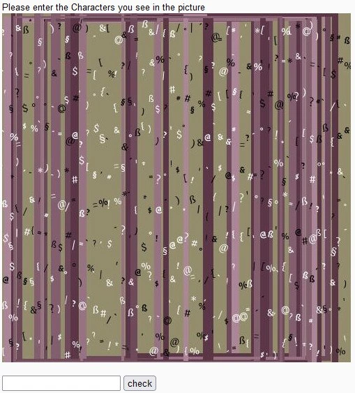
Imagine you’re trying to get into your favorite playground, but the gate has a keypad with a secret code. However, the code is written in super crazy scribbles, with paint splattered over it and stickers all on top. You only have a few seconds to figure it out. Sounds frustrating, right? You squint and tilt your head, but it’s just a jumble of shapes. It’s as if the park guard is saying, “Prove you’re allowed in here by reading my mind!” In real life, you’d probably throw your hands up and say, “No one can read this!” That’s exactly the feeling this picture gives. It’s showing a website’s little test to see if you’re a real person, but the test is so horribly messy that even a real person can’t pass it easily. It’s like a puzzle meant for robots instead of people. The joke is that something meant to be a simple check has become a goofy obstacle. We laugh because we’ve all felt that “Are you kidding me? I can’t even read this!” moment. The poor user just wants to prove they’re human, and the website made it nearly impossible – locking everyone out with a wall of gibberish. In simple terms, the meme is funny because the security test is too good for its own good, turning a normal person into a very confused person.

Level 2: Gatekeeping Gone Wrong

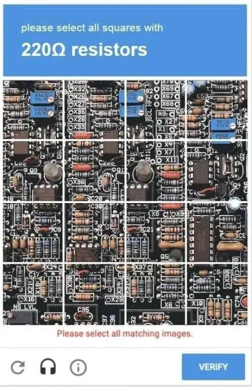
For a newer developer or someone just getting into web design, let’s break down what’s happening here. The picture shows a CAPTCHA, which is that funny little test like “type the blurry letters” or “click all the traffic lights” you often see when logging in or signing up on websites. The idea of a CAPTCHA is to prove you are human and not an automated program (a bot) trying to spam or break into the site. Basically, websites give you a puzzle that’s easy (or at least doable) for people but hard for computers. In this case, the puzzle is to read some characters (letters or numbers) in a picture and type them in a box. But as the title says, this design “forgot humans need to read them too.” The CAPTCHA here is so over-designed with security features that it’s become nearly impossible to read. Imagine squinting at an image with olive-green and purple stripes and tons of random symbols (@, %, $, #, etc.) piled on top of each other. You’re supposed to pick out a secret code from that mess. Yeah… not fun. This is a classic example of a UX failure (UX means User Experience, i.e., how easy and pleasant something is for a user). The test was meant to keep out bots, but it ended up keeping out real users as well! That defeats the whole purpose, right? It’s gatekeeping gone wrong. The site essentially built a door so secure that no one can open it, not even the good guys. Developers talk about the security vs usability trade-off: if you make something super secure, you might make it hard to use. Think of a house with ten locks on the door – very safe from burglars, but it takes you (the homeowner) 10 minutes to get inside every time. Not practical! In the web world, a mild CAPTCHA (like typing two clear words or clicking a checkbox that says “I’m not a robot”) is like a normal lock – it adds a bit of security but most people can handle it. What we see in this meme is like an overkill lock that requires solving a cryptogram under 15 seconds. Real users get frustrated or fail the test, which is bad news for a website – frustrated users might just leave instead of signing up. It’s also an accessibility problem. Accessibility means making sure everyone, including people with disabilities, can use your site. For example, someone who is visually impaired or color-blind would have zero chance of solving this CAPTCHA – they can barely see it or distinguish the symbols. Even people with perfect vision are struggling here, so that tells you how unfriendly it is. Good web practice would be to provide an alternative, like an audio CAPTCHA (where a voice reads numbers for you to enter) or simpler challenges, and to never make text this unintelligible. The meme’s little joke text, “You have 15 seconds. Prove that you’re not a human,” is poking fun at how backward this is. Usually, a CAPTCHA says “prove you’re not a robot” by doing a human task. But this one is so tough, it feels like only a robot could solve it! In summary, what’s funny (and sad) here is that a tool meant for security – a CAPTCHA – was designed with such extreme distortion and clutter that it backfired. It’s a lesson for junior devs: always balance web security measures with user-friendliness. A lock that keeps everyone out isn’t a good lock. Security is important, but if legitimate users can’t pass your tests, they’ll either leave or call it out as a mistake. And that’s exactly what this meme is doing: calling out a hilariously bad implementation so we can all learn from it (and maybe facepalm a little).

Level 3: When Humans Fail the Test

From a seasoned developer’s perspective, this CAPTCHA is a textbook case of security overkill and a UX fiasco rolled into one. The humor (or horror) here comes from the fact that the very mechanism meant to keep bots out has made legitimate users feel unwelcome too. As professionals in WebDev and WebSecurity, we’ve all seen the delicate dance between keeping systems secure and keeping users sane. This meme nails that tension: it’s poking fun at a Security vs Usability disaster where the pendulum swung violently to one side. The page literally says “Please enter the Characters you see in the picture.” — but good luck finding any actual characters in that digital haystack! The image looks more like abstract art than an authentication step, a pixelated security wall reminiscent of a Jackson Pollock painting made of punctuation. The developer or team behind this likely cranked every distortion knob to max, forgetting the golden rule: humans need to read it too. As experienced devs, we recognize all the elements of an impossible_captcha here: noisy background patterns, confetti of symbols, warping, occlusion — you name it. These techniques all existed for a reason: each one thwarts a known bot strategy. Vertical stripes and odd colors? That’s to break simple color filters and segmentation algorithms. Random overlapping symbols? Meant to confuse shape-matching so bots can’t distinguish real letters. Rotated or blurred characters? A tactic to defeat template-matching OCR. In isolation, each anti-bot measure is manageable for a user, but combined to such excess, it becomes an anti-human challenge. It’s the equivalent of deploying every single defense mechanism in the book without considering their cumulative impact on usability. The veteran in us chuckles and cringes simultaneously: we’ve seen security folks so paranoid about bots or spam that they inadvertently create a worse problem, a form of security theater where legitimate users suffer while determined attackers find workarounds anyway. Remember, if a spammer really wants to bypass this, they might use advanced machine vision or simply outsource CAPTCHAs to cheap human-solving farms. So all this pain might be for naught. Meanwhile, real users and developers are left frustrated. It’s developer_frustration 101 to implement a feature that you immediately get complaints about. Imagine the bug reports: “Your signup CAPTCHA is unreadable. I had to refresh 10 times to get one I could solve!” For any senior engineer, that’s an embarrassment and a signal we’ve failed our UX/UI mission. There’s also a serious AccessibilityStandards violation here. Seasoned web developers know that if your security measure locks out users with low vision, color blindness, or dyslexia, you’re doing it wrong. Proper CAPTCHAs provide alternatives (like an audio CAPTCHA or simpler challenges) and adhere to WCAG guidelines. This one clearly doesn’t: it’s an accessibility_nightmare. A blind user’s screen reader can’t parse an image at all, and if the audio alternative is as garbled as this visual, forget it. Even fully able users are at wit’s end; those 15 seconds mentioned in the post text (“You have 15 seconds. Prove that you’re not a human”) underscore how hostile the experience is. That line flips the usual script (“prove you’re not a robot”) to highlight the absurdity: this test might as well be checking that you are a robot with superior image analysis, because ordinary humans are failing it! In meetings, we senior devs often preach that security features must consider the user. Here, the developers lost sight of that principle. The result is a UXFailure of epic proportions – a gate meant to stop bad actors that ends up door-slamming everyone. Ultimately, the meme resonates with anyone who’s ever cursed at a registration form: it captures the collective exasperation of developers and users alike when confronted with a so-called security solution that backfires. It’s a cautionary tale: WebSecurity measures need balance. Otherwise, as this joke demonstrates, our well-intended “anti-bot challenge” turns into a pixelated security wall that even honest humans can’t get past, defeating the whole purpose.

Level 4: Pattern Recognition Arms Race

At this highest level, we delve into the theory behind CAPTCHAs and why this image is an extreme case of the security vs AI arms race. A CAPTCHA (Completely Automated Public Turing test to tell Computers and Humans Apart) is essentially a reverse Turing test, where a machine challenges a user to prove they're human. The logic is rooted in pattern recognition: present a task that a human brain can solve easily (like reading distorted text) but an algorithm struggles with. Early CAPTCHAs employed simple twisted letters or noise, exploiting the gap between human visual cognition and machine OCR (Optical Character Recognition). Over time, however, machine learning and advanced OCR algorithms caught up, learning to decipher those distortions with alarming accuracy. The result? CAPTCHA designers escalated the complexity, producing puzzles like this one: a riot of multicolor vertical bars and overlapping ASCII gibberish. This isn't accidental art – it's an adversarial design meant to confound computer vision at every turn. The alternating dusty-olive and mauve stripes create unpredictable color contrast, hindering edge-detection algorithms. The hundreds of superimposed symbols (@, %, §, etc.) act as decoys, so a program can’t easily segment the “real” characters from the noise. In theory, there’s a narrow threshold where humans can still decipher the intended code by using context and gestalt perception, while bots see only a chaotic jumble. In practice, as this meme highlights, that threshold has been overshot: the challenge has become nearly unreadable even for people. This illustrates the fundamental paradox of CAPTCHA design – it’s a moving target in an ongoing arms race. As soon as AI learns to solve a certain style of puzzle, developers increase the distortion or switch modalities (from text to image recognition tasks, for instance). It’s a constant one-upmanship cycle between bot-makers and security engineers. From an academic perspective, CAPTCHAs align with problems that are easy for humans, hard for computers, sometimes called AI-hard problems. They leverage our brain’s incredible ability to recognize patterns in noise – a capability rooted in millions of years of evolution – and pit it against the pattern-matching algorithms that, until recently, were brittle when faced with clutter or novel distortions. But as this nightmare CAPTCHA demonstrates, pushing complexity too far turns the test into a lose-lose scenario. It foreshadows a future where advanced AI can handle such adversarial noise better than humans, flipping the script of the Turing test entirely. Indeed, we’re nearing an era when a well-trained neural network might decode this psychedelic puzzle faster than a person rubbing their eyes in confusion. At that point, CAPTCHAs like this aren’t just unfair to humans – they’re ineffective at security, defeating their very purpose. In summary, this image is the culmination of a pattern recognition arms race: an overly zealous attempt to stay ahead of bots by bombarding the user (and any algorithm) with visual chaos, to the point where the human advantage – intuition and perceptual clarity – is all but negated. It’s a perfect (and tragicomic) example of how theoretical security measures can backfire when the fundamental limits of both human and machine cognition are misjudged.

Description

The image displays an intentionally absurd and likely unsolvable CAPTCHA test. At the top, a simple instruction reads, 'Please enter the Characters you see in the picture.' Below this, the main area is a chaotic jumble of special characters and symbols (like '@', '§', 'ß', '%', '&') scattered randomly. These characters are distorted, overlapping, and vary in color, set against a confusing background of vertical stripes in shades of purple and olive green. At the bottom, there is a standard empty text input box followed by a 'check' button. The provided caption, 'You have 15 seconds. Prove that you're not a human,' adds to the humor. This meme satirizes the escalating difficulty of CAPTCHA systems, which are designed to distinguish humans from bots. The joke is that this particular test is so difficult that a human would almost certainly fail, thus 'proving' they are not human by failing a test designed to be failed by bots. It's a commentary on poor UX, the security arms race, and the frustrating experience of navigating modern web verification


Comments

15
Anonymous ★ Top Pick I showed this CAPTCHA to our new ML model. It returned '42' and then resigned, citing ethical concerns about digital torture
  1. Anonymous ★ Top Pick

    I showed this CAPTCHA to our new ML model. It returned '42' and then resigned, citing ethical concerns about digital torture

  2. Anonymous

    “Release notes: CAPTCHA v42 successfully blocks every bot and 100% of users - only our headless Chrome + Tesseract smoke test makes it through. Funnel’s gone, but the security dashboard is all green.”

  3. Anonymous

    After 20 years in tech, I've optimized distributed systems across three continents, but I still can't convince a CAPTCHA that I'm not a robot on the first try. Maybe I should add 'Proven Human' to my LinkedIn certifications

  4. Anonymous

    This CAPTCHA is so secure, it successfully prevented 100% of users from accessing the site - including the legitimate ones. It's the perfect implementation of 'security through obscurity' taken to its logical extreme: if nobody can read it, nobody can hack it. The real test isn't proving you're human; it's proving you have the patience of a saint and the visual acuity of an eagle on Adderall

  5. Anonymous

    CAPTCHA: the one 'test suite' no CI/CD pipeline automates, humbling even 20-YoE architects

  6. Anonymous

    Security asked for a tougher CAPTCHA, so we shipped Unicode confusables on WCAG-violating zebra stripes - humans rage-quit, bots run Tesseract at 99% accuracy

  7. Anonymous

    We finally beat OCR - by violating WCAG and our conversion funnel in a single commit

  8. @sylfn 4y

    i would enter some spaces

  9. @ZgGPuo8dZef58K6hxxGVj3Z2 4y

    😂😂😂😂😂😂😂😂😂😂😂😂😂😂👌👌👌

  10. @slnt_opp 4y

    german skynet raising

  11. @thisisluxion 4y

    *smashes head on the keyboard* done

  12. @Magilarp 4y

    "i use reddit unironically"

  13. @RiedleroD 4y

    plot twist: the captcha only lets you through if you make an average amount of errors

  14. @Cairco 4y

    ñ

  15. @digital_insanity 4y

    Syntactically correct Perl script

Use J and K for navigation