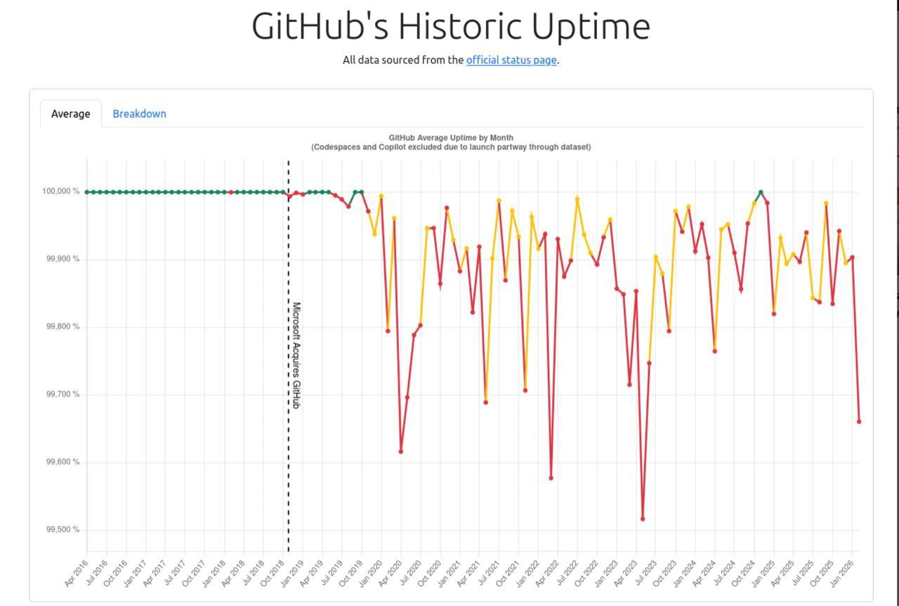
GitHub Uptime Chart Nosedives Right After Microsoft Acquisition Line
Why is this Microsoft meme funny?
Level 1: The New Manager Chart
Imagine a kid's report card that was straight A's for two years. Then a new guardian takes over the household, and suddenly the grades bounce between B's and D's every month. The chart draws a big dashed line on the day the new guardian arrived, as if to say: we all know whose fault this is. Maybe it's true. Or maybe the old report cards were graded by the kid themselves, and the new ones are graded by actual teachers. The joke is that the picture looks like ironclad proof, and everyone who's annoyed at the new guardian gets to point at it and say "see?!"
Level 2: Reading the Nines
Key concepts hiding in this chart:
- Uptime / availability: the percentage of time a service works. "Five nines" (99.999%) allows ~26 seconds of downtime a month; 99.5% allows ~3.6 hours. The y-axis spanning 99.5%–100% means even the worst red point is "down for an afternoon," not "down for a week."
- Status page: a public dashboard (like
githubstatus.com) where a company self-reports incidents. Self-reported is the operative word — companies historically under-report. - SLA (Service Level Agreement): the contractual uptime promise. Dips below it can trigger refunds, which is one reason status pages get... diplomatic.
- Truncated y-axis: starting the axis at 99.5% instead of 0% magnifies tiny differences. Classic persuasion technique — every point would look identical on a 0–100% scale.
- Correlation vs. causation: the dashed acquisition line implies Microsoft broke GitHub. But growth, new products, and better incident reporting all changed at the same time. A single annotated chart can't separate those.
If you're early in your career, the practical lesson: when GitHub goes down and your push hangs, it's not your network, and refreshing won't help. Go get coffee — and remember that git is distributed, so your commits are safe locally even when the mothership isn't.
Level 3: Correlation Wearing a Causation Costume
The chart's killer feature is that vertical dashed line labeled "Microsoft Acquires GitHub" — to its left, a serene row of green dots pinned at 100.000%; to its right, a decade-long EKG of yellow and red sawtooth spikes plunging toward 99.5%. The subtitle insists "All data sourced from the official status page," which is the data-viz equivalent of saying "I'm just asking questions." It's a real chart, with real data, constructed to make a senior engineer laugh and a statistician twitch.
Here's what the chart conveniently doesn't say. Before mid-2018, GitHub's status page was famously coarse: a green/yellow/red traffic light with minimal granularity. Post-acquisition, GitHub rebuilt status reporting with per-service component tracking — Actions, Pages, API, Packages, Codespaces, Copilot — and started admitting degradations it previously would never have surfaced. The pre-2018 flatline at 100% isn't divine SRE perfection; it's measurement opacity. The post-2018 chaos is partly genuine reliability decline and partly observability improving faster than reliability — the oldest confound in monitoring. When you instrument something properly for the first time, the graphs always get worse before they get better. The chart even tips its hand with the footnote "(Codespaces and Copilot excluded due to launch partway through dataset)" — an acknowledgment that the service surface area exploded, which alone changes what "GitHub is down" means.
That said — the cynics aren't wrong either. GitHub absolutely did have brutal stretches: the multi-hour database failures of 2020, the cascading Actions outages of 2021-2022, the rough months visible around mid-2023 where one point craters past 99.55%, and the early-2026 nosedive at the chart's right edge that coincided with the platform straining under AI-agent-driven traffic. The original post text — "feel free to spit in their faces" when someone blames "rising demand from agents" — captures the community's exhaustion with that last excuse. And note the y-axis: it runs 99.500% to 100.000%. Truncated axes are how you turn "three nines, which is honestly fine for a free-tier git host" into "the platform is dying." The difference between 99.9% and 99.5% is real (~43 minutes vs ~3.6 hours of monthly downtime), but the visual difference here is rendered as a cliff. Every uptime chart is an argument; this one is a polemic.
The systemic truth underneath: GitHub went from "git hosting with a nice UI" to the load-bearing infrastructure of the entire software industry — CI/CD, package registries, deploy pipelines, and now armies of coding agents hammering the API. When github.com blips, half the planet's deploys halt. The meme works because the dependency is total and the resentment is therefore personal.
Description
A data visualization titled 'GitHub's Historic Uptime' with subtitle 'All data sourced from the official status page'. The line chart shows 'GitHub Average Uptime by Month (Codespaces and Copilot excluded due to launch partway through dataset)' from April 2016 to January 2026, with the y-axis ranging from 99.500% to 100.000%. A vertical dashed line labeled 'Microsoft Acquires GitHub' (late 2018) splits the chart: before it, a flat line of green dots sits at 100% uptime; after it, the line becomes a jagged sawtooth of yellow and red points repeatedly dipping toward 99.5%, with notable troughs around mid-2020, early 2022, mid-2023, and early 2026. Tabs labeled 'Average' and 'Breakdown' appear above the chart. The implied joke is the stark correlation between the acquisition and degraded reliability, a beloved data-driven jab in developer communities

Comments
20Comment deleted
The dashed line isn't an annotation, it's a changelog entry: 'migrated reliability from on-prem to best-effort.'
99.6% tho that totals to ~3hr of downtime per months ✍️ Comment deleted
Are you sure https://mrshu.github.io/github-statuses/ Comment deleted
ok ye this is more like it 🙂 Comment deleted
mmh. the last time my home server was down was in december Comment deleted
yeah it may experience less use. but also I'm not a sysadmin and I don't really do much upkeep. Comment deleted
(I feel the need to clarify that the downtime was due to my ISP. server uptime as of today is 128 days) Comment deleted
Although correct, how about you consider that their recent fiasco 5 days ago with merge queue deleting history is not even classified as an outage or deviation? Comment deleted
🤭 Comment deleted
I mean who tf uses the website to merge prs anyways 🤝🤝 Comment deleted
claude --dangerously-skip-permissions read my tickets, fix one, commit, push, open pr, review, merge. please no mistakes. Comment deleted
but it feels much worse I must say 😏 Comment deleted
Microsoft Bought Github at June 4, 2018 Comment deleted
I don't understand the color scheme Comment deleted
Anthropic uptime 😒 Comment deleted
That graph needs the current drop to 87% and stuff Comment deleted
I believe I've seen these charts and a tool used to generate those on reddit and it's based on their own status page data. Obviously, it does not represent reality, at least from my personal feeling 🙂 Comment deleted
They just haven't done their "cloud homework" good enough. 🙃 Comment deleted
I’ve been tempted to propose a dependency cache for our build fleet, in the past few months builds have been regularly failing due to small GitHub outages Comment deleted
Earlier today we hit a bunch of 502’s for a few minutes Comment deleted