Apple fixes YouTube thumbnail after unfortunate 'Liquid ass' overlay snafu
Why is this Apple meme funny?
Level 1: Oops, Covered Word
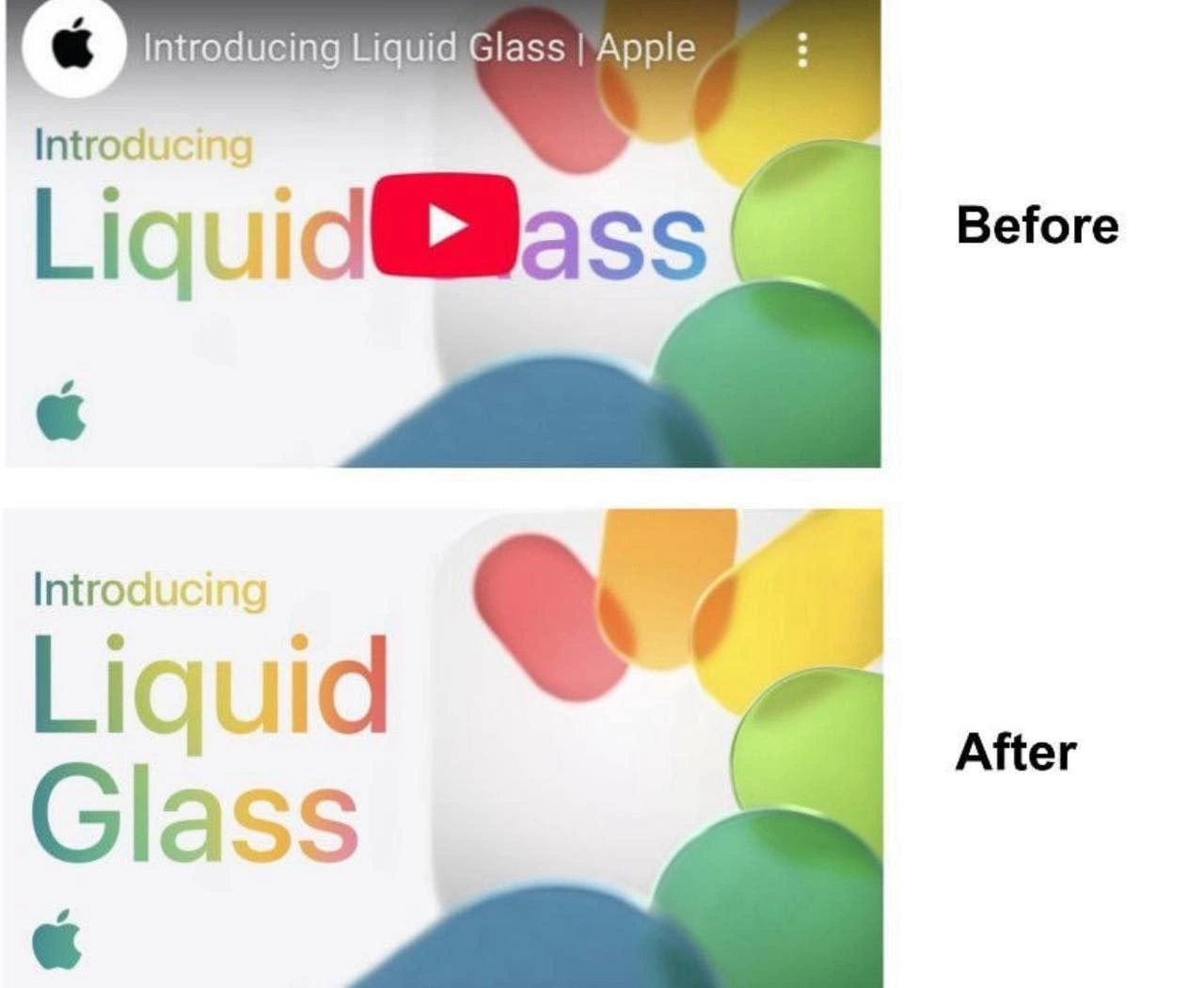
Imagine you drew a nice poster that says “Liquid Glass” in big colorful letters. You’re proud of it and show it to your friends. Then one friend sticks a big red sticker right in the middle of your poster. Suddenly, the word “Glass” isn’t fully visible – the sticker covers the “Gl”, so all people see is “ass.” Uh-oh! Now your poster accidentally says a silly (and kind of rude) word, even though you didn’t mean it. This meme is laughing at that kind of simple mistake.
Apple made a video and the preview image had the title “Liquid Glass.” But YouTube (where the video was posted) always puts a little red play button icon in the center of video previews. That’s like YouTube’s sticker. Apple’s team didn’t realize the play button would cover part of their title. So, when people first saw the video preview, they read “Liquid ass” by accident. It was a total oops moment! It’s funny because Apple is a big, serious company known for perfect design, yet here it looked like they wrote a potty-word on their fancy announcement.
Of course, as soon as they noticed, Apple fixed the picture. In the bottom image (“After”), they moved the words around so you can read “Liquid Glass” properly and the red play button isn’t blocking anything important. Now it looks nice and no bad word is hiding there.
The lesson is a simple one: if you put something important in your picture, make sure nothing is going to cover it up later! It’s like if you draw a sign on a sidewalk, remember someone might park their bike in front of part of it. In Apple’s case, they forgot about the YouTube play button, and it gave everyone a good laugh. Even big companies can make goofy mistakes, and that’s why this is funny. It’s a harmless mix-up that turned a serious announcement into a little joke, all because a picture was covering a word at the wrong spot.
Level 2: When Overlays Attack
Let’s break down what happened in simpler terms. Apple created a YouTube video titled “Introducing Liquid Glass.” The thumbnail (the preview image you see before clicking a video) had the product name “Liquid Glass” prominently in the center, with a pretty rainbow-colored font on a clean white background. They even placed a little Apple logo in the corner – classic Apple branding. However, YouTube always puts a play button overlay right in the middle of every thumbnail image. This is that red play icon (a red circle with a white triangle) that tells viewers “click here to play.” In Apple’s original design (labeled “Before” in the meme), the word “Glass” was exactly where YouTube’s play icon appears. So when YouTube displayed the thumbnail, the “Gl” in “Glass” got covered by the red play button graphic. The only letters still showing from the word Glass were “ass” – oops! Suddenly, the title looked like “Introducing Liquid ass” instead of “Liquid Glass.”
For context, UX stands for User Experience (the overall feel and usability of a product) and UI stands for User Interface (the actual onscreen elements like buttons, text, and images). This was a UX/UI oversight: Apple’s design team didn’t account for YouTube’s UI elements. In design and front-end development, this is a known pitfall. When you create graphics or layouts for another platform, you have to remember things like logos, buttons, or text that platform might layer on top – these are called overlays. A third-party overlay is any element not in your original image but added by the platform displaying it (here, YouTube’s play button is the third-party element).
A seasoned front-end engineer or designer has “learned the hard way” to check for these conflicts. If you’ve ever made a mobile app, for example, you must avoid placing important buttons under the phone’s status bar or notch. Similarly, for video thumbnails, many creators know to keep faces or text away from the direct center because of that play icon. It’s part of being responsive and considerate in design – kind of like responsive design, which means making sure things look good in different sizes and conditions. Here the condition wasn’t a different screen size, but a different context: the YouTube player UI.
In the meme’s “After” panel, Apple has fixed the issue. They likely adjusted the thumbnail by moving the word “Glass” down and to the side, or perhaps splitting “Liquid” and “Glass” onto two lines, so that the play button no longer covers any letters. Now viewers see the intended phrase “Liquid Glass” with no unfortunate cover-ups. This simple change shows a quick UXDesign fix: give that play button some breathing room! It’s a funny example of a UXFailure that was immediately corrected once noticed.
For a junior developer or designer, the takeaway is clear: always consider how your work will be displayed in the wild. Marketing assets (like this thumbnail) might look great on your computer, but you need to review them in the actual platform or device they’ll appear on. This is often called a marketing_thumbnail_review or just good practice in design QA (Quality Assurance). In this case, a basic review of the thumbnail on YouTube would have revealed the "Liquid ass" issue before the public saw it. It’s an easy thing to miss if you’re not familiar with the platform’s quirks. The meme humorously educates us about such a nonfunctional requirement – something not in the product spec but still very important for user experience, like “text shall remain readable and not inadvertently form embarrassing words when overlaid with platform UI.”
So, in summary, “Liquid Glass” turned into a bit of FrontendHumor because the YouTube overlay covered part of the text. Apple fixed it by redesigning the thumbnail so the text and the play button no longer clash. This kind of issue can happen to anyone new to a platform’s rules. Now you know: beware of overlays – whether it’s a YouTube play icon, a watermark, or any fixed UI element, always check where they appear so your design doesn’t accidentally say something very different (and in this case, very smelly 😂).
Level 3: Overlay Oversight
At first glance, this meme highlights a UI integration failure where Apple’s polished design collided (literally) with a third-party interface element. The result? The elegant title “Liquid Glass” was partially obscured by YouTube’s big red play button, unintentionally leaving the word "ass" visible. This is a textbook youtube_overlay_collision issue – a small oversight with huge meme potential. It’s an ironic twist of UX design fate that even a company as design-savvy as Apple fell victim to a marketing_thumbnail_mishap caused by a third-party overlay.
From a seasoned developer’s perspective, the humor comes from the contrast between Apple’s meticulously crafted gradient typography and the blunt reality of YouTube’s UI. Apple likely designed the thumbnail in isolation with beautiful pastel blobs and a rainbow-gradient San Francisco font for the text. But they apparently ignored the nonfunctional requirements of YouTube’s platform – namely the default play icon overlay and how it might interact with text. Hero banner testing should have caught this: experienced designers know to treat platform overlays as part of the canvas. It’s a known UX/UI best practice to leave a “safe zone” for things like play buttons or watermarks. Not doing so can lead to inconsistentUIs, where the combined interface (Apple’s content + YouTube’s controls) conveys something comically unintended.
The meme’s UX irony lies in how a high-profile, presumably well-reviewed marketing asset still face-planted into a juvenile joke. It’s a shared industry chuckle because many of us have been there – maybe not with “Liquid ass” specifically, but with UI elements overlapping or text breaking at the worst possible place. Think of an alert box covering a critical form field, or a frontend modal dialog’s CSS causing Submit Sub to appear on one line and mit on the next (creating a non-sensical or naughty word). These failures usually happen under pressure or oversight: a development team focusing on features and assuming someone else will handle UXDesign details, or a marketing team building a UIDesign mockup without testing it on the real platform. The lesson? Even trillion-dollar tech giants must mind the mundane details. Integrating with external platforms means accounting for their overlays, controls, and quirks – ignore those at your peril (and prepare to become FrontendHumor on Reddit when you slip up).
On a more historical note, this incident echoes earlier UXFailures in tech history. For instance, older TV interfaces had channel logos that sometimes covered sports scores, or early smartphone apps that didn’t account for the dreaded notch, slicing off content. The Apple “Liquid Glass” snafu will join the hall of fame of design goofs, reminding everyone that context is king. In an Apple keynote or on their website, they control every pixel. On YouTube, however, Apple had to play by someone else’s UI rules. The meme is poking fun in a good-natured way: even the masters of design occasionally get schooled by a basic UX principle – always check how your work appears in the final environment. This combination of high-stakes design and low-brow accidental humor (Liquid ass, folks!) is both cringe-worthy and hilarious, a perfect storm that frontend veterans can’t help but appreciate and facepalm at simultaneously.
Description
Composite meme with two nearly identical Apple video thumbnails shown side-by-side. Top panel, labeled "Before," is a screenshot of the YouTube player preview: header text reads "Introducing Liquid Glass | Apple" and the thumbnail itself says "Introducing Liquid Glass" in Apple’s rainbow-gradient San-Francisco font. YouTube’s big red play-button overlay sits squarely over the letters “Gl” in "Glass," leaving only "ass" visible, creating the unintended phrase "Liquid ass." Bottom panel, labeled "After," shows a redesigned thumbnail where the word "Glass" is shifted downward and left, safely outside the overlay’s hit-box, restoring the intended wording. Both panels display pastel blob graphics and a small green Apple logo in the lower-left corner on a white background. The joke highlights the real-world UX pitfall of ignoring third-party overlays in responsive design and marketing asset reviews, a lesson every seasoned frontend engineer has learned the hard way
Comments
6Comment deleted
Always render-proof the hero banner - skip that step and your Liquid Glass lands in prod as Liquid ass
Just like how we add 'async' to every function hoping it'll magically fix performance issues, Apple adds rainbow gradients to everything hoping it'll magically fix their diversity metrics
When your product launch gets more engagement from the ad-blocking community than your target audience - because nothing says 'premium user experience' quite like a YouTube mid-roll obscuring your carefully crafted gradient typography. Apple's design team spent months perfecting that color transition, only to have it hijacked by a red rectangle with a triangle. At least the ad blocker respects the design vision more than the platform does
Liquid Glass: Where blur radius rivals your legacy monolith's tech debt, and every layer tanks frame rates
Add a youtube_thumbnail_safe_area token to the design system, or the platform will refactor “Glass” into a production incident with z-index: 9999
Embedding third‑party players is the UI equivalent of an unpinned dependency - this one turned “Liquid Glass” into “Liquid ass”; after the postmortem, we added safe‑area tokens and a linter banning hero copy inside the player’s blast radius