Skip to content
DevMeme
4428 of 7435
Dynamic Island: Apple notch morphs into multitasking UI, meme for iOS devs
Apple Post #4850, on Sep 8, 2022 in TG

Dynamic Island: Apple notch morphs into multitasking UI, meme for iOS devs

Why is this Apple meme funny?

Level 1: Fun with a Flaw

Imagine you have a little black spot on a piece of paper that you can’t get rid of. Instead of it ruining the picture, you decide to draw a funny creature around it, turning that spot into the creature’s eye. Suddenly, what was an annoying dot becomes the best part of your drawing. 😄 That’s basically what Apple did with the iPhone’s front camera area. There’s a small dark shape at the top of the phone’s screen (because the phone needs a camera and sensors there – like a tiny island in a sea of screen). People used to see it as a blank, boring spot. Now Apple made that spot come alive and do tricks! It can show you if your headphones are connected, who’s calling you, or if your phone is unlocked – all in that same little area. It’s like turning a problem into a playful solution. This is funny and neat because instead of hiding the phone’s “black spot,” Apple put a spotlight on it and made it dynamic (meaning it can change and move). They even call it the “Dynamic Island,” as if that little cut-out is a special place. So what used to be a flaw is now a fun feature – and everyone’s smiling at how clever (and a bit cheeky) that idea is.

Level 2: The Notch Goes Live

Let’s break down what the Dynamic Island really is. On the new iPhone models (specifically the iPhone 14 Pro and Pro Max at launch), Apple changed the old static notch (the black bar area at the top of the screen that holds the front camera and Face ID sensors) into a pilI-shaped cut-out that can change size via software. Normally, a notch just sits there, and app developers had to design around that blank space so important buttons or text didn’t get hidden. Apple’s twist was: “What if that space could expand, shrink, and show information as if it were part of the interface?” So they gave it a playful name – Dynamic Island – to emphasize it’s not a fixed notch anymore, but an animated island of pixels that can show live content.

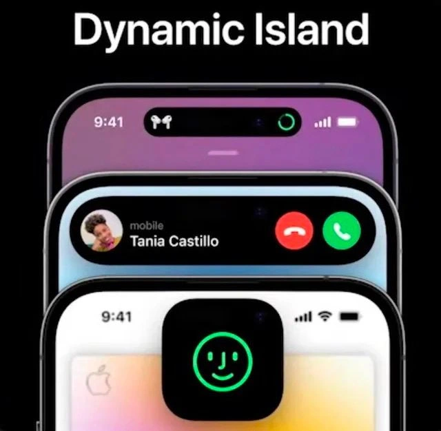
In the meme image, those three iPhone screenshots demonstrate different use cases:

  • Top screen (purple background): The Dynamic Island is showing a status indicator – specifically, icons for connected AirPods with a green charging ring. This happens when you connect your AirPods or start charging them; instead of a boring notification, the little pill at the top stretches just a bit and shows an AirPods graphic and battery status. It’s like a mini dashboard for ongoing tasks or device connections.
  • Middle screen (dark background): Here the Island grows wider to show an incoming call. You see the caller’s picture and name (“Tania Castillo”) and even the red and green buttons to decline or accept the call, all contained in that pill shape at the top. In older iPhones or other phones, an incoming call might take up a big banner or even the whole screen. But Apple tucked it into this top area, so you can keep doing something else on the screen while casually deciding to pick up the call or not. It’s multitasking on a phone, in a very space-efficient way.
  • Bottom screen (light mode background): The pill has morphed into a square with rounded corners, glowing with a green smiling Face ID symbol. This is likely showing the FaceID unlock animation or a verification in progress. On earlier iPhones, when Face ID was scanning, you might just see a padlock icon or a subtle animation near the top. Now, they’ve made it more visible and fun by using the island area to show a smiling face icon when the phone is actively scanning your face to unlock. It’s a friendly feedback to the user: “Hi, I see you!”

The meme caption jokes about Apple’s “front screen sensors” finally getting interesting treatment. For years, that notch (housing the sensors) was just something designers worked around. Now Apple basically said to developers, “Hey, we’ve got this new toy for you to play with.” As an iOS developer (IOSDevelopment), this means there’s a new API to learn: the Live Activities API (ActivityKit framework) introduced in iOS 16. Live Activities let your app show up-to-date info in specific parts of the system UI – notably on the Lock Screen and in this Dynamic Island – even if your app is in the background. For example, if you’re making a MobileDevelopment project like a food delivery app, you can now display the delivery status (e.g., “Pizza is 5 minutes away”) at the top of the phone in that pill, so the user can see it at a glance while using another app. Or a music app can show the currently playing song with a tiny album art up there.

From a UIDesign / UXDesign perspective, this is Apple encouraging MobileFirstDesign thinking: use minimal space for maximum info. The design philosophy is to keep the user informed without interrupting them. The Dynamic Island is essentially a built-in mini notifications center, but with style – it moves, bounces, and even shows little animations (like that charging ring or a waveform for music). Apple provides developers with guidelines so that whatever content goes into that island remains clear and not too cluttered – you might use a SwiftUI view or UIKit view configured specifically as a Live Activity. Under the hood, you don’t manually animate the pill shape yourself (Apple’s system does that). Instead, you supply text, images, and maybe a couple of action buttons through the Live Activities API, and iOS will render them in the Dynamic Island for you, using preset templates (so that, for example, all call notifications look consistent like the one in the meme).

For a junior dev or someone new to MobileDev, think of it this way: previously, you had to worry about the notch by just not putting content under it. Now, you can actually put content in that area, but via Apple’s controlled system. It’s both an opportunity (cool new feature to make your app feel integrated with the system) and a responsibility (you need to test your app on the new iPhone to ensure nothing important is hiding behind that pill, and implement Live Activities if it makes sense). In Xcode (Apple’s development tool), there are even simulators for the iPhone 14 Pro so you can see how your app’s UI behaves with a Dynamic Island present. Apple also updated their Human Interface Guidelines: now there’s a whole section on dynamic_island design dos and don’ts. One don’t: don’t treat it like a regular screen area – for instance, you shouldn’t try to drag it or put too much text. One do: use it for brief, glanceable updates (which aligns with good UXDesignPrinciples for mobile).

The humor in the meme for devs is partly “Oh great, Apple gave the notch a fancy name and now I have to deal with it in code!” but also genuine excitement – it’s a novel concept in smartphones. Unlike Android (where many manufacturers try to hide the camera hole or make it as small as possible), Apple leaned in and made that hardware quirk an interactive part of the UI. The term “Dynamic Island” itself is kind of funny and grandiose – it sounds like a game level or a theme park, not a status bar element! But that’s Apple’s marketing for you, always AppleProducts-level dramatic. As an iOS dev, though, you’re mostly thinking about how to implement it. In code, using ActivityKit might look like creating an Activity for, say, a live sports score: you define your activity’s content, e.g., teams and current score, and update it with new data. The system takes care of showing it on the Lock Screen and the Island. You’ll need to test your app to ensure that when this feature is in use, your main UI doesn’t conflict with it (for example, if you also show a custom in-app banner, you don’t want double notifications). In summary, this meme resonates because it encapsulates a moment when Apple changed something fundamental about the iPhone’s interface, and all the developers went “Whoa, the notch is now a feature we get to code for!” – equal parts UIDesign challenge and nerdy delight.

Level 3: When Life Gives You Notches

Apple’s Dynamic Island is a masterclass in turning a hardware quirk into a UX feature. In the meme’s image (from the iPhone 14 Pro launch day), we see three stages of this notch metamorphosis. The top iPhone screen shows the pill-shaped cut-out (housing the front camera and Face ID sensors) now actively displaying status info – here, a tiny AirPods icon with a green charging indicator. That black sensor gap isn’t just sitting there; it’s alive with system updates. This got senior iOS developers grinning because Apple managed to take the notorious screen notch_design (once an eyesore) and evolve it into an interactive status bar hub. It’s equal parts ingenious and comical: Apple basically drew neon signs around a screen blemish and called it a feature – classic Apple AppleEcosystem swagger.

From a seasoned dev perspective, this meme is highlighting how Apple’s design team flipped the script on a constraint. The iphone_14_pro’s cut-out isn’t static; it expands and morphs through slick microinteractions to show useful widgets: incoming calls, music playing, GPS directions, you name it. The middle phone in the meme previews an call_notification_ui scenario: the pill stretched wide to display a caller’s photo and “Tania Castillo… mobile” with decline/accept buttons. Instead of a full-screen alert, the call is neatly embedded in that top oval – a multitasking mini-UI. iOS devs immediately recognized this as a nod to the new Live Activities API. With live_activities_api, apps can now feed live updates to this Dynamic Island (and the lock screen), keeping users informed with real-time info like sports scores or ride-share ETAs without opening the app. The humor here is partly in how suddenly our app designs must adapt: one day you’re laying out a status bar, next day that bar literally comes alive and expects your app to provide content for it. It’s as if the status bar got promoted from a passive info strip to an active notification clubhouse, and every app wants the invite.

Why is this funny to industry veterans? Because it’s so Apple. They took something everyone else tried to minimize (pinhole cameras, teardrop notches) and embraced it flamboyantly. It’s reminiscent of how Apple turned removing the headphone jack into a “courage” moment – here they’ve turned a screen cut-out into a UX_UI triumph. The meme’s bottom image (white background) even shows the Island expanding into a square with a glowing green face_id_smiley icon. That’s the Face ID unlock animation popping out to greet you – the phone’s most sensitive security process now packaged as a friendly little glyph on the “island”. Apple is effectively winking at us: “Not only will we not hide the notch, we’ll make it dance.” For seasoned devs, it’s a mix of admiration and mild eye-roll. We know behind that playful UI is a lot of engineering: coordinated MobileDevelopment between hardware and software. The status_bar_microinteraction design had to account for multiple simultaneous activities (ever had music playing while a call comes in?). The Dynamic Island can even split into two bubbles if two background tasks are active – juggling states like a mini scheduler. Under the hood, iOS manages these with tight control; apps publish Live Activity updates, and the OS decides how to display them in the pill so that one activity doesn’t stomp on another. There’s a hint of the UXDesignPrinciples at play: visibility of system status (show the user what’s happening) and feedback (subtle animations when you interact). It’s funny because it all feels so over-the-top Apple: turning a hardware limitation into a centerpiece with its own marketing name, forcing developers to play along. And of course, iOSDevelopment shops rushed to update their apps – nobody wants to be the app that doesn’t animate on the cool new island. In short, Apple made the notch into a tiny stage, and this meme is our backstage pass to that spectacle, equal parts impressive and tongue-in-cheek.

Description

On a solid black background, bold white text reads "Dynamic Island" above a stack of three iPhone screens shown front-on. 1) The top screen has a purple gradient wallpaper; at 9:41 the status bar’s new pill-shaped cut-out displays AirPods icons and a green charging ring. 2) The middle screen shows an incoming call banner: left thumbnail photo, label "mobile", caller name "Tania Castillo", plus red decline and green accept buttons - all rendered inside the same pill. 3) The bottom screen is light themed; the pill is zoomed into a square, glowing green with a smiling Face ID glyph. The meme highlights Apple’s Dynamic Island micro-interaction pattern and hints at the Live Activities API that iOS developers must support, poking fun at how a hardware notch became a UX playground

Comments

46
Anonymous ★ Top Pick Dynamic Island is the ultimate senior-dev pattern: ship an unmovable hardware constraint, wrap it in a reactive API, add some spring animations, and suddenly the spec calls your notch a feature instead of tech debt
  1. Anonymous ★ Top Pick

    Dynamic Island is the ultimate senior-dev pattern: ship an unmovable hardware constraint, wrap it in a reactive API, add some spring animations, and suddenly the spec calls your notch a feature instead of tech debt

  2. Anonymous

    After 20 years of hiding hardware limitations with software abstractions, Apple finally said 'screw it, the notch IS the feature' - and somehow made us believe it. Next up: dead pixels as a distributed notification system

  3. Anonymous

    When your notification management system is so sophisticated that it requires O(n) physical devices to handle concurrent states - Apple's innovative solution to the notification queue problem is just buying more iPhones. Who needs proper state management when you can literally stack overflow your hardware?

  4. Anonymous

    Turning the notch into an API is peak Apple: marketing calls it “delight,” engineering calls it “another z‑order and safeAreaInsets regression.”

  5. Anonymous

    Dynamic Island is what happens when a hardware notch implements the Observer pattern and Marketing declares you’ve built a platform

  6. Anonymous

    Dynamic Island: Because static safe areas were too predictable for your Auto Layout solver

  7. @pavloalpha 3y

    Android: really?

    1. @Strad1variuS 3y

      does the Android has such synergie with UI?

      1. @RiedleroD 3y

        depends on the vendor

      2. @pavloalpha 3y

        Nah, but at least android isn't lagging such a lot

        1. @Strad1variuS 3y

          nice joke, mate.😂

          1. @pavloalpha 3y

            -

      3. @Box_of_the_Fox 3y

        Pretty much all android phones have small circle exactly around front camera and bleeding edge solution is to hide camera behind the screen. We are on third generation of hiding camera behind the screen. Then there were some companies that were making physical mechanisms that hid camera. And "synergy" is nothing more than software update to ui. So this thing is stupid bs for americans and apple fanboys to jerk off to.

        1. @Strad1variuS 3y

          hidden camera detected. And FYI in iPhone there is not only the camera, but FaceID sensors also.

          1. @daniilfurgen 3y

            Which, if they actually wanted, could be hidden in the frame like any other vendor does to hide their sensors and speaker.

        2. @pavloalpha 3y

          Fact.

  8. @saniel42 3y

    Yay moving my finger all the way up to answer call, nice design fuckin love it

    1. @Strad1variuS 3y

      Someday you will understand why popup has “up” in it.

      1. @saniel42 3y

        I could understand today if you explained you know

      2. @RiedleroD 3y

        because it pops up from the bottom of the screen, mate

        1. @RiedleroD 3y

          the opposite would be a dropdown, which drops down from the top

    2. @grandpa_the_kid 3y

      But man, Android has the same pop-up call notification. (Cap mode on) That's done to not interrupt your current activity (Cap mode off). I don't think that's a legit complaint

      1. @RiedleroD 3y

        android has whatever the vendor added. regarding calls, those are usually full-screen with the controls at the bottom.

        1. @grandpa_the_kid 3y

          When the phone is locked - for sure (same on the iPhone). But when it's not locked and you are in any app you will have the same pop-up notification at the top with buttons. It has been around since Android 8 I guess.

          1. @RiedleroD 3y

            no, it depends on the phone. Mine is always like that.

            1. @grandpa_the_kid 3y

              Okay, won't doubt. And it's stupid, because it is integrated into the default Android (like I used Pixels a lot)

              1. @RiedleroD 3y

                yeah, vendors often change way more than they should… and add double the bloat Android already has.

  9. @paul_thunder 3y

    people are so distracted with this...

  10. @SirMeowingtons5 3y

    Yay, finally my frontcam will be covered in fingerprints. Thanks, Apple 😊

    1. @farkasma 3y

      you haven't touched your front cam this far, you won't be after this either. all the touchable stuff is around it

  11. @Anfid 3y

    Problem with camera hidden under the display is that it’s quality is horrendous. It looks fancy in theory, but what you get in fact is a low-res pixel circle with a bad camera underneath. As usual with apple, it may get adopted later on when technology allows to avoid these compromises, but for now it’s just not there yet

  12. @pavloalpha 3y

    Huawei z.B.

  13. @pavloalpha 3y

    You really trust that for that 5 years apple really couldn't embed those Modules in smaller shape?)))

  14. @pavloalpha 3y

    Ahahaha, again some bruh that thinks that apple is a good capitalistic company that doesn't delay technology development

  15. @RiedleroD 3y

    iphone face recognition can be easily fooled, nothing beats a fingerprint sensor

    1. @pavloalpha 3y

      That's right

  16. @RiedleroD 3y

    trust me bro lol

  17. @pavloalpha 3y

    I don't have proof that apple delays technology for a few years Buuut I know that monopoly kills technology development

  18. @Box_of_the_Fox 3y

    https://discussions.apple.com/thread/251067885

  19. Kademlia 3y

    What's with the wasted space in the middle?

    1. @RiedleroD 3y

      that's where the camera and other stuff is

  20. dev_meme 3y

    and yes, sorry for posting this 🙈

    1. @RiedleroD 3y

      lmao

    2. @pavloalpha 3y

      Gachi memes

      1. @victorsheih 3y

        💻

  21. @AmirhosseinDotZip 3y

    nope

Use J and K for navigation