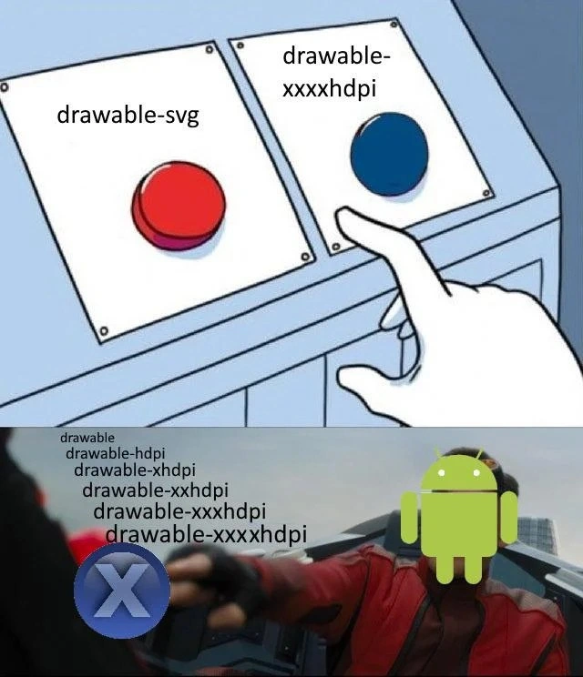
Android dev choosing between vector SVG or yet another xxxhdpi drawable
Why is this MobileDev meme funny?
Level 1: One Size Fits All
Imagine you need to decorate different classrooms with the same poster, but each classroom wall is a different size. One way is to print a small poster, a medium poster, and a huge poster so that each room gets one that fits exactly. The other way is to print one magic poster that can stretch or shrink to fit any wall perfectly. The funny picture shows an Android character (the green robot) who is super frustrated about having to make all those different-sized posters. At first, he can’t decide whether to make yet another big poster for a new giant wall or to finally use the magical stretchable poster that would work everywhere. In the next scene, he loses his temper and punches away the stack of differently sized posters flying around him. 😂 Why is this humorous? Because we’ve all felt that annoyance of doing the same task over and over in slightly different ways. The idea of a single do-it-all solution (one poster for all rooms) versus making tons of separate copies is something even a kid can relate to. It’s like having one size of clothes that fits you every year versus buying new clothes every time you grow a bit. The meme makes us laugh because the Android person is basically saying, “I’m done making a zillion versions – I just want one thing that fits all!” In simple terms, it’s poking fun at having to do extra work when a smarter, easier way could save the day.
Level 2: The DPI Dilemma
If you’re newer to Android development, this meme highlights a very real challenge in MobileDevelopment: handling different screen pixel densities. Essentially, not all screens are equal — a high-end phone might pack so many pixels per inch (ppi) that an image can look tiny or blurry if it isn’t high resolution. Android’s solution has been to use multiple drawable resource folders for different density buckets. You might have seen folders like drawable-hdpi or drawable-xxhdpi in an Android project. Each of those holds a copy of the same image optimized for a specific screen density (hdpi = high DPI, xhdpi = extra-high, xxhdpi = extra-extra-high, and so on). For example, an icon might be 48x48 pixels in the baseline drawable folder (for a normal mdpi screen), but 72x72 pixels in drawable-xhdpi to look the same physical size on a higher-density display. The idea is to prevent images from looking blurry or pixelated on sharper screens and avoid wasting memory on lower-res devices. However, maintaining all these copies is a headache! You end up manually exporting and managing multiple PNG files for every single image in your app. This proliferation of image files is what developers jokingly call “android asset density hell.” It means lots of tedious work and a higher chance of mistakes (ever accidentally put an xhdpi image in the xxhdpi folder? Been there).
The top panel of the meme (the two-button cartoon) labels one button as “drawable-svg” and the other as “drawable-xxxxhdpi”. Let’s break that down: SVG is a Scalable Vector Graphic, a fancy way to describe pictures defined by shapes and lines (vectors) instead of pixels. A vector image can scale to any size without losing quality, kind of like how a formula can plot a shape perfectly no matter how big or small. Android supports these through something called Vector Drawable (an XML resource that describes the image via paths). On the other side, drawable-xxxxhdpi is referring to yet another raster image asset for an extremely high-density screen. It’s a tongue-in-cheek way to say “maybe we need one more folder of even bigger images.” In reality, Android officially goes up to xxxhdpi (with three “x”’s) for the highest density category (around 640 dpi). The meme jokes by adding a fourth “x” – xxxxhdpi – to imply an absurdly high resolution (like a future device so pixel-dense that we’d need a new category). So the Android developer in the meme has two choices: use a vector (the SVG approach, one file that can stretch to any size) or make another giant PNG for this hypothetical xxxxhdpi device (continuing the multiple folder approach). It’s a tough call in the moment because using the vector means learning or trusting a new technique, whereas making one more PNG is the “devil you know” workflow.
Why is this a dilemma? Let’s consider what happens in practice. With the old approach (separate PNGs), when you add an image to an Android app, you typically save versions of it in several drawable-* folders. For instance:
res/
├─ drawable/ # default (mdpi baseline) image e.g., 48x48 px
├─ drawable-hdpi/ # image for 1.5x density (hdpi) e.g., 72x72 px
├─ drawable-xhdpi/ # image for 2x density (xhdpi) e.g., 96x96 px
├─ drawable-xxhdpi/ # image for 3x density (xxhdpi) e.g., 144x144 px
└─ drawable-xxxhdpi/ # image for 4x density (xxxhdpi) e.g., 192x192 px
Each directory holds a version of the same graphic scaled appropriately. When the app runs on a device, Android will automatically choose the closest matching version from these folders based on the device’s screen density. As a developer, in your layout XML or code, you just refer to the image by name (e.g., in an Android XML layout you might have android:src="@drawable/icon" on an ImageView). You don’t have to pick the file manually for hdpi vs xhdpi – the system does that for you. However, you do have to provide those different files in advance. This means more work preparing assets and potentially a larger app download size (since all those duplicate images take up space). It’s easy to see why this affects DeveloperExperience: every new graphic might mean five new files and carefully naming/placing each in the right folder. It’s like keeping multiple versions of a document in different languages or formats – time-consuming and error-prone.
Enter vector assets. A vector graphic (like an SVG or Android’s Vector Drawable) is essentially one file, often much smaller, that can be scaled up or down by the OS at run-time to any resolution needed. Instead of storing colored dots (pixels), it stores instructions like “draw a red circle of radius R” or “draw a path following these coordinates.” Because the OS knows the screen’s pixel density, it can draw that circle or path at the exact right size for that screen on the fly. The big benefit for developers is obvious: you include one XML file (the vector) in your app, and that replaces potentially all those separate PNG files. If a new xxxxhdpi device comes out, your vector will still look perfect on it without you doing any extra work — no more creating an even-higher-res PNG. This is a huge win for maintainability and has become a recommended practice for simple graphics like icons, logos, and illustrations in modern Android apps.
So why doesn’t everyone just use vectors? Well, in the earlier days of Android, vectors weren’t supported on older devices (Android versions below Lollipop didn’t originally understand the Vector Drawable format). Developers had to use a compatibility library or fallback PNGs for those cases, which slightly complicated things. Also, not all art is suitable for vectors: photos or very detailed artwork still need bitmaps. Some developers also faced a learning curve or tooling issues converting their existing asset pipeline into SVG. As a result, many projects stuck with the old reliable method of multiple PNGs in multiple drawable_resource_folders. It became a running joke in the Android community (hence this meme) about how we keep churning out hdpi, xhdpi, xxhdpi assets like an assembly line. It’s a relatable developer experience for Android folks – we’ve all felt that pinch when a new device comes out and we sigh, “Alright, time to generate yet another resolution of our launcher icon.” The meme exaggerates it by suggesting even one more level (xxxxhdpi!), and shows the Android character literally fighting back against this never-ending chore.
In summary, the meme is both educational and humorous for those in Android development. The top panel’s choice highlights the vector_vs_raster_assets debate: maintain lots of raster (bitmap) images for each density or use one scalable vector graphic. The bottom panel’s fight scene is the developer’s fantasy of eliminating the tedious old approach (“Begone, drawable-hdpi, xxhdpi, xxxhdpi folders!”). It’s funny because it’s true – dealing with hdpi_scaling and myriad resource directories has given many of us headaches. This kind of scenario is classic DeveloperHumor in the Android world: if you’ve been through it, you chuckle in commiseration, and if you’re new, now you know why your Android project has so many drawable folders! The meme takes a real technical choice and makes it vivid and absurd, which helps new developers understand the issue and lets experienced devs laugh at their past pain.
Level 3: Vector vs Raster Rumble
This meme humorously captures a classic Android developer predicament: maintain dozens of raster image assets in separate drawable resource folders for each screen density, or switch to a single vector asset that scales for all. The top panel uses the well-known “two buttons” dilemma format. One red button is labeled "drawable-svg" (meaning use an SVG vector drawable), and the other blue button reads "drawable-xxxxhdpi" (meaning generate yet another extra-extra-extra-high DPI bitmap). An Android dev’s gloved hand hovers hesitantly over the blue button. It’s poking fun at how, even when a better solution exists (the red button for vectors), developers often feel forced down the old path (pressing the blue button to churn out another PNG for a new density). The hesitation is real: choosing between a modern, scalable asset and cranking out one more xxxhdpi image is like choosing between doing a proper refactor or applying one more duct-tape fix — an all-too-familiar Developer Experience trade-off. The humor lies in that we know which button is the “right” choice, yet the Android dev is sweatily reaching for the comfortable, problematic one. It’s a satirical take on MobileDev habits: sometimes inertia or deadlines win over best practices, even if it means entering drawable folder madness.
In the bottom panel, the meme cranks up the drama: the Android mascot (the little green robot, now personified with fists of fury) is shown literally punching a large circular blue "X" icon. As the punch lands, a bunch of Android density folder names — "drawable", "drawable-hdpi", "drawable-xhdpi", "drawable-xxhdpi", "drawable-xxxhdpi", and the absurd "drawable-xxxxhdpi" — go flying like defeated enemies in an action scene. This is a visual metaphor for knocking out the cascade of drawable folders. The big blue “X” being clobbered is a cheeky representation of all those "xhdpi" qualifiers (xhdpi, xxhdpi, xxxhdpi… enough X’s already!). It’s as if the Android dev has finally had enough of the endless asset resizing treadmill and is delivering a cathartic punch to KO the whole system. The inclusion of drawable-xxxxhdpi (with four X’s) is an intentional exaggeration – officially Android’s highest bucket is xxxhdpi (three X’s) – so throwing in a mythical fourth X highlights how this pattern could keep going to absurd infinity. It’s a nod to the feeling that just when you’ve provided images for mdpi, hdpi, xhdpi, xxhdpi, and xxxhdpi, a new device will come along asking, “Got anything for xxxxhdpi?” The meme satirizes this screen-density fragmentation arms race. Seasoned Android devs chuckle (or maybe groan) because they remember the android_asset_density_hell of supporting every new flagship phone’s insane pixel density. It’s like fighting the Hydra: for each new DPI category you support, two more Xs sprout in the next monster device. 🐉
From a senior developer’s perspective, this meme hits on the tension between legacy habits and adopting newer solutions. Android’s support for Vector Drawable (scalable SVG-like images) was introduced to slay the multi-resolution Hydra. One vector asset can render crisply on any screen, theoretically freeing us from maintaining a half-dozen PNG files per icon. It dramatically improves app maintainability and DX (Developer Experience) by reducing duplicate work. However, in practice, teams didn’t switch overnight. Early on, vector support on older Android versions was only possible via the AppCompat support library (you had to enable vectorDrawables.useSupportLibrary = true in your Gradle config). Vectors also have their quirks: complex SVGs can bloat or even render slowly if misused, and not every image is easily representable as paths (photographic images still need bitmaps). So even if vector_vs_raster_assets has a clear winner on paper, real projects often ended up with a hybrid. Imagine a big app where all existing icons are PNGs; when a new design comes in, the quickest thing is to export one more PNG for drawable-xxxhdpi and let Android auto-scale it for lower densities. Boom – you pressed the blue button again. 😅 This cycle repeats because short-term convenience beats long-term cleanup when you’re rushing a release. The meme brilliantly exaggerates this internal struggle: the logical side saying “use the scalable SVG and be done with it!” versus the practical side saying “ehh, just toss another PNG in drawable-xxxdpi and ship it.”
The DeveloperHumor works here because it’s painfully relatable. Every Android developer who’s wrestled with image assets has at some point sighed, “Why do I have six copies of the same icon in my project?” We’ve all experienced the relatable developer experience of discovering our app looks blurry on a new phone because we missed a density, or cursing when the designer hands us @1x/@2x iOS assets and we must convert them to 5 Android sizes. This meme distills that frustration into two stark choices and then a fantasy punch-out scene. It acknowledges the absurdity we deal with in Android MobileDevelopment: supporting a huge range of devices is empowering, but it comes with maintenance headaches that feel like an endless chore. By personifying Android literally smashing the problem, the meme gives us a vicarious sense of victory — (“take that, hdpi/xhdpi folder sprawl!”). Of course, in reality the choice isn’t solved with a single punch; it takes refactoring the project to use vectors or new tools. But for a brief laugh, every Android dev gets to feel seen: Yes, choosing between more work now or more work later is a real struggle, and sometimes you just want to scream and hit something. This mix of truth and exaggeration makes the joke land. In short, the meme uses a pop-culture visual gag to spotlight a real DeveloperExperience_DX pain point from Android’s history, and anyone who has maintained an app through multiple device generations will grin (or cringe) in recognition.
Description
The meme is split into two panels. The top panel uses the classic "two buttons" cartoon: a control box with a red button labeled "drawable-svg" on the left and a blue button labeled "drawable-xxxxhdpi" on the right, with a white-gloved hand hesitating over the blue button. The lower panel is an action scene where a figure whose head has been replaced by the green Android logo punches a large circular blue "X" icon; grey overlay text lists every density folder name - "drawable", "drawable-hdpi", "drawable-xhdpi", "drawable-xxhdpi", "drawable-xxxhdpi", "drawable-xxxxhdpi" - flying across the frame. Visually, the contrast emphasizes red vs blue buttons and the flurry of folder names, while the technical joke highlights the perennial Android dilemma of maintaining dozens of raster asset folders versus switching to scalable vector graphics. It satirizes the developer experience pain of Android resource management and screen-density fragmentation
Comments
8Comment deleted
We’ve got dynamic-feature modules, R8 tuned like a F1 engine, but still ship 12 density folders because “vector drawables crash on that one minSdk19 tablet in procurement’s closet.”
After 15 years in the industry, you realize the real Android fragmentation isn't the OS versions or manufacturer skins - it's explaining to your PM why the app size doubled because marketing insisted on pixel-perfect raster images for every conceivable DPI bucket instead of just using vector drawables like you suggested in the architecture review
Android fragmentation is so thorough they even fragmented the act of displaying one icon into six folders
The eternal Android developer's paradox: spend 3 hours creating and maintaining 6 different density variants of the same icon, or spend 3 days debugging why VectorDrawable crashes on API 19 and renders incorrectly on Samsung devices. Either way, iOS developers are already shipping while you're still exporting PNGs at 0.75x, 1x, 1.5x, 2x, 3x, and 4x scales - because apparently 'xxxxhdpi' wasn't enough, and someone at Google thought we needed even more folders in our drawable directory
Android assets: use VectorDrawable and discover which part of the SVG (clipPath/gradient) Android politely ignores, or ship six PNG density buckets and turn a 24px icon into 20MB - choose your failure mode
drawable-xxxxhdpi isn’t a density bucket - it’s the PM asking for a 4K icon; use VectorDrawable or admit your APK is basically a texture pack
SVGs scale infinitely, but Android devs still herd PNGs through five density folders like digital cattle ranchers
Yes Comment deleted