
Windows Boot Spinner Font Meme Explained
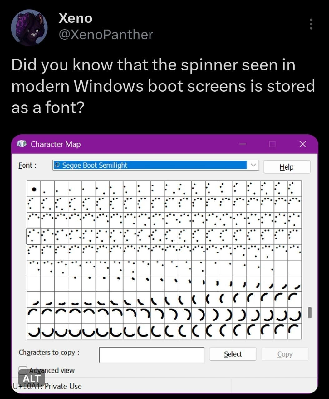
A tweet shows Character Map open on Segoe Boot Semilight: the Windows boot spinner is Private Use Unicode glyphs animated as text. The dive explains why early boot reuses the font pipeline instead of images.
Level 1: A Flipbook in a Font
Imagine you draw a simple cartoon of a spinning wheel in a little flipbook. Each page has the wheel turned just a bit more than the last page. When you flip through the pages quickly, the wheel looks like it’s moving. Now imagine hiding each of those wheel drawings inside what looks like ordinary letters in a special alphabet book. That’s basically what Windows did for its loading spinner! Instead of using a normal picture or video for the spinning dots you see when the computer starts, Windows hid a tiny cartoon of the spinner inside a font (which is like an alphabet file for the computer). Each “letter” in this secret font isn’t a real letter at all, but one picture of the dots in a certain position. When the computer boots up, it quickly swaps through these special characters one by one – just like flipping through the flipbook pages – and you see the dots spin in a circle.
Why is this funny or cool? It’s because it’s so unexpected. It’s like finding out a beautiful animated sign was made using regular old light bulbs blinking in a pattern, or discovering a secret message hidden in an alphabet soup. Developers and tech enthusiasts chuckle at this because it shows how something that looks fancy and dynamic (those spinning dots) is actually built from something very simple and old-fashioned (text characters!). It’s a clever little secret: the Windows startup animation is basically letters doing a dance. Even if you’re not a computer expert, it’s a bit like learning a magic trick – now you know the spinner is just the computer rapidly printing a bunch of funny “letters” you never knew existed. It makes us smile because it reveals the playful, inventive side of how computers work behind the scenes.
Level 2: Actually a Font
In plain terms, this meme is pointing out that the little loading circle you see when Windows boots up is actually drawn from a font instead of an image. The screenshot shows the Windows Character Map tool open with a font called Segoe Boot Semilight. In that grid of characters, instead of the alphabet, you see a bunch of dots and curved shapes. Those are the font’s glyphs – basically the pictures or shapes that the font will draw for certain characters. Normally, a font’s glyphs are letters (A, B, C…) or symbols (@, #, $), but here the glyphs are each like a frame of the spinning dot animation. When put in sequence and updated rapidly, those frames make the spinner you recognize on the boot screen.
Let's break down some key terms and elements to make this clearer:
- Windows Boot Spinner: The rotating dots that appear on your screen when Windows is starting. It’s a loading indicator. Instead of being a video or a GIF, it’s made by cycling through a series of images of dots-in-a-circle.
- Segoe Boot Semilight: This is a special font file in Windows. Segoe is the family name (used in many Windows interfaces), and “Boot Semilight” is a variant meant for the boot screen. This font doesn’t contain normal letters for typing out a document; it contains those dot shapes and arcs that make up the spinner graphic.
- Character Map: A built-in Windows application that lets you view all the characters in any font. The meme’s image is the Character Map displaying the Segoe Boot Semilight font. Each little box in the grid is one character from that font. You can see lots of nearly identical dots and curved shapes – that’s the animation broken into individual pieces.
- Unicode and Private Use: Unicode is the standard system of numeric codes that represent characters from virtually every writing system (and many symbols and emojis). “Private Use” areas in Unicode are ranges of codes that aren’t assigned to any standard symbol – they’re left open for individuals or companies to use for whatever custom characters they need. In the screenshot, when it highlights "U+E0A1: Private Use", it’s showing that this particular character code (E0A1 in hex) isn’t a normal letter or emoji; it’s one that Windows chose to use internally. Microsoft filled that spot with a glyph of the spinner. Essentially, U+E0A1 is one frame of the spinner animation in this font.
- Glyph Animation Frames: Think of a glyph as the picture a font shows for a character. An animation frame is one still image in a sequence of images that when shown quickly one after another create motion. Here, each glyph (dot or arc shape) is one still image of the spinner at a certain rotation. The system draws them in order (for example, U+E0A0, then U+E0A1, U+E0A2, ... and so on) to animate the spinner. Each step makes the dots appear to rotate.
So, putting it together: during the boot process, Windows needs to show you something so you know it’s working – that’s the spinner. But at that early stage, it’s easier and more reliable to use text rendering than fancy graphics. The developers created a font with the necessary pictures. When Windows is loading, it’s effectively printing a special line of text on the screen, but that text is composed of those custom spinner characters. By updating that text (cycling through the characters) rapidly, you see an animation. It’s a smart little workaround that most users would never notice. Only if you poke around in system files or open Character Map (like the person in the tweet did) would you discover that the spinning circle is coming straight from a font. For a new developer or an enthusiast, that’s a “wait, seriously?!” kind of revelation that shows how deep OperatingSystem details can influence something you see every day.
Level 3: Old Trick, New Boot
This meme sprang from a tweet marveling at a hidden gem of Windows internals: the familiar Windows boot spinner isn’t a GIF or a coded drawing routine at all, but a sequence of font characters. For seasoned developers, it’s both hilarious and nostalgic. Microsoft has a history of using fonts to draw UI elements – remember the Marlett font in Windows 95 that rendered window control icons, or the classic Wingdings/Webdings fonts full of symbols? Here we are in 2024, and a modern Windows is still sneaking UI graphics into fonts. It’s an old trick wearing new boots (quite literally boot glyphs). Seeing the Segoe Boot Semilight font reveal dozens of spinning-dot shapes is a "wow, they really did that!" moment. It makes experienced devs smirk because it feels like a practical joke by the OS developers: “It’s not a fancy animated image, it’s just text – gotcha!”
The humor lies in the UX irony. We expect a slick loading animation to be some dedicated graphic, maybe drawn with vectors or a tiny video. Instead, the OS is effectively saying, “Eh, I’ll just reuse the text system.” It’s as if the Windows team thought, “We already have a text renderer that works, why not make the spinner a font?” For a senior engineer, this resonates as a pragmatic solution born out of constraints. Early in the boot process, you don’t have the full DirectX graphics pipeline or complex UI framework loaded. But you certainly have the ability to draw text on the screen (you might need to display a "Preparing Automatic Repair" or a boot menu in plain text). So the engineers repurposed that capability to also draw the loading indicator. It’s a case of using what you’ve got: if all you have is a hammer, everything looks like a nail – if all you reliably have at boot is text, then the spinner might as well be text.
We’ve seen this pattern before in different guises. Web developers, for example, used to use icon fonts (like FontAwesome) to render icons before SVGs became widespread – letters and symbols standing in for images, because fonts scale well. In Windows’ case, the devs composed their own little icon font for the boot loader. That Segoe Boot Semilight font is essentially a sprite sheet, except implemented as a font file. Senior devs find it amusing because it’s a blend of high-level UX polish and low-level OperatingSystems cleverness. It’s the kind of thing you discover by poking around with the Character Map tool on a late night, and it immediately makes you say “of course they did that!” while shaking your head and smiling. This reinforces an unwritten truth in software development: behind every smooth user experience, there’s often a simple, crafty solution (or an outright hack) making it work under the hood. And when that secret is revealed – like an animation hiding in a Unicode font – the developer community collectively nerds out.
Level 4: Spinning in the Private Use Area
Windows’ boot spinner uses Unicode’s Private Use Area (PUA) code points to hide its frames inside a specialized font. At a low level, this is a clever coupling of character encoding and OS boot constraints. The early Windows bootloader environment has limited graphics capabilities before the full GUI is up, but it can render font glyphs. So Microsoft embedded the spinner shapes into a font (aptly named Segoe Boot Semilight). Each tiny dot and crescent arc you see in the Character Map corresponds to a glyph in this font. The status bar in the screenshot shows U+E0A1: Private Use – that code point sits in a Unicode range (E000–F8FF in the Basic Multilingual Plane) reserved for custom symbols. In Segoe Boot Semilight, Microsoft defined those private codes to be the frames of the spinner animation. Essentially, the boot process prints a sequence of these private-use glyphs as if they were characters, cycling through glyph animation frames to create the illusion of a spinning circle.
Using a font for the spinner is a resource-savvy hack grounded in Operating System design. Because these glyphs are vector shapes (just like letters in a TrueType font), they scale cleanly to any screen resolution and color scheme. This is crucial for a boot screen that must run on everything from tiny tablets to giant 4K displays without looking pixelated. By leveraging the text rendering pipeline (which is initialized early for drawing basic UI or BitLocker prompts), Windows avoids loading an image or sprite during boot. The UnicodeSupport for custom glyphs allows the OS to treat an animation as text data – an elegant trick. The boot code can simply increment through Unicode values (0xE0A0, 0xE0A1, 0xE0A2, …) and draw each corresponding glyph on the screen. It’s exploiting the fact that even in a minimalist boot environment, drawing a character from a font is an available primitive. The result? A smooth animated UX element delivered by one of the lowest-level, most stable systems in a computer: text rendering.
This approach highlights a blend of low-level ingenuity and standards. CharacterEncoding in Unicode is flexible enough that an OS can co-opt unused code points for its own purposes without conflicting with real text. If you copied one of those spinner characters and pasted it elsewhere, you'd likely see nothing or a placeholder unless Segoe Boot Semilight is active – that’s by design. It keeps the spinner frames essentially invisible and harmless outside their intended context. Under the hood, Windows’ boot sequence is doing something almost poetic: it’s using the same machinery that draws letters and emojis to draw a tiny rotating UXDesign graphic. This deep cut of system design delights kernel enthusiasts and font nerds alike, because it shows how even OperatingSystems employ creative shortcuts (born of necessity and clever engineering) to get the job done.
Implementing a loading spinner as a font is peak 'we need this to work before the graphics driver loads' energy
Of course the Windows boot spinner lives in Segoe Boot - when the graphics stack isn’t up yet, you do what any seasoned dev would: hijack the Private-Use Unicode range and let DrawText() handle your 60 FPS animation
This is peak 'it's not a bug, it's a feature' energy - Microsoft engineers storing boot animations in a font file because when you're rendering graphics before the graphics subsystem loads, you work with what you've got. Next they'll tell us BSOD error codes are actually just really aggressive emoji
Ah yes, the classic Microsoft engineering approach: 'We need a boot spinner.' 'Just make it a font.' 'But shouldn't we use SVG or - ' 'FONT. IT. NOW.' Turns out when you're Microsoft, every problem looks like a TrueType nail. Though I'll admit, storing animation frames as glyphs in a Private Use Area is actually brilliant - zero dependencies, hardware-accelerated rendering via the font engine, and it ships with the OS. It's the kind of elegant hack that makes you simultaneously respect and question the Windows team's architectural decisions. Next you'll tell me the BSOD is just a really aggressive CSS theme
Peak OS engineering: the Windows boot spinner is a font - use the one rendering path guaranteed pre-driver, animate Private Use Area glyphs, and ship “progress” as typography
Boot spinners as fonts: Because bootloader devs knew trig for arcs wastes cycles when font engines are preloaded and GPU-ready
Of course the Windows boot spinner is a font - vector glyphs render before the graphics stack is up, so the first thing your machine boots is a kerning demo
Spritemap
At least on windows
Ms has a lot of patents on improving it
And rendering resolution independently
Since windows 8 scaling is pretty much a key point
And fonts have a lot of enginering to make them look good on weird scaling factors or fontsizes
As they contain optional metadata for grid snapping
This is a hint where to round the floats in case it doesn’t align with the pixel grid of your screen. Then fonts dont look like they used different strength for different lines in the charavter
1 char has at most just a few triangles and even old af PCs can do that
Window decorations in Win9X were also done by special font.
they render fonts in the kernel btw 💀💀💀💀
point of repeating frames?
Half life does this too