
Compact Keyboard Layout UX Meme Explained
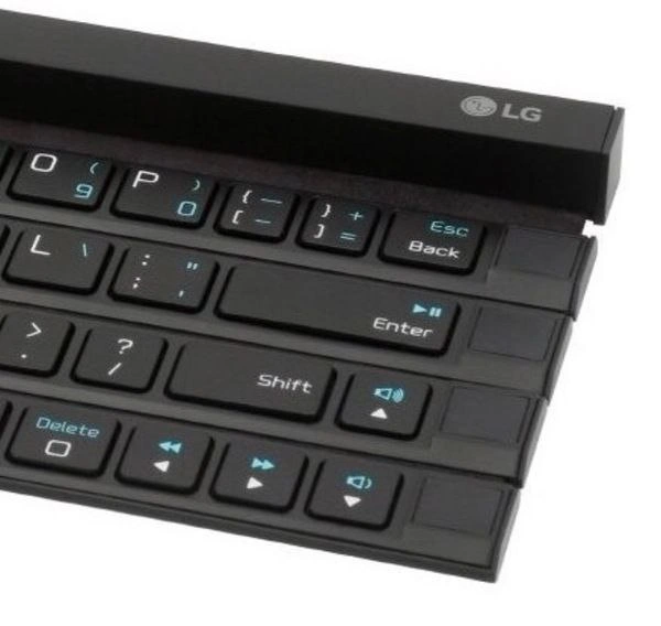
A photo of a black LG compact keyboard shows staggered right-side keys with Esc Back, Enter, Shift, and media controls in almost-normal but wrong places. The dive explains why near-familiar layouts punish developers’ muscle memory harder than fully alien hardware.
Level 1: The Wrong Drawer
It is like using a kitchen where the spoons, forks, plates, and light switches are all in almost the right places, but not quite. You reach without thinking and keep grabbing the wrong thing. The joke is funny because the keyboard looks usable at first, then slowly reveals that it would make every simple action feel a little cursed.
Level 2: Layout Is UX
A normal keyboard works because most people already know where common keys are. Enter submits commands, Shift changes letters or symbols, Delete removes text, arrow keys move the cursor, and media keys control sound or playback. Developers use these constantly, often without looking down.
This photo is funny because those familiar pieces are rearranged into a strange physical shape. The keys are not just small; they are offset and mixed with alternate functions printed in blue. That means a person has to stop and think about actions that are usually automatic. For coding, that is especially annoying because programming uses many punctuation marks and shortcuts. A misplaced bracket, slash, or navigation key can interrupt the whole flow.
The meme belongs with hardware, UX design, and dev experience because it shows how a physical interface can create software pain. Even if the keyboard technically works, it makes the user do extra mental work. That is the same problem as a confusing settings panel or inconsistent UI: the tool becomes something you must manage instead of something that disappears into the task.
Level 3: Muscle Memory Betrayal
The image shows a black LG compact keyboard where the right side of the layout has been broken into staggered horizontal slabs. The visible labels include Esc Back, Enter, Shift, Delete, arrow icons, volume icons, and media playback symbols. The post message says, "Longer you look at it the worse is feeling," and that is exactly the joke: every second of inspection reveals another tiny betrayal of normal keyboard expectations.
For developers, keyboards are not just input devices. They are part of the execution environment. Your hands carry a cached map of where Enter, Shift, Backspace, punctuation, and arrows live. Editors, terminals, debuggers, shells, and window managers all assume that map is stable enough that you can issue commands without consciously searching for keys. This keyboard attacks that assumption by making familiar controls look close to normal while shifting them just enough to punish confidence.
That is why this lands as a developer ergonomics and UX failure meme rather than merely a "weird hardware" photo. Bad interface design is often most painful when it is almost familiar. A completely alien keyboard would make you slow down and adapt. This one invites normal typing habits and then moves the floorboards. Esc Back sitting where a developer's panic reflex expects escape or backspace is a tiny incident waiting to happen in Vim, a terminal, or any tool where one accidental keypress can turn "editing a line" into "why did I just close that state?"
The deeper satire is about tooling that optimizes for packaging, novelty, or product differentiation while externalizing the cost onto users. Compact hardware often tries to solve space constraints by combining functions, compressing rows, and hiding secondary actions behind modifiers. That can be defensible, but the bill comes due in cognitive load. Every blue alternate symbol is another little negotiation between the user's memory and the manufacturer's idea of efficiency. Somewhere, a product manager saved twelve millimeters and a developer lost the will to type curly braces.



This keyboard has enough layout entropy to make Vim users discover new modes by accident.
why
🤣
Is this a real keyboard?
the fuck was delete sacrificed for?
Who designed this.... and WHY
Okay, now I'm getting why. Conventional keyboard used to have 6 rows, but they apparently tried to fit it all in 4 rows
Japanese one seems to solve issue by using 5 rows, but maybe just because they couldn't manage to fit all symbols into 4
anything other than dvorak is stone-age
this isn't useful for anything
Don't let Apple see it. They might be inspired by it.
Where are the F keys then?
Is this a computer keyboard layout from the 70s?