
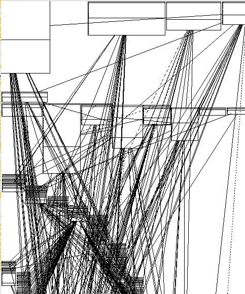
Auto-generated dependency graph of a legacy codebase: visualizing pure architectural chaos
Description
The image is a black-and-white diagram filled with dozens of empty rectangular boxes scattered around the canvas, some aligned at the top, left, and center. Each box is connected to many others by thin, straight black lines drawn at every imaginable angle, forming an almost impenetrable web of intersecting edges. The result resembles an auto-generated UML or dependency graph where relationships overlap so densely that individual connections are hard to trace, evoking the look of classic "spaghetti architecture." No text labels are visible inside the boxes, reinforcing the idea that the structure itself - not the content - illustrates the complexity. For software engineers, this instantly signals uncontrolled coupling, hidden circular dependencies, and the inevitable pain of maintaining or refactoring such a system



Comments
14Comment deleted
Asked the UML generator for a “high-level overview”; it returned a Jackson Pollock of circular dependencies - apparently the only bounded context left is my patience
This is the architectural diagram that finally convinced management we needed a refactoring budget - right after they asked us to add "just one more integration."
This is what happens when you run 'npm install' on a project that hasn't been touched since 2015 - a beautiful visualization of why your node_modules folder is 2GB and contains three different versions of lodash, each required by a different transitive dependency that nobody remembers adding. The architect who designed this probably left the company five years ago, and the only documentation is a comment that says 'TODO: refactor this later.' Spoiler: later never came
The service mesh after your team discovers 'observability via every-to-every tracing' - now even the graph can't find itself
Architecture review: “Can someone highlight the critical path?” - “Tarjan says the whole diagram is one strongly connected component.”
This is our event‑driven microservices diagram; every arrow is an RPC with retries and a shared DB behind it - aka the distributed monolith’s self‑portrait
Organizing graphs for readability is NP-hard Comment deleted
I found a super hacky way to do it in networkx Comment deleted
Look at the OP, think again Comment deleted
Just don't organise for readability? Comment deleted
Nope, it's just pointless doing it algorithmically in general case Comment deleted
Cursed legacy project Comment deleted
me likes graphs. graphs good. Comment deleted
There is organic, tree, circle,... automatic reorganisation graph edges with custom minimum free space between them Comment deleted