
User Reaction to UI Updates
Description
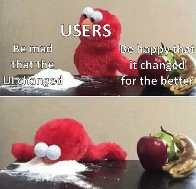
This is a two-panel meme known as 'Elmo's Choice' or 'Elmo with Cocaine'. In the top panel, a red Elmo stuffed animal, labeled 'USERS', is presented with two options. On the left is a pile of white powder representing an unhealthy choice, labeled 'Be mad that the UI changed'. On the right is a pile of healthy fruit (an apple and a banana), labeled 'Be happy that it changed for the better'. In the bottom panel, Elmo has decisively slammed his face into the pile of powder, completely ignoring the fruit. This meme humorously and cynically portrays the common user reaction to software updates. It satirizes the tendency of users to instinctively react with anger and frustration to any change in the user interface, even if the changes are objectively improvements to functionality or usability. For senior developers and product managers, this is a deeply relatable scenario reflecting the challenge of managing user expectations and the inherent resistance to change, regardless of the benefits


Comments
9Comment deleted
The main purpose of a gradual rollout isn't to test for bugs; it's to gaslight your users into thinking the UI was always this way
We shaved 300 ms off FCP, hit Lighthouse 100s, and even got WCAG AAA - yet every support ticket just says “revert, the button isn’t blue anymore.” Latency is negotiable; hue is sacred
After 20 years in tech, I've learned the only UI change users won't complain about is the one that never ships - which they'll also complain about. The real cocaine here is the dopamine hit from finally deprecating IE11 support
After 15 years in the industry, you learn that 'improved UX' is just a euphemism for 'prepare for a week of support tickets from users who can't find the button we moved 3 pixels to the left.' The real product roadmap isn't about features - it's about managing the emotional stages of grief users experience when you dare to update a shadow radius. Ship the A/B test, watch the metrics improve by 40%, read the feedback saying 'change it back,' and realize that Stockholm syndrome is the most powerful force in interface design
UI redesigns: users treat 'better UX' like a deprecated endpoint - immediate 410 Gone on their muscle memory
A/B says +3% task completion, but muscle-memory regressions turned the helpdesk into a write-ahead log - once the complaints append, nobody approves the rollback delete
Every redesign reminds me UI needs semantic versioning - move a button 8px and you’ve shipped a major release with an instant NPS regression
Better for the company maybe Comment deleted
For the better? Never happened to facebook Comment deleted