
UX UI Post #6458 · source on Telegram
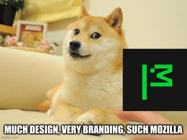
Doge Reviews MDN Neon Green Logo: Much Design, Very Branding, Wow
Description
Meme image of the famous Doge Shiba Inu lounging on a beige couch; the dog’s face is pixel-blurred. In the lower-right quadrant, a black square with Mozilla MDN’s new neon-green, highly abstract logo (two vertical strokes and a mirrored “3” forming a stylised “MDN”) is overlaid on the dog’s chest. Along the bottom, bold white Impact-font text reads: “MUCH DESIGN, VERY BRANDING, SUCH MOZILLA”. The visual gag riffs on classic Doge-speak to poke fun at Mozilla’s 2023 MDN rebrand, whose fluorescent palette and minimalist glyphs sparked lively debate among senior web devs about design systems, accessibility contrast, and brand consistency for a site long regarded as the canonical web-standards reference
More like this
More like this in UX UI →
Use J and K for navigation
Comments
11Comment deleted
Somewhere an over-eager brand guide just elevated --brand-green from accent color to incident severity
After 20 years in tech, you realize the most breaking changes aren't in your API versioning - they're when MDN moves that one CSS property example you've been copy-pasting since 2012, and suddenly your muscle memory grep patterns return nothing but existential dread
When Mozilla spent months workshopping their rebrand with design agencies and focus groups, only to have the entire developer community summarize their reaction in a single Doge meme. The real kicker? The geometric 'M' logo cost more than most startups' entire Series A, yet somehow has less personality than a Comic Sans wordmark. At least when they deprecated XUL extensions, we got WebExtensions in return - this rebrand gave us a logo that looks like it escaped from a 'Learn CSS Grid' tutorial
Thunderbird's logo: where Mozilla perfected Rust's syntax but forgot to refactor pixel art from the Netscape era
Marketing spent a quarter turning “Mozilla” into “moz://a”; my 12‑line i3 config actually improved throughput - yet only the logo got a launch party
While marketing agonizes over moz://a kerning, i3 users tweak a 40-line config and shave context-switch latency - branding with benchmarks
All I have to say is "Why not white flag" Comment deleted
Only for 🇫🇷 locales Comment deleted
I see a little barky face Comment deleted
But who cares about the corporation? The browser logo doesn't change right? Comment deleted
Like, the corporation could literally pick as its symbol the intolerant tolerance black power indigenous furry LGBTQIAA+ flag, and I still would not care. Comment deleted