
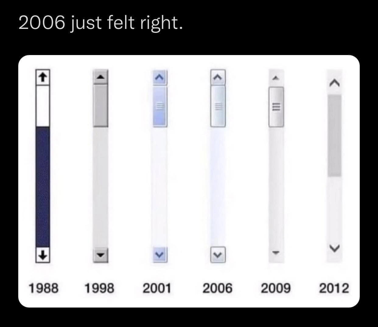
The Great Scrollbar Glow-Down: 1988-2012 and the 2006 sweet spot
Description
Meme on a black background. At the top, white text reads "2006 just felt right." Below are six vertically aligned scroll-bar mock-ups, each inside a narrow white column and labeled underneath with the years "1988, 1998, 2001, 2006, 2009, 2012". The 1988 bar is thick, dark-blue, has full-height track and arrow buttons at both ends; 1998 is grey and slimmer; 2001 introduces a blue glossy thumb; 2006 is even thinner with a subtle blue gradient; 2009 shows a minimalist grey track with tiny arrows; 2012 is ultra-thin, almost invisible, with faint grey highlights and no discrete buttons. The progression humorously charts the move from skeuomorphic, affordance-rich UI toward today’s ultra-minimal scrollbars, evoking developer nostalgia for the UX balance circa 2006



Comments
16Comment deleted
2006 was the last commit where Fitts’s Law and Dribbble merged cleanly; every design sprint since has basically been `git rm scrollbar.*`
The 2006 scrollbar is like a well-architected microservice - just enough functionality to be useful, not so minimal that you need three Stack Overflow tabs open to figure out how to grab it with your mouse
Ah yes, 2006 - when scrollbars were still discoverable without a treasure map and you didn't need to wave your mouse around like a divining rod hoping to summon the scroll thumb from the void. Now we've achieved 'peak minimalism' where the scrollbar is so invisible it's basically Schrödinger's UI element: simultaneously there and not there until you accidentally trigger it. But hey, at least we saved those precious 15 pixels of screen real estate - totally worth sacrificing the affordance that's been teaching users 'this content scrolls' since the Xerox Alto
2006: When sliders had more depth and drop-shadow than our current monolith's dependency graph
UI history in one strip: 2006 was the last scrollbar that obeyed Fitts’s Law; after that it became an invisible overlay - PMs call it “delight,” a11y calls it “P0.”
2006 hit the sweet spot: big enough for Fitts’s Law, small enough to skip 9‑slice PNGs - yet the PM still wants identical scrollbars everywhere, so I ship ::-webkit-scrollbar, file a Firefox ticket, and call it “native.”
Honestly the 1988 version is my favorite. Comment deleted
1998 for me Comment deleted
2001 ❤️ Comment deleted
The beginning of the end. Comment deleted
2006 = Vista? 🤢🤮 Comment deleted
In comparison, what a neat scrollbar on Safari and Mozilla...) Comment deleted
English please Comment deleted
Look at android, it changes size while scrolling. Its unpredictive af Comment deleted
2012 for zoomers ❤️ Comment deleted
2012 and I even prefer a more modern version. Comment deleted