When removing your glasses makes code look like colorful barcode lines
Why is this DeveloperExperience DX meme funny?
Level 1: Rainbow Blur
Imagine you’re reading a book that has each line of text in a different bright color. Now, if you take off your glasses (and you really need glasses to see), the page wouldn’t look like words anymore – it would just look like blurry lines of colored ink. You wouldn’t be able to tell what any word says, just that one line is maybe pinkish, the next is bluish, then yellow, and so on. It’d kind of resemble a rainbow striped painting instead of a page of text.
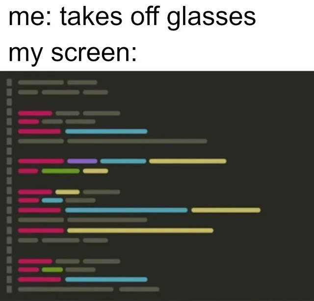
That’s exactly the joke here. A programmer’s computer screen normally shows code (instructions for the computer) in various colors to help them read it. But when this person takes off their glasses, they lose their clear vision. To them, the screen suddenly looks like a bunch of fuzzy, colorful bars lined up – like a barcode you’d see on a product, except in neon colors! It’s funny because the code, which is usually very precise and detailed, turns into something totally unreadable and absurd the moment their glasses are off. It captures a feeling of frustration in a silly way: the poor programmer can’t read anything and their screen might as well be modern art. The humor is basically, “Without my glasses, my code isn’t code anymore – it’s just a pretty rainbow blur!”
Level 2: Blurry Code Blues
For a less seasoned developer (or anyone new to coding humor), let’s break down the joke. Most programmers write code using an application like an IDE (Integrated Development Environment) or a text editor (for example, Visual Studio Code or Sublime Text). These editors have something called syntax highlighting: they show code in multiple colors. Each color usually means something:
- Keywords (like
if,while, orfunction) might be blue or purple. - Strings (text in quotes) could be green.
- Numbers might be teal or another color.
- Comments often appear in gray or italics.
- Function names or classes might be bold or a different color (pink in the meme image).
All those bright colors against a dark background make code look a bit like a neon text rainbow. This isn’t just for aesthetics – it helps developers quickly spot what’s what. For example, if you see a lot of green, you know there are strings or text, whereas blue might indicate language keywords. Code readability improves when your brain can latch onto these visual cues. This is a key part of a good developer experience: your tools (in this case the editor and color theme) help you understand code faster.
Now, enter the glasses (or rather, exit the glasses). If a programmer has poor eyesight (vision impairment like being near-sighted), they rely on glasses or contacts to see the screen clearly. “Me: takes off glasses” means the person in the meme has removed their glasses. The next line “my screen:” shows what they see now. The once-sharp code text has turned into blurry lines of color. Essentially, each line of text is so out-of-focus it looks like a horizontal bar of solid color. The dark theme of the editor is still there (charcoal gray background, lighter gray indent guides and line numbers), but the actual code characters have melted into fuzzy streaks. It’s as if someone smeared the lines of code with a blur tool. The result? The code editor resembles a panel of multicolored barcode stripes. You can’t read any words, you just see the general placement and color of lines.
This is funny to developers because it’s an exaggeration of a real experience. Many programmers have indeed had moments where:
- They rub their eyes or take off their glasses for a second and everything on the screen turns illegible.
- Stepping a few feet back from the monitor makes their nicely written code look like abstract art.
- Without corrective lenses, all that carefully indented, color-coded code might as well be a bowl of rainbow spaghetti!
It’s a relatable mix of developer frustration and humor: “I literally can’t read my code without my glasses – it’s just pretty colored blur.” The meme uses the visual gag of a code editor turned into a color bar image to drive the point home. If you’ve ever squinted at your screen or increased the font size because things were fuzzy, you’ll likely chuckle at this. It also lightly touches on accessibility in dev: not everyone has perfect vision, so being able to adjust font sizes, colors, or rely on tools is important. But in this case, the only “tool” that will fix it is putting the glasses back on!
In summary, for a junior dev or someone newer: The meme shows how without glasses, a developer’s screen full of code in different colors blurs out so much that it looks like a bunch of colored lines. It’s highlighting a day-to-day developer experience in a funny way – you need your glasses to code, otherwise your screen might as well be an unreadable rainbow barcode. This falls under classic coding humor/developer humor because it’s a situation only programmers might encounter (having multi-colored code) and find funny in an “oh no, so true!” kind of way.
Level 3: Focus Out-of-Scope
When a nearsighted developer takes off their glasses, the meticulously crafted source code on their screen can transform into an abstract art piece of colorful bars. What’s happening here is essentially an unintentional demonstration of optical and UI principles:
- Syntax Highlighting – Modern IDEs and text editors (think VS Code, IntelliJ, etc.) use bright, varied colors to distinguish keywords, variables, strings, and other syntax. Each line of code often contains multiple color tokens (e.g., a pink function name, a blue keyword, a green string literal). Normally, these colors improve code readability and help our brains parse complex logic faster.
- High DPI Displays vs. Myopia – Contemporary monitors have high pixel densities (often called Retina displays or high DPI screens) that render code in razor-sharp detail. But if your eyes can’t focus (due to myopia, i.e. being near-sighted), all that crisp detail is lost. The text on the screen blurs together, leaving only broad swaths of color perceptible. In effect, the human resolution has dropped – an eye-chart for code would suddenly read like abstract impressionism.
- Indentation and Structure – Notice those faint vertical guides and line numbers on the left? Even in a blur, you can make out code structure: indented blocks appear as shifted bars. The code’s shape (like where loops or functions start and end) is vaguely visible, but the actual characters are indistinguishable. It’s a bit like looking at a barcode: uniformly tall lines of varying lengths that carry information, except here the info (actual code logic) is effectively encrypted by blur.
From a Developer Experience (DX) perspective, this scenario hits home. We invest in ergonomic keyboards, multiple monitors, and custom color themes for productivity. Yet a simple act of removing glasses can defeat all those enhancements. The meme humorously reminds us that all the fancy IDEs/editors features in the world (like syntax highlighting, auto-completion, or zoom) mean nothing if you physically can’t see the screen clearly. It also hints at an accessibility issue in dev life: good vision (or corrected vision) is practically a requirement to decipher code on-screen. Some seasoned devs even bump up their font sizes or use tools like screen magnifiers to avoid the “colorful barcode” effect. In extreme cases of screen blur, a diff or code review without glasses might as well be a modern art critique – “I see bold strokes of pink and cyan, truly avant-garde, but I have no idea what it means.”
Beyond humor, there’s a kernel of truth: code readability isn’t just about clean syntax and good naming; it’s also about physical readability on a screen. That’s why accessibility in development matters – themes with good contrast, ability to zoom text (Ctrl + +), and yes, making sure your corrective lenses are up to date! This senior-level insight is both funny and a subtle nod: even the best technology is humbled by human biology. As one battle-scarred dev might quip, “All those 4K lines of code, and I’m seeing in 144p without my specs.”
Description
The meme has a white header with black text reading, "me: takes off glasses" on the first line and "my screen:" on the second. Below, a dark-theme code editor is shown, but every line of code is an indistinct horizontal bar, rendered in bright syntax-highlight colors - pink, cyan, yellow, green, and purple - against a charcoal background. Indentation guides and line numbers are visible on the left, yet the actual characters are completely blurred, mimicking severe myopia. The joke riffs on how developers with poor eyesight lose all code readability when they remove their glasses, turning carefully formatted source files into abstract colored streaks. It highlights day-to-day DX pain points around screen clarity, accessibility, and the reliance on IDE syntax highlighting for navigating large codebases
Comments
6Comment deleted
Forgot my glasses and my IDE rendered the entire codebase as a flamegraph - great for spotting perf hotspots, still hopeless for naming variables
Finally, a legitimate use case for AbstractSingletonProxyFactoryBean - when your code is so blurry it could actually be Enterprise Java and you'd never know the difference
The irony is that we spend thousands of hours bikeshedding over the perfect color scheme and font ligatures for our IDE, only to realize that when our eyes are tired enough, all that matters is whether the syntax highlighter can turn our codebase into an abstract impressionist painting. At least we can still distinguish strings from functions by color alone - who needs to read variable names anyway?
Without my glasses, VS Code renders as a Jaeger trace - colored spans, no context - probably the right abstraction level for this microservice anyway
Glasses off perfectly emulates debugging minified prod JS in Notepad - pure senior dev accessibility test
I used to think syntax highlighting was cosmetic - then I took off my glasses and realized it’s my primary parser