Skip to content
DevMeme
6047 of 7435
Earth's rebrand: now with less information
UX UI Post #6622, on Apr 3, 2025 in TG

Earth's rebrand: now with less information

Why is this UX UI meme funny?

Level 1: Where Did Everything Go?

Imagine you have a detailed globe or map of the world that shows all the countries, oceans, and even the clouds. You can point out where you live, where your friend lives, and where the mountains and rivers are. Now imagine someone comes along and says, “Let’s make this map look cooler.” They erase all the countries, all the lines and details, and they just paint a big blue and green circle. Now your map (or globe) is just a plain ball of blue and green with no markings at all. It might look clean and pretty like a simple toy or a logo, but you can’t tell what’s what anymore. You’d probably ask, “Hey, where did everything go?!”

That’s exactly why this is funny. It’s like taking something that was really useful and informative (but maybe a bit cluttered or old-looking) and making it super simple and modern-looking – and in the process, removing all the important parts! It’s as if your favorite storybook had detailed pictures, and then a designer turned them into just basic shapes and colors. You’d laugh because it looks so different, but you’d also be a little annoyed because you lost the details that mattered. In the meme, Earth’s “new look” is nice and neat, but also kind of silly because an Earth with no visible countries or features isn’t very useful. The joke is showing that sometimes making something simpler or fancier can backfire – it might look nice at a glance, but if you actually try to use it, you realize all the helpful stuff is gone. So it makes us laugh and shake our heads, because we recognize that feeling: uh-oh, maybe we went too far with the makeover!

Level 2: Where Are the Continents?

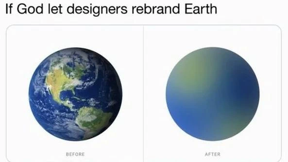
At first glance, a junior developer or casual viewer might ask, “Wait, where did all the continents and details go?” That’s exactly the point of the joke. In the “BEFORE” image, Earth looks like a regular globe: you can see landmasses (continents like Africa, Asia, etc.), the blue oceans, and white swirly clouds. It’s detailed and realistic. In the “AFTER” image, all those recognizable details are gone. Instead, we just have a smooth blue-green circle. It’s as if someone literally redesigned Earth in a super simple style. This style of design – removing details and using simple colors – is a known trend in UIDesign and UXDesign called flat design or minimalist design.

Let’s break down what’s happening in simpler terms. MinimalismInDesign means using only the most essential elements and nothing extra. In a user interface, that often means: no fancy textures, no detailed illustrations, just flat colors, basic shapes, and maybe some nice typography. Here, minimalism turned Earth into a plain circle with a subtle color blend. That blue-to-green color blend is a gradient (a smooth transition from one color to another). Gradients became really popular in modern design because they add some visual interest without going back to highly detailed imagery. In the “AFTER” panel, the gradient presumably is blue at one part (to hint at oceans) transitioning to green (to hint at land), but without any clear borders or shapes. Essentially, it’s Earth as an icon or logo, rather than Earth as a detailed map.

So why is this funny or significant to developers? Imagine a software or website you use undergoes a big redesign. Before, maybe the interface had clear icons with labels, distinct sections with borders, maybe even some 3D-style buttons that obviously look clickable. After the redesign, everything is ultra-modern: flat colors, maybe just simple icons without text, and a lot of white (or empty) space. Suddenly you have to relearn the interface because all the visual cues you relied on are different or gone. The meme is comparing that situation to an extreme case: relearning the Earth because a designer erased the familiar continents! It’s a playful exaggeration of what new design trends sometimes feel like to users.

Let’s introduce a key term: affordance. An affordance in design is a visual hint that tells a user what they can do. For example, if a button has a shadow and looks raised, it’s hinting “click me, I’m a button!” If a link is underlined and blue, it says “hey, I’m clickable text.” In older, more detailed designs, we had lots of these clues. Buttons looked like physical buttons, sliders looked like knobs, etc. Now, with flat minimalist styles, designers often remove those extra cues to make everything look cleaner. Sometimes a button is just a colored flat rectangle or even just text with a subtle background. If you’re not used to it, you might not recognize it’s interactive. In the Earth analogy, the continents, the different colors and textures on the globe, are like the interface clues or labels on a map. They tell you “this part is land, this part is water, here’s a storm system, here’s the equator.” Remove all that, and you have no idea what’s what — just like a newbie user staring at a new app design might have no idea where their favorite feature went.

Now, what is a design system? It’s basically a set of rules and components for a product’s interface. Think of it as a style guide or a toolkit that says “our buttons look like this, our colors are these, our icons all follow this style.” Companies create design systems to ensure consistency. When a new design system comes in, developers have to update the app to match it. If that new system is all about flat design and gradients, then things like images or detailed icons get replaced with simpler versions. In this meme scenario, the “design system” might have dictated: Earth’s new brand color palette is blue-green, and the shape language is simple and flat. So out goes the photo-realistic Earth, and in comes the flat gradient circle. This echoes real life – for example, a company might rebrand and tell the dev team: “No more drop shadows or skeuomorphic icons, everything should be flat and modern.” Developers then have to replace assets (like images, icons, CSS styles) throughout the app. It’s a lot of work, and sometimes not every screen is updated in time, leading to InconsistentUIs where some pages still have old styles and others have the new look. That inconsistency can be confusing: imagine one page of a site still shows the old detailed Earth image while another page uses the new gradient Earth graphic. You’d double-take and wonder if it’s the same product!

For someone early in their career, this meme is also a gentle introduction to DesignTradeoffs. A trade-off means you give up something in exchange for something else. Here, by making Earth look cleaner and more “modern,” we gave up clarity and information. In design terms, the trade-off was aesthetic appeal vs. informational richness. Many junior devs witness this when a UXDesign team decides to simplify an interface: the app looks less cluttered and more consistent (a good thing), but users might initially struggle because the recognizable bits (maybe a gear icon that meant “settings,” or colored indicators that meant warnings vs. safe status) have changed or been removed. The meme just pushes that idea to the extreme for humor – nobody is actually rebranding the planet, but if they did, it shows how absurd it would be to lose all that info.

And yes, this is definitely TechHumor and RelatableHumor. Even if you haven’t been through a redesign yet, you probably know the feeling of a favorite app changing its look unexpectedly. Think of when your phone’s OS updated and suddenly all the icons looked different and you weren’t sure which was which at first. Or when a website you visit regularly suddenly changes layout and you have to hunt for the login button which used to be obvious. It’s a bit annoying but also something we laugh about later. People in the industry poke fun at this because it happens a lot – styles in tech go through fads. One year everything has drop shadows and 3D effects, the next year it’s all flat and geometric. The meme uses Earth as a canvas for that joke: even something as big and important as Earth would not be spared from a redesign if designers had their way! Of course, it’s exaggerated satire – in reality we usually keep maps realistic for good reason – but it highlights how sometimes design trends can go overboard. The takeaway for a newcomer is: design changes can be great and make things modern, but they have to be balanced with usability. Too much change or simplification done just for style can leave people disoriented, much like a blank globe would leave a navigator lost.

Level 3: Flat Design Goes Global

The meme imagines a cosmic-scale UXDesign overhaul: “If God let designers rebrand Earth.” In the left “BEFORE” panel, Earth is shown in all its richly detailed glory – think NASA’s Blue Marble photo with distinct continents, swirling clouds, and textured oceans. In the right “AFTER” panel, Earth has been transformed into a featureless orb with a blue-to-green gradient fill, utterly minimalist. This before/after contrast parodies the modern MinimalismInDesign trend: taking something complex and information-rich and flattening it into a trendy but uninformative graphic. Seasoned developers and UI folks are chuckling (or cringing) because it’s IndustrySatire mirroring real-life redesigns. We’ve all seen a product’s UI go from detailed and clear to ultra-flat and abstract overnight. It’s the classic brand reductionism move – strip away “unnecessary” detail for a sleek look – taken to ludicrous extremes. The Earth’s continents, analogous to important interface details, have been vaporized into a vague color wash. Sure, the new Earth looks modern (hello, flat design 3.0 with gradients and soft hues), but it’s also lost every bit of useful information. This is humor with a bite of truth: in tech, design trade-offs often pit aesthetic minimalism against clarity. The meme exaggerates that tension by applying a designer_vs_realism philosophy to an entire planet. The result is both hilarious and painfully familiar to anyone who’s survived a radical app “refresh.”

From a senior dev perspective, this hits home because it’s a trope we recognize well. A new design system drops, and suddenly every distinct visual cue gets homogenized. In the meme, God’s presumably handed Earth’s style guide over to a trendy design agency, and they’ve returned a dribblet-style smooth ball. In real life, this might be when marketing decides the product needs a “fresh, youthful vibe” – cue the flat icons, pastel gradients, and sans-serif everything. The meme’s AFTER Earth is essentially a giant compliant UI component: Earth 2.0 with all the affordances and unique identifiers scrubbed off. For instance, continents in the “before” acted like clear labels or sections (“here’s Africa, here’s South America”); they provided semantic cues just like distinct icons or headings do in a UI. The “after” Earth has none of that – it’s like an app where every button and section looks the same. Veteran engineers have seen how this plays out: users get lost, critical info gets hidden, and the support tickets start rolling in (“Where did feature XYZ go?!”). It’s relatable humor because we’ve been the ones implementing such redesigns and then firefighting the fallout.

To illustrate how drastic this change is, imagine the actual implementation in code. Instead of using a detailed Earth image, the new design might be done with pure CSS. It’s literally gradient_everything. Perhaps something like:

/* Old Earth icon with a detailed image */
.earth.before {
  background: url('earth_detailed.png') center/cover no-repeat;
}

/* New Earth icon with flat gradient */
.earth.after {
  background: radial-gradient(circle, #66ccff 0%, #339933 100%);
  border-radius: 50%;  /* make it round like a circle */
}

In this pseudo-code: the original Earth had an actual image (earth_detailed.png) showing real terrain; the redesign replaces it with a radial-gradient (blending a blue ocean tone into a green land tone) on a perfect circle. No more distinct shapes or textures – just color and geometry. As front-end devs, we know this kind of change well: swapping out rich visuals for flat placeholders under tight deadlines. The snippet above is both absurd and accurate – it’s exactly how you’d implement a “flat Earth” look in CSS. And as soon as that goes live, QA and users might exclaim, “Umm, guys, the map’s gone blank!”

The deeper irony is how such DesignTradeoffs get justified. Proponents of ultra-flat design argue it looks cleaner, loads faster, and focuses on “essentials.” True, a gradient sphere is lightweight – no complex textures, and very on-brand if your brand is Generic Modern. But the essentials for usability might be gone. Affordances – those visual hints that say “I’m a button” or “this section is important” – often vanish in the quest for minimalism. In classic UI theory, a button with a shadow affords clicking by looking raised; a distinct icon plus label affords easy recognition of a feature. Remove these, and users must guess. In the meme’s Earth, we’ve lost the “affordance” of recognizable geography. It’s literally a world with no landmarks. This underscores a running joke in UX circles: too much minimalism can be user-hostile. You get a TechHumor situation where a magnificent, information-dense globe is reduced to what could be a chic app logo or a loading spinner backdrop. As an IndustrySatire, it gently mocks the (over)confidence of design teams who assume a minimalist rebrand can replace something as inherently complex as, well, reality.

Senior engineers also appreciate the nod to how such redesigns roll out in practice. Often, not everything gets updated in one go – legacy pages, older components, or entire features might lag behind. In a real project, that could mean half your app is the new flat style and half is still the old detailed style, creating jarring InconsistentUIs. The meme spares us that horror by showing an “after” that’s uniformly flat. But many of us have lived through a period where the UI felt like a mismatched patchwork: say, the home page is all new gradient minimalism, but drill-down screens still have shadows and skeuomorphic icons from 2010. The laugh here comes with a side of PTSD: we’ve debugged those CSS clashes at 3 AM, trying to make old and new coexist without breaking everything.

Ultimately, the meme’s joke lands because it’s outrageously RelatableHumor. It’s the world’s biggest design trade-off illustrated literally: aesthetic consistency versus informative detail. The “After” Earth might look like a cool logo for a startup called Earth.io, but you wouldn’t want to navigate by it. It’s like an inside joke for devs and designers: be careful what you simplify. Even God might raise an eyebrow at a sphere_design_simplification that wiped out the continents. By pushing a real trend to an absurd outcome, the meme makes us reflect on our own experiences with flatten-everything redesigns – and laugh (or groan) at how true it sometimes feels.

Description

A two-panel meme with the caption 'If God let designers rebrand Earth'. The left panel, labeled 'BEFORE', displays a detailed, realistic photograph of the planet Earth as seen from space, showing the continents of North and South America, deep blue oceans, and swirling white clouds. The right panel, labeled 'AFTER', shows a perfectly smooth sphere with a soft, minimalist gradient that transitions from a muted green at the top to a royal blue at the bottom. This 'rebranded' Earth is devoid of any features, textures, or details. The meme satirizes the corporate and tech industry trend of minimalist design, where complex and detailed logos or interfaces are often 'simplified' into generic, abstract gradients and shapes. For experienced developers, this is a relatable critique of UI/UX redesigns that prioritize a trendy, 'clean' aesthetic over information density and functionality, often resulting in a less usable product
Comments

22
Anonymous ★ Top Pick Earth v2.0: a breaking change that removes the 'continents' feature entirely. The documentation just says the new design is 'more intuitive.'
  1. Anonymous ★ Top Pick

    Earth v2.0: a breaking change that removes the 'continents' feature entirely. The documentation just says the new design is 'more intuitive.'

  2. Anonymous

    Classic redesign playbook: delete a few continents, ship the gradient, and call it an MVP - just don’t ask the GIS microservice where to put California now

  3. Anonymous

    Just like how we went from detailed skeuomorphic interfaces to flat design that users can't distinguish buttons from labels, Earth 2.0 ships with zero affordances - good luck finding your continent when everything is just a smooth gradient. At least the bundle size is smaller and it renders at 60fps on all devices

  4. Anonymous

    This perfectly captures the modern design philosophy: take something with rich, complex information architecture and reduce it to a gradient that looks great in a portfolio but tells you absolutely nothing. It's the visual equivalent of replacing your entire monitoring dashboard with a single green circle that says 'System: Good' - technically minimalist, aesthetically pleasing, and completely useless when you actually need to debug production at 3 AM

  5. Anonymous

    Classic visual refresh: swapped geography for a CSS radial-gradient and a design token - OKRs green, WCAG red, and every GIS integration just hit a breaking change

  6. Anonymous

    Classic rebrand: continents deprecated as ‘visual noise’ and replaced by design tokens planet.primary and planet.accent - looks great until your routing algorithm returns “blue” for every destination

  7. Anonymous

    Earth's continents deprecated for viewport scalability - now renders at 60fps on any device

  8. @ZgGPuo8dZef58K6hxxGVj3Z2 1y

    This is how it will look like after AI nukes the planet.

  9. @callofvoid0 1y

    if earth was a japanese... uh...

  10. @SoutHora 1y

    Ugh, a gradient, too complicated. Make it two tones. Blue and green 👍

    1. @callofvoid0 1y

      color ramp : linear❌ constant✅

    2. @ZgGPuo8dZef58K6hxxGVj3Z2 1y

      "DEI here. That excludes africa and the middle east and The arctic" /s

  11. @NaNmber 1y

    I like gpt suggestion more

    1. @mira_the_cat 1y

      why letter?

      1. @ZgGPuo8dZef58K6hxxGVj3Z2 1y

        Because murrica

    2. @mira_the_cat 1y

      more like this imo, but with better colors

      1. @mira_the_cat 1y

        make an image/svg+xml with $\left|x\right|\le\left|y\right|\left\{x^{2}+y^{2}\le1\right\}$ being green and $\left|y\right|\le\left|x\right|\left\{x^{2}+y^{2}\le1\right\}$ being blue

        1. @sylfn 1y

          you couldve used css of tikz

        2. @mira_the_cat 1y

          then i converted resulting svg to base64, from which i've made a data: URI, which i opened and screenshoted that to get this image 👍

          1. @qtsmolcat 1y

            Must be a true sw engineer, severely overcomplicating everything

  12. @Le_o_R 1y

    Meanwhile at Google...

  13. @Cyanhound 1y

    Round pizza theory

Use J and K for navigation