Skip to content
DevMeme
1476 of 7435
Web Design Evolution: From Kernel Compilers to Button Templates
TechHistory Post #1651, on Jun 1, 2020 in TG

Web Design Evolution: From Kernel Compilers to Button Templates

Why is this TechHistory meme funny?

Level 1: Homemade vs Store-Bought

Imagine building a treehouse. Twenty years ago, a super handy person (like the buff dog in the meme) would chop the wood, hammer every nail, and design the whole treehouse from scratch. They’d even climb the tree and make sure each plank fits perfectly, doing all the hard work themselves. Now imagine someone today (like the smaller dog) who wants a treehouse but instead buys a ready-made treehouse kit from the store. They just follow the instructions, maybe snap a few pieces together, and ask others “Hey, which kit is the best one to get?”

That’s the joke of this meme in simple terms. The strong dog on the left is like a master craftsman who does everything the hard way (but gets exactly what he wants). The smaller dog on the right is like someone who prefers things pre-made for convenience. It’s funny because the difference is so extreme: one built an entire “kingdom” by hand, and the other just wants to download a ready button (like buying a pre-painted door for the treehouse).

So, think of the old web designer as a chef who bakes a cake from scratch – mixing flour, sugar, eggs, and even decorating it meticulously by hand. The new web designer is like someone who goes to the bakery and buys a beautiful cake or uses a cake mix, then maybe just adds a cherry on top. Both get a cake in the end, but the effort and skills used are completely different. We laugh at the meme because seeing them side by side – the all-powerful DIY expert versus the convenience-seeking modern guy – is a fun way to understand how making websites used to be versus how it is now. It’s basically saying, “back then you had to be a builder and an artist, now you can be more of an assembler and a planner.” And that big change in how things are done is so dramatic that it’s just inherently comical when illustrated with these two dogs!

Level 2: Handcrafted vs Prefab

Let’s break down what’s happening in each panel and why it reflects such a big change in web design from 2001 to 2020:

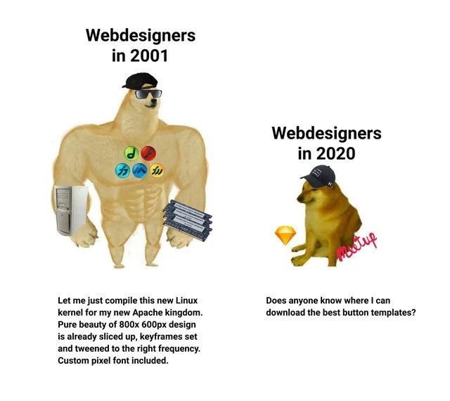
Webdesigners in 2001 (Buff Doge): In 2001, a person building websites often had to do everything from scratch. The meme shows a super-strong Doge with old software logos on his chest and holding computer parts, which represent the all-encompassing role of a “webmaster.” Here’s what all those references mean:

  • Compiling a Linux kernel: The kernel is the core of an operating system (Linux, in this case). “Compiling” it means turning the source code into a working program – essentially building your own custom OS. In practical terms, a tech-savvy web designer might compile a Linux kernel to optimize their server. For example, they might remove unnecessary drivers or enable special CPU features to make the server run faster or use less memory. This is a very low-level, advanced task – imagine taking apart a car engine and rebuilding it tuned to your needs. In 2001, some web folks did this to squeeze more performance out of their Apache server (the software that serves web pages to users). Apache was the most common web server software then (and still one of the top ones). Saying “my Apache kingdom” is the Buff Doge humorously calling his web server environment a kingdom he rules over. So essentially, this dog is both the castle architect and the king – he sets up the server machine himself and reigns over the website it hosts.

  • Beige PC tower & RAM sticks: The Doge is holding an old-school beige computer tower and a handful of RAM modules. This is a visual joke: back then, web designers often dealt with physical hardware. If your site needed to handle more visitors, you might literally install more RAM in your server or upgrade the CPU. The beige color of the PC is a nod to the typical look of PCs in the 90s/early 2000s – most computer cases were this beige/gray color (think retro PCs). RAM (random-access memory) is what computers use to hold data temporarily for quick access – more RAM means your server can handle more simultaneous users or heavier applications. Buff Doge holding hardware shows that in 2001, working on the web could involve sysadmin tasks (system administration) and hardware knowledge, not just graphic design. It’s like he’s saying, “Need more power for my site? I’ll just stick in another 256MB of RAM and recompile some code.” It was a very hands-on approach.

  • Dreamweaver, Flash, Fireworks, Shockwave icons: These round colorful icons on Doge’s chest are logos of popular WebDev tools from the early 2000s.

    • Dreamweaver: An HTML/CSS editor with a visual design interface (a WYSIWYG editor). It allowed designers to drag-and-drop elements and then it would generate the code. Many professionals still ended up tweaking the code manually, but Dreamweaver was like the IDE (Integrated Development Environment) of web design in that era. Owning and using Dreamweaver was a sign you were serious about web design.
    • Flash: A tool for creating animations and interactive content that would run in the Flash Player plugin in browsers. Flash used a timeline with keyframes (like frames in a cartoon) and tweening (the software filling in movement between keyframes) to animate graphics. Web designers used Flash to make things like animated banners, splash pages, or even entire websites. It was very popular for making a site look “cool” with moving graphics and sound. (Fun fact: You needed the Adobe Flash Player installed in your browser to see this content – that’s the thing that got killed off in 2020 because modern web standards replaced it.)
    • Fireworks: A graphics editor specifically geared towards web graphics. Think of it as a mix between Photoshop and Illustrator but optimized for making website images. You could design a webpage layout in Fireworks and then “slice” it into pieces for export. Slicing means cutting one big image into many smaller images so you can assemble them in a webpage. For example, if you designed a whole webpage as one image, you’d slice the navigation bar, buttons, backgrounds, etc. into separate image files. This was done to optimize loading and to enable certain parts to be clickable links. Fireworks made this easier by letting you draw slice boundaries and export all of them at once.
    • Shockwave: Another browser plugin from Macromedia (same company as Flash). Shockwave was used to play content created in Macromedia Director, which was typically heavier multimedia like 3D graphics or complex interactive games/educational tools. It’s mentioned here likely as an extra flex of old tech – Shockwave was more niche than Flash for web design, but if you knew it, you were really doing high-end stuff (like 3D product demos or elaborate animations). It’s largely obsolete now (browsers don’t even support the plugin anymore).

    Having all these icons on Buff Doge implies that a 2001 web designer often had to know multiple complex tools. One person might use Dreamweaver for site structure, Fireworks or Photoshop for graphics, and Flash for animations or interactive parts. It’s multidisciplinary: coding, visual design, and even audio/animation design in one role.

  • 800×600px design (already sliced up): The text says the design of 800x600 pixels is “already sliced up”. This refers to the common practice of designing for a fixed resolution (800×600) and then slicing the layout. Why 800×600? Because at that time, many monitors used 800×600 as their display setting, and it was considered safe to make websites that width so everyone could see the full page without scrolling horizontally. “Already sliced up” means our 2001 designer has taken their page layout (likely created in Photoshop or Fireworks) and cut it into pieces to build with HTML tables. This slicing was a meticulous process. For example, you might have one slice for a header image, slices for each menu button (so they could light up on hover), and slices for various content blocks and backgrounds. Each slice would be saved as a separate image file (like .gif or early .png or .jpg) and then put into an <table> code structure in the HTML. This is how complex visuals were achieved before CSS could layer things easily. It was labor-intensive, but it was the norm. If you ever come across older web pages’ source code, you’ll see lots of <table> tags, with rows and columns holding tiny images — that’s the slicing in action.

  • Keyframes set and tweened to the right frequency: This is describing the process of making a Flash animation. Keyframes are specific frames in the animation timeline where you define a state or position of objects. Tweening is letting the software fill in the frames in between so the motion looks smooth. The “right frequency” is a funny way of saying the right frame rate (how many frames per second, fps). For instance, 24 fps was a standard for relatively smooth animation (mimicking film), 12 fps could look choppier but use less CPU. In Flash, designers would choose a frame rate that balanced smoothness and performance. Early 2000s computers and internet speeds meant you had to be mindful of not making your animations too heavy. If you set a very high frame rate or had too much going on, some users’ computers would lag. So a skilled Flash designer would test and pick the best frame rate (the meme calls it frequency). The phrase is playfully over-technical, underscoring that the 2001 designer not only did animations but did them with a fine-tuned sense of timing. They likely also had to consider things like the Flash file size (keep it small for quicker download on slow internet) and use ActionScript for any interactive parts (like making buttons clickable, or fancy splash loading screens).

  • Custom pixel font included: Early web design often had to deal with the fact that not all computers had the same fonts, and small-font rendering was poor. A pixel font is a font designed to look crisp at a specific small size by aligning with the pixel grid (no anti-aliasing or blurring). Designers used pixel fonts in Flash or in images to make sure text, especially small labeling text or menus, looked clean and sharp at small sizes (like 8px or 10px tall text). “Custom pixel font included” means the 2001 designer even made or used a special font to give the site a unique look. It shows an extreme attention to detail: instead of relying on standard fonts like Arial or Times New Roman (which were among the few “web-safe” fonts), this designer packaged a custom look for text. Back then, you couldn’t just embed any font you wanted via CSS (that came much later with @font-face). If you wanted a fancy font, you often turned the text into part of an image or Flash movie. So including a pixel font often meant your navigation text or titles were actually graphics. This was part of how designers achieved a very exact aesthetic.

So, our 2001 web designer (Buff Doge) is basically an all-in-one developer and designer. He can administer the server (even the OS level by compiling Linux), set up the web service (Apache), write the code (HTML, maybe some early CSS, JavaScript, or use Dreamweaver to generate it), craft the visuals (Fireworks/Photoshop), and add interactive/animated flair (Flash/Shockwave). It’s a hands-on, low-level approach. It required a broad knowledge base and a willingness to tinker with technology directly. There was also a lot of constraint: limited screen resolutions, slower internet, weaker computers, and immature standards meant you had to be clever and work within tight limits. Web designers were often called “webmasters” because they truly were masters of the web’s many aspects, at least in small projects or personal sites.

Webdesigners in 2020 (Cheems): Fast-forward to 2020, and things look very different for someone working on web design. The right panel’s Cheems (the shy, small doge) highlights the modern UX/UI designer who heavily relies on high-level tools and existing resources:

  • UX cap: The cap with “UX” indicates this designer’s focus is User Experience (UX). UX designers concentrate on how a product feels and how easy it is for users to achieve their goals. The fact that Cheems has that title (instead of “webmaster” or just “web designer”) shows how roles have specialized. In many companies, a UX/UI designer may not code at all; they produce design documents, prototypes, and style guides that developers use to implement the actual website or app. “UX” being front and center implies that in 2020, understanding user needs, doing usability tests, and making interfaces intuitive became a bigger part of the job than, say, configuring servers or optimizing low-level code.

  • Sketch app logo (the yellow diamond): This is the logo of Sketch, a popular design application for macOS used widely in the 2010s for creating user interface designs, icon vectors, and prototypes. Sketch is like a modern replacement for what many used Photoshop or Fireworks for, but it’s geared towards UI design. It allows designers to draw interfaces, define symbols/components, and even collaborate with others or export assets. By 2020, knowing Sketch (or its alternatives like Figma or Adobe XD) was a standard skill for a UI/UX designer. The presence of this logo next to Cheems shows that today’s web designers operate in dedicated design software rather than directly in code. With Sketch, you can create the entire look of a website or app without writing any HTML/CSS. It’s a visual design tool – the output is a mockup or a prototype, not a working website (although there are plugins to help extract measurements or generate some code, developers usually still have to build it for real). This symbolizes how the focus is on design tooling and visuals rather than raw HTML editing.

  • “Mockup” wordmark (pink cursive text): The text “Mockup” suggests the idea of using mockup templates or possibly refers to an online service (though there’s not a famous product just named Mockup in pink; it likely means general mockup files). A mockup is basically a static model of how a design looks. Designers in 2020 commonly download or purchase mockup templates to showcase their designs. For example, you might download a mockup of an iPhone screen where you can insert your app design to present it realistically, or a website template to show a design in a browser frame. The presence of the word “Mockup” could also allude to the use of pre-made design files (like templates for entire pages or UI elements). Essentially, Cheems has these around him to indicate he’s relying on design aids and ready-made elements. Where Buff Doge had physical tools and hardware, Cheems has software and templates.

  • “Does anyone know where I can download the best button templates?” This caption is the core of the joke on the modern side. It characterizes the 2020 designer as someone who, when faced with a design task (like making a nice button for a website/app interface), immediately looks for pre-designed templates or examples on the internet. This isn’t far-fetched – designers often browse sites like Dribbble for inspiration or download UI kits from marketplaces to save time. A button template means a ready-made style for a button, possibly a Sketch file or a snippet of code/CSS that already has a nicely styled button. Instead of designing the shape, gradient, shadow, hover effect of a button from nothing, a modern designer might think “Surely there’s a great existing design I can start from.” The meme pokes fun at this because it contrasts sharply with Buff Doge’s approach of doing everything custom. It suggests that the 2020 designer might lack either the skill or the confidence to design a simple element like a button on their own, preferring to download someone else’s work. While that’s an exaggeration (many modern designers are very skilled, they just work smarter by reusing components), the comedic truth is that the abundance of resources now means reinventing the wheel is often seen as inefficient. Why design a brand-new button style when thousands of polished ones are freely available?

In simpler terms, the 2020 web designer’s workflow is more about using high-level tools and building blocks:

  • They use programs like Sketch/Figma to draw the app or site.
  • They often adhere to or borrow from design systems – e.g., using Google’s Material Design guidelines or Apple’s Human Interface guidelines, which come with predefined color schemes, button styles, iconography, etc.
  • If they need an asset (like an icon or a fancy widget), there are tons of libraries and templates online. For instance, need a social media icon? You download an icon pack or use a service like FontAwesome. Need a whole page layout? Maybe start from a free template or Bootstrap example.
  • They might not worry about how the design will be coded in detail – there are front-end developers who will take the Sketch file and implement the responsive HTML/CSS/JS. The designer’s role is to ensure it looks good and the user flow is correct.

Key differences, summarized:

  • Scope of Knowledge: 2001 designers needed broad technical knowledge (from OS setup to writing code and working with multimedia). 2020 designers focus more on the design process and user experience, often leaving coding and server stuff to others or to specialized tools.

  • Tools & Technology: In 2001, tools were relatively primitive by today’s standards or very specialized (and often offline desktop software). Many tasks were manual (coding by hand or using WYSIWYG, optimizing images painstakingly, etc.). In 2020, sophisticated software handles a lot of heavy lifting. Need to check your design on multiple screen sizes? Software can preview that. Need to export assets? Tools can cut assets out automatically (the modern equivalent of slicing, but far easier). Also, in 2020, web technology itself is more capable: you don’t need Flash for animations; you can animate directly with CSS/JS. You don’t need custom pixel fonts as images; you can embed fonts or use SVG icons. So a lot of what the 2001 designer had to fight against is now solved by the web platform itself or by ubiquitous frameworks.

  • Design Approach: The 2001 approach was “handcrafted”. Every button, every icon might be custom-made or at least manually placed. The layout was often unique to the site (even if many sites had a similar navigation-on-the-left, content-on-the-right formula, each was built individually). In contrast, 2020’s approach is more “prefabricated” or standardized. There’s a huge emphasis on consistent design languages (like Material Design, Bootstrap’s default style) which leads to many sites having a similar look and feel. Modern web designers often start from these standard building blocks because users already find them familiar and they are proven to be effective. It’s like using LEGO pieces to build a design rather than molding your own clay bricks.

  • Terminology and Roles: Notice even the title changed – “webdesigner” in 2001 vs “UX/UI designer” in 2020. In 2001, if you made websites, you might just be called a Web Designer or Web Developer or Webmaster, and you’d do a mix of everything. By 2020, roles are more granular. A UX designer focuses on user research, wireframes, user flows (the blueprint of the site), a UI designer or visual designer focuses on the look (the high-fidelity mockups with colors, typography, final layout), a frontend developer writes the code to make that design a reality, and a backend developer ensures the server and database stuff works. Sometimes one person might do multiple roles, but rarely all. So Cheems having a “UX” hat implies he’s mostly concerned with the design and experience, not the coding or system infrastructure below it.

  • Examples for a newcomer: If a junior web developer today hears an older colleague talk about “slicing a PSD” or “making a Flash intro,” they might be puzzled. Those concepts are basically retired:

    • Slicing PSD (Photoshop Designs) for layout has been replaced by writing responsive HTML/CSS or using frameworks.
    • Flash intros have been replaced by maybe a neat CSS animation or video, but generally, we avoid heavy intros due to user experience (people don’t like to wait).
    • If a modern designer wants a cool button, they might literally google “CSS button examples” or use a library where the buttons are pre-styled, whereas in 2001, you’d design the button look in Photoshop and then write the HTML/CSS for it manually or use an <img> with that button graphic.

Another real-world scenario: Imagine it’s 2001 and you want a navigation bar with roll-over buttons that change color when the mouse is over them. The Buff Doge approach: design two versions of each button (normal and hovered) in Fireworks, slice them out, write JavaScript or use Dreamweaver’s behaviors to swap the image on hover, and ensure it all loads fast. Now imagine it’s 2020 and you want the same effect. The Cheems approach: use the built-in button component from a UI library or just add a CSS :hover style to change the color — or even easier, use an existing style guide that already defines the hover effect. If you didn’t know how to do it, you’d search, “hover effect CSS” or more likely you’d already be using a modern framework that has that covered. The amount of original effort is much smaller in 2020 for these common tasks because answers and pre-made solutions are abundant.

To put it simply: In 2001, if you didn’t know how to do something, you had to figure it out (experiment, read thick manuals or early internet forums). In 2020, if you don’t know how to do something, you can often find a template or snippet online in minutes that does it, and you just adapt it. The meme captures that by showing the old designer internally saying “I will make it happen with my skills” and the new designer saying “Surely someone has done this, I’ll just borrow that.”

It’s also worth noting that design aesthetics changed. Early websites often featured pixel art, small fonts, and were constrained by that 800px width. By 2020, designs are more minimalist, vector-based, and need to scale from tiny phone screens to huge 4K monitors. So modern designers rely on vector graphics (SVGs, icon fonts), fluid layouts, and systems that automatically adjust. Using templates ensures that you don’t accidentally create something that breaks on a smaller screen – many templates are built to be responsive. This makes life easier for a modern web designer, but also means they might not get into the nitty-gritty of the code that does that responsiveness (it’s already handled).

For someone starting out (a junior developer or designer), this meme is a funny history lesson. It tells you:

  • Back in the day, web design was a one-person show where you had to know a bit of everything, from hardware to software to design.
  • Today, you can lean on established tools and patterns; you’re expected to know tools like Sketch or frameworks like React, but not necessarily how to configure a web server or make images by hand for every little element.
  • The “download the best button templates” part is a light-hearted warning: don’t become over-reliant on templates to the point where you can’t create anything yourself. It’s poking fun, but also true that understanding fundamentals (like how to design a button or code a basic component) is valuable. Templates are helpful, but a good modern designer still needs a strong foundation in design principles (color, typography, spacing) and some knowledge of web technology limits (what can be done easily in CSS vs what’s hard, etc.).

In conclusion, the meme’s two characters illustrate a big shift from hands-on, manual web creation to tool-assisted, resource-rich design. The Buff Doge shows the old-school ethos of “if you want it, you build it (or configure it) yourself,” while Cheems embodies the new-school ethos of “why build it if someone already did? Just reuse it.” Both approaches have their place, but seeing them side by side like this is both educational and entertaining for anyone interested in how web development has changed over time.

Level 3: When Webmasters Ruled

This Buff Doge vs Cheems meme format perfectly captures the webdesigner_evolution that seasoned developers love to joke about. On the left, we have the buff Doge labeled “Webdesigners in 2001,” essentially a parody of the old-school “webmaster” archetype. On the right, a timid Cheems dog represents “Webdesigners in 2020,” the modern breed of designer. The humor here comes from juxtaposition: the absurdly overqualified, hands-on approach of yesteryear versus the template-dependent, hyper-specialized approach of today. It’s an old_school_vs_modern smackdown rendered in meme form. Anyone who’s been in web development long enough can’t help but smirk (or cringe) at how accurately this caricature hits the mark.

Why is this so funny (and a bit painful)? Because it’s built on shared experiences and a grain of truth. In the late ‘90s and early 2000s, many of us who called ourselves web designers were jacks-of-all-trades. You might find yourself configuring an Apache server in the morning, hand-coding HTML/CSS in the afternoon, and drawing graphics or animating a Flash banner by evening. The Buff Doge’s bravado — “Let me compile this Linux kernel for my Apache kingdom” — is a tongue-in-cheek exaggeration, but not completely off-base. Back then, even though not every web designer literally compiled the OS kernel, you definitely needed a stronger grasp of the technical underpinnings to get a website live. Deploying a site often meant dealing with Linux servers or at least grappling with FTP uploads, config files, maybe even SQL database setup. Older devs reading that line recall the DIY spirit of the early web, where setting up your own LAMP stack (Linux, Apache, MySQL, PHP) was a weekend project and a point of pride. It was common to refer to your personal server or site as your “kingdom” because, frankly, you had to rule over every aspect of it. The meme has Buff Doge literally holding hardware (a beige PC tower and extra RAM), which is a visual punchline: it implies the 2001 web designer would upgrade his own hardware or fix server memory issues physically, something a modern web designer probably never worries about (that’s what cloud hosting and IT staff are for, right?).

Another aspect of the left panel that tickles veterans is the references to bygone software. Seeing the Dreamweaver, Flash, Fireworks, and Shockwave logos plastered on Buff Doge’s chest is like a hit of pure nostalgia. Those icons were once ubiquitous in web dev circles; now they’re practically ancient hieroglyphs. The meme milks this for humor: the buff Doge wears them like medals, proclaiming his elite skills. This resonates with senior devs who remember when listing “Adobe/Macromedia Flash” on your resume meant you were hot stuff. Today, telling someone you’re a Flash expert will earn you puzzlement or pity (Flash has been deprecated and is basically extinct). The meme’s absurd scenario of a designer juggling kernel compilation, server setup, and intricate design work is a nod to how wide-ranging the old skillset had to be. It’s funny because it’s true: the webmasters of 2001 had to do everything, and the meme exaggerates it to the point where he’s basically an IT superhero (sunglasses included 😎).

Now contrast that with Webdesigners in 2020 on the right. Our friend Cheems is smaller, droopier, and wearing a cap labeled “UX” – highlighting that modern web designers often specialize in UX/UI (User Experience/User Interface) rather than being a one-person army. His plea, “Does anyone know where I can download the best button templates?”, is the punchline that cracks up the room. It satirizes the modern tendency to rely on pre-made solutions. To an old-timer, that question sounds almost absurd – “the best button templates? Seriously?” – because the implicit assumption is that today’s designer often doesn’t craft even basic UI elements from scratch; they download a prefab asset created by someone else. The humor here is laced with a bit of cynicism: the mighty web warrior of 2001 has given way to a designer who might panic if they can’t find a ready-made Sketch UI kit or a Bootstrap theme to plug in. Seasoned developers find this hilarious because they’ve witnessed (or mentored) juniors who, for example, struggle to implement a simple button style without a library. It’s the classic “kids these days have it so easy they barely know how it works!” sentiment, distilled into a meme.

The meme also pokes fun at how web design principles and priorities shifted. Buff Doge proudly mentions the “pure beauty of 800×600 design…custom pixel font included.” That line drips with early-2000s web design vibes: fixed-size layouts and pixel-perfect obsessiveness. In those days, making a site look exactly the same in Internet Explorer 5 and Netscape Navigator 4 (the big rival browsers) at 800×600 resolution was the holy grail. We joke about it now, but it was a real struggle – “Best viewed in 800x600, IE5+” was a common footer on sites. Older devs remember painstakingly slicing images and using HTML tables or spacer GIFs to get everything aligned just so. That was web design principle #1 circa 2001: make it pixel-perfect and assume a desktop screen. Meanwhile, Cheems’ world in 2020 is all about user experience consistency and speed. But the meme specifically zeroes in on a trope: the 2020 designer might focus on aesthetic trends and ready-made components over understanding fundamental code or visual principles. The presence of the Sketch logo and a “Mockup” sign by Cheems underscores that: today, much design work happens in dedicated design software with loads of templates, rather than directly in code or raw graphic editors. It’s a bit of an inside joke among devs: we’ve gone from “view source to learn how that button is made” to “just Google and download a button pack”. The Cheems character embodies that by literally asking the internet for a button template as his first instinct.

Real-world scenarios amplify why this is funny. A senior developer might recall a time around 2001 when, to add a navigation menu, they either coded it by hand or maybe used a bit of JavaScript (like those old DHTML drop-down menus) – it took thought and effort. If you wanted a fancy animated intro, you spent nights in Flash making it. There was a sense of craftsmanship and maybe a bit of madness to it. Now, a junior designer in 2020 tasked with a website might start by searching for a theme or template on sites like ThemeForest, or grabbing a UI kit that already has most elements styled. They might not even touch the raw HTML/CSS much; if they do, it’s often tweaking an existing framework (like changing a couple of CSS variables in Bootstrap rather than writing CSS from scratch). We end up with situations like someone asking in a forum, “Hey does anyone have a good download for a set of modern flat buttons?” – which to an old-school dev is both amusing and a little horrifying. That’s basically Cheems’ question in the meme. It’s not that modern designers are lazy or not creative; it’s that the ecosystem now encourages reuse and fast turnaround. The humor arises from the culture clash: the self-reliant 2001 Doge versus the resource-reliant 2020 Cheems.

The industry patterns behind this meme are very real. Over two decades, web development grew from a niche skill into a massive industry with far more abstraction. In 2001, a “web designer” often had no choice but to learn some coding, server setup, graphic optimization – the tools were not as automatic, and teams were often small, so one person wore many hats. By 2020, the complexity of creating modern, interactive, responsive websites led to specialization. We carved out roles: UX designers focus on research and wireframes, UI designers craft the look in tools like Sketch or Figma, front-end developers translate those into code, and DevOps folks deploy and maintain the servers. The meme exaggerates for effect, implying the 2020 “web designer” is just a visual designer who might feel lost outside their design tool comfort zone. It’s funny because, in many cases, it’s true enough to sting. A UX designer today might not know how to write a single line of HTML or CSS – and they don’t necessarily need to! But an old-timer finds that alien, since in their day, design and code were much more intertwined.

This contrast also highlights how the values have shifted. The Buff Doge era valued technical prowess and end-to-end control (if you could build and run a site solo, you were king). The Cheems era values user-centric design and efficiency (if you can deliver a polished prototype rapidly using existing assets, you’re succeeding). So the Buff Doge scoffs from his pedestal of technical purism, while Cheems operates on a principle of “don’t reinvent the wheel.” The meme gets laughs by capturing that dynamic: an almost gatekeeping tone from the past (“I hand-code and compile, bow before my skills”) versus a modern self-deprecating tone (“uh, can I just download something to do this for me?”). Any developer who’s been to meetups or online forums has likely seen a hint of this attitude gap. Senior devs might reminisce or grumble, “Remember when web designers coded in Notepad and had to support IE6? Now they just grab a template and call it a day.” Meanwhile, younger folks might jokingly admit, “Yep, guilty as charged – why fight with CSS for hours when someone’s already made a great button style I can use?”

Importantly, the meme exaggerates for comic effect – not every 2020 designer is clueless about coding, and not every 2001 designer was a kernel-compiling guru. But it’s relatable enough to ring true. The shared trauma of table-based layouts, the sound of a dial-up modem as you upload your Flash site, the thrill of seeing your handmade pixel font render correctly – those memories make the buff Doge panel hilarious and endearing to older devs. Conversely, the Cheems panel evokes the modern reality of endless frameworks, templates, and the sometimes overwhelming abundance of choices (“which template is the best?” becomes a real question!). It’s the DeveloperHumor equivalent of “I used to walk uphill both ways in the snow to school, and you kids get a bus.” Here, it’s “I used to manually slice images and code everything in vi, and you kids have Sketch and Google.”

In the end, we’re laughing at ourselves and our industry’s rapid change. The meme succinctly illustrates a bit of TechHistory: how WebDev practices have flipped. It reminds senior devs of how far things have come (and maybe makes them feel a bit superior for surviving the Wild West days), while giving junior folks a funny perspective on how hard things used to be. The best part is there’s no malice – it’s all in good humor. We recognize the Buff Doge’s chest-thumping as comically over-the-top, and Cheems’ helpless query as a playful jab, not an actual insult. It’s FrontendHumor with a side of history, showing that even something as simple as making a button on a website has a drastically different story now than it did 20 years ago. And as every meme connoisseur knows, exaggeration and truth make the most potent comedy combo. This one nails it, leaving anyone who’s dabbled in WebDesignPrinciples over the decades nodding and chuckling, “Yep, we’ve gone from compiling kernels to downloading button packs. What a ride.”

Level 4: Archaeology of Web Design

In the early 2000s, the term “webmaster” truly meant master of all. A web designer back then often straddled roles that today are divided among front-end developers, back-end engineers, and system administrators. The left panel’s Buff Doge is an ancient web artisan from around 2001, brandishing the relics of a bygone era. He’s emblazoned with icons of Macromedia’s legendary suite — Dreamweaver, Flash, Fireworks, Shockwave — the tools of the trade for that period. These weren’t just cute app logos; they were the holy grail of web design power in their time. Dreamweaver was a popular WYSIWYG HTML editor (born 1997) that let designers lay out pages and then tweak the generated code. Fireworks specialized in optimizing and slicing images for web delivery. Flash (originally by Macromedia, later Adobe) enabled rich animated content and interactive graphics via the ubiquitous Flash Player plugin. Shockwave, a cousin of Flash, powered heavier multimedia content and browser games via the Director engine. Mastery of these tools signified you were building the cutting edge of the “web 1.0” experience. It was an era when websites proudly required plugins and often greeted you with a “Loading… 90%” progress bar as a Flash intro buffed your ego (and tested users’ patience).

Buff Doge isn’t just using these tools; he’s going further into hardcore territory by saying “Let me just compile this new Linux kernel for my new Apache kingdom.” This hints that our 2001 web designer isn’t relying on any managed hosting or one-click installs — he is literally rebuilding the Linux kernel (the core of the operating system) from source code to fine-tune his server environment. In the late ‘90s and early ‘00s, compiling your own kernel was a badge of honor among Linux geeks. By tailoring which drivers and features were included, you could squeeze extra performance out of modest hardware or enable specific capabilities. It was byte-level craftsmanship: akin to forging your own custom tools before constructing the actual product. Why bother? Well, back then a web designer might double as the server admin for their personal site or small business server. Internet hosting wasn’t as trivial as spinning up a quick cloud VM. Often you’d have a beige PC tower (like the one Doge clenches) running in a closet or under a desk, acting as your web server. By compiling a lean kernel, you freed up precious CPU cycles and memory for your Apache web server (the “kingdom” he rules). Apache HTTP Server was (and remains) a dominant open-source web server platform, but in 2001 running Apache on Linux required manual setup and tweaking. Only a true tech alpha would recompile the OS kernel itself to optimize this. The Buff Doge’s other paw clutching a stack of DIMM RAM sticks is a tongue-in-cheek nod to the hardware tinkering ethos of the time. Need your site to handle more visitors or run a heavier Flash app? Pop in more RAM and maybe recompile your kernel to address the new memory — problem solved, circa 2001. 🧰

The “pure beauty of 800×600px design” Buff Doge speaks of is an archaeological clue to screen resolutions of that era. In 2001, 800×600 pixels was a common display setting (particularly on 15-inch CRT monitors). Web designers targeted that resolution to ensure sites fit on most screens without horizontal scrolling. This was the age before mobile devices and high-DPI Retina displays — a simpler (and smaller) canvas. Designing for a fixed 800×600 viewport meant you typically created a comp (layout design) of exactly that size in Photoshop or Fireworks. The Buff Doge has “already sliced up” that design, referencing the painstaking process of image slicing. In the pre-CSS-layout days, complex page designs were often achieved by cutting a large design image into many smaller image files (using tools like Fireworks) and then assembling them in an HTML <table> layout. Each cell of the table might hold a slice of the image, or maybe a transparent spacer GIF to adjust spacing. This method came from a limitation of early web tech: CSS support was rudimentary and inconsistent across browsers, and there was no flexbox or grid layout back then. Instead, designers controlled layouts by nesting HTML tables (sometimes multiple levels deep) to get the desired structure. Sliced images ensured that graphics and text appeared exactly where designed, at the cost of generating lots of files and HTML calories. It was a true “table_layouts_era” in web design — heavy on creativity, heavier on markup (and a nightmare to maintain by today’s standards).

The Buff Doge’s brag about “keyframes set and tweened to the right frequency” teleports us into the realm of Flash. In Flash animation, you’d set keyframes (important frames where you define a specific state of an element) and then use tweening (Flash auto-calculates the in-between frames to animate from one keyframe to the next). The “frequency” here humorously refers to frame rate — early web designers often had to pick the right frames-per-second for their Flash movies. Choose too low (like 12 fps) and your animation might look choppy; choose too high (24 or 30 fps) and you’d tax the user’s CPU or cause the animation to lag on slower PCs. There was an art in finding the sweet spot of smooth visuals without causing someone’s Windows 98 machine to catch fire. This Buff Doge isn’t just coding HTML; he’s also effectively a multimedia developer, adjusting motion curves and easing in Flash to make that splash intro look just right. It’s worth noting how complex the skill set was: one needed both programming logic (ActionScript, Flash’s scripting language, might be involved for interactive elements) and an animator’s eye for movement, all delivered over dial-up internet speeds. Speaking of dial-up — yes, many users in 2001 still used 56k modems or at best early DSL. That’s why images were meticulously optimized and Flash content kept as lightweight as possible. Those shiny vector animations had to somehow load over a phone line, a constraint unimaginable to a modern designer streaming hi-res prototypes over fiber internet.

Finally, Buff Doge adds “Custom pixel font included.” This is a lovingly specific detail referencing how designers of the early web era often used pixel fonts or bitmap fonts to achieve a crisp look for small text. At low resolutions like 800×600, normal fonts (vector TrueType fonts) would often render blurry or illegible at tiny sizes due to limited pixel density. So designers either created their own pixel-perfect fonts or downloaded libraries of tiny bitmap fonts (like the famous mini-fonts from [Fountain of Fonts] or FontFont, or freeware ones like Silkscreen and Bitmap Two). These fonts were hand-crafted pixel by pixel to be clearly readable at specific small sizes (often 8 or 10 pixels tall). They were widely used in Flash menus or as text embedded in images, because standard HTML text at that size would look awful in the browsers of the time. The phrase “custom pixel font included” indicates Buff Doge’s design is so complete and polished that even the typography is bespoke. It’s the 2001 equivalent of today’s designer saying “We picked a unique web font for brand consistency” — except back then, you couldn’t rely on CSS @font-face to deliver custom fonts. Instead, you packaged the text as an image or part of your Flash SWF. This highlights how labor-intensive early web design could be: everything down to the font and every icon might be custom-made or manually optimized.

Fast-forward to 2020, the right panel’s Cheems represents a very different landscape in web design. By 2020, the field had undergone a dramatic abstraction ascension. Many tasks that were manual in 2001 have been automated, standardized, or assigned to specialized roles. Notice Cheems’ baseball cap labeled “UX” – signaling that modern “web designers” often go by titles like UX/UI designer or Product Designer, emphasizing a focus on User Experience over low-level technical details. The Cheems character is dwarfed by the buff dog not just in size but in scope of work. Whereas Buff Doge was essentially a full-stack web generalist (from kernel tweaking to graphic design), Cheems is a specialist in the visual and user interaction aspect of websites or apps. And rather than boasting about mastering complex tools, Cheems meekly asks: “Does anyone know where I can download the best button templates?” – a comedic encapsulation of the modern reliance on prefabricated design assets and templates.

What changed in those two decades? Fundamentally, web design moved from a craft requiring low-level technical prowess to a discipline leveraging high-level tools, frameworks, and shared resources. In archaeological terms, if Buff Doge’s era was the Bronze Age where you smelt your own ore to forge a sword, Cheems is in the Industrial Age using mass-produced tools from a catalog. The very tools around Cheems illustrate this shift: the yellow diamond logo is Sketch, a popular digital design tool (released 2010) that by 2020 had become a go-to for creating high-fidelity UI mockups. Unlike Dreamweaver or FrontPage (which aimed to produce HTML code for actual websites), Sketch is not about coding at all – it’s about drawing interface elements, much like Adobe Photoshop or Illustrator but optimized for UI designers. Sketch and its competitors (like Adobe XD, Figma) encourage designers to focus on look and feel, producing static designs or interactive prototypes that developers later translate into code. The presence of the pink cursive “Mockup” text near Cheems likely alludes to the world of mockup templates and design kits. By 2020, it’s extremely common for designers to use or purchase pre-made UI component libraries, icon sets, and template layouts. Websites like Dribbble, Behance, and countless asset marketplaces are filled with “free download: modern button pack” or “material design UI kit” offerings. Cheems is essentially saying, “I don’t want to draw a button from scratch – surely someone on the internet has already done it better, I’ll just use that.” This is a totally different mindset from Buff Doge’s. Our 2001 web expert had no choice but to create everything custom (or maybe use some built-in primitives from the tools). In 2001, the concept of a “template” often meant either a raw HTML/CSS template from scratch or using a WYSIWYG template that still required significant tweaking. In 2020, template-driven design is pervasive: whether it’s starting a project with a pre-designed theme (like a WordPress theme or a Bootstrap template) or copying components from a design system (e.g. using Google’s Material Design components), much of the work is assembling existing pieces rather than inventing anew.

This evolution was driven by several factors. Web standards matured significantly in the 2000s: CSS grew powerful (CSS2, CSS3) and could do layouts and animations that once required slicing or Flash. JavaScript became robust (thanks to libraries like jQuery and later frameworks like React/Vue/Angular), reducing the need for external plugins to create interactivity. By the 2010s, Flash and Shockwave were in decline, with Flash’s official end-of-life announced for end of 2020 (indeed a historical coincidence: Buff Doge’s prized Flash skills became obsolete by Cheems’ time). On the server side, no modern web designer is compiling Linux kernels for their website – instead they might use a managed host, or leave server config to DevOps engineers. The rise of cloud infrastructure and user-friendly hosting (cPanel, managed WordPress, etc.) means setting up Apache is often as easy as clicking a few options, no C compiler needed. In fact, many modern web designers never directly touch a web server; they might hand off designs to a developer, or use platforms that abstract away server management.

Another fundamental shift: responsive design. The Buff Doge targeted 800×600 on desktop; Cheems has to consider myriad screen sizes from phones to 4K displays. However, modern designers have powerful frameworks and tools (like CSS Flexbox/Grid, responsive templates, or design software previews) that handle a lot of that complexity. They don’t slice images for different layouts; instead, they make fluid designs or multiple artboard sizes in Sketch. They can grab a template that already knows how to behave on mobile vs desktop. It’s a trade-off: less low-level fiddling, but also potentially less understanding of what’s happening under the hood. This trade-off defines the humor of the meme — a once highly technical job has been partially outsourced to tooling and community resources. To an old-timer, a question like “where can I download the best button templates?” sounds almost sacrilegious: why not craft your own button? But to a modern designer overwhelmed with deadlines and myriad device requirements, reusing a proven solution is just pragmatic.

In summary, the archaeology of web design reveals how different the layers of the job have become. 2001’s web designer was essentially digging in the digital dirt with bare hands, uncovering and assembling each piece of the site by hand-coding and manual server tweaks. 2020’s web designer stands on a tall stack of abstractions — using refined tools built on decades of collective progress. The Buff Doge vs Cheems meme cleverly visualizes this stratification: the muscular Doge represents the foundational layer of hands-on, low-level expertise, and the Cheems represents the high-level layer where convenience and specialization reign. It humorously captures both the nostalgia for the old ways and the mild absurdity of how simplified some aspects have become. Yet, buried in the joke is a real insight: as technology evolves, each generation of builders leverages the accomplishments of the previous ones (sometimes to the point of forgetting how to do things the old way). What was once a laborious individual craft has transformed into a collaborative, tool-enhanced process. From a tech historian’s perspective, this meme is a condensed story of web development history — from hand-rolled, low-level ingenuity to template-driven, high-level design — all summed up in one image of two meme dogs.

Description

This is a two-panel 'Swole Doge vs. Cheems' meme comparing web designers from different eras. On the left, under the title 'Webdesigners in 2001', a muscular, confident Doge character is shown holding a desktop computer tower and RAM sticks. On his chest are logos for classic web development software like Macromedia Dreamweaver and Flash. The caption reads: 'Let me just compile this new Linux kernel for my new Apache kingdom. Pure beauty of 800x600px design is already sliced up, keyframes set and tweened to the right frequency. Custom pixel font included.' On the right, under 'Webdesigners in 2020', a small, anxious Shiba Inu (Cheems) is depicted next to the Sketch logo and a 'Meetup' logo. The caption asks: 'Does anyone know where I can download the best button templates?'. The meme humorously contrasts the perceived deep, low-level technical skills of early web professionals with the modern reliance on high-level tools and pre-made assets, a common nostalgic observation among veteran developers
Comments

7
Anonymous ★ Top Pick Back then, we tweened keyframes in Flash. Now, we just hope our dependencies don't have a transitive dependency that breaks the entire build when we add a new button component
  1. Anonymous ★ Top Pick

    Back then, we tweened keyframes in Flash. Now, we just hope our dependencies don't have a transitive dependency that breaks the entire build when we add a new button component

  2. Anonymous

    2001 web designer: “Hold my CRT while I recompile the 2.4 kernel, patch Apache, and slice this Fireworks PNG into 37 nested tables.” 2020 web designer: “Does Figma have a plug-in that exports a fully-accessible button with the right vibes?” Twenty years of innovation and the only thing we’ve truly optimized is our ability to forget why anything works

  3. Anonymous

    We went from hand-coding spacer GIFs and table layouts to arguing about whether 14 or 16px is the optimal button border-radius, while our npm_modules folder quietly consumed three quarters of the known universe

  4. Anonymous

    The evolution from compiling Apache from source and hand-tweening CSS keyframes at 800x600 to frantically searching for pre-built button components perfectly captures how we've traded deep systems knowledge for an ever-growing node_modules folder - though let's be honest, nobody actually misses debugging IE6 table layouts or maintaining their own LAMP stack at 3 AM when a kernel panic hits production

  5. Anonymous

    2001 webdevs compiled kernels before slicing GIFs; now it's 'npm i ui-kit' - same pixel-pushing, fewer segfaults at 3AM

  6. Anonymous

    From “web designer who recompiles the kernel so Apache can serve an 800×600 Flash intro” to “web designer who downloads Figma button templates” - abstraction didn’t kill the yak shaving, it just moved it to the plugin store

  7. Anonymous

    We traded recompiling kernels between Fireworks slices and Flash tweens for npm install a design system and a week-long bikeshed over the CTA - fewer table layouts, many more dependencies

Use J and K for navigation