Users Ignore the Tear Here Contract
Why is this UX UI meme funny?
Level 1: The Wrong Rip
Imagine putting a big arrow on a box that says "open here," but someone opens the box from the side because it feels easier. They are not trying to break the rules; they just want what is inside. The meme is funny because software users do the same thing: they ignore the perfect plan and use whatever works for them.
Level 2: Users Have Plans
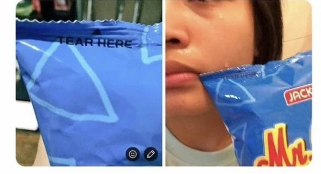
An interface is anything a person uses to interact with a system. It can be a website, an app, a checkout form, or even a snack bag. In this image, the printed words TEAR HERE are the interface instruction. The user still opens the bag from a different spot.
For software, this happens constantly. A designer might expect users to click the primary button, fill fields in order, read helper text, and follow the intended path. Real users skip steps, misunderstand labels, paste strange values, use browser back buttons, double-click things, close modals, and search for workarounds.
That does not mean users are foolish. It means the design must handle real behavior. Good InterfaceDesign makes the right action easy, the wrong action difficult, and recovery clear when something goes wrong.
For example:
Weak: "Enter a valid value"
Better: "Use a date like 2026-06-21"
Best: Date picker + validation + clear recovery
The meme is relatable because developers and designers often believe their flow is simple until someone outside the team tries it. Then the "simple UI" suddenly has edge cases, confusion, and a support queue.
Level 3: Affordance Autopsy
The whole usability study is printed on the package:
TEAR HERE
Then the second panel shows the bag torn open from the side anyway. The visible failure is physical, but the post message turns it into a perfect UXDesign joke: "It's a simple UI.. Users will be able to understand easily." That sentence has launched a thousand support tickets.
The bag is basically a real-world interface. The top seam is the intended action area, the text is the label, and the tear notch or weak point is the control. The user, however, does not interact with the designer's intention. They interact with what the object seems to permit in the moment. If the side feels easier to grip, if the instruction is partly obscured, if the material resists at the printed location, or if the user's previous snack-bag experience says "just rip wherever," the designed path loses.
This is why UIDesign cannot rely on instruction text alone. Text is a signifier, but a strong interface also uses constraints, shape, placement, feedback, and error tolerance. Good design makes the correct action feel like the obvious action. Weak design writes "TEAR HERE" and then acts betrayed when a tired human improvises.
The developer version appears every time a team says:
| Assumption | User Reality |
|---|---|
| "The button label is clear." | Users do not read every label. |
| "The field has placeholder text." | The placeholder disappears while typing. |
| "The error message explains it." | The user just wants the form to submit. |
| "The happy path is simple." | Nobody promised to stay happy. |
The second panel is especially funny because the user did accomplish the goal. The bag is open. From the system's perspective, though, the path is messy, unsupported, and probably made the contents harder to pour. That maps directly to software UXFailures: users find workflows that technically work but bypass validation, destroy state, create duplicate records, or leave support wondering why the database now contains a phone number in the first-name field.
The serious lesson under the joke is that "user error" is often a design bug wearing a fake badge. If enough people tear the bag from the side, the problem is not that humans failed the package; the package failed to communicate, constrain, or accommodate common behavior. This is why UsabilityTesting matters. It catches the moment where a designer's "obvious" action meets an actual person with hands, habits, distractions, and no interest in respecting your beautiful flow diagram.
Description
A two-panel image shows a blue snack bag with the printed instruction "TEAR HERE" near the sealed top edge, followed by a person holding the same bag after it has been ripped open awkwardly from the side instead. The meme is captioned in the metadata as "It's a simple UI.. Users will be able to understand easily," turning the packaging into a physical usability test. For developers, the joke maps directly to UI affordances and product assumptions: even explicit instructions do not guarantee users will follow the intended flow.
Comments
3Comment deleted
Every "intuitive" interface eventually meets a user with their own fork of the happy path.
Missclick. Nevermind Comment deleted
Ah, reminds me of a particular meme template: It's a simple UI, but quite unusable. Comment deleted