Skip to content
DevMeme
4141 of 7435
The Hype Cycle in Action
IndustryTrends Hype Post #4518, on Jun 22, 2022 in TG

The Hype Cycle in Action

Why is this IndustryTrends Hype meme funny?

Level 1: Looks Good, Feels Bad

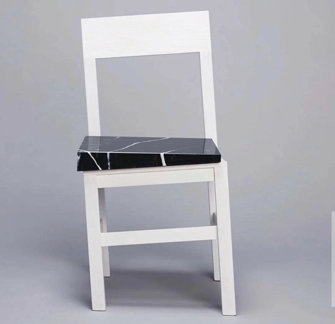
Imagine you see a really pretty chair in a furniture store. It’s all white, modern and looks super cool, so you think, “Wow, that must be a great chair to sit on!” That’s the “looks good” part. Now you go to sit down and – ouch! Instead of a normal comfy seat, the chair has a big slab of hard, cold rock on it, and there’s a hole in the back where support should be. Suddenly that cool-looking chair isn’t fun to sit in at all. It might even hurt! That’s the “feels bad” part. The chair fooled us: it was like a trick. It looked like a normal chair (so it interfaces with us like a chair), but when you try to use it, it doesn’t work like you expected (the experience is terrible).

This is funny because it’s so silly – who would make a chair you can’t comfortably sit on? 😄 But it’s also a simple lesson: just because something is nicely designed on the outside doesn’t mean it’s good on the inside. It’s like a toy that’s shiny and cool-looking but breaks when you try to play with it. In everyday terms, it’s as if someone iced a cake to look beautiful, but when you cut inside, the cake is uncooked dough. You’d laugh and say, “Well, it looked great, but you can’t actually eat that!”

So, the meme is comparing that idea to things developers make. Sometimes programmers create an app or gadget that looks perfect at first glance (like that pretty chair), but when people try to use it, it doesn’t work well or is uncomfortable (like realizing the chair hurts to sit on). It makes us laugh because it’s a bit ridiculous – it’s pointing out a goofy mistake: focusing only on how something looks and forgetting what it’s for. Everyone can understand that a chair’s job is to be sat on, so if it fails at that, no amount of prettiness can save it. The take-home message in the simplest way: looking good isn’t enough – it has to work right, too!

Level 2: Shiny UI, Shaky UX

From a more down-to-earth developer perspective, this meme is highlighting a simple concept: looks can be deceiving in design. The chair looks modern, clean, and well-designed at first (that’s the shiny UI – the part we immediately see and judge). But when you go to actually use it, you realize there’s a huge chunk of slippery marble as the seat and a missing back support – making it nearly impossible to sit comfortably. That’s the shaky UX – the actual experience of using the thing is terrible, no matter how nice it looked. In software, we often encounter similar situations:

  • A web application might have a minimalist interface with smooth graphics and a nice layout (great UI), but if pages take 10 seconds to load or buttons don’t do anything useful, the user experience (UX) is awful.
  • A piece of code (like a library or function) might have a very clean API – for example, a simple function name and parameters that make it easy to call – but if under the hood it’s doing 100 unnecessary calculations or network calls, it will be slow or break easily, making it frustrating for anyone who actually uses it.
  • An object in code could implement all the right interfaces and follow the formal requirements (so other code thinks it can use this object easily), but its actual behavior is buggy or inefficient. This is like a class that promises to do something simply, yet its internal code is a mess of patches and hacks (technical debt everywhere) that cause crashes or weird errors when used in real scenarios.

Let’s break down some key terms and how they relate to the meme:

  • Interface vs. Implementation: In design and coding, an interface is the outward contract or look – what something is supposed to do or how it’s presented to the user. The implementation is how it actually does it under the hood. Here, the chair’s interface (its appearance and basic structure) says “I’m a normal chair, you can sit on me.” The implementation (wood frame + marble seat) is how it’s built. And that implementation is flawed for actually sitting. In coding, you might have a function that promises to, say, save a file. The interface is just saveFile(data). But if the implementation writes to disk in a very slow way or corrupts the file on large input, then it “breaks usability.” The interface was fine, the implementation was not.
  • UX (User Experience) vs. UI (User Interface): UI is what you see – the chair’s shape and style, or a software’s buttons, menus, and screens. UX is how it feels to use it – in the chair, that’s comfort and stability; in software, that’s things like speed, ease of use, and whether it does what you need without frustration. A big lesson for junior devs: a product can have a gorgeous UI but a terrible UX if the underlying implementation isn’t done right. It’s like a UX failure hiding behind pretty visuals.
  • Overengineering: This means designing something more complex or fancy than necessary, often to show off or to be “technically cool,” but it ends up impractical. The marble slab seat is a great example of physical overengineering – who needs a heavy marble seat on a simple chair? In code, overengineering might be using five different classes and design patterns to do something a single simple loop could do, or using an enterprise-grade database for a simple list of items. It makes the project heavier and more fragile than it needs to be. New developers sometimes fall into this trap by trying to write overly clever code or ultra-generic frameworks that end up hard to maintain or use. The meme’s chair is basically saying: “you did way too much, and now the basic purpose (sitting, or in software’s case, solving the user’s problem) is compromised.”
  • Technical Debt: When the meme chair’s designer realized “Hmm, a person can’t actually lean back because I left a big hole in the backrest,” they effectively incurred a design debt. Their quick fix might be “Alright, let’s use a super heavy seat so the chair doesn’t tip backwards when someone sits, and maybe that will kinda-sorta work.” That’s analogous to technical debt in code: quick fixes or kludges we introduce to prop up a flawed design. It’s like putting band-aids on a bad implementation. It might keep the system working for now, but it makes the code harder to change later and often leads to other problems. Junior devs learn that while it’s tempting to patch over problems to meet a deadline (like shoving a marble slab to stabilize the chair), those shortcuts accumulate into bad practices that someone will have to clean up eventually (imagine later having to redesign this chair because surprise, no one likes sitting on marble and people get hurt).
  • Code Smells: These are signs in the code that something is wrong with the design. In the chair, visible “smells” might be the odd gap in the backrest or the awkward protruding seat – they clue you in that the design might be problematic. In a codebase, a smell could be a function that’s 500 lines long or a variable name that doesn’t make sense – things that suggest a deeper problem in the implementation. A junior developer learns to notice these; they’re like hints that even if the program runs, the way it’s built might cause trouble (just like you can sit on that chair, but you have a feeling you shouldn’t).

In simpler terms, this meme is teaching a key lesson: Don’t judge a system by its interface alone. Just because the outside (interface or UI) looks well-designed doesn’t mean the inside (implementation) is good. Always consider the actual usage and practicality. A clean look or a theoretically sound plan can hide a lot of ugly hacks and design flaws. As a developer early in your career, you might encounter codebases that seem well-organized at first (good naming, clear module separations) only to discover that actually running the code or modifying it is a nightmare because under the hood it’s like that marble slab – heavy, unwieldy, and out of place. Good design means balancing looks with functionality, and this meme is a funny cautionary tale of what happens when you don’t. It’s basically “design without usability” in a nutshell.

To put it in a relatable scenario: imagine as a junior dev you create a website that looks amazing because you used a beautiful CSS framework (so styling is on point), but you wrote very inefficient JavaScript for the functionality. In the demo, the site’s layout wows everyone, but when real users come, it lags and breaks when they try to actually do things. That’s the website version of this chair – eye-catching design, failure in use. You’d likely get feedback like, “It’s a cool design, but we need to fix how it works underneath,” much like we’d tell the chair designer, “Love the look, but no one can sit on this thing!” This meme humorously reminds us (even as newcomers) that a good developer or designer never stops at “does it look good?” but also asks “does it work well for the user?”

Level 3: The Façade Fallacy

"When the interface looks clean but the implementation breaks usability completely"

At first glance, this meme is a masterclass in form-over-function irony. We see a sleek, minimalistic chair design – the clean interface – paired with an utterly impractical black marble slab as the seat – the broken implementation. In software terms, this is like a beautifully designed API or UI that conforms to all the right formal patterns and design principles on paper, yet the underlying code is so over-engineered or misguided that it breaks usability in the real world. Seasoned developers recognize this situation as the Façade Fallacy: when a system’s external elegance (its interface or architecture diagram) masks a brittle, painful reality underneath.

This image perfectly captures a scenario where architecture diagrams and design patterns check all the boxes, but actual user needs get forgotten. The chair’s white frame is elegant and minimal – analogous to a neatly defined interface or a pristine class hierarchy following SOLID principles. It’s the kind of interface that architects and senior devs might proudly show in a UML diagram or a design review. However, that massive polished marble seat is a glaring design trade-off. It’s heavy, uncomfortable, and protrudes awkwardly, much like an implementation that technically “works” but creates terrible user experience. In other words, the developers likely satisfied the formal requirements (“it has a seat and a backrest, so it’s a chair, right?”) while completely ignoring usability (comfort and stability, the whole point of a chair!).

This dichotomy is a common anti-pattern in engineering: building a polished facade that hides a shaky foundation. We see it in software projects all the time: a web app with a gorgeous minimalist UI that’s painfully slow or buggy once you try to use it, or a library with a clean API that internally spawns 10 threads and 5 network calls for a simple request. The meme’s humor resonates because any senior engineer has refactored a system where the public interface looked fine but the private code was a nest of code smells and fragile logic. It’s a textbook case of leaky abstraction: the fancy interface can’t fully hide the fact that something is very wrong under the hood. Sure, the interface (or API) might be logically correct and even elegant, but if calling that API causes a cascade of slow operations or unpredictable behavior, the end-user effectively feels the “marble seat” in their backside. Usability suffers, performance suffers, and ultimately trust in the system suffers.

Why does this happen? Often it’s the result of overengineering or misapplied patterns. Perhaps an ambitious developer or designer was so focused on achieving a clean look or a “perfect” architecture that they lost sight of practical needs. Maybe they insisted on using a fancy new framework or a heavy-weight component (the marble slab) to impress stakeholders or meet some abstract requirement (“we need our storage layer to be ACID-compliant, so let’s use an enterprise-grade database for this simple app”). The end result is engineering absurdity: an overly complex solution that technically fulfills the spec but creates more problems than it solves. In real projects, this could be choosing an unnecessarily complex design pattern, adding layers of abstraction for a simple task, or integrating a huge library for something trivial – all equivalent to balancing a slab of marble where a normal seat should be. It’s elegant in theory and aesthetic in diagrams, but try to sit on it (or maintain the code, or scale the system) and it’s an instant ouch.

The meme also subtly points to technical debt accumulation. To compensate for a bad design choice (like a chair missing proper support), you often see ad-hoc fixes that make things even more convoluted. Imagine the chair maker realizing the backrest has no support, so they plop a heavy slab to lower the center of gravity and prevent tipping. In software, these are the hacks and patches we add to keep a flawed system running – quick fixes that break usability or maintainability down the line. Developers end up writing convoluted exception handling, special-case code, or extensive documentation (“Warning: do not sit too hard!”) to work around the fundamental design flaw. Each patch is like putting duct tape on that marble seat; it might keep things technically together, but it’s creating long-term pain. Experienced devs have been there: the product demo goes great because the UI is slick, but in production, users encounter cryptic errors or weird limitations (“please avoid clicking this button twice or the app crashes”). The system meets the formal requirements but fails the real-world requirements.

Crucially, this meme highlights the divide between UI (User Interface) and UX (User Experience). The clean lines of the chair are the UI – comparable to an app’s visual design or an API’s surface syntax. The comfort and stability of the chair represent the UX – akin to how it feels to use the app or call the API in practice. Here we have a UX failure of epic proportions: a chair that might score an A+ in a design magazine for looks, but an F from anyone who tries to sit on it. The developer humor in this situation comes from that all-too-familiar “laugh so you don’t cry” recognition: we’ve all seen software that looks great in demos or diagrams but is basically unusable in production. Like a bad practice come to life, it reminds us that prioritizing appearances (be it clean code aesthetics or sleek UI) while neglecting substance (efficient, user-friendly implementation) is a recipe for disaster.

To sum it up in senior-engineer speak: this chair is a design smell. It’s the physical furniture equivalent of a class that compiles and satisfies the interface contracts but has a terribly inefficient, memory-leaking implementation. It’s an architecture that is conceptually clean but functionally dirty. Seasoned devs might chuckle and then cringe, recalling their own “marble chair” moments in projects where they had to refactor such design without usability. The meme is a witty reminder that design patterns and architecture principles mean nothing if they don’t serve the end user. In the battle of facade vs. reality, reality will always bite – or in this case, give you a backache! 😅

Description

This meme likely satirizes the tech industry's obsession with hype cycles and new technologies. It might use a format like the 'Drake Hotline Bling' meme, where the developer is rejecting a stable, proven technology in favor of a new, hyped-up one. Or, it could be a 'Distracted Boyfriend' meme, where the developer is ignoring their current project (the girlfriend) to chase after the latest JavaScript framework. The humor resonates with senior developers who have seen countless technologies come and go, and have learned to be skeptical of the 'next big thing.'


Comments

7
Anonymous ★ Top Pick The tech hype cycle is a flat circle. We're all just waiting for the next technology that will finally solve all our problems, and will be completely replaced in 18 months
  1. Anonymous ★ Top Pick

    The tech hype cycle is a flat circle. We're all just waiting for the next technology that will finally solve all our problems, and will be completely replaced in 18 months

  2. Anonymous

    Acceptance criteria only said “supports sitting,” so we shipped the marble-slab chair - SLA’s green, P99 tailbone latency is through the roof

  3. Anonymous

    That's not a cracked screen, it's just the visual representation of our test coverage after the PM said "we need to ship today" and the CEO's nephew pushed directly to main

  4. Anonymous

    This is what happens when your infrastructure team says 'it'll hold' without running proper load tests. The foundation looks solid, the architecture seems sound, but nobody stress-tested the actual weight-bearing component. Classic case of optimistic capacity planning meeting reality at 3 AM on Black Friday. The chair's still standing though, so technically it's not a P1 incident - just a 'known issue' we'll address in the next sprint

  5. Anonymous

    Lightweight monolith frame meets microservices seat: elegant overhang, zero production stability

  6. Anonymous

    Your microservices migration in one photo: featherweight services wrapped around a single shared database - the marble monolith everyone still has to sit on

  7. Anonymous

    Enterprise architecture in one chair: rock-solid data layer (marble), skeletal app, zero back support - no one can sit, but at least the transactions are ACID

Use J and K for navigation