Skip to content
DevMeme
3696 of 7435
Straight Lines Fool The Renderer
Graphics Post #4035, on Dec 14, 2021 in TG

Straight Lines Fool The Renderer

Why is this Graphics meme funny?

Level 1: Eyes Playing Tricks

This is like looking at a tiled floor and feeling sure the lines are wavy, even though a ruler would show they are straight. The funny part is that your eyes are trying so hard to find a hidden curved line that they invent one. The picture is not really broken; your brain is just doing a very confident bad inspection.

Level 2: Straight But Suspicious

The key technical idea is pattern recognition. Human brains are very good at finding shapes quickly, even when the shapes are incomplete or misleading. In this image, the repeated gray details inside each tile make the green grid lines seem curved. Your eyes combine the small interior patterns with the larger grid and report, "Something is bending here."

In UI design, this kind of effect matters because users do not read screens one pixel at a time. They scan. They group related elements. They compare spacing and alignment. If cards, borders, shadows, colors, or chart marks are arranged carelessly, users may misunderstand what is connected, what is important, or what changed.

In data visualization, the same issue appears when a chart is technically accurate but visually misleading. For example, a color gradient might exaggerate a tiny difference, or a cramped axis might make normal variation look dramatic. The data may be correct, but the presentation can still guide the viewer toward the wrong conclusion.

For early-career engineers, the practical lesson is simple: visual bugs are not always caused by wrong coordinates. Sometimes the implementation is doing what it was told, but the design creates a perception problem. That is why screenshots, user testing, accessibility checks, and real device review matter alongside automated tests.

Level 3: Visual Cortex Bug

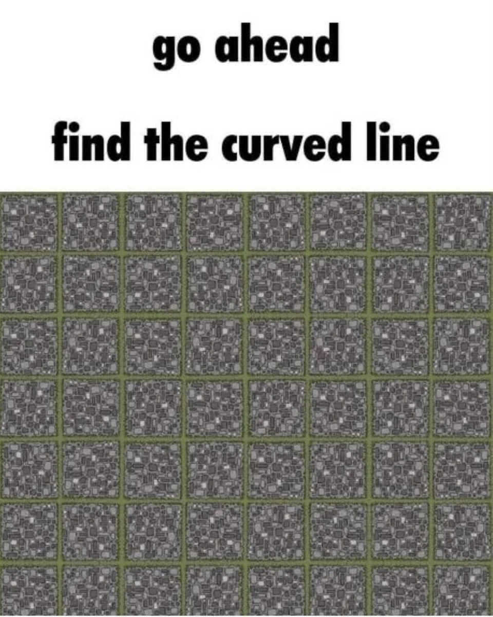
The meme gives a direct challenge:

go ahead

find the curved line

Below it is a regular grid of square-ish tiles separated by green lines. The trick is that the grid lines look like they bend, bulge, or wobble, but the visible structure is built from straight horizontal and vertical separators. The gray patterned interiors, uneven contrast, and repeated small shapes create the impression of curvature where the geometry does not actually provide one.

For developers, this lands as a small graphics and UX joke because it exposes a recurring engineering problem: humans are not neutral renderers. We do not inspect pixels like a rasterizer, and we do not perceive layout like a geometry engine. We infer edges, depth, alignment, motion, and grouping from context. That is usually helpful, until a perfectly straight UI grid "looks off" in a design review and somebody opens a bug against math.

The image is adjacent to computer graphics because rendering is not just about producing correct coordinates. A line can be mathematically straight and still look visually unstable if surrounding texture, antialiasing, contrast, spacing, or neighboring patterns interfere with perception. This matters in real interfaces: tables, dashboards, charts, map tiles, CAD views, heatmaps, and dense monitoring screens can all produce misleading visual impressions if the design forgets how aggressively the brain searches for patterns.

The more senior lesson is that visual correctness has two layers:

  • The data model says where elements are.
  • The human observer decides what the result appears to mean.

Those two layers are not always aligned. A UI may pass snapshot tests, pixel diffs, and layout assertions while still feeling crooked, cluttered, or misleading. A chart may encode values accurately while causing users to see a trend that is mostly an artifact of scale, color, or grouping. A grid may be straight while the tile interiors convince everyone it has developed opinions.

That is why human factors in engineering and UX design principles are not soft decoration sprinkled on top of "real" technical work. They are part of whether a system communicates truthfully. If a dashboard causes operators to misread severity, if a data visualization implies a relationship that is not in the data, or if a dense UI makes the eye chase nonexistent structure, the bug may live in perception rather than code. Naturally, it will still be assigned to frontend by Friday afternoon.

Description

The image has large bold black text on a white background reading, "go ahead" and underneath, "find the curved line." Below the text is a dense grid of square tiles separated by greenish lines, with gray patterned interiors that make the straight grid appear warped or curved in places. The sibling metadata calls it "Some offtopic for you to release Monday stress," so the post is more visual puzzle than direct software meme. Its technical relevance is adjacent to graphics, visual perception, UI inspection, and the familiar engineering lesson that human pattern recognition can report bugs the geometry does not actually contain.

Comments

11
Anonymous ★ Top Pick The grid passes geometry tests; the visual cortex still opened a rendering bug.
  1. Anonymous ★ Top Pick

    The grid passes geometry tests; the visual cortex still opened a rendering bug.

  2. @nkormakov 4y

    Monday?

    1. Deleted Account 4y

      Tuesday*

  3. @okutaner 4y

    my career

  4. @zherud 4y

    There is none

  5. @AmirhosseinDotZip 4y

    Found it

  6. @stepykun 4y

    civil war

  7. @ozalexo 4y

    found a cat

    1. @RiedleroD 4y

      found the schizophrenia guy

      1. @ozalexo 4y

        nice mirror you have! ;-)

  8. @Artkash 4y

    "Go ahead, find a bug in my non-DRY code"

Use J and K for navigation