Skip to content
DevMeme
1088 of 7435
Stack Overflow Finally Goes Dark
DevCommunities Post #1222, on Apr 2, 2020 in TG

Stack Overflow Finally Goes Dark

Why is this DevCommunities meme funny?

Level 1: Turning Off The Room Light

This is like reading in bed with a tiny lamp, then someone suddenly switches on the big ceiling light every time you need help with homework. Dark mode is the softer lamp. The meme is funny because everyone is celebrating a simple switch as if it saved their eyes from years of surprise brightness.

Level 2: The Theme Toggle Saga

Dark mode means the interface uses darker backgrounds and lighter text instead of the traditional black-text-on-white-page layout. Developers often like it because code editors, terminals, and dashboards are commonly used in dark themes, especially during long debugging sessions.

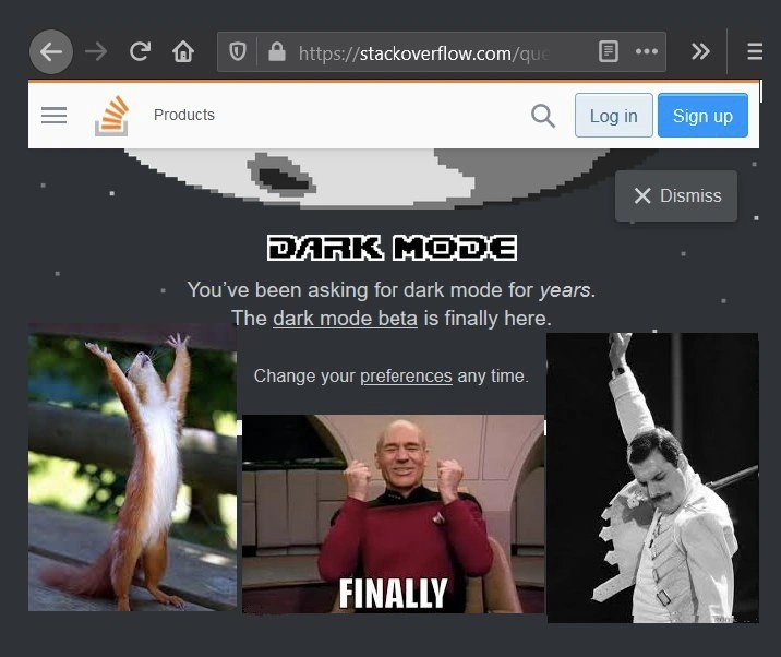
In the image, Stack Overflow's page still shows normal site controls like Products, Log in, Sign up, and Dismiss, but the main banner is dark and space-themed. The text says the dark mode beta is finally available and that preferences can be changed later. A beta means the feature is available for testing but may still have rough edges.

For a junior developer, the joke is easy to recognize after the first late-night search for an error message. You might be working in a dark editor, hit a bug, open Stack Overflow, and suddenly your browser becomes the brightest object in the room. The meme exaggerates the joy of getting a matching theme because the site is so important to everyday programming.

This also belongs to UX/UI humor. User experience is not only about big workflows; it includes small frictions repeated thousands of times. A theme setting can matter because people use the same tool constantly. When a community asks for something "for years," the feature becomes symbolic: not just a darker page, but proof that someone finally listened.

Level 3: Retinas In Production

The screenshot shows Stack Overflow presenting a banner for:

DARK MODE
You've been asking for dark mode for years.
The dark mode beta is finally here.

Under it, three reaction images escalate from tiny animal triumph to Captain Picard captioned FINALLY to Freddie Mercury celebrating. That pileup is the joke: a color-scheme preference is being treated like a moon landing, because for developers using Stack Overflow at night, it kind of was.

The technical humor sits in the gap between developer experience and product prioritization. Stack Overflow is not just a website; for many programmers it has historically been an unofficial extension of the IDE, documentation set, debugging workflow, and emotional support system. When a tool becomes that central, small interface details stop being cosmetic. A bright white page opened from a dark editor at 1 AM is not merely a theme mismatch; it is a flashbang delivered by a Q&A database.

Dark mode is easy to mock because it sounds superficial. In practice, building it well means auditing a whole design system: backgrounds, text contrast, syntax highlighting, vote buttons, accepted-answer states, code blocks, tags, alerts, navigation, focus rings, disabled states, hover states, embedded images, and third-party content. A lazy dark mode turns into gray soup with invisible links. A careful one forces the team to admit that "just invert the colors" is the CSS equivalent of "just rewrite the monolith."

The meme also captures a familiar developer community dynamic. Users ask for a quality-of-life improvement for years. The product eventually ships a beta. The reaction is not polite appreciation; it is collective catharsis. The word FINALLY works because the audience already understands the implied backlog: bug reports, meta threads, browser extensions, custom CSS, accessibility complaints, and countless engineers quietly choosing between documentation and eyesight.

The Dismiss button in the screenshot adds a small extra layer. This announcement is technically just a dismissible UI panel, yet the reactions underneath frame it as a historic event. That mismatch is classic web-dev comedy: the feature is a toggle, the implementation is a design-system migration, and the community response is a stadium encore.

Description

A browser screenshot of Stack Overflow shows a dark themed promotional panel with a moon graphic and the headline "DARK MODE." Visible interface text includes "Products," "Log in," "Sign up," "Dismiss," "You've been asking for dark mode for years. The dark mode beta is finally here." and "Change your preferences any time." Three reaction images underneath show an animal raising its arms, Captain Picard celebrating with the caption "FINALLY," and Freddie Mercury posing triumphantly, framing dark mode as a long-awaited developer-community quality-of-life feature.

Comments

1
Anonymous ★ Top Pick After years of copying answers at 2 a.m., the site finally optimized for the actual production environment: exhausted retinas.
  1. Anonymous ★ Top Pick

    After years of copying answers at 2 a.m., the site finally optimized for the actual production environment: exhausted retinas.

Use J and K for navigation