Skip to content
DevMeme
448 of 7435
Modern Application Architecture: A Microservices Spaghetti Diagram
DesignPatterns Architecture Post #516, on Aug 5, 2019 in TG

Modern Application Architecture: A Microservices Spaghetti Diagram

Why is this DesignPatterns Architecture meme funny?

Level 1: All Tangled Up

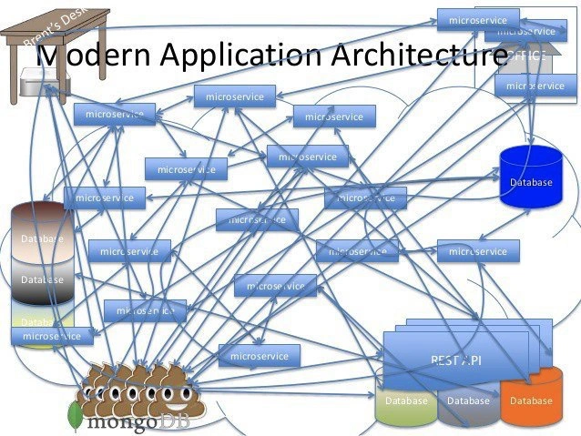
Imagine you have a bunch of kids who all want to talk to each other at the same time. Instead of sitting in a circle and taking turns, every kid runs a string (like a tin can telephone line) to every other kid. Pretty soon, the playground is filled with crisscrossing strings in the air – a total snarl. Nobody can move without getting caught in a web of strings, and if one kid drops their string, another kid’s message might never get through. It’s chaos! This picture is basically the computer version of that. Every part of the system is directly connected to every other part, which sounds like it might be good (everyone can talk to everyone!), but it actually becomes super confusing and fragile. Even the drawing of it looks like a big tangled mess of lines, almost like a pile of spaghetti noodles thrown on a plate. The little poop symbols and tiny desk in the corner add some silliness: they’re joking that one part of the system stinks (the poop emoji for the database choice) and that the person using the system is sitting at a small desk far away, not knowing how complicated and messy the behind-the-scenes really are. The meme is funny because it shows that making something too complicated can be a disaster – so messy that even a diagram starts crying about it.

Level 2: Tangled Web of Services

Let’s step back and explain the joke in simpler terms. Microservices are a design approach where instead of building one big application (called a monolith), you build many smaller applications (services), each in charge of a specific feature or domain. These services then talk to each other usually over a network (for example, calling each other’s REST API endpoints). In theory, this is supposed to make systems more modular, scalable, and easier to maintain. Each microservice can be developed and deployed independently – that’s the dream.

The meme shows what happens when that dream goes off the rails. In the image, all the blue rectangles labeled "microservice" have arrows (thick blue lines) going to almost every other microservice. Essentially, every service is directly talking to every other service. This is the "tangled web" of the title. Normally, you’d expect a microservice architecture to have more structure – maybe a few core services with well-defined APIs, or groups of services where each group handles a particular business area. But here it’s just chaos: if you drew lines for every communication path, you ended up with a big blue ball of spaghetti. It’s as if no one said “no” to any dependency; every piece of the backend calls any other piece it wants information from.

Some key terms and ideas to know:

  • Spaghetti code: This is a metaphor for code that is tangled and messy, where everything is so interconnected that it’s hard to follow. By extension, this meme illustrates a “spaghetti architecture” where the entire system’s structure is a mess of interconnections. If you’ve ever seen a bunch of cables or wires all tangled up behind a TV or computer, that's what spaghetti code/architecture is like, but with software components.
  • Dependencies: A dependency is when one piece of software relies on another. In a clean design, you want to minimize unnecessary dependencies. In this diagram, dependencies are everywhere – each microservice depends on many others. This is bad because if one changes or breaks, it affects all the others that depend on it. It’s a bit like a group of dominoes standing close together; knock one over, and many others might fall.
  • Distributed system: This just means the system is running on multiple computers (or processes) that have to communicate over a network to work together. Microservices by nature create a distributed system (as opposed to one program doing everything). Distributed systems are famous for being hard to manage because you have to deal with network latency (things are slower over network than in memory), partial failures (one part might crash while others are fine), and data consistency (making sure all parts agree on the data). The meme highlights the partial failure problem: with so many lines, if any one line (communication link) or service box fails, it could disrupt many others.
  • Scalability: One reason people use microservices is to scale parts of the system independently. For instance, if one service is under heavy load, you can scale it up (run more instances of it) without scaling the entire app. But in the depicted overconnected design, scalability would be tricky. Why? Because if every service calls every other, scaling one service might just increase the load on all the others it touches. The supposed independence isn’t there. It’s like trying to pull one thread in a knot – you just tug the whole knot.
  • Overengineering: This term means designing a solution that's far more complicated than necessary. If the user’s needs could have been met with a simpler approach (maybe a well-structured monolith or just a few services), building this massive interconnected microservice mesh is overkill. It’s as if someone wanted to use all the latest tech buzzwords in one project: microservices! multiple databases! a REST API layer! – without considering if it’s actually an improvement. Developers, especially less experienced ones, sometimes fall into this trap by thinking “more = better” or because they want to play with new technologies. This meme is a cautionary picture of that mindset taken to an extreme.

The visual elements of the meme correspond to real things in software architecture:

  • The blue rectangles labeled "microservice" each represent a small application or service. In practice, each might be running on its own server or container, and they communicate via network calls. The lines connecting them likely represent API calls or messages sent between services. In a healthy architecture, you’d only see lines where necessary (maybe forming a logical flow). Here, it looks like a spiderweb, indicating an overconnected architecture – basically every service is talking to too many others.
  • The cylinder icons labeled "Database" stand for database systems. In microservices, it’s common to give each service its own database (to avoid sharing data in uncontrolled ways). The meme shows multiple databases (left, right, bottom), implying each service or group of services might have its own data store. That can be fine, but the fact they’re all drawn in different places and connected by lines suggests that services might be reaching into each other’s databases or there are just so many databases that it’s a data management nightmare.
  • The stack of blue folders labeled "REST API" likely represents an API gateway or a collection of API definitions. A REST API is a way for services to communicate using HTTP calls (like how your browser talks to a server). The presence of an entire stack labeled "REST API" might mean the system has an API layer that itself is complex or that they documented a bunch of APIs. Possibly it’s another component that aggregates calls to multiple services (so it needing access to multiple databases and services, hence the lines). It’s a bit tongue-in-cheek: you’d think the REST API layer would simplify things for the outside world, but internally it’s also entangled in the mess.
  • The pile of poop emojis labeled "mongoDB" is a cheeky detail. MongoDB is a type of database (specifically a popular NoSQL database) known for being flexible and JSON-based, used a lot in modern web apps. The inclusion of the poop emoji is the meme creator’s way of saying “something stinks here.” It reflects a running joke in programming circles: some love MongoDB for ease of use, others rant about how it can lose data or how people use it without understanding the consequences. By showing it as a literal pile of 💩, the meme implies the usage of MongoDB (or the way it’s used in this architecture) is a crappy decision. It’s a bit of insider humor – if you’re a junior developer, just know that every database has its fan club and its haters; MongoDB gets this poop joke often due to its early-days issues.
  • The "Client's Desk" in the top-left corner is representing the end user or client’s point of entry. It’s humorously drawn as a tiny desk, far away from all the chaos. This indicates that the person using the application (for example, visiting a website or using a mobile app that talks to this backend) is blissfully unaware of the monstrosity behind the scenes. The request from the client’s desk presumably travels into that tangled cloud of microservices to get some work done. The contrast of the tiny, simple “client” vs. the huge, convoluted backend emphasizes the overengineering: from the outside, the app might just be a simple thing (“enter data here, get results there”), but behind the curtain is a circus of interconnected parts.

In summary, for a junior developer: the meme is poking fun at a backend architecture that’s overly complex. It warns that if you make every little thing its own service and let them all talk freely, you can end up with an unmanageable system. The humor comes from exaggeration (probably no real system has every service calling every other, hopefully) and from relatable truth (many have seen something close to this). It's basically saying: "Microservices are great, but if you overdo it or do it wrong, you'll get a big mess... and even the diagram illustrating it will look like a bowl of spaghetti that fell on the floor."

Level 3: Distributed Monolith in Disguise

To an experienced engineer, this diagram screams “distributed monolith.” It’s the classic scenario where an organization enthusiastically embraces MicroserviceArchitecture for its promises of independent deployment and scalability, but ends up recreating the monolith’s DependencyHell over the network. Every box labeled "microservice" is so tightly coupled to the others that you might as well have one gigantic codebase – except now every function call is replaced with a network call (and every bug potentially becomes a distributed chase at 3 AM 🔥). The meme exaggerates by drawing every possible connection, but it’s uncomfortably close to situations we’ve seen in real-life systems that weren't carefully designed. It’s satire, but it’s painfully accurate satire for anyone who has untangled such webs in a late-night debugging session.

Why is this funny? Because it’s too real. We’ve all heard the tech mantra “just break the monolith into microservices!” as a silver bullet. Management expects a neat, Modern Application Architecture (as the title ironically puts it) with clear-cut responsibilities. Instead, without proper planning, you get a microservices spaghetti monster: a tangle of inter-service calls just as knotted as a ball of legacy spaghetti code. The diagram literally looks like someone dumped a plate of noodles on the network topology. Even the architecture diagram itself is having a breakdown – it "cries" because attempting to trace a single user request through this maze is enough to make an architect sob. Each blue line is presumably a REST API call or some RPC, and they crisscross in a way that suggests there’s no rhyme or reason to the dependencies.

Let’s break down the carnage on this diagram:

  • Cascading failures: With every service talking to every other, if one goes down, it can trigger a domino effect. Service A waits on B, which waits on C; C hiccups and suddenly A and B are wedged. At 3 AM, this feels like a horror show where the “one tiny change” in service Z mysteriously broke service A, and you’re frantically chasing the trail through 10 logs.
  • Performance overhead: Microservices are supposed to scale, but here every request might bounce through dozens of hops. Network latency adds up. Instead of a simple in-process function call, you have JSON going over HTTP to fifteen services serially – that’s a recipe for sluggish response times and ScalabilityIssues. Not to mention, more moving parts mean higher chance one of those parts is slow at any given time.
  • Operational complexity: Keeping this kind of system running is an ops nightmare. Think of DevOps on hard mode – you likely need a container orchestration system (Kubernetes, hi) just to keep these services alive and discovering each other. Monitoring and logging have to be distributed too; you need tracing tools (e.g. Zipkin, Jaeger) to figure out how that user request wandered through the labyrinth. The meme’s chaotic lines are the visual representation of what your distributed tracing UI would look like – a complete spiderweb. On-call engineers have to become detective sherlocks with distributed context: “The request died somewhere between microservice X and Y – time to pull up five dashboards to figure out why.”
  • Tight coupling & versioning hell: Notice how almost every microservice depends on the others. In real life, this means you cannot change Service X’s API without possibly breaking Y and Z and ... (basically everyone). You wanted independent deployability, but instead you’ve got to coordinate releases just like in the old monolith days. Except now, it's worse because these are separate processes possibly maintained by separate teams – so you schedule cross-team meetings to update a shared API contract. The whole point of microservices was to avoid the big coordination, and here we are, living a distributed reprise of it.

The presence of multiple Database icons and that heap of smiling poop emojis labeled "mongoDB" is another jab by the meme at architecture choices. Often in microservice-happy teams, each service is allowed to pick its own database or data storage. Polyglot persistence sounds great until you have one service on PostgreSQL, another on MySQL, two using MongoDB (one of which is apparently 💩), and maybe a Redis or Cassandra thrown in for “speed.” The poop emoji on MongoDB reflects a common sentiment from veteran developers: MongoDB gained popularity for being schema-free and easy to start with, but it had a reputation (especially around 2019 when this meme was posted) for losing data or being less reliable if misused. It’s a tongue-in-cheek way to say “this part of the data layer stinks.” From a design perspective, if each microservice owns its data, they shouldn’t be directly querying each other’s databases. But in this nightmare diagram, it looks like some services (like that stack of "REST API" folders connected to multiple databases) might be reaching into others’ data stores or acting as an all-knowing god-service. That violates the single responsibility principle of microservices and creates hidden coupling through the backdoor (database dependencies instead of just service APIs).

This meme also nods at overengineering. The tiny "Client's Desk" in the corner suggests the actual user or client is a small afterthought compared to the behemoth behind the scenes. Perhaps the client just asked for a simple feature, and what they got was an over-engineered monstrosity of 50 microservices, each with its own database and a mesh of calls. The client doesn't care if you used Kubernetes, Kafka, and 12 different databases – they just want the app to work reliably. But the engineers might have gotten overzealous, introducing a microservice for every noun in the business domain (and some for verbs!). The result? A system where adding a simple feature means touching a dozen services and praying nothing breaks. It's funny because it's true: developers sometimes joke that microservices can be "distributed SOA done right" – but done wrong, you’ve simply distributed your spaghetti code across the network. Congratulations, now you have a spaghetti architecture and a network headache!

The phrase "Modern Application Architecture" emblazoned on top is outright sarcasm. It hints that in the rush to adopt the latest and greatest architecture trends, we may just be rebranding old problems in new terms. The veteran voice in this meme would say something like, “We had an ‘Enterprise Service Bus’ mess in the 2000s, and now we’ve got a ‘microservice mesh’ mess in the 2010s. Same circus, different clowns.” In essence, the humor lands because those blue lines are familiar. Many seasoned devs have opened up an architecture diagram or a network graph from a monitoring tool and seen a hairball like this – and they know that when the diagram looks like that, trouble is brewing.

Level 4: Complete Graph Chaos

In the realm of distributed systems theory, what's depicted here is essentially a complete graph of microservice interactions. If you have n microservices and each talks to every other, you’re dealing with an explosion of connections on the order of $O(n^2)$. In fact, the number of direct communication channels grows as:

$$ \text{Connections} = \frac{n(n-1)}{2}, $$

which for large n is massive. This is the handshake dilemma: every new service shakes hands with all the others, and soon you have a knotted web of handshakes. The architecture diagram isn't just crying for comedic effect – it's practically weeping under combinatorial complexity. Managing such an architecture means dealing with N-squared failure modes and interactions. Each service must handle requests (or events) from dozens of others, making reasoning about system state a nightmare.

This unholy mesh also butts up against the fundamental limits like the CAP theorem. With multiple Database cylinders scattered around (and even a pile of "mongoDB" 💩 for good measure), maintaining consistency across the system is a Herculean task. If every microservice has its own data store, any slight network partition or crash means some services see stale data while others charge ahead – eventual consistency becomes eventually impossible consistency. To avoid total chaos, you’d need complex distributed transaction protocols or saga patterns spanning many services, which are notoriously difficult to implement and reason about. The more nodes that must coordinate, the harder it is to guarantee ACID properties or even a simple agreement on what time it is. We’re in the territory of Byzantine fault tolerance (when services miscommunicate or fail in weird ways) and the results are as messy as those blue spaghetti lines.

Another theoretical headache: cycles and emergent behavior. In a fully meshed setup, it’s almost guaranteed that some subset of services form cyclic call patterns (A calls B, B calls C, C calls A… and so on). Such cycles can lead to feedback loops that amplify latency or resource usage (think positive feedback in a circuit – here it’s network calls feeding on each other). Deadlock is no longer a database-only term; two microservices could easily end up waiting on each other’s responses indefinitely if design is sloppy. This diagram is basically a strongly connected graph where every node is reachable from every other – great for network resiliency on paper, but horrendous for state space explosion. If you tried to formally verify or model-check this system, the state combinations caused by so many interdependencies would make the model checker throw up its hands (and maybe produce its own crying diagram). In summary, the meme humorously illustrates a worst-case microservice topology that violates the principle of high cohesion, low coupling at a fundamental, theoretical level. It’s pushing an architecture style to its absurd extreme – and from a computer science standpoint, the absurdity is very real. The math and theory predict exactly the kind of nightmares the meme is mocking.

Description

A satirical architectural diagram titled 'Modern Application Architecture'. The diagram depicts a chaotic and tangled web of dozens of blue boxes labeled 'microservice', all connected by a dense mesh of intersecting blue arrows, creating a classic 'spaghetti architecture' visualization. Various database symbols are scattered throughout: a blue cylinder for a generic 'Database', a stack of three cylinders on the left, a stack of three colored cylinders connected to a 'REST API' layer, and most notably, a cluster of smiling poop emojis labeled 'mongoDB'. In the top left, a simple desk labeled 'Brent's Desk' is also connected into this mess. The image humorously critiques the often-overhyped and poorly implemented reality of microservice architectures, which can devolve from an organized, decoupled system into an unmanageable, tightly-coupled monolith, often referred to as a 'distributed monolith'. The pointed jab at MongoDB plays on old criticisms of the database regarding data consistency and reliability, humorously depicting it as a pile of... well, you know


Comments

7
Anonymous ★ Top Pick Ah, the 'Modern Application Architecture' - also known as the 'dependency graph that looks like a Jackson Pollock painting.' The best part is the single sign-on is managed by that service connected to Brent's desk
  1. Anonymous ★ Top Pick

    Ah, the 'Modern Application Architecture' - also known as the 'dependency graph that looks like a Jackson Pollock painting.' The best part is the single sign-on is managed by that service connected to Brent's desk

  2. Anonymous

    Turns out giving every squad its own microservice just implements Conway’s Law in O(n²) network calls - and the tracing budget in O($∞)

  3. Anonymous

    We successfully decomposed the monolith into microservices. Now we have 47 ways to lose the same customer order and a distributed tracing setup that costs more than the revenue it's supposed to track

  4. Anonymous

    This diagram perfectly captures the moment when 'Let's break the monolith into microservices' transforms into 'We've created a distributed monolith with network calls.' Every senior architect has seen this evolution: start with 3 well-defined services, end with 47 'microservices' that all need to talk to each other synchronously, turning your O(1) function call into an O(n²) network topology problem. The real kicker? That MongoDB at the bottom is probably being hit by 15 different services with no clear data ownership, and the 'REST API' box is desperately trying to orchestrate this symphony of cascading failures. At least with the old monolith, you could debug it with a single breakpoint

  5. Anonymous

    We didn’t decompose the monolith - we just horizontally scaled the outage across 37 chatty services and five ‘single’ sources of truth

  6. Anonymous

    We didn’t build a service mesh - we built a complete graph; every request tours 12 “independent” services, consistency is eventual, and the trace ends at the client’s desk

  7. Anonymous

    Microservices: trading monolith simplicity for a distributed system where tracing a request feels like debugging a kernel panic across 50 pods

Use J and K for navigation