Skip to content
DevMeme
1770 of 7435
The Futile Effort of Positioning Images in Microsoft Word
Microsoft Post #1977, on Aug 28, 2020 in TG

The Futile Effort of Positioning Images in Microsoft Word

Why is this Microsoft meme funny?

Level 1: Domino Effect

Moving a picture in Word is a bit like trying to adjust one domino in a long line of standing dominoes. Imagine you’ve set up a neat row of dominoes, and you decide to nudge one domino just a tiny bit. But the moment you touch it – whoops! – that domino falls and then knocks over the next, and the next… before you know it, the entire line of dominoes has toppled over. You only wanted to move one piece, but everything came crashing down around it. That’s what happens in Microsoft Word: you try to move one little image, and suddenly your whole document layout falls apart like a chain reaction. It’s funny in the meme because it exaggerates how often this happens, but it feels true. A small change causes a big mess, and you’re left staring at the screen thinking, “I just wanted that one thing in the right spot – now everything is messed up!” It’s a silly way to show how one tiny action can unexpectedly ruin the whole setup.

Level 2: Picture Imperfect

Imagine you’re writing a project report in Word and you want to include a diagram. Microsoft Word is a WYSIWYG editor – that stands for What You See Is What You Get, meaning it tries to show your document on screen exactly as it will appear when printed or finalized. Sounds great, right? But when you drag or move a picture in Word, it often doesn’t stay exactly where you drop it. Instead, the whole page layout can shift around as if you set off a chain reaction.

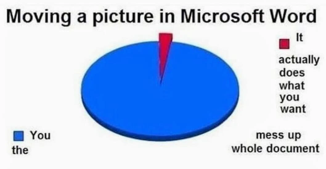
The meme’s pie chart is basically saying: 98-99% of the time, moving a picture will mess up the whole document, and only that tiny red slice (1-2% of the time) does it actually do what you want. This is exaggerating for comedy, but it feels true when you’re frustrated with your doc. What does “mess up” mean here? For a newcomer, it might look like this: you drag an image a few inches to the right, and suddenly an entire paragraph jumps to the next page, or big empty gaps of space appear above and below the picture. Your carefully numbered list might get split in half, or a caption that was under the image is now on a completely different page. In short, the formatting goes haywire.

Why does this happen? When you insert an image in Word, by default it might be treated as floating with text wrapping, not just a simple inline element. A floating image isn’t tied to a fixed spot on the page – it’s tied to a piece of text via an anchor. Think of the anchor as a little tag saying “keep this image around here.” If you move the image, you might unknowingly move its anchor to another paragraph. Word then tries to make the text wrap nicely around the image’s new position. All the surrounding text repositions itself according to a bunch of rules (to avoid overlapping the picture, to keep lines together, etc.). If the image’s new spot doesn’t have enough room, Word might push text to the next page to fit everything. That’s why a small change like moving a picture can suddenly affect the layout of dozens of pages after it.

For someone new to this, it’s a DocumentationWoes lesson. The first time you experience it, it’s almost comical: you just wanted that image moved a little bit, and Word behaves like you hit a self-destruct button for the doc’s formatting. The meme captures that feeling. It’s a rite-of-passage for anyone maintaining documents in Word – after a while, you learn to be very careful (or use other tools). Many junior developers encounter this when preparing user manuals or design docs. They find out that something as simple as dragging an image in a rich text editor can have surprising side effects. It’s one of those DeveloperPainPoints where you realize that tools like Word have a mind of their own unless you know all the settings.

The phrase “Moving a picture in Microsoft Word” above the pie chart sets the scene. The giant blue area labeled “mess up whole document” is joking that almost every time you try this, the document gets messed up. The tiny red sliver labeled “it actually does what you want” is the rare miracle when the image goes exactly where you expect without any collateral damage. It’s funny because we’ve all hoped for that red-slice outcome, and most of us ended up in the big blue reality instead. This sort of ToolingFrustration is very relatable: you expect a WYSIWYG tool to be straightforward, but in practice you have to wrestle with it to get the result you envision.

In simpler terms, Word’s trying to be smart about layout, but if you’re not familiar with how it works, it feels like the software is working against you. The meme is a lighthearted way to say, “Hey, we’ve all been there – one small edit and suddenly your whole doc is broken.” It’s both a warning and a laugh for new developers: even the tools for documentation can have their own quirks and learning curves!

Level 3: WYSIWYG vs Reality

This meme’s pie chart quantifies a near certainty: if you try repositioning an image in Microsoft Word, there’s about a 99% chance you’ll throw your whole document layout into chaos. Only a tiny sliver of hope (maybe 1%) represents the scenario where the picture actually moves without messing up your formatting. It’s funny because it’s true – Word’s WYSIWYG (What You See Is What You Get) editor often behaves more like “What You See Is What You Never Get” when images are involved.

Under the hood, Word uses a complex layout engine to flow text around images and other objects. An image placed in Word can either be inline (treated like a giant text character) or floating (movable with various text-wrapping options). Floating images come with an invisible anchor that attaches them to a location in the text. Here’s where the trouble starts: when you drag a picture even slightly, Word might automatically shift its anchor to a different paragraph or page. That one small move triggers a cascade of re-calculations: the text reflows around the new image position, paragraphs jump, page breaks shift, and suddenly your carefully crafted document looks like it had a minor explosion.

In pseudo-code form, it’s like Word internally does this when you move a picture:

// Simulated outcome of dragging an image in Word
if (attemptToMovePicture) {
    if (Math.random() < 0.99) {
        messUpWholeDocument();    // 98-99% chance: global reflow chaos
    } else {
        doWhatUserActuallyWanted(); // 1-2% chance: it just works
    }
}

That snippet is a tongue-in-cheek way of saying Word’s behavior feels randomized – almost always destructive to your layout, with a slim chance of success. Developers who write documentation have collectively experienced this. You’ll hear groans in any software team when someone innocently says, “I just need to add one image to the spec doc,” because we all know that might snowball into an afternoon of fixing formatting. The humor is in the DeveloperPainPoints being poked at: we build sophisticated systems with code, yet a simple task in a documentation tool can make us pull our hair out. It’s a classic ToolingFrustration where the tool’s hidden complexity surfaces at the worst time.

This pie-chart joke specifically highlights microsoft_word_layout problems – Word’s automatic layout is notoriously finicky. It tries to be helpful by dynamically adjusting layout (so that what you see on screen is print-ready), but the logic isn’t transparent. When Word guesses wrong about where you wanted that image anchored, the result is massive formatting_breakage. Think of adding a screenshot to a spec and suddenly your 10-page document reflows into 12 pages, with weird blank gaps and misplaced headings. It’s not that the image itself is evil; it’s that Word’s algorithm is juggling so many layout rules (keep lines together, avoid breaking tables, push images to nearest boundaries, etc.) that a small change knocks over this fragile balancing act. DocumentationWoes like this are so common that many devs half-jokingly treat Word as if it were a volatile piece of legacy code – touch it, and everything breaks.

Historically, Word’s behavior comes from decades of feature accretion and backwards compatibility. The program has to handle documents created over many versions, each introducing new layout features. The result is a bit like a Jenga tower of formatting rules. Microsoft Word’s priority is making documents look nice on the fly, but for complex technical docs with lots of figures, it’s incredibly easy to confuse that layout engine. There’s an ironic contrast here between Documentation tools and coding: when we code, we have version control, diff tools, and predictable text-based formats. But when using Word (a binary format with hidden state), we’re often at the mercy of its whims. Many a developer has learned the hard way that writing in plain text or Markdown can save you from this exact headache. In a code file or a Markdown document, an image is typically referenced explicitly, and nothing moves unless you change the text around it. No mysterious reflows.

The reason this meme hits home is that it exaggerates just enough to be painfully relatable. We laugh (maybe a bitter laugh) because we remember that one time the entire document’s formatting went haywire five minutes before the deadline, simply because we nudged an image slightly to the left. It’s a shared industry in-joke capturing a universal DeveloperHumor moment: even with all our advanced software tools, a seemingly trivial action can unleash disproportionate havoc. In Word, moving a picture isn’t just moving a picture – it’s potentially inviting chaos into your document. The meme uses the pie chart to visualize that joke succinctly: the overwhelming majority outcome (mess up whole document) versus the slim ideal outcome (it actually does what you want).

Clippy (the old Office assistant) might say: “It looks like you’re trying to move an image. Want me to completely reformat your document for you?” 😉

In summary, the humor comes from experience: something as simple as arranging an image should be straightforward, but Word’s wysiwyg_quirks turn it into a gamble. The meme brilliantly turns that frustration into a visual gag – one that every Word user in the software world recognizes immediately. It’s both a laugh and a warning: move that picture at your own risk!

Description

A pie chart meme titled 'Moving a picture in Microsoft Word'. The chart is overwhelmingly blue, with a tiny red sliver representing a very small percentage. According to the legend, the tiny red section, labeled 'It', represents the outcome where the picture 'actually does what you want'. The massive blue section, labeled 'You the', corresponds to the outcome where you 'mess up whole document'. This meme visualizes the universal and deeply felt frustration among users, including tech professionals, with Microsoft Word's notoriously unpredictable and chaotic image positioning and text wrapping features. It humorously claims that any attempt to move an image will almost certainly wreak havoc on the entire document's formatting

Comments

7
Anonymous ★ Top Pick CSS positioning is just Microsoft Word for web developers. You think you understand the box model, and then you move one div and suddenly the footer is the new header
  1. Anonymous ★ Top Pick

    CSS positioning is just Microsoft Word for web developers. You think you understand the box model, and then you move one div and suddenly the footer is the new header

  2. Anonymous

    Dragging a PNG in Word is the cheapest form of chaos engineering: one pixel shift and your headers start operating in an eventual-layout consistency model

  3. Anonymous

    After 20 years in tech, I've debugged distributed systems, optimized database queries across petabytes, and even successfully migrated legacy COBOL to microservices. But ask me to reliably position an image in Word without triggering a cascading document apocalypse? That's when I reach for LaTeX and pretend the business stakeholders will understand why their simple request now requires a build pipeline

  4. Anonymous

    Microsoft Word's image positioning is the perfect example of Schrödinger's layout: until you actually try to move that picture, your document exists in a superposition of 'perfectly formatted' and 'completely destroyed.' The moment you click and drag, the wave function collapses - and it's always into the 'three pages of blank space and your conclusion is now on page 47' state. Senior engineers know the real solution: convert everything to Markdown, version control it in Git, and render to PDF via LaTeX. Because if you're going to fight with tooling, at least fight with tooling that's deterministic

  5. Anonymous

    Moving a picture in Word is a non-idempotent prod deploy: nudge it 2px and the anchor rebinds, the whole doc reflows, and your table quietly migrates to page 37

  6. Anonymous

    Word's layout engine: the legacy monolith where one image nudge triggers a full-document cascade failure, proving floats were a bad idea long before CSS

  7. Anonymous

    Word’s image anchoring is Raft with hostile partitions: drag once, everything re‑elects, the TOC forks, and your only snapshot is Save as PDF

Use J and K for navigation