Skip to content
DevMeme
2804 of 7435
A Developer's Sanctuary: The Art of Linux Ricing
CLI Post #3097, on May 14, 2021 in TG

A Developer's Sanctuary: The Art of Linux Ricing

Why is this CLI meme funny?

Level 1: Look What I Made!

Imagine one of your friends has a plain room, and they decide to transform it into the coolest clubhouse ever. They paint the walls their favorite color, put up a really neat poster of a space dog (because they love space adventures), and arrange all their toys and furniture just right so everything has its place and nothing overlaps or gets messy. They even set up a special board that shows things like the room’s temperature and how much candy is left in the candy jar, updating in real-time with little colored bars! Now your friend is super proud of this setup. When you come over, they excitedly show you: “Look at my awesome room! See how I put the poster and organized all my stuff? And check out this cool gauge that tells me everything about my room at a glance!” They’re grinning ear to ear, because they made it all by themselves just the way they like it. It’s funny and cute because they’ve turned their room into a mini high-tech space, and they’re so happy to show every little detail. You can’t help but smile, because their excitement is contagious and their personalized clubhouse really is pretty cool!

Level 2: Ricing 101

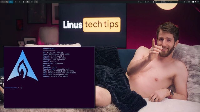
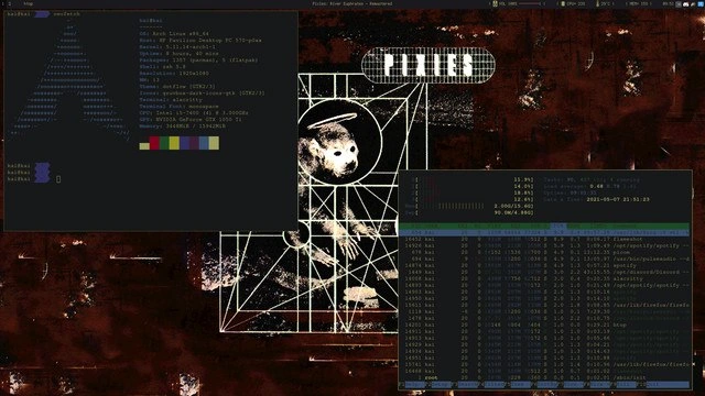
Let’s break down what we’re seeing in more straightforward terms. This is a screenshot of a highly customized Arch Linux desktop. Arch Linux is an operating system (a distribution of the Linux OS) that is known for being minimalist and user-driven. Unlike Windows or Mac, which come preconfigured, Arch starts very bare-bones and you add everything you need. This means the person using it likely built their setup piece by piece. The result is what the Linux community fondly calls a “riced” system – ricing means personalizing the look and feel of your system extensively (the term comes from customization culture, essentially meaning “to deck out” your setup).

In the upper-left of the image, we see a terminal window (that black box with text) showing the output of a tool called neofetch. A terminal is a text-based interface to the computer – here it’s where you type commands and see text output instead of using graphical icons and buttons. The neofetch program prints out system information alongside a big ASCII art logo. In this case, the ASCII art is the Arch Linux logo – the giant letter “A” made of text characters. Neofetch’s output is basically a quick summary of the system. Some key lines from that left window:

  • OS: Arch Linux x86_64 – This tells us the operating system is Arch Linux, 64-bit.
  • Kernel: 6.*.* – The version of the Linux kernel (the core of the OS) running. Arch users often run very up-to-date kernels; 6.x is a recent version.
  • Packages: #### (pacman) – The number of software packages installed via Arch’s package manager, pacman. (Pacman is the tool Arch uses to install/update software. A high number might imply lots of tools or a well-set-up system.)
  • Shell: zsh – The shell is the command-line interface program the user is running. Here it’s Zsh (Z Shell), which is an alternative to the default Bash shell. Zsh is popular for its features and customizability. This means when they open a terminal, it’s using Zsh to interpret commands.
  • WM: i3 – The window manager in use is i3. A window manager controls how application windows appear and behave. i3 is a tiling window manager, which arranges windows in a grid (tiles) rather than letting them float freely. This line indicates the user isn’t using a full desktop environment like Gnome or KDE, but a lightweight setup where i3 handles window placement.
  • CPU and GPU: These lines (not fully shown in the description, but typically present) would list the processor (CPU) model and the graphics card (GPU) model. It’s common for neofetch to show something like “CPU: Intel® Core™ i7-XXXX” and “GPU: Intel HD Graphics 620” (or whatever hardware the system has). This just shows the hardware specs.
  • The row of colored blocks is the ANSI color palette of the terminal. Terminals have a set of standard text colors (like red, green, blue, etc.). Those blocks are showing what each color looks like with the current theme. It’s there mostly for aesthetics – to display the terminal’s theme/colors at a glance.

Just below all that info, you can see the command prompt in that terminal. It likely shows the username and the ~ symbol. In Linux, ~ stands for the user’s home directory. So if we see something like archuser@machine ~ $, that means the user is logged in as “archuser”, the computer’s hostname is “machine”, and they’re currently in their home folder. The prompt ending with a $ is a typical sign of a regular user (as opposed to a # which would indicate the administrator/root). This prompt isn’t part of neofetch; it’s just the shell waiting for the next command, but it’s visible in the screenshot because neofetch was run and then it returned to the prompt.

Now, on the lower-right side of the screenshot, there’s another terminal window that appears split into two sections (top and bottom). This likely is because i3 tiled two terminals on the right, or one terminal was split using a tool like tmux. In the top pane, we see system status information: things like uptime (how long the computer has been running since last reboot – for example “1 day, 4 hours”), load average (three numbers that indicate how busy the CPU has been in the last 1, 5, and 15 minutes), and memory and swap usage (how much RAM is in use vs available, and how much swap space is used vs total). This kind of summary could be from a command or a small status program. It might even be the top portion of htop (htop usually has a header showing exactly those stats).

In the bottom pane, we see htop running. Htop is an interactive process viewer, basically a more user-friendly version of the old top command. It lists all the running processes (programs) on the system and updates them in real time. Each row in that list shows a process ID (PID), the user who owns the process, how much CPU% and memory% it’s using, how long it’s been running (TIME+), and the command name of the process. At the very top of htop (which might be in the top pane or the very top of the bottom pane, depending on how it’s split) are colored bars or graphs: typically, htop shows one bar per CPU core (with color segments showing how much each core is doing and whether the load is system, user, or nice processes), a memory usage bar, and a swap usage bar. In the screenshot description, they mention colored CPU meters and memory bars — those are the visual gauges htop provides to quickly see system load. So, in simpler terms, htop is like a task manager. It’s showing that, for example, CPU1 might be 30% busy (and that portion might be green, meaning user processes, or red for system processes), CPU2 maybe 10%, etc., memory bar maybe 2GB of 8GB filled (just as an illustrative example). The user has this on display likely to keep an eye on system performance, but also because it looks impressively techy with all the colors and moving numbers.

Now, about i3 tiling window manager: unlike a regular Windows or Mac desktop where you click and drag windows around and they can overlap, a tiling WM like i3 automatically positions each new window to use part of the screen without overlapping others. So if you open one terminal, it might take up the full screen. Open a second, and i3 will split the screen (by default vertically or horizontally, depending on how it’s configured or the user’s command) so both windows are visible side by side or one on top of the other. In the screenshot, it looks like the user has at least three terminal windows: one on the left (neofetch), and two on the right (the top-right with system summary, bottom-right with htop). The i3 WM arranged them neatly in a grid: perhaps the first split gave two columns (left and right), then the right column was split into two rows. This way, nothing overlaps — you can see all open terminals at once. i3 is controlled largely by keyboard shortcuts (for example, pressing a certain mod key + Enter to open a new terminal, mod + arrow keys to move focus, etc.), which is super efficient for those who get used to it. It doesn’t have the conventional minimize/maximize buttons or fancy animations; it’s all about productivity and simplicity.

The bar at the top of the screen is part of the i3 environment as well. By default, i3 can use a status bar (like i3status or others) to show info. In many rice setups, people use Polybar, a highly customizable status bar, because you can script it to show exactly what you want (weather, stock prices, music playing, etc.). In this screenshot, the bar is showing (from left to right) the workspaces and some system info on the right. The workspaces are numbered (you might see something like “1 2 3 4 …” or icons) – these represent virtual desktops. In i3, you can have multiple workspaces to organize windows. For example, workspace 1 might have these terminals, workspace 2 might have a web browser, workspace 3 might be your coding editor, etc. The bar highlights the ones in use. Then on the right side of the bar, the screenshot shows the date 2023-05-27 (a date in YYYY-MM-DD format), and likely network status (maybe an icon or text indicating if the internet is connected) and volume (maybe a speaker icon with a volume percentage or bars). These are pretty common things to have on a status bar so you can glance at the time and system state without opening another app. All of this is configured through files – for instance, an i3 config file to define keybindings and what bar to use, and a bar config (or script) to define what to show. The user probably spent time editing these configuration files to get everything just right (for example, choosing that date format, deciding which metrics to show, etc.).

The wallpaper in the background is a stylized image of Laika, the Soviet space dog. It’s a monochrome geometric art piece with Laika’s image in a sort of retro, scientific diagram style capsule. This doesn’t affect how the computer runs, but it’s part of the aesthetic customization. People who rice their desktops often pick wallpapers that match their color scheme or reflect something they like. Here the wallpaper’s dark rusty-red tones likely influenced the choice of terminal colors or vice versa. It gives the whole setup a distinct personality. Laika being the first dog in space (way back in 1957) is a bit of a niche, nerdy reference – it’s possible the user just found it cool, or maybe it resonates with the idea of exploration (as in exploring the “space” of custom Linux setups!). Either way, it’s unique and makes the screenshot memorable.

All these pieces together — the Arch Linux system, the neofetch stats, the htop monitor, the i3 tiling windows, the custom status bar, and the themed wallpaper — show a user who is very comfortable with the Command Line Interface (CLI) and with tweaking their operating system. It’s the kind of setup you arrive at after learning how to configure Linux beyond the basics. For a newer developer or someone just getting into Linux, some of these things might be unfamiliar, but each has a purpose: neofetch and the terminal for interacting with the system through text commands, htop for watching what the computer is doing, and i3 for efficient window management without the mouse. This person has essentially built their own personalized development environment. It’s lightweight (uses minimal system resources compared to heavy graphical desktops), it’s likely very fast, and it’s tailored exactly to their preferences.

To sum it up in plain terms: the image is showcasing a custom Linux setup. The joke or the fun here is in how extreme the customization is — it’s like showing off a hotrod car. In the Linux world, saying “I run Arch with i3” is a bit like saying “I tuned my own engine from scratch” in car terms. It commands a little respect and also a friendly eye-roll from peers who know the trope. But importantly, if some of these terms were unfamiliar, now you know: Arch Linux is the DIY distro, neofetch is for showing off system info with style, htop is like task manager in a terminal, ricing means heavy customization mostly for looks, i3 tiling window manager keeps everything organized, and we even learned Laika is that space pup on the wallpaper. It’s a lot of tech packed into one screenshot, but each part is a window into the world of Linux customization and command-line tool culture.

Level 3: Terminal Flexing

This image is the quintessential Arch Linux ricing flex, merging hardcore customization with a dash of developer bravado. To experienced Linux users, this screenshot screams “I use Arch, by the way.” every bit as loudly as if the user had said it outright. Arch Linux is proudly on display via the huge ASCII art “A” from neofetch, along with every brag-worthy spec: the latest kernel 6.x (Arch is always riding the cutting edge), a hefty package count via pacman (proving the user has all their favorite tools installed), and a custom shell (Zsh) and window manager (i3) setup. It’s basically a digital résumé of one’s system, shown off in a terminal window.

What makes this funny to seasoned developers is the recognizable pattern of showing off your command-line interface. Running neofetch and htop in a screenshot is a form of technical peacocking. The neofetch output isn’t needed for work — it’s there like a badge of honor, a visual “check out my battlestation”. The unspoken message is that this person not only uses Arch Linux, but has mastered it enough to tailor everything to their liking. This kind of screenshot would fit right in on the r/unixporn subreddit (the community for sharing *nix desktop aesthetics) where users enthusiastically swap themes and configs. It’s both sincere hobby and tongue-in-cheek competition: who can craft the most sublime terminal setup?

Every element in the shot has meaning. The tiling window manager i3 is a telltale sign of a power user: instead of dragging windows around with a mouse, windows are arranged automatically in a grid, navigated with keyboard shortcuts. That top bar (likely i3’s status bar or a custom Polybar) showing workspaces, date, network, and volume is unmistakably DIY. A default Windows or macOS setup won’t have you scripting your own status indicators — this person did, and they’re proud of it. The colored blocks in neofetch flaunt the user’s carefully chosen ANSI color scheme; it’s terminal art for art’s sake. And of course, htop running on the right is the pièce de résistance of the flex. Those live-updating bars and process lists don’t just inform about CPU and memory usage — they look cool, scrolling in real-time. It’s like popping open the hood of a custom car: “See those cylinders firing? See how clean everything is running?” Even if nothing is wrong with the system, htop makes it look dynamic and technical.

Long-time devs can’t help but smile at this because many have been through a “ricing” phase (or know someone who has). There’s a shared understanding that setting up an Arch+i3 rice is as much a creative project as a practical one. You wrestle with config files, you fine-tune your .dotfiles, you pick the perfect wallpaper and color palette. It’s equal parts engineering and self-expression. The irony and humor come from the fact that after all those hours of tweaking, you essentially end up admiring your terminal running the same programs any Linux can run — but darn if it doesn’t look amazing doing it. It’s a bit like spending a weekend customizing your text editor or prompt instead of coding. We’ve all been there, and we’re low-key impressed when someone shows off a particularly sweet setup. Here, the Laika wallpaper (that Soviet space dog in a retro-futuristic grid design) adds an extra layer of nerd cred. It’s a niche reference that says the user has eclectic taste — a nod to history and space exploration — aligning with the whole “explorer” vibe of Arch users venturing beyond the defaults.

In short, the humor for the seasoned crowd lies in recognition. We recognize the Command Line Interface obsession, the Arch Linux pride, and the ritual of screenshotting your desktop with neofetch output as a rite of passage. It’s both admirable and a little over-the-top. The user has basically turned their Linux box into a work of art and is broadcasting: look how leet and optimized my setup is! It’s hard not to grin when you see it — partly because it does look pretty slick, and partly because it’s such a classic move in developer culture. This is terminal flexing at its finest, and everyone in the know gets the joke.

Description

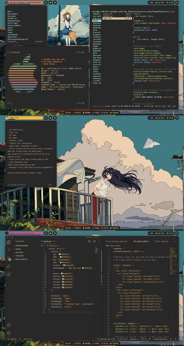
A screenshot showcases a highly customized desktop environment running on Arch Linux, a popular choice for developers who prefer a high degree of control. This practice is known as 'ricing' within the Linux community. On the left, a terminal window displays the output of 'neofetch,' showing system information like the OS, kernel version (5.11.16-arch1-1), window manager (bspwm), and hardware specifications (Intel i5-7400, NVIDIA GeForce GTX 1050 Ti). Two other terminal windows on the right show system resource monitoring, likely from a tool like 'btop' or 'htop,' displaying CPU usage and a list of running processes. The background features a dark, stylized wallpaper of the album art for 'Doolittle' by the band Pixies. The overall aesthetic is minimalist, text-centric, and dark-themed, reflecting a common preference among seasoned developers for functional, non-distracting, and keyboard-driven workflows. It's less a meme and more a statement of technical identity and expertise
Comments

7
Anonymous ★ Top Pick Some engineers ship products. Others ship a perfectly configured bspwm setup with a polybar that fetches their GitHub contribution graph in real-time. Both are solving for 'hello world' in their own way
  1. Anonymous ★ Top Pick

    Some engineers ship products. Others ship a perfectly configured bspwm setup with a polybar that fetches their GitHub contribution graph in real-time. Both are solving for 'hello world' in their own way

  2. Anonymous

    Arch + i3: proof that if a week of ricing saves one second of Alt-Tab, the ROI curve looks just like our microservices migration - exponentially beautiful in slides, depressingly linear in htop

  3. Anonymous

    Spending 47 hours perfecting your dotfiles and terminal color scheme just to run the same three kubectl commands and git status all day

  4. Anonymous

    When your desktop rice is so elaborate that you spend more time perfecting your Neofetch ASCII art and color schemes than actually monitoring the production servers that are currently on fire. But hey, at least your terminal looks absolutely sick while everything burns - priorities, right?

  5. Anonymous

    I call it observability: neofetch proves the distro, htop proves it’s idle, and the 800-line i3 config explains why the feature slipped

  6. Anonymous

    20 YoE optimizing prod SLOs, yet my tmux resurrects faster than any Kubernetes pod

  7. Anonymous

    Arch + i3: neofetch to declare ideology, htop to quantify regret, and pipes to visualize the microservice graph - ironically, the only part of our observability stack that never flakes

Use J and K for navigation