King Ghidorah Ranks Pagination, Load More, and Footer-Killing Infinite Scroll
Why is this UX UI meme funny?
Level 1: Chasing the Carrot
Imagine reading a magazine where the "back cover" has the phone number you need — but every time you get close to the last page, the magazine magically grows fifty more pages. Two normal ways of reading (flipping pages, or asking "show me more") work fine. The third way looks fancy but means you can never reach the back cover. That's why the third dragon head looks the way it does: it's the idea that seemed cool right up until anyone tried to use it.
Level 2: Three Ways to Serve a Long List
- Pagination — content is split into numbered pages (1, 2, 3…). The user clicks to the next page. Predictable, bookmarkable, and the footer sits politely at the bottom of every page.
- "Load More" button — one long page, but new items only appear when the user explicitly clicks. The page never grows behind your back, so you can always scroll past the last item to the footer.
- Infinite scroll — JavaScript watches how far you've scrolled and automatically fetches and appends more content as you near the bottom. Great for feeds; catastrophic when something important lives below the feed.
If you're early in your career, you'll likely implement this with an IntersectionObserver watching a sentinel element. The day you demo it, someone will ask, "How do I get to the privacy policy link?" — and you'll watch them chase the footer like a donkey chasing a carrot. That moment is this meme.
Level 3: The Footer That Got Away
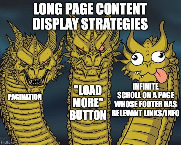
The King Ghidorah template — two regal, menacing dragon heads beside one cross-eyed head with its tongue out — is the industry's favorite way of saying "two of these were designed by adults." Under the banner "LONG PAGE CONTENT DISPLAY STRATEGIES", the serious heads get PAGINATION and the "LOAD MORE" BUTTON, while the derpy head is saddled with "INFINITE SCROLL ON A PAGE WHOSE FOOTER HAS RELEVANT LINKS/INFO." That phrasing is surgically precise. Infinite scroll isn't inherently the goofy head — Twitter and Instagram built empires on it. The anti-pattern is the combination: an endless content stream and a footer containing things users actually need (contact, terms, sitemap, careers, accessibility statement).
The mechanics of the failure are almost comedic in their inevitability. The user scrolls toward the footer; an IntersectionObserver or scroll-position listener fires; an XHR fetches the next page of results; new DOM nodes are injected above the footer; the footer is shoved another 3,000 pixels down. The footer becomes a horizon — visible, approachable, never reachable. Veterans will recognize this as a real ticket: "Customer says the Contact Us link doesn't exist. It exists. It is merely unattainable."
What makes this "too real" is the organizational dynamic behind it. Infinite scroll usually arrives via a product mandate — engagement metrics love it, because session length and scroll depth go up. The footer, meanwhile, belongs to legal, marketing, and SEO, who all stuffed it with mandatory links years ago. Nobody owns the interaction between the two, so the conflict ships. The known fixes — move footer links into a sidebar or header, switch to a Load More button after N auto-loads, or use a sticky footer reveal — all require someone to admit the two requirements collide. Easier to close the ticket as "works as designed."
There's also a deeper UX cost the meme gestures at: infinite scroll destroys place. Pagination gives you addressable state (?page=7) — shareable, bookmarkable, back-button-friendly. The hybrid "LOAD MORE" button keeps user intent explicit while avoiding pogo-sticking between pages. Pure infinite scroll throws all of that away, breaks scroll restoration on back-navigation, and quietly bloats the DOM until the tab starts wheezing unless you bother with list virtualization.
Description
The three-headed dragon (King Ghidorah) meme template: two fierce, serious golden dragon heads and one derpy cross-eyed head with its tongue out. The title text reads 'LONG PAGE CONTENT DISPLAY STRATEGIES'. The left serious head is labeled 'PAGINATION', the center serious head is labeled '"LOAD MORE" BUTTON', and the goofy right head is labeled 'INFINITE SCROLL ON A PAGE WHOSE FOOTER HAS RELEVANT LINKS/INFO'. An imgflip.com watermark sits in the bottom-left corner. The meme mocks a notorious UX anti-pattern: implementing infinite scroll on pages that still have a footer containing important links, making the footer perpetually escape the user as new content keeps loading just before they can click it
Comments
6Comment deleted
Infinite scroll with a footer is the frontend's Zeno's paradox: the contact link exists, you just can never reach it
Floating footer Comment deleted
All three is pagination actually Comment deleted
I love the last one, it just has to not be on the main page Comment deleted
we were about to follow the last path, but swr complexity made us abandon it in favor of pagination with buttons 🙂 Comment deleted
Ah yeas I have all three Comment deleted