Skip to content
DevMeme
2278 of 7435
Newspaper job ad expects applicants to type absurd percent-encoded URL
UX UI Post #2535, on Dec 26, 2020 in TG

Newspaper job ad expects applicants to type absurd percent-encoded URL

Why is this UX UI meme funny?

Level 1: Too Long; Didn’t Type

Imagine a company wants you to call them for a job, but the phone number they give is 200 digits long and full of weird symbols. Would you even try dialing it? You’d probably laugh or get frustrated, because it’s an impossible task for a normal person. That’s exactly the feeling this picture gives. The job ad is telling people to visit a website by typing in a ridiculously long string of nonsense characters. It’s like giving someone directions to a house by writing down an entire novel of turns and codes, instead of a simple address. It’s funny because it’s obviously a silly mistake – they made it so hard to follow the instructions that almost no one will succeed. In simple terms: the link is just too long to type, and everyone can see that expecting people to do it is a bad idea. That contrast between what the company intended (“Hey, apply online here”) and what actually happens (“Umm, nobody can type this!”) is what makes us shake our heads and laugh.

Level 2: Manual Entry Mayhem

What’s going on here? We have a percent-encoded URL printed out in a newspaper. A URL is a web address, and when it has a lot of extra stuff like %3E or %7B in it, that means the address includes special characters that have been “escaped” into a safe format. For example, %20 in a URL actually means a space character. So all those % codes are the computer’s way of including symbols (like commas, braces, or spaces) in the link. After the main part of the web address, there’s a long section of query parameters (the part after a ?). These parameters tell the website specific info – in this case, probably which job listing to show and the search criteria used. Normally, if you click a link online, you don’t care how ugly or long those parameters are; the browser just goes to the right page. But if you have to type it out by hand from paper, each character becomes a hurdle.

This ad is a perfect storm of bad UX design (User Experience design). It’s asking regular people to perform an extremely error-prone task: type hundreds of random letters, numbers, and symbols exactly. That’s practically impossible without mistakes. One typo, and the web page won’t load. It’s the kind of design decision that makes people give up. For someone trying to apply for a job, it’s discouraging and confusing – a true usability_nightmare. Good web design principles (WebDesignPrinciples 101) say you should make things easy for the user. Here they did the opposite. The company could have simply printed a short, memorable URL or even just instructions like “Visit our site and search for job number 14488.” There are even services to create short links (e.g. TinyURL or Bit.ly) specifically to avoid this problem. Nowadays, some print ads use QR codes – those square barcodes you scan with your phone – so nobody has to type a long address. Any of those solutions would have been better. This meme is tagged UXFailures because it shows what not to do if you want people to actually reach your website. It’s also a bit of CareerHumor: the ad is supposed to help folks get a job, but ends up giving them a headache. The lesson for new developers and designers is clear: always consider the context. If something works fine on a computer screen but becomes torture when done offline, it’s time to redesign! Don’t make your users jump through hoops, because as we see here, they’ll probably just nope out.

Level 3: Query String Quagmire

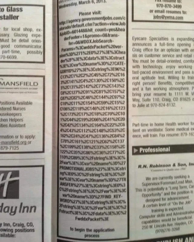
This meme highlights a spectacular UX failure that senior developers recognize instantly: someone printed a massively complex web link in a newspaper ad and expected people to manually retype it. The image shows an entire column filled with a percent-encoded URL – basically an avalanche of %2C, %3E, %7B and other gibberish that only a browser could love. Why is it so long? It looks like the ad creator copy-pasted a GET request URL directly from a jobs website without any shortening. The query string (everything after the ?) contains every possible parameter for the job posting. We even see clues like WDDXJobSearch-Params=%3CwddxPacket...: decoding that reveals a <wddxPacket> XML blob, meaning the site stuffed an entire data structure (yes, WDDX, an old Web Data eXchange format) into the link! In other words, the web portal’s advanced search state – categories, filters, maybe the kitchen sink – all got dumped into a single URL. That might be fine for bookmarking or sharing online, but in print it’s absolutely user-hostile.

For seasoned devs, this is a facepalm moment showing a classic anti-pattern: designing for the web without considering the real-world context. Printing a raw, unabridged URL is the path of most resistance for the user. One slip of the finger typing any of those hex codes and the link breaks. It’s a usability nightmare and an unintended test of an applicant’s patience (or typing accuracy!). The ad even cheerfully ends with “to begin the application process,” as if surviving that typing marathon is just Level 1 of the job hunt. 😅 Experienced folks know it didn’t have to be this way. A simple URL shortener (like turning that monster into a bit.ly/JobApply link) or even just instructing “Go to agency.governmentjobs.com and search for job ID 014488” would have saved everyone’s sanity. The humor (and horror) here comes from seeing an obviously broken workflow: a high-tech job application link delivered through a low-tech medium with zero adaptation. It’s the kind of real-world UXFail that makes developers simultaneously laugh and cringe, because it’s a textbook example of how not to bridge technology and humans.

Description

A grayscale photo of a newspaper classifieds page shows one narrow column entirely consumed by an enormous URL. The header reads “Wednesday, March 6, 2013” followed by bold text “Please visit:”. Beneath it, hundreds of characters - full of “%2C”, “%3E”, “%7B”, etc. - form a percent-encoded query string that stretches from the top to the bottom margin before ending with the line “to begin the application process.” Surrounding ads are ordinary one-sentence blurbs, making the wall-of-text link look ridiculous. Technically, the image highlights a spectacular UX failure: the job poster dumped every GET parameter into a printable link, ignored URL-shortening, and created a practically impossible user journey - an anti-pattern in web development and digital recruiting

Comments

11
Anonymous ★ Top Pick Any firm that prints a 3-kilobyte percent-encoded GET string in the classifieds is basically saying, “Survive this manual 414 challenge and you’re our new Senior Human cURL.”
  1. Anonymous ★ Top Pick

    Any firm that prints a 3-kilobyte percent-encoded GET string in the classifieds is basically saying, “Survive this manual 414 challenge and you’re our new Senior Human cURL.”

  2. Anonymous

    Finally, a job posting that's honest about requiring 271% effort - though usually they hide that expectation until after you've accepted the offer and discovered you're also the DBA, DevOps engineer, and coffee machine debugger

  3. Anonymous

    This is what happens when someone on the newspaper staff discovers 'View Source' for the first time and thinks copying the entire URL-encoded query string is how you 'download' a job posting. Somewhere, a government web developer is still wondering why their carefully crafted ColdFusion redirect parameters ended up immortalized in newsprint as a monument to the eternal struggle between web and print workflows. The real tragedy? This probably passed through three rounds of editorial review, and nobody noticed because it 'had computer stuff in it' so it must be right

  4. Anonymous

    Printing a ColdFusion WDDX query string in a newspaper is treating applicants as a distributed, lossy URL shortener with 0% SLA and infinite rage retries

  5. Anonymous

    Faxing resumes: the original async queue with infinite retry hell and no idempotency

  6. Anonymous

    Government job ad prints a 1KB WDDX-encoded ColdFusion URL in a newspaper; first screening: if you can hand-type the query string before the session expires, you can maintain the monolith

  7. @umidjonnasimov 5y

    😂😂

  8. @ryankrage77 5y

    the hyphenated line wrap means the URL wouldn't work even if typed out exactly as printed

  9. @x_Arthur_x 5y

    This is... sad

  10. Deleted Account 5y

    Happened to me irl

  11. Deleted Account 5y

    the Persian || arabic power

Use J and K for navigation