The Ultimate Simplification of the Firefox Logo
Why is this IndustryTrends Hype meme funny?
Level 1: Where Did the Fox Go?
Imagine you drew a really cool picture of a fox wrapped around a ball. It’s bright and detailed – you can even see the fox’s fluffy tail and the continents on the ball. That was the Firefox picture at first. Then someone says, “Let’s make it simpler so it looks fancier.” So you draw a new picture: it’s still a fox, but now it’s more like a simple cartoon with just a few shapes and pretty colors. It’s like turning a detailed coloring page into a basic cartoon logo. Some people say, “Wow, so modern!” Now, the funny part: what if you keep going and make it even more simple? You erase the fox completely and you just leave an orange ring on a black paper – basically a fuzzy circle that doesn’t show the fox at all. Then you put on a pretend top hat and monocle and say, “Ah yes, so fancy!” 🤴🧡 It’s silly, right? Because you went from a cool fox drawing to almost nothing, yet you’re acting like each step is more special. This is why it’s funny: it’s like a magic trick where the fox disappears, and we’re joking that the last super simple picture (that orange-black circle) is being treated as the most special of all. The meme makes us laugh at how sometimes grown-ups or companies keep changing logos (pictures for brands) to be simpler and claim it’s better each time – even when, to a kid, it might just look like they made the picture kind of vanish!
Level 2: Less Detail, More Fancy
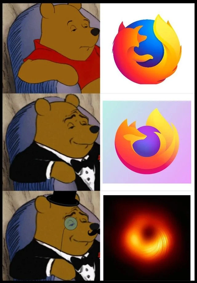
Let’s break down what’s happening. The meme uses three panels of Winnie-the-Pooh to rate the Firefox logo simplification trend. In the first row, Pooh is casually dressed (red shirt) next to the classic Firefox logo. That original logo (used for many years) shows a bright orange fox with a full tail wrapping around a blue globe. It's detailed and almost realistic (you can see the fox’s fur and the continents on the globe). This represents old-school UI design where icons had lots of detail, shading, and character. Pooh’s neutral face suggests “It’s okay.”
In the second row, Pooh has donned a tuxedo, looking more impressed. This corresponds to the 2019 Firefox icon redesign – a more minimalist, flat design. The new icon still has a fox-like shape and the iconic Firefox colors (orange, yellow, purple), but with fewer details: the fox’s body is abstract, and there’s no globe at all, just a stylized swoosh. The background is a soft gradient instead of a detailed Earth. This flatter style is part of a big UXDesign movement known as flat design, which favors simple shapes, solid or gradient colors, and no intricate textures. Companies opt for this style because it looks clean and is scalable (important for tiny app icons or high-resolution screens). Pooh in a tux is the meme’s way of saying “Ooh, fancy!” – poking fun at how designers (and marketing teams) often consider the newer, sleeker logo as more modern or “elegant.” As developers, we remember when this Firefox update rolled out: some users liked the modern look, others missed the cute detailed fox. But corporate branding loves to say “less is more.”
Now the third row takes the joke to the extreme. Pooh now wears a top hat and monocle – the epitome of over-the-top sophistication. And what’s he looking at? Not an official logo at all, but the famous black hole image captured by the Event Horizon Telescope! This blurry orange-red swirl is a real photograph of a black hole’s accretion disk (glowing gas around the black hole). Visually, it’s basically a bright ring on a dark background – which, humorously, could kind of look like an extremely simplified Firefox emblem (the colors and circular shape are vaguely similar). The meme implies that if you keep simplifying the Firefox logo further and further, eventually you’d end up with… well, literally nothing (since a black hole absorbs everything). It’s a tongue-in-cheek way to say the design trend might be going too far. Firefox hasn’t actually adopted a black hole as a logo (don’t worry!), but this panel satirizes how each redesign removes more detail. Front-end developers who deal with web design principles and branding updates find this hilarious because it resonates with real experience: every few years, tech companies rebrand with flatter, more abstract logos. We’ve seen Google go from a serif multicolor logo to a flat one, Microsoft turn the Windows flag from wavy to straight-edged, and Apple ditch detailed icons for flat glyphs in iOS. It’s an industry trend. On one hand, these changes are grounded in practical reasons (clarity, modern aesthetics, consistency across platforms). On the other, it often feels like change for the sake of change – a bit of hype to signal “new and improved” without adding any actual new features. Developers joke about it because we’re often the ones updating app icons, splash screens, or documentation to match the “fresh look,” even though the software itself hasn’t fundamentally changed.
So, in summary, this meme is pairing a popular format (the Tuxedo Winnie-the-Pooh meme, which shows increasing levels of smug sophistication) with the progression of the Firefox logo (detailed -> simplified -> essentially gone). It highlights the logo simplification trend in a funny, exaggerated way. Even if you’re new to web development, you likely notice how logos and app icons have become simpler over time. And now whenever a company unveils a “cleaner, modern logo,” you’ll remember this meme and think: are we approaching the black hole of design? 😅
Level 3: The Event Horizon of Design
In this meme, we’re witnessing the gravitational collapse of a logo into pure abstraction. It humorously charts the Firefox logo evolution from a detailed fox circling a globe to an ultra-minimalist orb that literally resembles a black hole. The joke is that each successive redesign is hailed as more sophisticated—paralleling how UX design trends often favor flat minimalism over skeuomorphic detail. Seasoned developers have seen this pattern before: a beloved, highly-detailed icon (with textures, shadows, a proud fox mascot) gets “refreshed” into a simpler, more geometric form. Initially, around 2013, flat design was a bold innovation (goodbye glossy 3D buttons, hello clean two-dimensional shapes). But taken to an extreme, it’s as if the brand’s identity gets sucked past an event horizon – beyond recognition. The meme’s final panel uses the 2019 black hole photo (from the Event Horizon Telescope) as the ultimate punchline: a hyper-minimal logo that’s literally cosmic nothingness. This wryly exaggerates how design teams, in pursuit of modern UXDesignPrinciples, sometimes over-optimize for simplicity until the original character is lost. 😏
For veteran front-end developers, there’s also a bite of BrowserWars fatigue here. Firefox’s branding has changed multiple times in the race to stay relevant against Chrome, Edge, Safari, etc. Each rebrand means updating assets, re-learning the icon, maybe enduring a flame war on r/webdev about whether the new look is awesome or awful. We nod knowingly because we’ve lived through design hype cycles: today’s “fresh, modern icon” can become tomorrow’s dated look that another rebranding will fix. It’s a never-ending orbit. The meme captures that “here we go again” feeling. Each Pooh image upping his fanciness (first normal, then tuxedo, then tux + monocle) mocks the pretentious language around these redesigns. The corporate design team in 2019 likely called the new flat logo “bold and sophisticated.” Meanwhile, devs joked it looked like a 🦊 fox got Thanos-snapped into an orange swoosh. And if that was sophisticated, well then the black-hole – an almost featureless orange ring – must be the pinnacle of elegance, right? Dark humor aside, there’s genuine industry context: logos must scale from high-res screens down to tiny favicons. Simplifying shapes can improve recognizability in small sizes and across devices. But this meme jabs at the absurdity of chasing simplicity to the point of absurdity. It’s a shared comedic catharsis for anyone who’s sat through a “new branding rollout” meeting thinking, “Is this really better, or have we lost the plot?”
Description
A three-panel 'Tuxedo Winnie the Pooh' meme, showing a progression of sophistication. The first panel features the standard Pooh Bear next to the classic, detailed Mozilla Firefox logo. The second panel shows a more refined Pooh in a tuxedo, paired with the newer, simplified and more abstract Firefox logo. The final and most sophisticated panel depicts Pooh with a top hat and monocle, placed next to the first-ever photograph of a black hole, taken by the Event Horizon Telescope. The humor lies in the striking visual resemblance between the minimalist Firefox logo and the glowing accretion disk of the black hole, comically suggesting that the ultimate endpoint of corporate logo simplification is a cosmic singularity. It's a clever mashup of tech design trends and a landmark scientific achievement
Comments
11Comment deleted
Firefox spent years on user research to simplify their logo. Meanwhile, gravity just needed a star a few million times heavier than the sun to create the perfect, most minimal icon
At this rate the 2025 Firefox rebrand will just be an empty SVG - marketing will dub it “zero-byte premium,” and the ops team will list it as “/dev/null-as-a-Service.”
After 20 years of optimizing JavaScript engines and memory management, Firefox finally achieved the ultimate performance optimization: collapsing into a singularity where even light-weight DOM operations cannot escape its event horizon
Firefox's performance optimization has reached such extreme levels that it's now bending spacetime itself - though senior engineers know that achieving 'black hole' performance usually means your memory consumption has also reached event horizon levels where no RAM can escape
Firefox logos: more iterative abstractions than a monolith's microservices migration, collapsing into a singularity where recognition escapes velocity
After three “simplify the logo” OKRs, marketing shipped a black‑hole photo - perfect: we replaced a recognizable 4KB SVG with a 120KB JPG and zero brand recall
Firefox logo evolution: fox → abstract swoosh → event horizon - fitting, because a week-old tab becomes a RAM singularity where not even GC or swap can escape
Firehole? Comment deleted
Blackfox Comment deleted
Firefart. Comment deleted
blackhole of your RAM Comment deleted