Skip to content
DevMeme
6311 of 7435
How Different Disciplines Explain Things: From Concrete Blueprints to Abstract Blobs
Mathematics Post #6921, on Jun 23, 2025 in TG

How Different Disciplines Explain Things: From Concrete Blueprints to Abstract Blobs

Why is this Mathematics meme funny?

Level 1: Just Trust the Arrow

Imagine you’re trying to learn how to bake a cake, and you ask three friends for a diagram of the process. The first friend is very hands-on and practical – they give you a detailed recipe diagram. It shows a picture of every ingredient (eggs, flour, sugar) measured out to the gram, and each step has an illustration (mixing, baking at exactly 350°F for 45 minutes). You could follow this picture like a map and end up with the exact cake they envisioned. This is like the engineer’s blueprint: super detailed and exact. Now you go to the second friend, who’s more of a science teacher. They draw a simpler picture: maybe a cartoon cake with arrows showing “mix ingredients” -> “apply heat” -> “cake rises”. They tell you, “Real baking is more complicated than this, but this is the basic idea of how a cake comes to be.” Their drawing isn’t as exact (they don’t show every ingredient or the precise timing), but it’s easier to understand at a glance – you get the concept that heat makes it rise, without needing to see every bubble of air in the batter. That’s like the physicist’s simplified diagram: it’s not a true picture of what’s happening, but it’s a helpful story. Finally, you ask a third friend, who happens to be a pure theorist. They give you the most bizarre diagram: just a big mystery box labeled “Stuff” (that’s the green blob) and a red arrow pointing from “Stuff” back to itself. They say, “Inside this box is a subset of all possible baking actions – I’m not going to tell you which ones. And this red arrow is a morphism that represents the transformation of ingredients into a cake.” In simpler terms, they’re basically saying, “I’m not going to show you the recipe at all, but trust that there is some magical step that turns ingredients into cake.” You’d probably tilt your head and chuckle, because that diagram doesn’t help you bake anything – it’s just saying “there is a way to bake a cake” with a fancy arrow. That’s exactly why the meme is funny: the mathematician’s “just trust the arrow” approach is like giving someone a treasure map where X marks the treasure, but no route is drawn to get there. The arrow is there, pointing vaguely, saying “you can go from start to finish,” but it doesn’t show the path or the obstacles. It’s both silly and relatable – we laugh because sometimes explanations in real life feel just like that: someone points and says “just do it somehow,” and we’re left thinking, “Wait… how exactly?” So the meme uses this simple scenario to poke fun at how differently people can explain the same thing. The engineer’s way feels like a step-by-step LEGO instruction booklet, the physicist’s way is like a basic cartoon diagram that gives the idea, and the mathematician’s way…well, it’s like a mysterious sign with an arrow that says “trust me, it’ll work” – funny, but not very helpful if you actually need to get the job done!

Level 2: From Blueprint to Blob

Let’s break down the meme panels one by one, defining some terms along the way and connecting them to experiences developers might have:

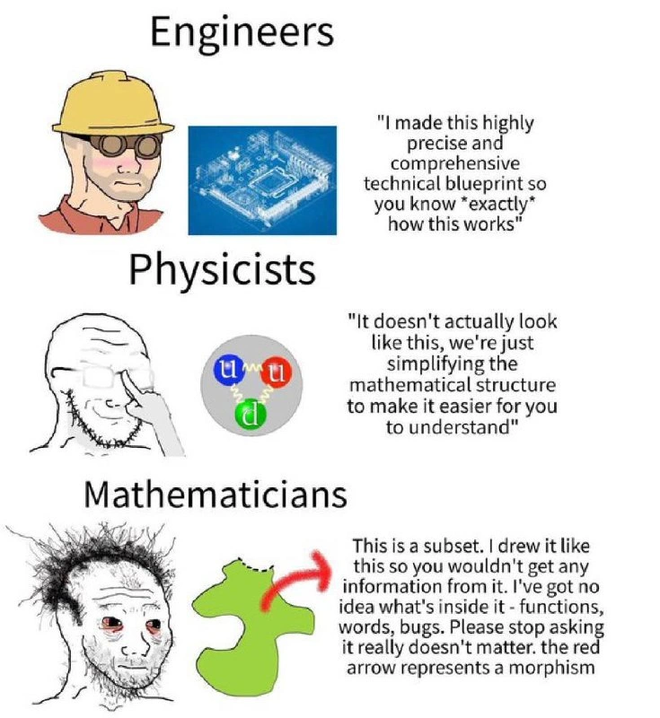
  • Engineers (Panel 1): We see a cartoon engineer (with a hard hat and determined expression) accompanied by an image of a PCB blueprint in cool blue tones. A PCB (Printed Circuit Board) blueprint is an ultra-detailed diagram that shows all the electrical connections, components, and pathways in a hardware design. When the engineer says, “I made this highly precise and comprehensive technical blueprint so you know exactly how this works,” they mean it literally. Every line in that PCB CAD drawing corresponds to a copper trace or a pin on a chip; every symbol represents a resistor, capacitor, or microchip. In engineering documentation, especially in hardware, fidelity is king – the diagram is basically a one-to-one map of the real thing. For a developer, this level of detail is akin to well-documented code where every function is described, every API contract detailed, and nothing is left to guesswork. It’s thorough and leaves little room for misinterpretation. If you can read the blueprint, you could reproduce the gadget exactly. The humor in this panel is that the engineer is almost over-communicating: “exactly how it works” implies there’s no abstraction at all – it’s the raw truth, every nut and bolt. This is fantastic when you need to implement or build the thing, though sometimes engineers might overwhelm others with details if they’re not ready for that level of depth.

  • Physicists (Panel 2): The second panel shifts to a scientist’s perspective. We have a Wojak (meme figure) with glasses, looking thoughtful, next to a simplified diagram of a proton. The diagram shows three colored circles labeled “u, u, d” (which stand for two up quarks and one down quark, the constituents of a proton) connected by curly lines (representing gluons, the particles that carry the strong force binding quarks together). The physicist’s caption reads: “It doesn’t actually look like this; we’re just simplifying the mathematical structure to make it easier for you to understand.” This is a classic scientist approach: they create a model. In reality, a proton doesn’t have neat little balls labeled “u” and “d” sitting still – it’s more like a fuzzy cloud of quark interactions (and actually an intense quantum field situation). But drawing that accurately would be impossible to visually parse, so physicists use an idealized diagram. The colored balls and squiggly lines convey the idea (proton has quarks held by gluons) without being visually chaotic. It’s like when we draw an atom as a mini solar system – not true to life, but helpful to get the concept across. In developer terms, this is akin to drawing a high-level architecture diagram of a complex system: you might represent a whole cluster of servers as one box labeled “Server Farm,” or show data flow as a single arrow even though under the hood it’s multiple network hops. The key terms here are abstraction and simplification. The physicist explicitly says the picture isn’t literally accurate – they acknowledge that they’ve left things out or distorted reality (maybe the sizes, the distances, or the continuous nature of fields) to focus on the structure that matters for explanation. For a junior developer, it’s important to know that many diagrams or models they encounter (like an ORM entity-relationship diagram, or a flowchart of an algorithm) might not capture every detail – they are teaching tools. The physicist’s approach is honest: “we simplify the math structure so it’s easier to understand.” It’s a bit like saying, “We drew the database as if it’s a single monolith in the diagram, but in reality it’s a distributed sharded system – we abstracted that complexity away for now.” This panel gently introduces the idea that sometimes documentation isn’t literally true, but it’s useful. That’s a common scenario in tech: e.g., a tutorial might say “imagine the internet as a cloud” – it’s not a fluffy cloud, but it helps you mentally group a complex thing into one concept.

  • Mathematicians (Panel 3): Now for the final, and most perplexing panel. We see a scraggly, wild-haired mathematician character (probably meant to be a tongue-in-cheek portrayal of someone who hasn’t slept while pondering deep problems), and next to him is a very minimalistic diagram: a green blob shape and a red arrow curving from the blob back to itself (or out towards something ambiguous). The caption is a goldmine of absurdity: “This is a subset. I drew it like this so you wouldn’t get any information from it. I’ve got no idea what’s inside it – functions, words, bugs. Please stop asking; it really doesn’t matter. The red arrow represents a morphism.” Let’s unpack those terms for clarity:

    • Subset: In mathematics, a subset is a set contained within another set. If we’re thinking in terms of software, you can imagine a subset as a collection of things (maybe a subset of features or a subset of data) that lives inside a bigger collection. By drawing a blobby shape and calling it a subset, the mathematician is basically saying “this green shape is some collection or component of the system.” But unlike the engineer’s blueprint which would detail every element in that subset, here we have no clue what elements are included – it’s just abstractly “a subset of something larger.”
    • No idea what’s inside: The mathematician lists “functions, words, bugs” as possible contents of the subset. This is intentionally absurd and funny – it mixes completely different kinds of things (functions are like pieces of code, words could imply textual data or documentation, and bugs…well, those are the pesky errors and issues). By jumbling them, the meme emphasizes that this diagram is not telling you what kind of thing the subset is. It could be anything! In a way, this mocks overly abstract documentation: you sometimes see a component in a diagram labeled very vaguely (like “Data Source” or “Subsystem X”) and you wonder, is that a database? A file? A microservice? Code? Nobody can tell from the diagram – it’s not specified.
    • Morphism: This is a term from advanced math (category theory, as mentioned above in Level 4). A morphism is basically a mapping or transformation from one object to another. In simpler terms, you can think of it as a function (like in programming: a function takes input and gives output). The red arrow in the diagram “represents a morphism,” meaning it represents some process or mapping involving that green subset. Perhaps it maps the subset to itself (if the arrow loops back) or to another set. The key is, they don’t say which function or what it does – only that there exists some relationship (arrow).

    The mathematician’s approach to diagrams is ultra-abstract. It’s common in theoretical computer science and math to draw a blob or a node and not label the internals, because one is reasoning about general properties. For example, a mathematician might say “let ( S ) be a set representing all possible states of the program” and draw it as a bubble, without enumerating those states. Why? Because the theory they’re developing might work for any set ( S ), whether it has 2 states or 2 billion states. By not committing to details, the result stays very general. The red arrow morphism could be something like a transition function or an interface mapping one part of a system to another. In a software architecture sense, this could be like showing an API call or data flow with an arrow, but not saying what the payload is or how the logic works – just that “some transformation exists from this module to that module.”

    For a junior developer, this panel is highlighting a form of communication that you might encounter if you ever read formal specifications or academic papers about computing. They often use words like “there exists a function ( f: A \to B )” without telling you what ( f ) concretely does, only that it has certain properties. It’s a bit mind-bending because you’re used to concrete examples. It can feel like someone drew a big box labeled “magic happens here.” In fact, developers jokingly use “magic happens here” or “black box” in diagrams to denote something opaque. The mathematician’s diagram is basically the ultimate “black box”: a subset blob with an arrow. The humor comes from imagining a person seriously presenting that as documentation – it’s the kind of high-level schematic that provides zero actionable info if you’re trying to implement the system, yet it sounds authoritative (“the red arrow is a morphism, trust me”).

So, “From Blueprint to Blob” summarizes the journey: we went from a blueprint (extreme detail, engineer-style), to a model diagram (simplified concept, physicist-style), to a blob-and-arrow (totally abstract, mathematician-style). In each step, the fidelity of the diagram drops and the abstraction rises. This relates to software and tech communication in that there’s always a balance between detail and abstraction. Too much detail (like a full PCB schematic for a simple idea) can overwhelm or be unnecessary at early stages. Too much abstraction (like “just trust the morphism”) and nobody knows what’s actually being proposed. Finding the middle ground – enough detail to be useful, enough abstraction to be clear – is an art. This meme exaggerates each style to make us laugh and also nod: we’ve seen each of these approaches in real life documentation or explanations. And truth be told, sometimes we’ve even been guilty of them ourselves (maybe writing overly detailed docs that nobody reads, or conversely, writing an abstract design doc that waves hands at the actual problem). By understanding these terms and approaches – from precise blueprints to conceptual models to abstract schemas – a junior developer can better appreciate why different people present information so differently, and how to ask the right questions: “Is this diagram supposed to be exact, or just a guiding model? Should I worry about what’s inside that blob, or is it intentionally unspecified?” In tech, knowing what level of abstraction you’re dealing with is half the battle in understanding documentation.

Level 3: The Great Diagram Drift

This meme nails a progression that many senior developers have witnessed (often with a mix of amusement and horror): the diagram fidelity drift from concrete to abstract as you move from engineering through science to math – or, analogously, from low-level design to high-level “architectural vision.” In the first panel, Engineers (think electrical engineers or hardware designers) present diagrams like a PCB blueprint: every wire, resistor, and chip pin meticulously drawn. It’s the kind of diagram where you could hand it to a manufacturer and get a real circuit board made. The humor here is that the engineer says, “so you know exactly how this works.” And they mean exactly – no ambiguity, no mystery. Hardware engineers live by the mantra that the documentation should be exhaustive and precise (because if one connection is wrong, things literally catch fire). Now contrast that with the second panel’s Physicists. The physicist (depicted as a pensive Wojak figure with glasses) admits, “It doesn’t actually look like this; we’re simplifying the structure to make it easier to understand.” The diagram next to him – a proton composed of quarks (u, u, d) held together by gluon squiggles – is a scientific model. Physicists often use simplified diagrams (like the classic Rutherford atom with electrons orbiting like planets, or Feynman diagrams with squiggly lines for forces) to explain phenomena. They fully know reality is messier (quantum fields, probability clouds, etc.), but the simplified model captures the essence without needing an electron microscope or a particle accelerator in the classroom. This is analogous to how software architects or senior devs might draw a high-level system diagram: perhaps a few microservice boxes with arrows showing API calls, while glossing over the gritty details like network ports, thread pools, or the exact SQL queries. They simplify to communicate the idea, not the literal truth down to each bit. We chuckle because the physicist’s stance is a halfway point: “We know this picture is wrong, but it’s useful.” It’s a wink-wink acknowledgment that diagrams are sometimes just teaching tools or conceptual aids.

Then we crash into the third panel with the Mathematicians, and the fidelity of the diagram has completely disintegrated into abstraction. The wild-haired mathematician character has drawn a green amoeba-like blob annotated as a “subset,” with a red arrow looping out and back in. The caption is a comedic over-the-top version of a mathematician’s explanation: “I drew it like this so you wouldn’t get any information from it. I’ve got no idea what’s inside it – functions, words, bugs. Please stop asking; it really doesn’t matter. The red arrow represents a morphism.” This is where the meme hits the sweet spot for experienced devs: it satirizes those moments when documentation or explanations become so abstract that they cease to inform. In software teams, this happens when an architecture document goes from a useful schematic (e.g., UML class diagrams with specific methods) to a vague box-and-arrow sketch, and finally to something like “Module A (somehow) relates to Module B via transformation φ” – which leaves the readers scratching their heads. Senior devs have sat through presentations where an overzealous academic-turned-architect talks about the system in terms of abstract algebra or category theory, complete with statements like “We model our data flow as a functor on category 𝒞” – and everyone else is nodding politely while thinking “But… what does the code actually do?”. The meme’s mathematician is basically that person who has retreated entirely into theory. The phrase “just trust the morphism” perfectly parodies the frustration: it's like being told “just trust that this arrow (function) does the right thing, details aren’t important.”

This “Great Diagram Drift” is relatable office comedy. Early on, the team might have a detailed spec (like the engineer’s blueprint) – every endpoint, every database schema defined. Later, maybe a scientist-type on the team says, “Alright, the real system is too complex, so here’s a conceptual model of how data flows,” akin to the physicist’s simplified proton diagram. Finally, by the time the project is handed to an enterprise architecture group or a research team, the documentation has become a pile of mathematical abstractions: perhaps some set theory notation or an architecture decision record that uses ultra-generic terms (the blob and morphism!) that could apply to any system in the world. It’s humorously true that as some teams chase “high-level design” or “future-proof principles,” their diagrams can become so generic that they’re practically content-free. We end up with what one might call architecture astronautics – diagrams floating in space, untethered to reality, much like the mathematician’s subset drawing that “provides no information.” Seasoned engineers feel the irony: documentation is supposed to clarify, but here it has evolved (or devolved) into something that obscures everything but a trivial outline. The meme lampoons this perfectly by using the personas of engineer, physicist, and mathematician – escalating from concrete reality to useful approximation to almost comically abstract nonsense. It’s a gentle jab at how communication styles differ across disciplines and how in tech, mixing those styles can lead to absurd outcomes. Every senior dev who has tried to extract actual implementation steps from a lofty theoretical design doc chuckles (or winces) at this, thinking, “Yup, been there – started with a solid blueprint, ended up with a fancy morphism that tells me nothing.” It’s a cautionary tale and a shared joke: the more the documentation tries to be universal and abstract, the less anyone can actually use it to build things in the here and now.

Level 4: Morphism Mystery Box

At the highest level of abstraction, this meme dives into category theory territory – the realm of morphisms, objects, and blissful ignorance of internal structure. The mathematician’s diagram (a blobby green subset with a red curved arrow) is essentially a category theory sketch: it shows an object (the green shape) and a morphism (the red arrow) mapping it to something, without revealing any internal details. In category theory (formalized by Eilenberg and Mac Lane in the 1940s), an object can be anything – a set, a type, a space – and a morphism is a structure-preserving mapping (like a function) between objects. Crucially, category theory deliberately doesn’t care what’s inside an object. All that matters are the relationships (arrows) and that they obey certain compositional rules. This allows mathematicians to prove very general truths without getting bogged down in implementation. It’s powerful, but also why the meme’s mathematician says, “I’ve got no idea what’s inside – functions, words, bugs – it really doesn’t matter.” In a category diagram, a green blob labeled as a subset could represent, say, some data type or a component’s state space, and the red arrow a transformation or function between states or systems. From a theoretical CS perspective, this is elegant: you focus on morphisms and compositions, guaranteeing properties like associativity or identity without specifying how each function works internally. This extreme abstraction is the essence of frameworks like type theory and even influences functional programming (ever heard someone explain a monad as “a monoid in the category of endofunctors”? 🙃 That’s peak mathematician style – technically precise, yet inscrutable to the uninitiated). The humor here comes from that familiar bafflement: the diagram is so abstract it’s almost useless for practical understanding. It’s a Morphism Mystery Box – a black box approach where you’re told, “there exists a structure and a mapping, just trust us.” In real software architecture, this is akin to those lofty design documents that define modules only by their interfaces or contracts (the arrows) but say nothing about the implementation inside. It’s pure abstraction: great for reasoning about high-level properties (or proving theorems), but maddening if you actually need to build or fix the thing. The meme cleverly contrasts this with the far more concrete depictions from engineering and physics, highlighting a fundamental truth from computer science theory: as you climb the ladder of abstraction, you often trade away concrete information for generality. That red arrow represents a morphism – essentially “some process happens here” – which is both the magic and the weakness of such diagrams. It’s the reason why category theorists can unify whole branches of math under one diagram… and also why everyone else jokes that mathematicians live in an Ivory Tower of abstraction. The wild-haired mathematician caricature embodies the architecture astronaut archetype in software teams: the person who draws insanely high-level diagrams with blobs and arrows (maybe even throwing in a functor or two) and insists the specifics don’t matter. Seasoned devs recognize this pattern: when documentation reaches this level of abstract algebraic bliss, it’s both impressive and utterly unhelpful for day-to-day work – and that contrast is exactly what makes the meme hilariously relatable.

Description

A three-panel meme using Wojak characters to humorously contrast the explanatory styles of different technical fields. The top panel, labeled 'Engineers', shows a confident engineer with a highly detailed technical blueprint, stating it's to show 'exactly how this works.' The middle panel, 'Physicists', shows a thoughtful academic with a simplified model of a proton's quarks, explaining it's a simplification of the 'mathematical structure.' The bottom panel, 'Mathematicians', features a stressed, disheveled character next to an amorphous green blob, giving a deliberately unhelpful explanation: 'This is a subset. I drew it like this so you wouldn't get any information from it... the red arrow represents a morphism.' The meme satirizes the increasing levels of abstraction, moving from the engineer's concrete reality to the physicist's useful models, and finally to the mathematician's pure, almost comically impenetrable abstractions. For developers, this reflects the different ways systems are understood: from detailed infrastructure diagrams to high-level architectural concepts where the internal implementation is intentionally ignored


Comments

28
Anonymous ★ Top Pick An engineer will give you a perfect sequence diagram. A physicist will say it's basically a state machine. The mathematician will just tell you it's a monad in the category of endofunctors and ask why you're still confused
  1. Anonymous ★ Top Pick

    An engineer will give you a perfect sequence diagram. A physicist will say it's basically a state machine. The mathematician will just tell you it's a monad in the category of endofunctors and ask why you're still confused

  2. Anonymous

    This is why our architecture deck starts with a beautifully rendered system map and ends on slide 42 with one green blob labeled ‘DomainObject ⟶ ???’ - the true enterprise morphism

  3. Anonymous

    After 20 years in tech, I've learned that engineers document everything nobody reads, physicists approximate everything to spherical cows, and mathematicians prove things exist without ever showing you where they are - yet somehow we still ship products that mostly work, except when they don't, which is usually because someone assumed their abstraction level was everyone else's reality

  4. Anonymous

    This perfectly captures why cross-functional collaboration is so challenging: engineers over-document every implementation detail until you're drowning in UML diagrams, physicists abstract away all the useful information behind elegant but impenetrable models, and mathematicians... well, they've already moved on to proving the documentation itself is undecidable. Meanwhile, the PM just wants to know if it'll ship by Friday

  5. Anonymous

    Stakeholder questions are inversely proportional to diagram fidelity - blueprints trigger scope creep, physics-style “not to scale” buys time, and a category-theory blob with a morphism is the only architecture fully backward-compatible with requirements that don’t exist yet

  6. Anonymous

    Architecture translation layer: engineers draw the C4, physicists call it a toy model, and the principal reduces it to a morphism prod -> pager that composes nightly

  7. Anonymous

    Engineer ships the full monorepo diagram; physicist calls it a Lagrangian approximation; mathematician: Yoneda lemma embedding, peek inside at your peril

  8. @thisisluxion 1y

    you wouldn't usually represent a subset like this if you haven't given it an additional structure of some kind, it has functionally no value. You'd usually use such a drawing for a generic topological subspace, with the red arrow being specifically a continuous function or an homeomorphism

    1. @RiedleroD 1y

      noo not maths in the comments

      1. @s_DiYaKon_s 1y

        2+2=5

        1. @RiedleroD 1y

          *dies*

        2. アレックス 1y

          No politics please

          1. @RiedleroD 1y

            lmao

        3. @TERASKULL 1y

          true for large amounts of 2

          1. @ZgGPuo8dZef58K6hxxGVj3Z2 1y

            Based

        4. @itsTyrion 1y

          0.1+0.2=0.30000000004

      2. @thisisluxion 1y

        sorry haha

  9. @mrYakov 1y

    Also engineers: We dont fucking understand how this shit actually performs under load, neither we dont now how long it can perform without degradation, so we just divide our results by ten and call it a day

    1. @gongchanM1 1y

      "If it works don't touch it" c

    2. @deadgnom32 1y

      in electrical engineering you can buy components with >20% inaccuracy.

      1. @RiedleroD 1y

        yeah can I have uhhh a resistor somewhere between 120Ω and 180Ω?

      2. @RiedleroD 1y

        I love how > 20% technically could be anything, so you could be ordering an E3 150Ω resistor and instead get a 200MΩ resistor, and it'd still be within specifications

        1. _ 1y

          At that point you'll specify both the resistance and the tolerance. The point is that if you have >20% tolerance anyway, there's not point asking for values from E12 or E6

          1. @RiedleroD 1y

            oops. yeah

        2. _ 1y

          BTW 150Ω is E6 but not E3

    3. @Agent1378 1y

      Intel 13th & 14th generation's vibes here!

  10. @deadgnom32 1y

    meanwhile engineers

    1. @endisn16h 1y

      pi = 4

Use J and K for navigation