The Perils of Unfortunate Product Naming: A Case Study in 'Pro-Lapse'
Why is this Marketing meme funny?
Level 1: Little Mistake, Big Difference
Imagine you have a nice little ice cream shop and you paint a big sign for it. You want the sign to say “Ice Cream” in bright letters. But oops – you accidentally put the letters too close together, or maybe you draw a fancy picture in place of one of the letters. Now, instead of reading “Ice Cream,” people walking by read it as “I Scream.” Uh-oh! Your friendly ice cream shop suddenly sounds like it’s about yelling loudly, which is pretty silly and confusing. In a funny way, you turned a sweet message into a spooky or goofy one just by messing up the spacing of the letters.
That’s exactly what happened in this meme’s story. A group made a video app that helps people with time-lapse videos (those fast-forward kind of videos). They tried to name it something cool and professional – “Pro Lapse” – to suggest it’s for pros. But when they designed the logo and wrote it out, it ended up looking like the word “prolapse,” which is actually a term for a scary medical problem. Yikes! It was a tiny mistake (just how the text was spaced and styled) but it made a huge difference in meaning. People saw the name and went “😳 That can’t be right!” It’s funny because it was an accident that no one caught before going public. In simple terms: a little design goof turned the name into something totally weird and embarrassing. The lesson? Always be careful how you put words together, because our eyes can see things in ways we don’t expect – and it can completely change what you’re saying!
Level 2: The Kern of the Matter
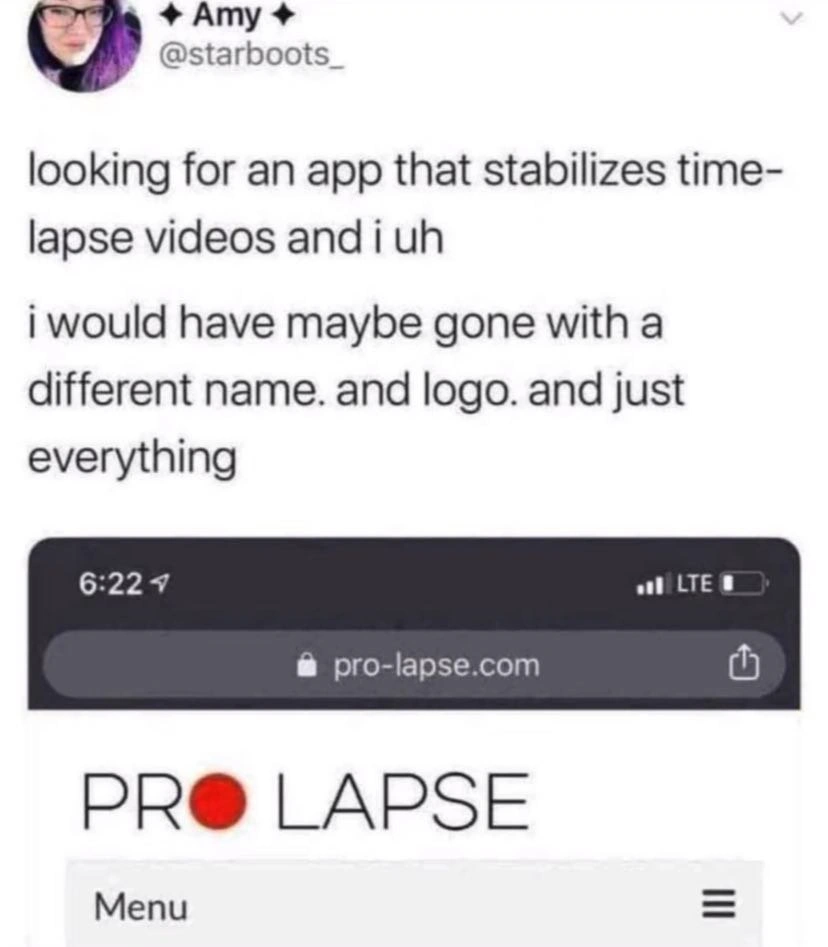
Let’s break down what happened in plain terms. The meme shows a tweet and a screenshot about a video app’s unfortunate name. The key issue here is something called kerning – that’s a design term for the spacing between letters. If you kern text poorly, letters that should be separate can smush together and be misread. In the app’s logo, the word “PRO” is immediately followed by “LAPSE,” but they replaced the “O” in “PRO” with a red circle (a little recording dot 📕). That tiny design choice messed up the spacing, so instead of seeing “PRO LAPSE” as two words, people’s brains see “PROLAPSE” as one big word. Essentially, bad kerning caused a naming collision between an innocent product name and a not-so-innocent word from the dictionary.
So, what is that not-so-innocent word? Prolapse is a medical term. It describes a serious condition where part of the body, usually an internal organ, slips out of its normal place. (Yikes! Definitely not something you’d ever expect in a tech product’s name.) Now, the app in question is supposed to help stabilize time-lapse videos. A time-lapse video is a sped-up video showing a long process in a short time – like a camera taking pictures of a flower blooming over hours and turning it into a quick 10-second video. Often these time-lapse videos can be a bit shaky, so people look for apps to make them smoother. This particular app wanted to market itself to serious users, hence the name “Pro Lapse” (short for “Professional Time-Lapse”). On paper, that might sound okay: pro = professional, lapse (from time-lapse). But when you string it together as a logo or a domain name, the result was terribly misleading.
Let’s talk about branding and UX/UI here. Branding is all about how a product or company presents itself – the name, the logo, the colors, the overall vibe you get when you see it. UX/UI design focuses on making sure things not only look good but also make sense to the user (UX = user experience, UI = user interface). In this case, both branding and UX design slipped up. The logo design (putting that red dot in “PRO”) was meant to be creative, but it unintentionally hid the space between words. No one on the team realized, “Hey, if we do that, people might read it differently.” This is a communication failure: the team intended one message (“our app is for PROs, and it does time‑lapse”), but users received a very different message (“uh, something about a medical problem?”). That’s classic miscommunication.
The domain name choice didn’t help either. The screenshot shows the site pro-lapse.com. They probably added a hyphen in the URL (“pro-lapse” instead of “prolapse”) to try to keep “pro” and “lapse” somewhat separate. But most people reading it quickly — or saying it out loud — would still interpret it as “prolapse.” When choosing a domain, companies usually avoid combinations that form weird or offensive terms. It’s like how the programming Q&A site Stack Overflow chose a decent name, whereas if they had mashed words carelessly they could’ve ended up with something like “stac-koverflow.com” (which thankfully they didn’t!). This app’s team either didn’t notice the issue or thought the hyphen was enough. Spoiler: it wasn’t.
For a junior developer or designer, the takeaway is to always get a second pair of eyes on your work, especially something as critical as a product name or logo. In software engineering, we do peer reviews for code to catch mistakes. The same idea applies to design and marketing. If these folks had shown their Figma mock-up to basically anyone outside their bubble, they might have caught the problem instantly. Even just saying the name out loud – “Pro Lapse” – could have raised a red flag (it sounds like “prolapse”). This is also a reminder that naming is hard. Developers learn this early: picking the right name for a variable, a function, or a product is trickier than it seems. You want it to be clear and not clash with anything unintended. It’s why there’s that tongue-in-cheek saying: “There are only two hard things in Computer Science: cache invalidation and naming things.” It’s half-joke, half-truth. Here, the naming thing proved hard in a very public way.
In summary, the meme highlights a huge oops in the world of tech branding. A team tried to be creative and concise in naming their app, but a small design detail (letter spacing and that red dot) completely changed the meaning of their brand. For anyone new to tech, it’s a great lesson: always check how your product name could be read or misread, and make sure your design choices aren’t accidentally turning your message upside-down. A few extra minutes of review can save you from becoming an overnight joke on the internet. 😅
Level 3: Pro Lapse in Judgment
Every experienced dev and designer knows that NamingThings can make or break a product’s first impression. In this meme, we witness a spectacular brand_name_fail that shows exactly why you always sanity-check names and logos. One look at the domain pro-lapse.com – with a stylized “PRO” and a red record-dot in place of the “O” – and you realize this innocent time_lapse_app has faceplanted into an unintended medical double entendre. The product was aiming for “professional time-lapse” vibes, but thanks to some sloppy kerning and a clever not-so-clever logo, it ended up spelling out “prolapse”. Yes, prolapse as in the medical emergency where something internal is, uh, no longer internal. Not exactly the professional image the marketing team had in mind.
"i would have maybe gone with a different name. and logo. and just everything"
– Amy (@starboots_), on Twitter, laying out the issue plainly.
Amy’s tongue-in-cheek tweet (shown in the meme) perfectly captures the cringe: the app’s branding is so off-target that a casual user immediately jokes they’d redo “just everything.” It’s both hilarious and painful because the mistake is so obvious in hindsight. The bold red dot that replaced the “O” was supposed to evoke a recording indicator (a cute nod for a video tool). Instead, that design choice closed the gap between PRO and LAPSE, causing our brains to merge it into “PROLAPSE.” This is a classic UXDesign snafu where a visual tweak backfires spectacularly. The logo itself became an unfortunate_logo: a tiny symbol turned the harmless phrase “Pro Lapse” into a word that evokes hospital rooms and 911 calls. Talk about UXFailures – one small lapse (pun intended) in design judgment led to a huge lapse in user trust and brand perception.
From a senior perspective, the humor here comes with a knowing wince. It’s a miscommunication at a fundamental level, one that veteran developers and product folks have seen before. It’s the perfect storm of a good idea gone bad: marketing came up with a snappy name, design added a trendy icon, but nobody read the final result out loud (MarketingVsReality in action). The intent was “This is a Pro tool for time-lapse videos.” The reality? Users are now thinking of medical procedures. The gap between intent and interpretation couldn’t be wider (or funnier, to us onlookers). In essence, a naming_collision occurred between the product’s intended meaning and an entirely different, unfortunate meaning. In coding, a naming collision might cause some namespace bugs; in branding, it causes public ridicule. Seasoned devs have learned to guard against both.
To drive home how easily this can happen, many of us recall infamous examples from tech history. One classic case: the Q&A site Experts Exchange chose the domain expertsexchange.com – readers immediately parsed it as “expert sex change.” 😬 Oops. They eventually added a hyphen (experts-exchange.com) after that PR debacle. Likewise, there’s the legendary penisland.net (meant to be Pen Island) and the therapistfinder.com fiasco (“Therapist Finder” read as “The Rapist Finder”). The list goes on. The BrandingInTech lesson is clear: even the spacing of letters can make or break you. A hyphen or capital letter can be the difference between a professional product and a viral joke. In our meme’s case, even with a hyphen in the domain, Pro Lapse reads as something no startup wants associated with its image. It’s a product_naming_wtf for the books.
The developer experience (DeveloperExperience_DX) angle here is also enlightening. You can build the most advanced video stabilization algorithm, but if your app’s name accidentally implies something horrifying, users will sprint in the other direction (or straight to Twitter to roast it). It’s a reminder that DX isn’t just about clean APIs or good documentation; it’s also about not making your users do a double-take in disgust. The meme’s caption nails it: this is a cautionary tale for anyone who’s ever pushed a design from Figma to production without a second look. In software, we insist on code peer reviews to catch bugs; likewise, naming and UX decisions need that extra pair of eyes to catch disasters-in-waiting. Because if you don’t, you might wake up to find your proud product trending for all the wrong reasons. The folks behind “Pro Lapse” undoubtedly learned this the hard way. In the end, the entire fiasco can be summed up as a pro-level lapse in judgment. The fix is clear: time to perform an emergency rebrand, stat. 🚑💻
Description
A screenshot of a tweet from a user named Amy (@starboots_) who was searching for an app to stabilize time-lapse videos. The tweet expresses regret over the branding choices of a particular app, stating, 'i would have maybe gone with a different name. and logo. and just everything'. Below the tweet is a mobile screenshot of the website 'pro-lapse.com'. The site's logo prominently displays 'PRO LAPSE' in large capital letters, with a red, circular symbol between the two words. The humor lies in the unfortunate double meaning of 'prolapse,' which is a serious medical condition. The app developers likely intended the name to mean 'Professional Time-Lapse,' but the chosen name and logo create a comical and cringe-worthy branding failure that is instantly recognizable to anyone familiar with the medical term
Comments
21Comment deleted
Naming is one of the two hard things in computer science. The other is cache invalidation, and apparently, running your brilliant domain name idea through a quick Google search first
Add a step to your release pipeline: `grep -i -f banned_medical_terms.txt $BRAND_NAME` - saves you from explaining to the board why SEO thinks your app treats organs, not videos
After 20 years in tech, I've debugged race conditions in distributed systems, optimized database queries that would make a DBA weep, and survived countless production incidents... but nothing prepared me for the existential dread of realizing your perfectly functional video stabilization SaaS has the SEO profile of a medical emergency room intake form
This is what happens when your entire product team skips the 'Google it first' step in the naming sprint. Somewhere, a PM is learning that SEO research isn't just about keywords - it's also about making sure your brand name doesn't autocorrect to a medical emergency. The red dot in the logo really doesn't help the situation either. Classic case of 'we checked if the domain was available' but forgot to check if anyone should actually register it
Pro Lapse: the app name where marketing skipped the naming linting step, deploying a branding bug straight to prod
Ship a name without ICU word-break checks and a cross-language medical lexicon, and your timelapse stabilizer graduates to a full-blown “PRO•LAPSE” incident
There are two hard things in CS: cache invalidation, naming, and convincing marketing that pro-lapse won’t pass a brand-safety audit
No, this name and logo is the goat se Comment deleted
Pls explain Comment deleted
https://en.wikipedia.org/wiki/Prolapse Comment deleted
Ah, lol)) thanks Comment deleted
Oh so it wasn't related to porn or something I was too ace to comprehend Comment deleted
The world is so wack that I assure you there are freaks who do [insert term] porn. Comment deleted
Like software engineering porn? Comment deleted
much more creative Comment deleted
I mean, when last time did you opened PR/MR in collaborative and easy-to-give-feedback team? 🌚 Comment deleted
Hence my comment at the very top, heh. Comment deleted
Licking, kissing and even sucking on a prolapsed colon is like 1~2 page thing on such sites. I mean even a decent bbw is a less common thing. Comment deleted
jesus Comment deleted
Wait, it's not? But... Comment deleted
oh god, this is real 🧐 Comment deleted