A Statistical Case for the Golden Age of Gaming
Why is this MentalHealth meme funny?
Level 1: Lucky Socks Logic
Pretend one day you wore your lucky socks and got a perfect score on your test. You might think, “Wow, these socks are magic!” But deep down, you know it was probably because you studied or the test was easy, not because of the socks. This meme’s joke is like that. It points to a time when kids were playing a lot of video games and using the early internet, and at the same time fewer young people were feeling really bad or hurting themselves. Some people might jokingly say, “See, video games must have been keeping everyone happy!” But that’s like saying your socks deserve credit for your A+. Sometimes two things just happen together by coincidence. For example, lots of people eat ice cream in the summer and lots of people get sunburned in the summer, but eating ice cream doesn’t cause sunburn — the hot sun is behind both. In the same way, the low point on that serious graph and the “golden age” of video games might have overlapped just by chance or due to other reasons. It would be silly to think throwing more LAN parties (big video game play dates with friends) would magically solve a really serious problem. We laugh at this meme because it shows how goofy it is to mix up coincidence with cause. Just because two things happened at the same time doesn’t mean one made the other happen, no matter how neat the story sounds!
Level 2: Gamers to the Rescue?
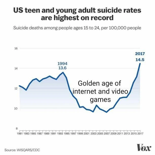
At first glance, this chart looks like something from a serious news article. The title “US teen and young adult suicide rates are highest on record” sets a somber tone, and the source line (“WISQARS/CDC”) tells us it’s based on real data from a public health database (the CDC’s injury statistics). We see a blue line graph representing the suicide death rate among 15–24-year-olds (per 100,000 people) for each year from 1981 to 2017. Key points are marked: a peak around 1994 at 13.6, and the highest point in 2017 at 14.5. The curve dips to its lowest values in between, roughly from the late ’90s into the 2000s. The design is very Vox-style — clean layout, labeled data points, a gentle blue shading under the line, gridlines — the kind of visual that screams “Here’s an important trend.”
But smack in the middle of that trough is some bold text that doesn’t normally appear in official reports: “Golden age of internet and video games.” This overlay was added by the meme’s creator for comic effect. Why highlight that? Because roughly 1998–2008 was when the internet and multiplayer video gaming really took off. Think of it as the golden era of dial-up modems and local networks. A LAN party is when friends gather with their computers or game consoles in the same place, connect them together (LAN stands for Local Area Network), and play video games for hours — often fueled by pizza and soda. In the late ’90s and early 2000s, this was a popular weekend plan for many young people and tech enthusiasts. By calling that period the “golden age of internet and video games,” the meme humorously suggests that this tech-filled social scene might have had an unexpected side benefit: during those years the youth suicide rate was relatively low. It’s as if all those nights of playing StarCraft, Counter-Strike, or World of Warcraft formed a magical protective bubble for teen mental health.
This is where the joke meets a classic logic problem: correlation vs. causation. Just because two things happen around the same time doesn’t mean one caused the other. A correlation is when two trends or numbers move in a related way. Here, as the graph shows, youth suicide rates went down in the years that internet use and gaming were exploding. Those two trends coincided — that’s a correlation. However, causation means one thing directly makes the other happen (like flipping a switch causing a light to turn on). The meme is implying a causal story (“more gaming and internet led to fewer tragedies”), but we know that’s an oversimplification. There could be dozens of other factors explaining the rise and fall of this graph: economic conditions, changes in social support systems, improvements in mental health awareness during the 2000s, or even shifts in how the data was recorded. The point is, it’s easy to be fooled by a graph that shows two things changing together. It’s like noticing that whenever ice cream sales go up, pool drownings also increase — it would be silly to claim ice cream causes drowning (in reality, hot summer weather is behind both). In the same way, the overlap between low youth suicide rates and the “golden age” of gaming could be pure coincidence or due to other forces. The meme gives a light-hearted reminder: an interesting pattern in a data visualization isn’t proof of a cause.
Now, about that title: “LAN parties as the next public-health OKR.” OKR stands for Objectives and Key Results, a goal-setting method popular in tech companies. An objective is a big goal, and key results are how you measure achieving it. For example, a company might set an objective to “Improve team knowledge” with a key result like “Conduct 5 training workshops this quarter.” OKRs are usually serious business tools, all about metrics and evidence. So it’s pretty funny to see OKR language applied to public health and gaming. It imagines some officials saying: “Objective: Reduce youth suicide rates. Key Result: Organize monthly LAN parties.” The joke here is that treating “throw more LAN parties” as a formal health objective is absurd. Public health issues (like teen suicide) are complex and not solved with a single quirky trick. But in the tech world, we’ve all seen strange leaps of logic where someone takes a flimsy insight and turns it into a big initiative. Maybe a graph showed user engagement spiked on a day we added a cat photo to the homepage — suddenly there’s an OKR to post more cat photos, as if that alone will double our revenue. Here, that kind of knee-jerk reasoning is parodied by suggesting video game parties could become an official strategy to improve mental well-being.
So, the meme is taking a real, serious trend (young people’s mental health struggles) and overlaying a goofy “solution” (more video games!) to poke fun at sloppy analysis. It uses the credibility of a Vox-style chart to set us up, then subverts it with that cheeky “golden age” annotation. The whole thing is a gentle nudge to anyone who works with data or dashboards: don’t jump to conclusions. Sure, it would be awesome if hosting Halo tournaments or Minecraft nights could fix a public health crisis, but life isn’t that simple. The meme humorously reminds us that not every line on a chart holds a deep truth — sometimes a big rise or fall is just a coincidence, and treating it like fate can lead to some pretty silly ideas.
Level 3: Dashboard Delusions
In this polished data visualization, a grave mental health metric is oddly repurposed into a punchline. The chart shows youth suicide rates climbing to a record high by 2017, yet the meme-maker has cheekily planted a “Golden age of internet and video games” label over the deep valley (circa 1998–2008). Seasoned engineers recognize this graph as a cautionary tale: a textbook case of correlation vs causation confusion. It’s poking fun at our industry’s tendency to draw grand conclusions from coincidental trends. We’ve all sat through a meeting where someone triumphantly points to a dashboard line and proclaims a eureka insight—only for a skeptical senior to mutter, “Correlation, not causation, folks.”
This meme perfectly skewers that fallacy (the old post hoc ergo propter hoc in logic terms) using a real public health dataset. It riffs on how data storytelling can go off the rails: take a serious trend (CDC’s youth suicide data) and overlay a completely unrelated narrative (the rise of dial-up modems, LAN parties, and console gaming) to imply a causal link. The joke lands because it’s a dashboard misinterpretation in action — like a product manager seeing two lines dance together on a graph and treating a mere coincidence as if it were proof of cause. Suicides dropped while Quake and StarCraft were in their heyday? Quick, someone file a Jira ticket to make “weekly LAN party” our next KPI! The absurdity is familiar to senior devs who’ve seen decision-makers chase trends on the flimsiest of statistical links.
The humor gets sharper when you consider context. During that late ’90s to mid-2000s internet era, youth were reveling in early online culture and the blossoming video game era: from noisy 56k modems and AOL chat rooms to all-night LAN parties with iconic multiplayer games. Ironically, older generations at the time often blamed the internet and video games for harming kids’ minds, but here the graph’s narrative flips the script — gaming might have been saving lives! To a veteran, this reversal is deliciously sarcastic. It evokes those infamous “spurious correlation” charts (remember the gag linking declining Internet Explorer usage to declining murder rates?). We know that’s nonsense, just as we know making LAN parties a public-health metric is facetious. Yet we’ve witnessed similar leaps in real life: a CEO attributing a revenue spike to the new website font, or a manager insisting that last quarter’s team offsite caused a drop in bug reports. The seasoned perspective here is clear: treat time-series ‘insights’ with guarded skepticism. If an engineer doesn’t pause to ask “Wait, what else might be happening here?” they’ll end up chasing phantoms, allocating resources to initiatives as effective as prescribing Minecraft for depression. The meme’s wry message: Graphs don’t automatically tell truths — always interpret them with context, healthy doubt, and maybe a chuckle.
Description
The image displays a line graph from Vox, sourced from WISQARS/CDC, titled 'US teen and young adult suicide rates are highest on record'. The chart plots suicide deaths per 100,000 people aged 15-24 from 1981 to 2017. The data shows a peak in 1994 at a rate of 13.6, followed by a significant decline into the early 2000s, and then a sharp increase to a new record high of 14.5 in 2017. A text overlay is placed over the period of decline and low rates (roughly 1997-2009), which reads, 'Golden age of internet and video games'. The meme uses a real, serious statistic to create a darkly humorous and nostalgic commentary. It ironically suggests a correlation between the era of classic online video games and a decrease in youth suicide rates, implicitly contrasting it with the subsequent rise of modern social media and its perceived negative effects on mental health. This resonates with a generation of tech professionals who grew up during that 'golden age' and often critique the current state of the internet

Comments
22Comment deleted
The data is clear: peer-to-peer connections over dedicated servers had a measurably better impact on mental health APIs than the current centralized, algorithm-driven, engagement-optimized social graph
If product wants a quick win on wellness KPIs, just cite this chart and propose Counter-Strike servers in every household - because nothing says rigorous causal inference like a convenient dip in a single time series
Ah yes, the classic 'correlation implies causation' fallacy - though as engineers who've debugged production at 3am while our Slack channels burn with incident reports, we know the real killer feature of the internet age isn't video games, it's the always-on culture and the existential dread of maintaining legacy codebases written by developers who left no documentation
Ah yes, the classic 'correlation implies whatever narrative I'm selling' fallacy. This graph beautifully demonstrates that suicide rates actually *decreased* during the supposed 'golden age' of internet and gaming, then spiked after - almost as if complex societal issues can't be reduced to 'kids these days and their screens.' It's the statistical equivalent of blaming your production outage on the intern who deployed on Friday, when really it was that technical debt from 2015 finally coming due. Senior engineers know: when your monitoring shows an inverse correlation between two metrics, maybe - just maybe - your hypothesis about causation is backwards. But hey, 'Nuanced analysis of multifactorial mental health crisis' doesn't get the same engagement as 'Video games bad,' does it?
This is why exec dashboards need causal graphs, not labels - someone’s about to open a Jira to roll back the internet to dial‑up because the time series says the KPIs will hit SLOs
The real spike hit when feeds went distributed: single-player LAN parties scaled better for sanity than infinite-scroll clusters
Annotation‑driven development: label the valley “Golden age of internet and video games” and ship causality to prod - RCT’s in the backlog
Oh, there are my people Comment deleted
why so many mfs committed suicide in 2004 Comment deleted
socioeconomic disparity Comment deleted
*wonders who will get the reference* Comment deleted
any guide for someone born after that date? Comment deleted
A furry game that has been rereleased multiple times since then Comment deleted
Ratchet & Clank (2002(?)) Comment deleted
You think that the horizontal axis here means year of death (suicide). I think it means year of birth. We are not the same. Comment deleted
Clearly admins fault for posting graph with cut-off date as 2017 Comment deleted
Oh yeah, golden era of the Top Gear production Comment deleted
I hoped that it is percentage of suiciders, but is people in 100000😢 Comment deleted
hoped? Comment deleted
If a man commits suicide, it is one less potential suicide in the future Comment deleted
that's certainly an opinion Comment deleted
It's just US Check Chinese out lol Comment deleted