Skip to content
DevMeme
5235 of 7435
The UN's War on Aesthetic Dissent
UX UI Post #5741, on Dec 16, 2023 in TG

The UN's War on Aesthetic Dissent

Why is this UX UI meme funny?

Level 1: Rebels in Art Class

Imagine your school says everyone must use the same happy cartoon sticker on every homework assignment. The sticker is a big smiling blob character that the school thinks makes your work look friendly. But you really don’t like that sticker – you think it’s silly and you’d rather draw your own cover for your project. Now, picture the teachers like guards making sure every student uses the sticker. You try to turn in your project without it, yelling “I hate this sticker!” because you’re so annoyed. Suddenly the teachers surround you, holding extra sticker sheets, saying “We’ve got you surrounded – put the sticker on!” It’s a funny scene because it’s treating a tiny rule (using a certain art style) like a huge deal that needs an army. The meme is just like this: it shows a developer (like the student in our story) who doesn’t want to use the company’s cute pictures, and the company’s “art police” coming after him. It’s humor that anyone can get – it feels like when grown-ups force you to do something that seems unimportant to you, and you just want to stomp your foot and refuse.

Level 2: Brand Guidelines Boot Camp

Let’s break down what all this means in simpler terms. Corporate Memphis style is a nickname for the common cartoon art you see in big tech company websites and presentations. Think of those flat, brightly colored drawings of people with big heads and tiny bodies doing generic tasks (like stacking blocks, shaking hands, or sitting at a giant laptop). Companies use this art style as part of their brand guidelines – basically a rulebook for how all their stuff should look (logos, colors, fonts, and yes, illustrations). The idea is that if every slide deck, website page, and internal document shares the same look, the company feels more unified and professional. This falls under UX/UI design considerations: maintaining a consistent visual experience for users and even employees.

Now, in the meme, developers (the people who write the code) are shown “staging a mutiny” against having to use this corporate art. Why would an engineer care about art in slides? Well, if you’re a junior developer, you might experience this soon! Imagine you’re preparing a presentation about your software project. You might craft some simple, straightforward slides with code snippets and data. But then you learn you’re required to use the official company PowerPoint template. Suddenly your simple slide now has to include the company’s friendly cartoon characters or the official mascot image on the title page. Maybe the template forces a bright palette and playful shapes that you feel don’t match your serious technical content. It can be frustrating; you might feel like the corporate culture is intruding on your personal presentation style.

Key concepts explained:

  • Corporate art (in this context) refers to those pre-approved images and illustrations that match the company’s style. It’s “corporate” because it’s designed by the company’s design team for everyone to use, and “art” in the sense of visual assets, not gallery paintings.
  • Slide deck just means a set of presentation slides (like a PowerPoint or Google Slides file). In a big company, slide decks for meetings often must use the official theme.
  • Internal collateral means any internal documents or media – things like training manuals, wikis, or presentation decks used inside the company. Even these often have to follow the design rules.
  • Corporate Memphis style itself is characterized by simple flat colors, geometric shapes, and often people drawn in a very simplistic, abstract way. Fun fact: the people are often colored in non-realistic skin tones (blue, green, pink) to appear diverse and playful without representing any specific real-world group. It’s meant to be universally appealing, but many find it bland or overused.
  • “I hate corporate art!” – This is just the developer voicing frustration. New engineers quickly learn that in a large organization, it’s not enough to solve the coding problem; you also have to package your solution in the “company-approved” format. That might include using certain buzzwords, templates, and yes, illustrations. Over time, this can feel stifling, which is why even a usually technical person might jokingly “rebel” against it.

So, imagine you’re new at TechCorp Inc., and you make a beautiful graph to explain a performance issue. You’re about to present it, and a teammate says, “Hey, you should add our official cartoon mascot on the cover slide, otherwise the VP will ask why we’re not following the template.” You might groan internally. This meme is basically capturing that groan as a full-on cartoon rebellion. It’s DeveloperHumor 101: take a small annoyance in the developer life and blow it up to an extreme, humorous scenario. By understanding these terms (corporate art style, branding rules, etc.), you can see why the situation is funny – it’s poking fun at the sometimes ridiculous lengths companies go to control appearances, and how developers just want to be left alone to focus on the real work.

Level 3: The Memphis Mutiny

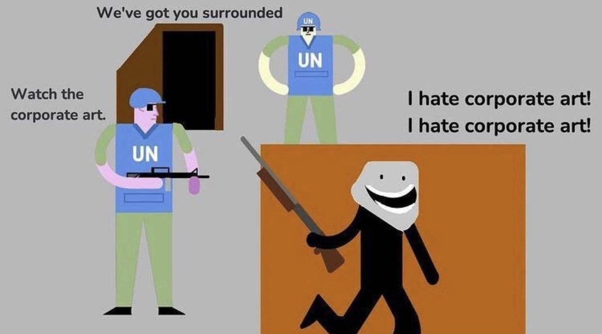
In this meme, flat-design Corporate Memphis style artwork gets turned into a battlefield. Two cartoon UN peacekeepers (decked out in blue vests and helmets) are cornering a masked stick-figure rebel. One soldier demands compliance – “Watch the corporate art.” – as if reading from a brand guidelines manual at gunpoint. Meanwhile our rebel, brandishing a rifle, defiantly shouts “I hate corporate art! I hate corporate art!” twice for good measure. This absurd scenario is dripping with irony and developer humor:

  • Enforced Whimsy: The joke is that these cute, minimalist illustrations (the kind found in every corporate slide deck) are being enforced with rifles. It’s a satirical exaggeration of how seriously big companies take their slide deck aesthetics. The friendly, feel-good art style is supposed to be harmless and blandly positive – yet here it’s guarded by armed “design police.” It’s like being held at gunpoint and told to add happy cartoon figures to your PowerPoint. The cognitive dissonance is hilarious to anyone who’s worked in a strict corporate culture.

  • Developer Rebellion: Seasoned engineers recognize the mutiny here. In real life, many developers quietly seethe at mandatory branding rules. Maybe you’ve spent late nights perfecting a technical presentation, only for a well-meaning brand officer to insist: “Please replace your unique diagrams with our official corporate art.” 😑 This meme voices that frustration out loud. The rebel’s rallying cry (“I hate corporate art!”) is every engineer’s inner monologue when forced to use yet another cookie-cutter illustration of faceless folks high-fiving beside a giant graph. It’s HumorInTech because we’ve all felt that pointless clash between individuality and sanitized branding.

  • CorporateCulture at Gunpoint: The presence of “UN” on the soldiers’ vests hints at a universal mandate – as if all companies worldwide (a United Nations of design teams, so to speak) agreed that Corporate Memphis is the only acceptable style. This exaggeration pokes fun at how monolithic design trends become. Just like “It’s always DNS” is a running joke in tech, “It must use Corporate Memphis art” is a running joke in design and UX circles. The meme suggests there’s an almost military precision to enforcing those brand guidelines. The phrase “Watch the corporate art” parodies a soldier yelling “Watch your fire!” – except here the precious thing to protect isn’t a civilian, it’s the on-brand artwork. Seasoned folks laugh because it feels true: step out of line (use an off-brand icon or a meme in your docs) and the Design System Police will descend on you. It’s an illustration insurgency, where the rebels are developers who just want their slides to be free of cringey clipart, and the empire is a well-armed branding department.

  • Shared Trauma and Satire: This scenario resonates especially with those who’ve lived through endless UX/UI redesigns and corporate rebrands. Remember the era of glossy stock photos of “diverse office teams” in every presentation? That gave way to today’s flat illustrations of blob-shaped people with quirky proportions. These trends come and go, but the top-down enforcement remains. The meme taps into that history: developers have been rolling their eyes at mandatory aesthetics for ages – whether it was clippy in the corner, the company watermark on every page, or now a flat art avatar waving on the intro slide. Tech memes like this are funny because they dramatize real workplace absurdities. No, your PM doesn’t actually carry a rifle, but when they email “Please use the approved slide template,” it feels like a hostage situation for your creative choices. This parody hints that under the friendly mask of corporate culture lies an authoritarian streak about branding. Seasoned devs chuckle (perhaps a bit cynically) at how a trivial thing like illustration style can spark an us-vs-them standoff in the office. It’s absurd, it’s relatable, and it’s a gentle roast of the conformity big tech sometimes demands.

Description

A surreal cartoon drawn in a minimalist, flat vector style, often mockingly referred to as 'Corporate Art' or 'Alegria.' The scene depicts two armed soldiers in blue UN vests and helmets surrounding a figure inside a brown structure. One soldier says, 'We've got you surrounded,' while another cautions, 'Watch the corporate art.' Emerging from the structure is a black stick figure with a creepy, wide, white smiling mask, carrying a rifle and shouting, 'I hate corporate art! I hate corporate art!'. The humor is absurdist, parodying the intense dislike many in the tech and design communities have for this specific art style, which is seen as soulless, generic, and emblematic of sanitized corporate culture. The meme elevates this aesthetic disagreement to the level of an armed conflict with a UN intervention, resonating with anyone who feels oppressed by ubiquitous, uninspired design trends in modern software and marketing
Comments

7
Anonymous ★ Top Pick This is what happens when you mark the 'Implement new UI illustrations' ticket as 'Won't Do'. It gets escalated beyond the product manager, beyond the CTO, and straight to the UN Security Council
  1. Anonymous ★ Top Pick

    This is what happens when you mark the 'Implement new UI illustrations' ticket as 'Won't Do'. It gets escalated beyond the product manager, beyond the CTO, and straight to the UN Security Council

  2. Anonymous

    Marketing’s design-system SWAT team: “Your deck violates policy - where’s the obligatory Corporate Memphis blob?” Me (20 yrs in): “Incredible; the brand guidelines now have stricter consistency guarantees than our databases.”

  3. Anonymous

    When the design system committee insists their 47-shade gray palette and abstract geometric patterns are "inspiring innovation" but your entire engineering team has been using dark mode since 2015 to avoid looking at it

  4. Anonymous

    Every senior engineer knows this standoff: HR announces a 'mandatory fun' initiative to 'improve culture' with inspirational posters and open office redesigns, while the dev team just wants to be left alone to solve actual problems. It's the eternal conflict between those who measure success in engagement metrics and those who measure it in uptime and latency. The corporate art always wins the battle, but the engineers win the war by simply ignoring it while shipping features

  5. Anonymous

    In the enterprise, Corporate Memphis isn’t a style - it’s a transitive dependency; hate it all you want, CI still fails until figma-tokens.yml passes brand compliance

  6. Anonymous

    Corporate art: the one monolith where even the ops team votes to delete first

  7. Anonymous

    Corporate art shouting “I hate corporate art” is the design‑system version of a circular dependency - amusing right up until BrandOps’ CI fails your PR for missing the approved blob gradient

Use J and K for navigation