Skip to content
DevMeme
2519 of 7435
The Unstoppable Trend of Abstract Spiral Logos
IndustryTrends Hype Post #2793, on Feb 24, 2021 in TG

The Unstoppable Trend of Abstract Spiral Logos

Why is this IndustryTrends Hype meme funny?

Level 1: Swirly Superheroes

Imagine you have three favorite superheroes, each with their own special logo or symbol – one has a big bat 🦇, another a bold "S", and the third a cool bird emblem. These symbols are how you quickly tell them apart, right? Now picture this: one day, each superhero decides to change their symbol to a colorful swirl. 🔵🟢🔴 Suddenly, all their logos look almost the same, just in different colors. When you check out their new costumes, you’d probably giggle: “Wait, who is who now? They all have the same swirly badge!” It would be pretty silly if heroes known for being unique all ended up with matching swirly signs.

That’s exactly what this meme is joking about, but with web browsers (the programs you use to surf the internet, like the apps with icons you click to go online). Each browser used to have its own clear picture icon – one had a fox, another a blue ‘e’, another a duck. But now some of them changed their pictures to swirly, colorful shapes. They all went to the same “fashion store” and bought the same style logo! 😄 The meme imagines even the duck might change to a swirl. It’s funny because it’s like a bunch of friends who used to dress totally differently suddenly all wearing the same funky shirt. You’d laugh and ask, “Did you all plan this?” It makes us chuckle that big tech products, which are supposed to be different teams, ended up looking like they coordinated their logos in the same style. Just like the superheroes with matching emblems, when every browser logo becomes a similar swirl, it’s both comical and a little confusing – a playful reminder that even in the tech world, everyone sometimes follows the same trend.

Level 2: Gradient Swirls Everywhere

Let’s break down what’s going on in this meme in simpler terms, and clarify some of the tech and design references for a newer developer or someone less familiar with the context. First, the key players here are web browsers and a search engine’s logo:

  • Firefox – a popular web browser (from Mozilla) that historically had a logo featuring a fox wrapped around a globe (symbolizing the World Wide Web). In 2019, Firefox redesigned its icon to a modern, simplified look: now it’s an abstract swirl shape in fiery colors (red, orange, purple). The new logo still suggests a flame or a fox’s tail, but it’s no longer a literal fox image.
  • Microsoft Edge – Microsoft’s web browser. It’s the successor to the old Internet Explorer (IE). IE’s logo was a very recognizable blue “e” with a ring around it (a staple of early web days). When Microsoft launched the new Edge (rebuilt on Chrome’s engine around 2019), they also unveiled a new logo: a swirl that’s primarily blue and green. This swirl is shaped subtly like a small wave or a twisted letter “e”. It’s meant to look fresh and distinct from the old IE, but as the meme notes, it ended up looking conceptually similar to Firefox’s swirl.
  • DuckDuckGo – not a browser, but a search engine (like Google) that prides itself on privacy. DuckDuckGo’s logo is a cute white duck’s head with a yellow beak, wearing a green bow tie, all inside an orange circle. It’s pretty old-school cartoonish compared to the sleek Firefox/Edge symbols. Importantly, DuckDuckGo has not changed its logo to a swirl – the meme is joking about a hypothetical redesign.

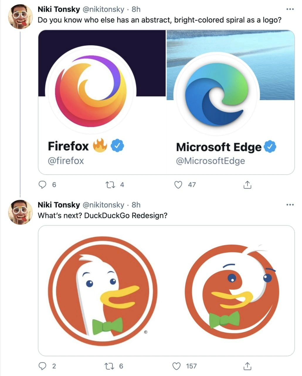
The meme presents a comparison: Firefox’s new logo and Edge’s new logo side by side, highlighting that both are “an abstract, bright-colored spiral”. Then it jokingly asks if DuckDuckGo will get a redesign next, and shows a made-up swirling duck logo to illustrate the idea. Here’s a quick summary of the logos in question:

Product Old Logo (Before) New Logo (After)
Firefox Fox circling a blue globe (detailed) Stylized swirl in red/orange/purple (no literal fox)
Edge Blue “e” (Internet Explorer style) Wave-like swirl in blue/green (abstract “e”)
DuckDuckGo Cartoon duck head in an orange circle No real redesign (yet) – meme shows a fake swirl duck for laughs

So, why do these new logos look alike? The term flat design comes up in conversations about this. Flat design is a style where icons and UIs (user interfaces) avoid heavy details like shadows, gradients (older style gradients), and 3D effects, aiming instead for flat shapes, simple forms, and often bright but uniform colors. Around the mid-2010s, flat design and its successor styles became very popular. Companies started updating their logos to be simpler and more abstract for a cleaner, modern look.

For instance, Firefox simplified its logo to look more streamlined and modern. The designers likely wanted something that still felt like Firefox (fast, fiery, global) but was minimalist enough to scale well on a small app icon or browser tab. They kept the gradient colors (red/orange to purple, resembling fire) but removed fine details (the fox’s paws, the globe details). Microsoft, when reimagining Edge, wanted to shed the baggage of Internet Explorer. They chose a logo that hints at the ocean (surfing the web) and the letter “e”, but it’s basically an abstract swirl with a two-tone gradient.

The meme’s joke is pointing out how these independent decisions ended up with very similar outcomes: two swirly, colorful logos. If you aren’t paying close attention, the Firefox and Edge icons could almost be distant cousins in a design sense – both round, swirling, with vibrant colors. It’s like noticing two different superheroes now wearing very similar costumes.

Now, DuckDuckGo enters the joke because it still has a very different style (a friendly duck mascot). The tweet “What’s next? DuckDuckGo Redesign?” teases that maybe everybody is jumping on this swirl logo bandwagon, so will DuckDuckGo do it too? The attached image is a parody: the normal DuckDuckGo logo next to a twisted, spiral version of the duck. The parody basically took the duck’s head and warped it into an abstract spiral shape, while keeping the duck’s colors (orange and white) and features (its eye and beak are sort of visible). It looks silly on purpose – the duck’s eye and bow tie are floating on a spiral. This exaggeration drives home the point: taken far enough, the trend could make every logo look like some kind of colorful whirlpool, even something as distinct as a duck character.

For someone newer to tech or design, a few terms and context clues in this meme might need explanation:

  • Logo redesign: Tech companies periodically refresh or completely change their product logos to stay up-to-date or rebrand. It’s similar to when a company changes its slogan or packaging. In tech, this often happens alongside big updates or shifts (like Firefox expanding its services, or Edge being rebuilt). Often, redesigns follow current design fashions – in this case, flat and abstract is “in”.
  • Abstract, bright-colored spiral: This literally describes the visual style – instead of a clear object (like a fox or a letter), the logo is a swishy spiral shape with bright gradient colors. “Abstract” means it’s not a clear depiction of a physical thing; it’s more of a concept shape.
  • Browser icons all looking alike: For web developers (especially front-end developers and UX/UI designers), the distinct icons of browsers are part of daily life. They might have multiple browsers installed (Firefox, Edge, Chrome, etc.) each with its icon in the taskbar. If those icons start to resemble each other, it’s both funny and a tiny bit confusing. The meme taps into that daily experience – imagine accidentally clicking Edge when you meant to open Firefox because at a quick glance both icons are round colorful swirls. It hasn’t happened to everyone, but it’s a scenario you can chuckle at if the logos keep converging.
  • BrowserWars (tagged in the context): Historically refers to competition between browser makers (like features, speed, market share). The tag here is used humorously – usually “wars” implies big differences (features, who’s better, etc.), but visually the “combatants” are starting to wear the same uniform (the swirl!). It’s an ironic nod: the browser war might make them all look the same in the end.
  • UX/UI professionals: These are folks who work on user experience (UX) and user interface (UI) design. They are very attuned to trends in design, like what styles of logos and icons are popular. The meme is labeled as something UI/UX people would find relatable because they likely discussed these redesigns when they happened. For example, when Firefox’s new logo came out, many designers on Twitter debated it – some liked the modern look, others missed the fox. Similarly for Edge. So this meme kind of says “hey design folks, isn’t it funny how these all turned into swirls?”

In summary, Level 2 explanation is: Two big web browsers updated their logos to look modern, but accidentally ended up looking similar (colorful swirls). The meme jokes that maybe every tech logo (even a duck-themed one) will turn into a swirl next. It’s highlighting a trend in design where many logos are becoming flat, simplified, and kind of alike. If you’ve just started noticing these things, don’t worry – even experienced devs/designers find it amusing and a bit absurd. The meme is basically a friendly poke at the trendiness in tech branding: when one style becomes hot, a lot of companies jump on it, sometimes to the point that their once-unique symbols all blend together. It’s a familiar cycle in design and quite funny to see it happening with something as iconic as browser logos.

Level 3: Spiraling Identity Crisis

The meme highlights a tongue-in-cheek convergence in browser branding that many senior web developers and designers have noticed over the past few years. In the image, tweets by a user point out how both Firefox and Microsoft Edge now sport abstract, colorful swirl logos – a dramatic shift from their earlier, more distinct icons. The tweet asks rhetorically:

"Do you know who else has an abstract, bright-colored spiral as a logo?"

showcasing the new Firefox 🔥 logo (a red-orange-purple swirl) side-by-side with the new Edge logo (a blue-green swirl). These once fierce competitors in the "BrowserWars" suddenly look like they share a designer or at least the same design trend playbook. The follow-up tweet quips:

"What’s next? DuckDuckGo Redesign?"

with a parody image swapping DuckDuckGo’s unique duck mascot for yet another orange-white spiral. It’s a hilarious exaggeration of a real IndustryTrend: major tech products adopting flat, abstract, and often circular logos with vibrant gradients. The humor hits home for seasoned developers and UI/UX folks because it feels too true – after years of painstakingly cultivating distinct brand identities, all the browsers are suddenly wearing matching uniforms!

From a senior perspective, this is poking fun at design-system homogeneity. We remember when each browser had a personality: Firefox’s logo literally had a fox on fire circling the Earth, and Internet Explorer/Edge was a trusty blue “e”. Those icons carried history and uniqueness. Fast forward to 2021: Firefox rebranded with a slick flame-like swirl (no actual fox to be seen), and Edge – after rebooting as a Chromium-based browser – ditched the old “e” for a wave-like swirl. Now both logos are abstract, circular shapes with multicolor gradients. They’re undeniably modern and pretty, but at a glance, they look surprisingly similar. It’s as if all browsers went to the same logo design boot camp and graduated with swirls in different color palettes.

This brand identity convergence didn’t happen overnight. In the broader context of WebDev and design, there was a movement toward flat design and simplicity throughout the 2010s. You might recall how app icons and logos across the tech industry underwent “modern” makeovers: flattening 3D effects, simplifying shapes, and embracing bright gradient colors. It started as an antidote to overcomplicated, skeuomorphic designs (remember the glossy, detailed logos of the early 2000s?), but it eventually led to a kind of design monoculture. Everyone wanted to signal “hey, we’re up-to-date” by following the same minimalist, geometry-inspired aesthetic. Material Design guidelines from Google and Fluent Design from Microsoft promoted clean shapes and bold colors for better scalability and a consistent feel across devices. This had many benefits – simpler logos scale better to small icons and high-resolution screens, and consistent design language can unify a product family. However, the unintended side effect is that distinct brands start to look eerily alike. It’s a bit like all car manufacturers optimizing for aerodynamics and safety until every car model starts to have the same smooth, teardrop shape. In tech, all our browsers are starting to wear the same friendly swirl, just tinted differently.

For veteran developers, there’s an almost cynical humor in seeing this play out during the so-called browser wars era of the 2020s. The "Browser Wars" of the late 90s and 2000s (Netscape vs IE, then Firefox vs IE, then Chrome joining the fray) were fought not just with features and performance but also with distinct branding to capture user mindshare. The logos were like battle flags: Firefox’s fiery fox, Internet Explorer’s iconic blue e with a ring, Chrome’s bold primary-colored pinwheel, Opera’s red O, Safari’s compass. Each was immediately recognizable. Now, with Firefox and Edge’s new logos, it’s as if two rival generals showed up to the battlefield wearing the same swirling tie-dye uniform. 😅 The meme humorously suggests DuckDuckGo (a privacy-focused search engine whose logo is a quirky duck in a green bow tie) might be the next to succumb to this trend, by rendering the poor duck’s head into a swirl form. It’s funny because it extrapolates the trend to absurdity: if even the duck mascot isn’t safe from the swirl trend, then truly no tech logo is sacred!

This resonates with developers who have lived through numerous redesigns and rebrands. We’ve seen user backlash when a beloved logo is flattened or abstracted (“Bring back the fox!” was an actual outcry from some Firefox fans when the new logo launched). But we’ve also sat through design meetings where brand teams earnestly explain that simpler logos improve user recognition across devices. There’s truth to that – a complex logo can become unrecognizable when scaled down to a favicon or mobile app icon. The Firefox team, for example, argued that the fox-and-globe motif was getting too tiny and intricate for modern device screens, and that the new abstract swirl would be more versatile as part of a larger brand system (Firefox has a whole suite of products now). Microsoft’s Edge rebranding similarly aimed to distance the browser from the legacy of Internet Explorer’s “blue e”, signaling a new era (Chromium under the hood) while still hinting at an “e” shape and a wave (for surfing the web) with that swirl.

So from an experienced dev/UX vantage, the meme lands because it underscores a real balancing act in tech branding: following trends to appear contemporary vs. maintaining a unique identity. When everyone follows the same design trend, all identities blur together — which is precisely the joke. The phrase “abstract, bright-colored spiral” is basically a gentle roast of modern logo design clichés. It reminds us of times when every startup had a flat minimalist logo or when all corporate illustrations suddenly adopted the same quirky art style. Insiders chuckle because they’ve seen this pattern repeat: what starts as bold innovation in design becomes overused to the point of parody. The meme is a nudge and a wink to those in the industry: “Haven’t all these logos started to look the same? You noticed it too, right?”

Now, what really brings it home is that second image of DuckDuckGo’s duck twisted into a spiral. It’s simultaneously horrifying and hilarious to a designer’s eye. The DuckDuckGo mascot is one of the few distinctive holdouts – a cute duck in a circle that clearly stands out among a sea of swirls. The meme suggests even this could be revamped into oblivion, leaving just a warped swirl with a duck beak and an eye floating around. It’s a hyperbole, but it tickles anyone who watches tech branding because, who knows, we’ve seen stranger redesigns become reality! It’s a form of satire on Industry Hype: if the execs decide that abstract swirls are the hot new thing that test well with users, maybe no logo is safe.

In essence, the meme’s humor is multi-layered for the seasoned crowd: it references the recent Firefox rebrand (Firefox got a lot of press in design circles for dropping the detailed fox), the Edge logo change (part of Microsoft’s bid to reboot Edge’s image), and ties it into a broader commentary on design convergence. It’s the UX/UI equivalent of a codebase where every project ends up using the same frameworks and looking alike. There’s a mix of fond nostalgia (“remember the old logos?”) and playful ribbing of present trends (“everything is a swirl now”). This kind of joke gets knowing nods because it taps into shared experiences: arguing over redesigns, recognizing app icons at a glance, and the irony of creative work all ending up in the same place due to herd mentality or “best practices.” It’s humor, but also a small caution to designers: if you chase the same trends, you might just erase what made your brand yours. The meme captures that sentiment in one image – causing us to laugh, then maybe sigh as we Alt+Tab and see a row of similar-looking icons glowing back at us on our taskbar.

Description

This image is a screenshot of a two-part Twitter thread by user Niki Tonsky. The first tweet points out the design similarity between the Firefox and Microsoft Edge browser logos, asking, 'Do you know who else has an abstract, bright-colored spiral as a logo?'. It displays both logos, which are indeed colorful, circular swirls. The follow-up tweet speculates on the future of this trend with the text, 'What's next? DuckDuckGo Redesign?'. Below this, it humorously contrasts the current, friendly DuckDuckGo mascot logo (a cartoon duck with a green bowtie) with a parody redesign. The redesigned logo grotesquely contorts the duck into the same abstract spiral shape, stretching its beak and misplacing its eyes to fit the mold. The meme satirizes the 'blanding' or homogenization of tech company branding, where distinct identities are replaced with generic, abstract designs that end up looking alike
Comments

54
Anonymous ★ Top Pick The final stage of every tech logo's lifecycle is to be put through a design pipeline that achieves 100% test coverage for curves and gradients but results in 0% brand recognition
  1. Anonymous ★ Top Pick

    The final stage of every tech logo's lifecycle is to be put through a design pipeline that achieves 100% test coverage for curves and gradients but results in 0% brand recognition

  2. Anonymous

    First they all spoofed Mozilla/5.0 in the UA string, now they’re shipping identical gradient swirls - guess browser detection’s down to hashing the Bézier control points

  3. Anonymous

    The real browser war isn't about JavaScript engine performance or privacy features anymore - it's about who can abstract their logo into the most generic swirl while still maintaining plausible deniability that it represents something tangible. Next up: Chrome announces their new logo is just a loading spinner that never stops

  4. Anonymous

    When your design system is so 'modern' that every browser logo converges to the same abstract spiral, you know we've reached peak 'let's flatten everything and add gradients' era. Next sprint: rebranding all tech companies to indistinguishable swirls because apparently differentiation is a legacy pattern we're deprecating. At least when browsers had distinct identities, you could tell which one was eating your RAM just by looking at the dock

  5. Anonymous

    We solved engine fragmentation; marketing replaced it with a branding microservice where hash(fox|edge|duck) = swirl‑gradient

  6. Anonymous

    Browser logos: the one thing that renders with perfect cross-engine consistency

  7. Anonymous

    Browser logos have achieved eventual consistency: Firefox and Edge both resolve to the same gradient spiral - a hash collision. Waiting for DuckDuckGo to ship the prod incident while marketing labels it “brand alignment.”

  8. @pyproman 5y

    Wow, a meme from the creator of Fira Code

  9. @karim_mahyari 5y

    But seriously, edge is just a weird copy of everything I much prefer firedox or chrome separately, not the stew edge offers

  10. @nuntikov 5y

    edge design is actually kinda cool

  11. @nuntikov 5y

    but firefox

  12. Deleted Account 5y

    Sad day for humanity

    1. @prkiso 5y

      No the fox just got so fast it's now a blur

      1. Deleted Account 5y

        analog humanity trapped in a digital world (+ The globe isn't there)

  13. Deleted Account 5y

    This is an apple ad The apple has been eaten tho

  14. @def410 5y

    Осуждаю

  15. @batuto 5y

    The fox is behind the sphere, now we can only see his tail.

    1. @nuntikov 5y

      "Mozilla turning their back to us"

  16. @sashakity 5y

    that's not even the firefox logo tho, that's the mozilla brand logo

    1. @RiedleroD 5y

      no, it is the firefox logo, but firefox now stands for more than just the browser

      1. @RiedleroD 5y

        if I understood that correctly at least

      2. @sashakity 5y

        ur thinking of mozilla

        1. @RiedleroD 5y

          no, mozilla is the company, firefox is their browser + a few other things

          1. @sashakity 5y

            nope, mozilla owns forefox + few other things

            1. @RiedleroD 5y

              bro, this isn't even close to the mozilla logo

  17. @sashakity 5y

    firefox means browser

  18. @sashakity 5y

    you can find this out by looking at the firefox program's icon

    1. @RiedleroD 5y

      ok so, according to mozilla in this article, firefox stands for their browser, lockwise, monitor, and send. The browser still has the old logo, while the firefox suite (if I can call it that?) has the new swoosh as a logo

      1. @RiedleroD 5y

        this is the mozilla logo

        1. @RiedleroD 5y

          this is the former mozilla logo if you don't think the new one is a proper one

      2. @sashakity 5y

        exactly, it's not the logo of the browser

        1. @RiedleroD 5y

          but it's not mozillas logo either dumbass

  19. @sashakity 5y

    triggered, libtard?

    1. @RiedleroD 5y

      ah, a troll, I see. Must be real nice down there at an IQ of 80

      1. @sashakity 5y

        you're 16

        1. @RiedleroD 5y

          and still smarter than you, think about that one.

  20. @sashakity 5y

    you ca keep your dino saur

  21. @sashakity 5y

    doubt it

  22. @sashakity 5y

    where's proof

    1. @RiedleroD 5y

      I just sent you proof to all of my arguments except for the insults, so fuck off.

      1. @sashakity 5y

        have u tried typing coherently

        1. @RiedleroD 5y

          have you tried learning a second language? Because mine is english, mfer. I'm trying dude.

          1. @sashakity 5y

            yeah

  23. @sashakity 5y

    never needed to use it tho so i just forgot it

    1. @dugeru42 5y

      ur so wordy chill human

      1. @sashakity 5y

        >man

        1. @RiedleroD 5y

          nobody cares at this point

  24. @sashakity 5y

    whyd u reply

    1. @RiedleroD 5y

      can you please reply to the correct person so we know who you're talking to? Thanks.

    2. @dugeru42 5y

      cos u spam in chat

      1. @sashakity 5y

        do u want me to not have a conversation

        1. @dugeru42 5y

          i want u to have good conversation with people and have fun

  25. @sashakity 5y

    no jej

  26. @sashakity 5y

    ok

Use J and K for navigation