Skip to content
DevMeme
6201 of 7435
Witty Auth Company Clarifies that the Sign-In Process Is the Demo
DeveloperExperience DX Post #6799, on May 23, 2025 in TG

Witty Auth Company Clarifies that the Sign-In Process Is the Demo

Why is this DeveloperExperience DX meme funny?

Level 1: The Lock and Key Lesson

Imagine you go to see a cool new magic door lock a company invented. You excitedly say, “Show me how your amazing lock works!” The company’s demo is: they closed a door with that lock, and now they hand you the key and say, “Go ahead, open it.” But then you get upset and yell, “This is annoying! Why do I have to unlock the door just to see the demo of the lock? Fix this right now!” It sounds pretty silly, right? Because using the key to open the lock is exactly how you see the lock’s magic in action. In this meme, the “lock” is a login system and the “key” is signing in with a username and password. The frustrated person didn’t realize that doing the sign-in was the whole point of the demo. It’s funny because it’s like they asked for a taste of a new candy, and then complained that they actually had to eat the candy to find out what it tastes like. Sometimes, to show how something works, you have to actually do that thing – and complaining about doing it makes everyone who understands the situation giggle.

Level 2: Demo Gatekeeping

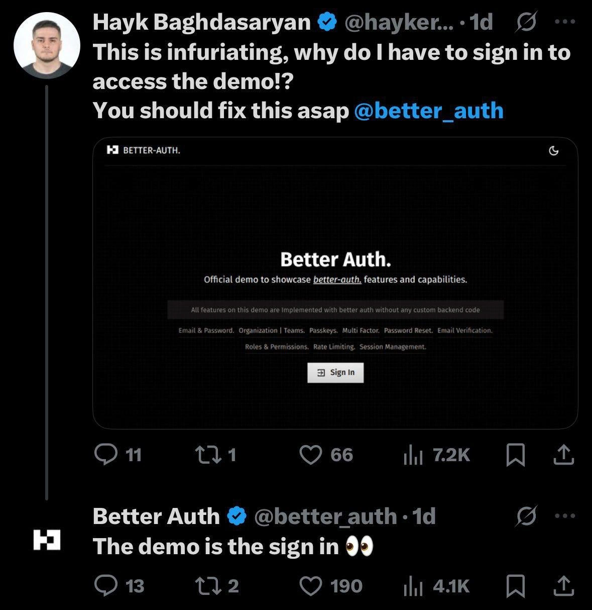
Let’s break down the meme for those newer to these concepts. The image is a screenshot of a Twitter conversation about a product called "Better Auth." Authentication (often shortened to auth) is the process of verifying who you are — basically the login flow where you enter a username/email and password, sometimes with extra steps like a code from your phone (that’s Multi-Factor Authentication, aka MFA or 2FA). The person in the tweet is upset because they went to see the Better Auth demo page and it immediately asks them to Sign In. They expected to freely browse a demo, but instead they hit a login form. From a user’s perspective, that feels like an unnecessary roadblock, especially if you’re used to demos being open showcases. The tweet says “fix this asap” — clearly the user thinks requiring a sign-in for a demo is a mistake that needs correcting.

But here’s the catch: Better Auth’s entire product is about signing in. It’s an authentication service likely meant for developers to use in their own apps so they don’t have to code all the login and user management stuff from scratch. The demo page description even highlights that all the features (like Passkeys which are passwordless login methods using something like fingerprint or Face ID, Password Reset flows, Email Verification to confirm new users, Roles & Permissions which control what different users can do, Rate Limiting to stop spam or hacking attempts, etc.) are implemented without any custom backend code. This means if you plug in Better Auth, you get all those features out-of-the-box, no need to write the server logic for them. For a developer, that’s a big deal: building a secure auth system yourself is notoriously tricky and time-consuming.

Now, a demo in the context of a developer product is usually a way to try out the service or see it in action. Often, companies will provide a sample application or a sandbox you can play in without much effort. In an ideal world (especially from a UX/UI stance), a demo should be quick and easy to access — no heavy setup, no significant barriers — so interested users can immediately see the value. That’s why the person tweeting is annoyed: having to sign up or sign in feels like unwanted friction when all they wanted was a quick peek at the product. This frustration is fairly relatable for many new developers: imagine clicking “Live Demo” on a site and the first thing you see is a login form asking for your email and password. You might think, “Ugh, I have to register an account just to test this? No thanks.” It’s seen as a bad user experience (UX) in many cases.

However, here that bad UX is actually intentional and central. Security vs Usability is a classic trade-off: if you want things super secure, you often have to add steps (like sign-ins, verifications) which make it a bit less convenient. Better Auth is demonstrating security features, so they need you to go through those steps to prove their system works. From a developer experience (DX) perspective, they’re saying: look, even with all these advanced auth features (teams, MFA, etc.), it’s still smooth enough to try right now. They want devs to feel how seamless integrating these flows could be by actually logging in through them. The humor (and slight cringe for a junior dev) comes from the misunderstanding — the user in the tweet doesn’t realize that by clicking “Sign In” and going through that flow, they would essentially be experiencing the demo. The company’s response, “The demo is the sign in 👀”, is basically telling them that. In plainer terms: “Our demo is literally letting you try to log in using our system, because that’s what we’re selling!”

To put it simply: authentication methods like those Better Auth offers can’t be shown off with a pretty screenshot or video alone; you have to feel them. For instance, one of the features listed is Passkeys – if the demo lets you use a fingerprint or hardware key to log in, that’s something you need to interact with to appreciate. The company likely expects someone evaluating their product to actually create a demo account and walk through the login, perhaps including receiving a verification email, trying a password reset, adding a 2FA code, etc. All of those are part of the “wow, it works!” moment for a developer. So while a newcomer may think “I just see a login screen, where’s the demo?”, an experienced dev knows the login screen is where all the action happens. The irony is now clear: the user’s angry demand to remove the sign-in step is basically asking the auth product to not do auth for the demo, which would defeat the purpose. No wonder other devs found this exchange funny enough to share—it’s a lighthearted example of a product demo misunderstanding.

Level 3: Auth Inception

At first glance, this meme’s scenario feels like an authentication paradox: a user is furious about needing to sign in to see an auth product’s demo, not realizing that signing in is the demo. Experienced developers immediately recognize the Security vs Usability tension here. The company Better Auth is presumably a SaaS identity provider (think Auth0, Okta, etc.), showcasing a full-featured login flow as their product demo. The dark humor is that a frustrated user on Twitter demands removal of the very gate meant to show off the gate’s features. It’s a classic case of “it’s not a bug, it’s a feature” in action. From a senior dev perspective, the tweet is both painfully relatable and hilarious: we’ve all groaned when marketing requirements or UX decisions seem counter-intuitive, but here it’s deliberate and ironically necessary.

Why is this funny to a seasoned developer? Because it highlights a common Developer Experience (DX) catch-22. We spend careers balancing security and user experience — every extra step (like a login prompt) protects the app but risks annoying users. In this case, the product is a secure sign-in system. So of course the “Official demo to showcase better-auth features” is going to ask you to log in! The list of features on that black demo page reads like an identity guru’s wish list: Email & Password login, Organizations/Teams (group accounts), Passkeys (passwordless WebAuthn methods), Multi-Factor Authentication (entering a code from your phone), Password Reset, Email Verification, Roles & Permissions (authorization levels), Rate Limiting (throttling bad actors), Session Management (handling user sessions). All of it is implemented “with better-auth without any custom backend code,” meaning their value prop is handling these heavy-lift security features for you. To really show that off, they funnel you through an actual login process using those very features. It’s a bit of UX irony: the demo has to introduce a little user friction (signing in) in order to prove it can eliminate bigger friction for devs in the long run (no custom auth code needed). Seasoned devs chuckle because they’ve been on both sides of this: building secure login flows and also getting annoyed when a quick demo isn’t one-click simple.

The Twitter exchange itself is comedic gold for insiders. The user Hayk’s indignant tweet (“This is infuriating, why do I have to sign in to access the demo!? You should fix this asap @better_auth”) sounds off like a bug report, as if requiring login were an oversight. But any experienced dev reading it knows: requiring sign-in is absolutely intentional. It’s the product’s core feature being showcased. The company’s reply – “The demo is the sign in 👀” – is cheeky yet precise. The eyes emoji (👀) is the perfect touch of sass, implying “look closely, you’ll see why”. It’s the modern “get it? 😉” for a situation dripping with irony. In a way, Better Auth’s social media manager is likely an engineer or tech-savvy marketer having a little laugh, thinking “our whole selling point is a better login flow, so of course our demo is literally logging in.”

This resonates with veteran developers because it points out how relatable tech experiences can be misunderstood by end-users or even less experienced devs. It echoes countless moments where tech companies gate content behind sign-ups — something we often label as UX failures or marketing friction — except here that gate is the show. Historically, devs remember times evaluating new APIs or dev tools: nothing kills enthusiasm faster than a required account creation just to see a hello world. Better Auth turned that scenario on its head: the demo login gating isn’t a misstep, it’s exactly the demo’s purpose. The humor also gently pokes at that perennial documentation vs product marketing struggle: how do you show off a security product without making someone go through security? The answer: you can’t, really. And so you get a tongue-in-cheek Twitter thread making the rounds in DeveloperHumor circles.

Description

The image is a screenshot of a Twitter exchange. The first tweet is from a user named Hayk Baghdasaryan who is complaining to a company called '@better_auth'. He writes, 'This is infuriating, why do I have to sign in to access the demo!? You should fix this asap'. The tweet includes a screenshot of the 'Better Auth' website, which displays a simple sign-in page for their authentication service demo. Below this, the official 'Better Auth' account has replied directly to the user with the short, clever statement: 'The demo is the sign in 👀'. The humor lies in the user's misunderstanding. For an authentication product, the user experience of the sign-in process itself is the feature being demonstrated. The company's witty and concise reply highlights this, turning a customer complaint into a viral marketing moment that resonates with developers who understand that the user flow *is* the product in this context
Comments

9
Anonymous ★ Top Pick The user reported a bug where the feature is the feature. This is the most senior-level ticket I've ever seen: 'System is working perfectly as designed, please fix immediately.'
  1. Anonymous ★ Top Pick

    The user reported a bug where the feature is the feature. This is the most senior-level ticket I've ever seen: 'System is working perfectly as designed, please fix immediately.'

  2. Anonymous

    Nothing like shipping an entire SaaS that’s 99% OAuth and 1% homepage - guess which part the PM called 'optional UX polish'? 🔐

  3. Anonymous

    After 20 years in tech, I've seen authentication evolve from simple passwords to biometrics, but the ultimate security pattern remains unchanged: making the demo so secure that even potential users can't evaluate it. It's like requiring a pilot's license to test drive a flight simulator

  4. Anonymous

    Ah yes, the classic chicken-and-egg problem in authentication: requiring users to authenticate before they can see how your authentication works. It's like a restaurant that requires you to eat a meal before you can see the menu. The Better Auth team's self-aware response with skull emojis shows they understand the absurdity - though one wonders if this is brilliant meta-commentary on authentication UX or just an unfortunate oversight in their demo deployment strategy. Either way, it's a masterclass in how not to reduce friction in your developer adoption funnel. At least they're not asking for OAuth scopes to view the landing page... yet

  5. Anonymous

    Requesting an auth demo without signing in is like asking to demo Postgres without a table; the 302->OIDC dance, WebAuthn prompt, and session cookie are the feature tour

  6. Anonymous

    Complaining that an auth product’s demo requires sign‑in is like asking a DB vendor to demo transactions without writes - the friction is the feature, and if it doesn’t exercise RBAC, sessions, and passkeys, why would you buy it?

  7. Anonymous

    Zero-trust demos: verify identity before revealing the auth features - even the showcase bows to RBAC

  8. @TERASKULL 1y

    vibe coding is a disaster for the human race

    1. Sure Not 1y

      s/vibe/llm/

Use J and K for navigation